I am sure we have all had those days where you stare at an image and just start moving sliders up and down to see what they do. What happens if I take this slider all the way up and this slider all the way down? For the most part, the results are entertaining, but not really aesthetically pleasing. But every once in a while, you can stumble onto something pretty awesome.
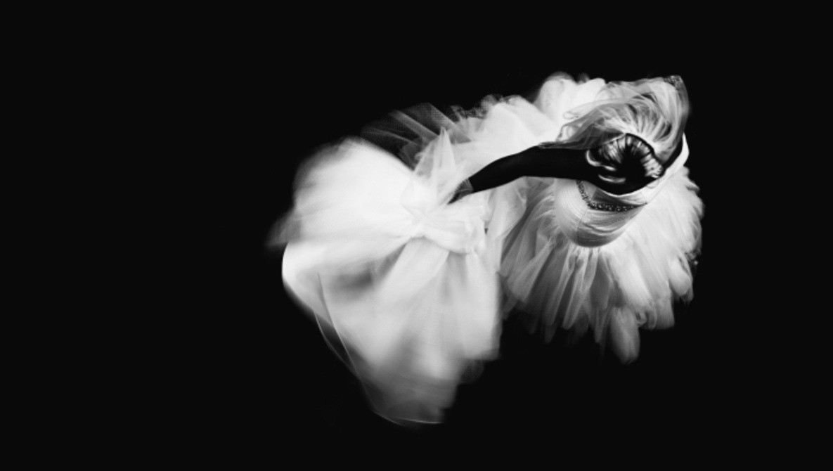
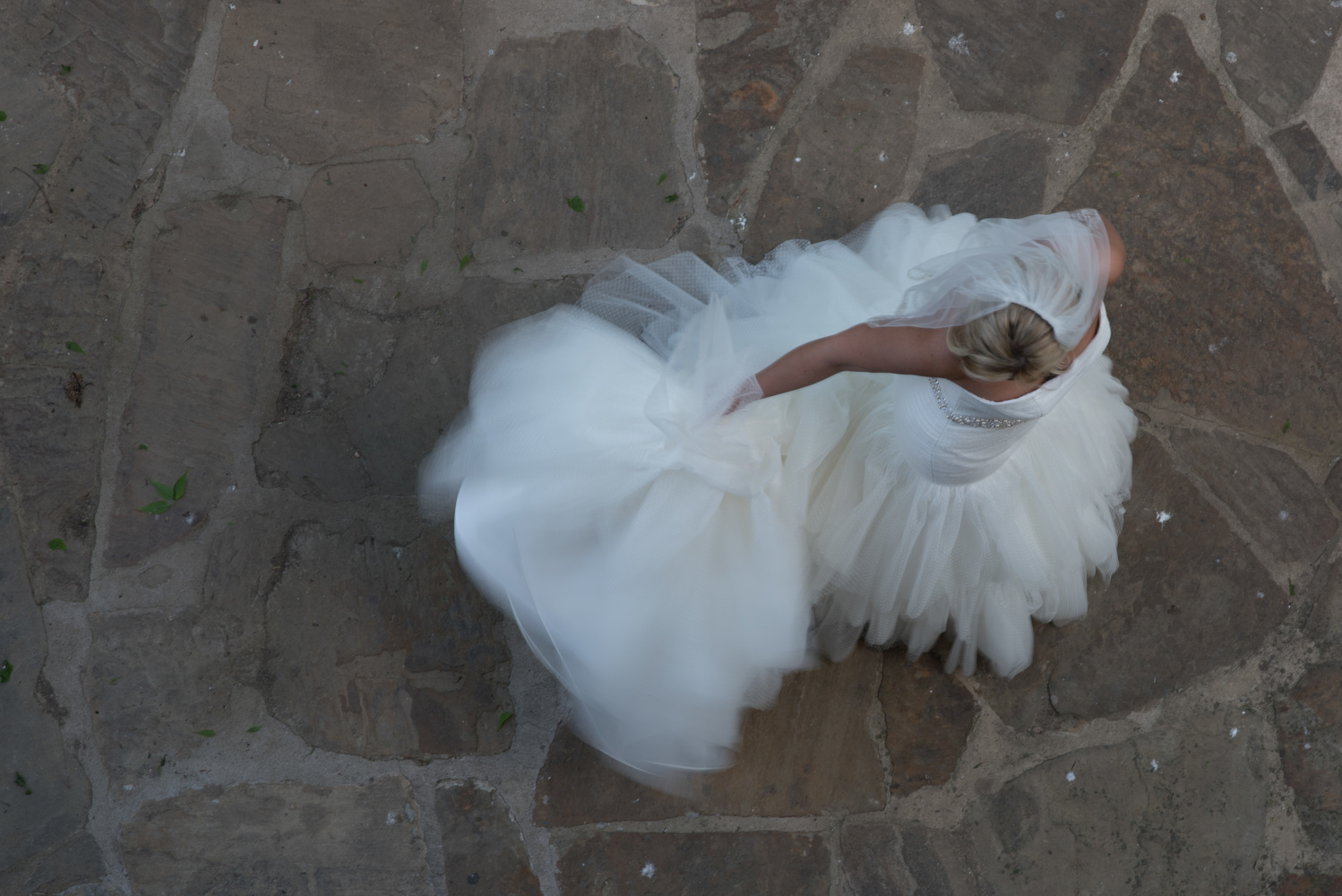
To start, I’ll explain how I shot this image. The bride and groom were getting ready at the same hotel, and I was shooting the groom and groomsman upstairs. My wife was taking the ladies outside to start some of the formals and the groom’s room happened to be right above where they were heading outside. I wanted to try and get some movement from the bride walking around, so I set my shutter to 1/10th of a second and braced the camera against the ledge of the balcony. The image I liked the most is the one below of the bride adjusting her dress. She is not moving very much, so she remains sharp, while the motion of her dress is streaked by the slow shutter.

The above image is the unprocessed raw file. I like it, but it’s nothing super special. This is where I started going a little crazy with the sliders and developed this process. To save some time, I’ll just explain how to get the final result instead of stepping through it in the chaotic way that I stumbled upon it.
The Edit
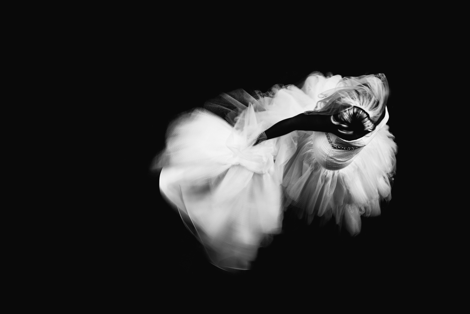
Because this is a high contrast black and white, I start by adding a curves adjustment to boost the highlights. I also lift the blacks a bit in order to give them a slight fade.

From here, I crank the contrast slider to +100 and the shadows, blacks, and saturation sliders to -100.
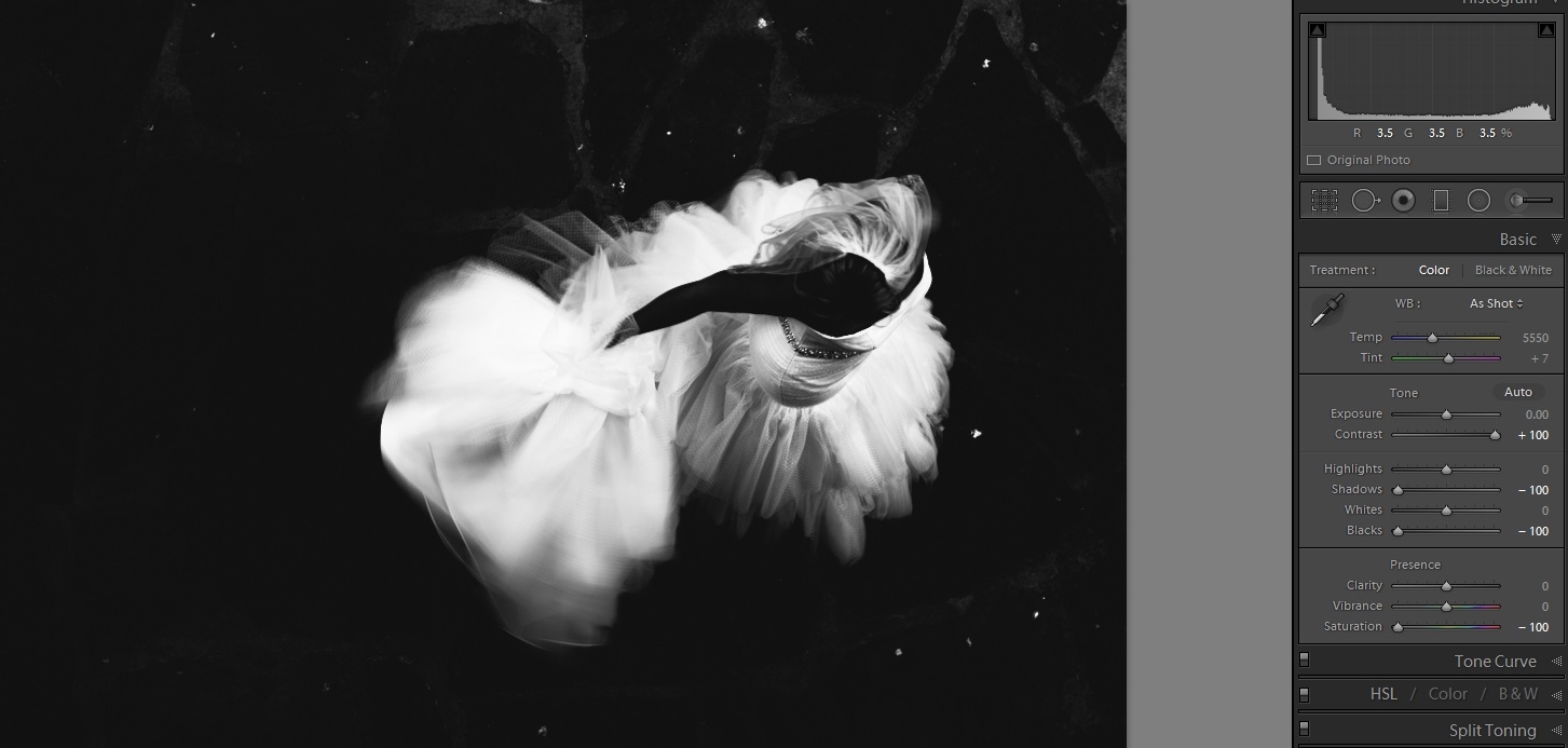
As you can tell, we are almost there, but you can see some details in the ground. To fix this, I use the brush tool with the exposure slider set to -4 and brush over any details that I want to go black. If you have a stubborn spot that does not go to black with a single brush adjustment, you can just add another layer of brushing onto that spot. I will also mention that although I start with a curves adjustment, a lot of the time, I'll revisit the curves adjustment at this point and fine-tune how high I have the highlights boosted.
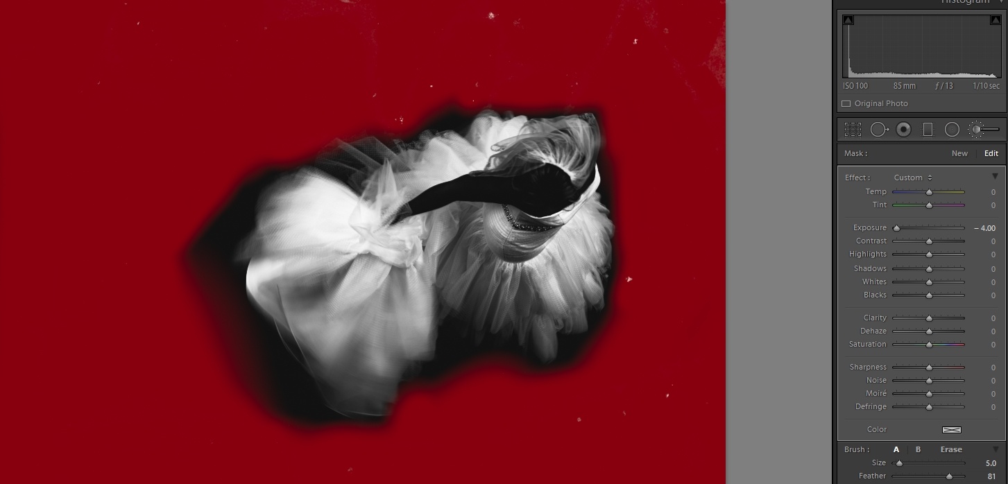
Now that we have taken care of all the spots that we wanted to be black but were not, we now need to take care of all the areas that are black that we want to be white. In this scenario, I would like for the brides hair to stand out a little more, but because we don't want to go overboard in this area, we are going to be less heavyhanded on the slider. I’ll do this in one of two different ways. One is to have the slider value fairly high, and the flow of the brush fairly low, from which I will then slowly let the effect build up to taste as I brush over the area. The other way is to have the slider fairly high, so you can see where you are painting, then once everything is covered, dial back the sliders to taste. Experiment with both and see what works best for you, and you’ll see there are different scenarios where one works better than the other. If you come to an instance where you like what is happening to a small section but don't like what it's doing to nearby areas, you can play with the contrast, shadows, and highlights sliders in the brush tool in order to try and separate out those areas.

Conclusion
While I know that this processing does not work on every single image, I have really liked the end result on images when it does work. When I see a somewhat flat image that has light-colored details, I’ll just give it a quick try and see what it looks like. You can generally have a good idea of what the final result will be after you make the initial adjustment to contrast, shadows, blacks, and saturation. From there, it's just a matter of slight adjustments here and there. Below are a few more examples of this edit. Not every image needs the sliders dialed into the extreme either. As you experiment, you will notice when the contrast slider can be pulled back a bit or you may need to dial down the highlights. The above steps are a good place to start though.
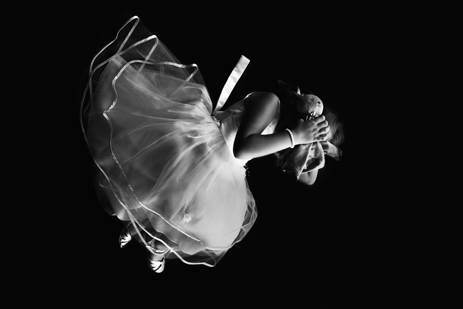


This one is an example of the same technique but dialed back a bit.
Have you made anything special by going crazy with the sliders in Lightroom? If you try this processing, share your results in the comments.


I've got to hand it to you, Jason, I'd probably be heading to PS to pull anything like this? Nice.
thanks man! its definitely an extreme edit for Lightroom.
The working image is a bit warm while being black and white, while your final image is a pure black and white version. How do you achieve that?
i think it's because the working images are screen shots and the final image is an actual exported JPEG
Thanks Jason, I'm a bit late to this article, but I'll be passing it along to some friends who have been looking for a great way to achieve this look. I used ps/nik for mine, now I can do it in LR. Cheers
I just stumbled upon this post and am happy to state, I developed the same way some of photos in LR.