Bird photography is brutally unforgiving when it comes to editing. A dull background, clashing colors, or a flat-looking subject can kill an otherwise great shot, and getting it right in Lightroom takes a specific sequence of decisions that most people skip.
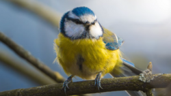
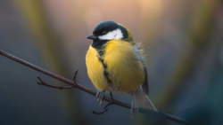
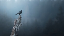
Coming to you from Christian Möhrle - The Phlog Photography, this detailed video walks through Möhrle's complete editing process for a bird shot, starting from a flat raw file and finishing with a punchy, color-rich final image. After cropping to center the bird, Möhrle uses Lightroom's generative AI remove tool to clean up crossing tree branches, a step that makes a bigger difference than you'd expect before any tonal adjustments happen. From there, he sets the Adobe Landscape profile for added saturation, nudges the exposure up while pulling highlights back to avoid clipping, and lifts shadows and blacks to open up the darker areas of the subject. He also pulls dehaze down slightly to add a soft glow, which is easy to overlook but adds a lot to the overall feel.
The masking sequence is where the edit really takes shape. Rather than using Lightroom's subject mask, Möhrle uses the objects mask with rectangle select mode, which gives a cleaner, more precise selection of the bird. He then builds a series of linear gradients around the subject, darkening each side of the frame while subtracting an objects mask to protect the bird from being affected. Each gradient also pulls the temperature down, making the background cooler and creating color contrast against the warmer bird. This push-pull between a cold background and a warm subject is the core of what makes the final image feel so dimensional. He also drops texture and clarity on the upper corner gradients to soften the remaining tree branches without removing them entirely.
Two subject-level masks add the finishing detail. A linear gradient with an inverted selection adds a subtle light effect to the bird's head, and a tight brush mask with zero feathering targets just the eye. On the eye mask, Möhrle raises exposure, shadows, and whites, then pushes clarity and texture to make the iris look sharp and detailed. After masking, he works through the color mixer, shifting yellows and greens toward orange, pushing aqua and blue saturation in the background, and using luminance to brighten the bird while darkening the blues behind it. The calibration panel gets a blue primary hue shift that ties the color grade together in a way that's hard to replicate with the HSL panel alone.
Check out the video above for the full rundown from Möhrle, including his exact sharpening settings and the specific mask order that keeps the edit from falling apart.
Join the Fstoppers community for free
-
Post comments and join in the discussions
-
Browse the site ad-free
-
Share your work and get featured in the community
-
Compete in the photo contests for fun and prizes
2 Comments
Again this old one?
I think you know, Alex, that I'm generally a fan of your articles (as a fellow Clevelander, of course I would be), and I have no issue with your choice of subject matter here. The video certainly offers editing advice that some photographers may find useful.
That said, as a serious hobbyist bird photographer, I just can't get past the quality of the image chosen for the demonstration. Before I even begin processing a photograph, it has to pass a number of basic quality tests, and this image falls short in several important ways that no amount of masking, color adjustments, or other editing techniques can truly fix.
A few examples:
• A harsh branch shadow runs directly across the bird, with additional shadows from the beak and around the eye, likely the result of poor lighting or photographing at the wrong time of day.
• The pose is fairly static and uninteresting.
• The photograph was taken from well below the bird, whereas bird portraits are almost always stronger when shot as close to eye level as possible.
• The image isn't particularly engaging. There's no compelling behavior, interaction, or story to draw the viewer in.
• Even after the distracting branches were removed, the background remains cluttered and doesn't do the subject any favors.
For me, this one missed the mark, not because of the editing techniques demonstrated, but because the starting image simply wasn't strong enough to showcase them. In my opinion, it's usually far more valuable to spend time capturing a better photograph in the field than trying to rescue one that has fundamental composition and lighting issues.