
I am, by training and inclination, a black and white photographer. My very first exposure to black and white photography, as an artful medium, was a photograph that I saw when I was in art school many years ago that was entitled "Monolith, the Face of Half Dome." At that time I was studying to become a Board Illustrator, which would have been a bored illustrator. The moment I saw that one photograph became a transformative one for me. Of course, when that happened the only option in terms of doing photography was to use film (this was way before digital was available), and my goal was to use black and white photography as my means of artistic expression.
Several years later I had the opportunity to meet several great contemporary landscape photographers. And while I am not especially enamored with all of their personal work, they did teach me the very basics of black and white work. So, for the ensuing 30-plus years I worked hard to hone my technique, and more importantly my vision, so that I can look at a scene and pretty much know what I would need to do to get what I want to get out of the photograph.
I was pretty sure I knew what the film would do in any situation and how to get it to do what I needed to do to get out of it what I wanted, which was always a negative with the most printable information it could carry, in the values I could use most effectively in my darkroom when I printed it.
Before I get into that, let me outline what it is that I expect of my work when I am using black and white materials.
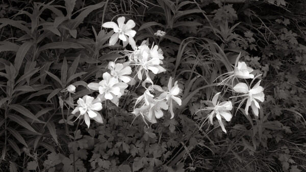
I prefer my shadow areas very open, with deep rich detail seeming to project out of the shadows and very few areas where there is an actual black with no detail. I want my most brilliant highlights to be just a half shade darker than paper-base white, with a full range of tones between them. I personally believe that the success, or failure, of a photographic image is determined by the mid-tones.
When I began working to make black and whites with a digital camera that had the same creative potential as my film cameras, one of the things I wanted was the same level of tonal control I had with my film cameras. Considering that I had complete control at every step using black and white film, that task was more daunting than you might think. With film I could use colored filters on the front of the lens to modify how the film saw the tones when it was exposed. I could modify the overall contrast of the image in film development, as well as control how much luminance there would be in the shadows with the film's exposure. Then, in the printing of the image, I could control overall as well as local density and contrast. Because of those things, a skilled photographic darkroom worker could hit their targets for shadow density, highlight sparkle and detail, as well as mid-tone luminance, and even more direct control was possible using post-processing film masks to increase or decrease overall contrast, or local contrast. In short, I had full control over every step in the creative process. I wanted to get the same results in my digital work, and I did not want to use apps to do it.
When I began making the transition to digital, my first thought was that I could treat my digital files the same way I treated my film negatives, using the same tools I use in my film darkroom to print onto black and white paper. The concept sounded logical, but in reality, it didn't work.
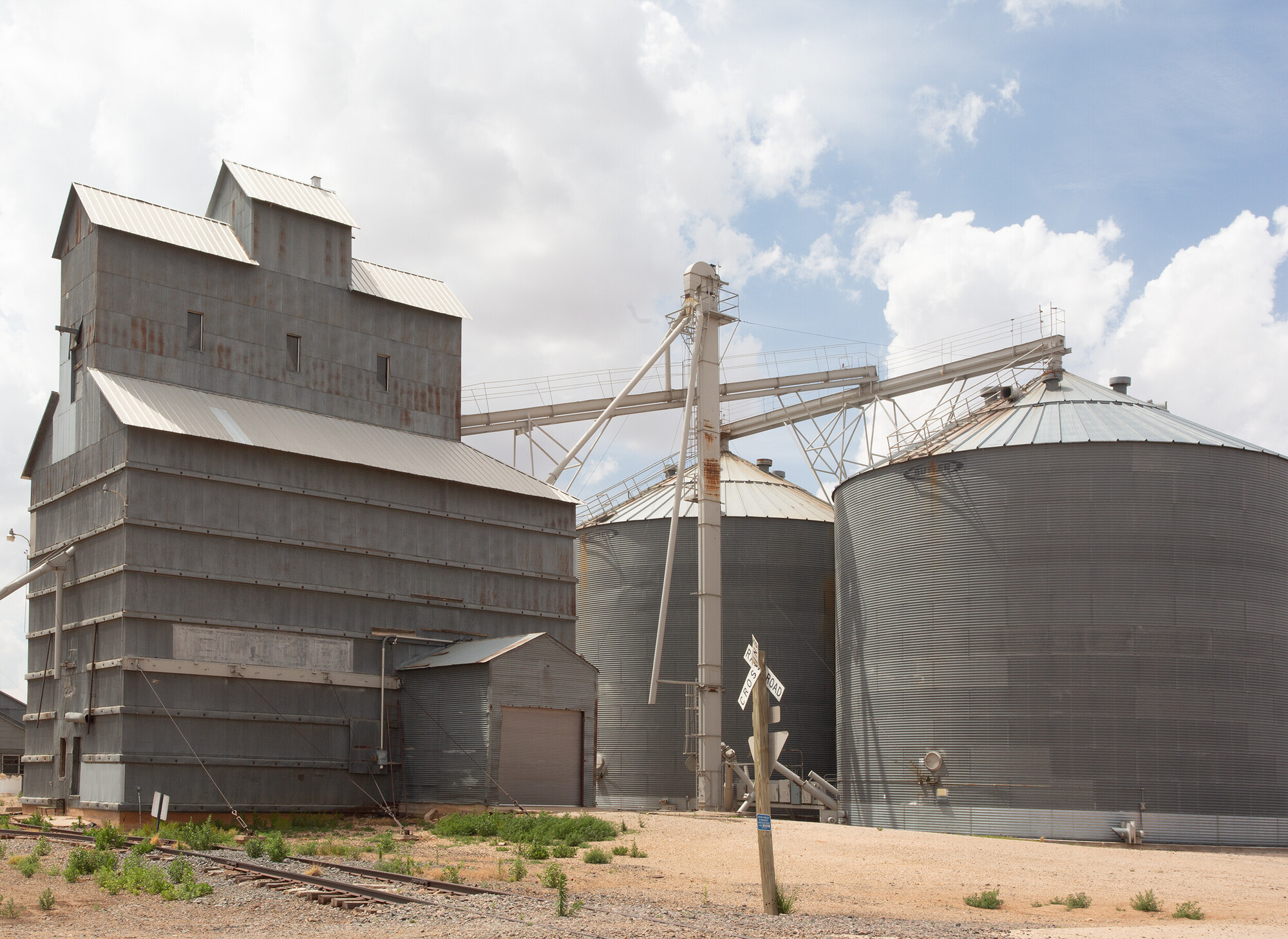
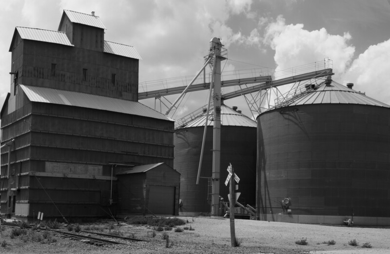
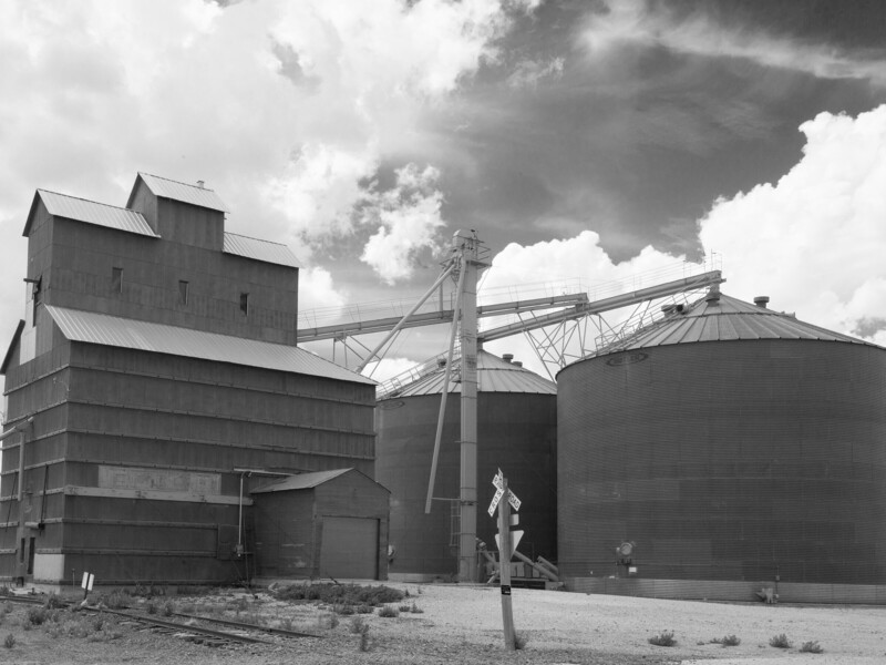
"Grain Mill, New Mexico" We were forecast for rainstorms when I was writing this article so I decided to go to a location about 10 miles away and use this for my tests because of the different colors involved and a semi interesting sky. I used a Canon 5D MkIII for this test with the picture style set to monochrome. I used a Canon 17-40L lens. The aperture was set to f-18 and the exposure times varied according to which filter was being used.
One of the things I really wanted to learn to do was to be able to convert the digital camera images to look as much like my darkroom images as possible. I wanted the prints from my Epson wide format printer to look as much like the silver prints from my darkroom.
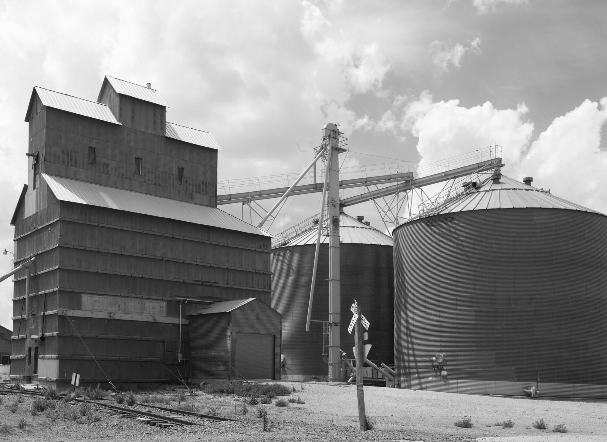
The first thing I tried was to simply go to Image > Grayscale, but it gave me a completely dull and uninteresting interpretation of the color image my camera had recorded. And there were very few options available other than image contrast and density, burning and dodging. The example of that is in the illustration immediately above this paragraph, along with the color original as it came out of the camera.
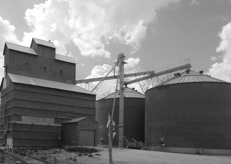
The next test was to set the image mode to monochrome and take the filters I have used for many years with black and white film and put them, one by one, over the camera lens. This test was done using a #21 Dark Orange filter, since it is the one I most often use. It worked quite well for me. However, the mid-tones and darker areas went kind of dead, lacking the mid-tone luminance I like to see. That could be improved by using a levels adjustment layer, of course. However, I am wanting to see which of these methods actually does work best to produce the basic image.
The next method I tried was to take the color image original and add a new layer, setting the blend mode to multiply, and then using the paint bucket tool to make the layer orange, as close as I could to that of the filter I use in the field. The image was then flattened and converted to a monochrome image using Image > Grayscale. The photograph should then approximate what a proof print would look like from film exposed through a #21 Dark Orange filter.
Next I took the original image and, using the Hue/Saturation adjustment layer, desaturated each color separately by 100%. Then, in the same adjustment layer, I went through each color channel and adjusted the density of each channel until I got something that approximated what I had in mind when I made the exposure.
Now, on to the one that is most obvious, and in this case worked the best for my purposes and desired intent: the black and white adjustment layer. Knowing that I had used a #21 Dark Orange filter in the field, the adjustments were mainly to increase luminance in the Red and Yellow channels (Red + Yellow = Orange) and to decrease luminance in the Cyan and Blue channels. A Yellow or Red filter will block Cyan and Blue, since they are almost directly complementary to each other, and since Orange is the result of Red and Yellow in combination, they will work to increase contrast in the warmer portions of the image and to decrease density in the areas with colors that are cooler in temperature. This method worked best for me in this circumstance.
This test showed me that the best method of converting a color file to black and white that most closely simulated the images I produced from my large format camera and film is using the Photoshop black and white layer and then adjusting the luminance of each color in the photograph using the sliders to arrive at the conclusion I wanted.
Of course, this is just to produce an image that I might like to have displayed on my wall, or that would represent me in a gallery or art show. The rest of the equation is to find a paper that imitates, or looks like, the silver-based photographic paper I have used for years, and that will mix well with the images I have already printed in my black and white darkroom. In that endeavor I have located a paper that is a close approximation of my darkroom papers.
The inkjet that does that as well as any of the ones I have tested is Epson Exhibition Fiber Paper. Of the other papers tested, some were close and others were just plain dreadful. However, as the saying goes, "beauty is in the eye of the beholder," so the choice of papers becomes a very personal choice.
My source for all expendable supplies is B&H.
Join the Fstoppers community for free
-
Post comments and join in the discussions
-
Browse the site ad-free
-
Share your work and get featured in the community
-
Compete in the photo contests for fun and prizes
2 Comments
Ah, colored filters. Bought a bunch in the '70s for my 35mm Ricoh (good times) and have them today. So tempting to go play again on a digital set to monochrome.
And thank you for the tip on the paper.
People that are used to working in film media, and understand how those filters work might find it useful to use those filters. IMHO, the adjustments available in Photoshop, and to be honest I use Lightroom only to set my output levels and to correct for lens aberrations when using a digital camera. Pre-sharpen images etc before they go to a folder on the desktop. I use photoshop for almost everything else. Also, I am using an Epson 3880 printer. If you are using another kind of printer like a Canon, for instance, the Epson paper may not do as well as a Canon paper would.
And BTW, I have used Canon printers and they were excessively disappointing to me. Also bearing in mind that I was not using a higher end Canon printer, and that might be all the difference. Some folks really like them. They haven't given me the results I like to see and all of my adjustments are built around using an Epson 3880. Also, I have used Epson office printers for many years, and still do use an Epson 260 in my office. The interesting thing is that I get almost equal results from it to the higher end 3880 when printing on premium paper as in when making up greeting cards.