
Adjustment Layers are probably one of the most useful, and most used tools in Photoshop. It's one of the best ways to keep a non-destructive editing workflow in place and offers additional features such as blending modes to add exciting effects to your images. With all this in mind, why don't we see how we can use it to make our Instagram images stand out more?
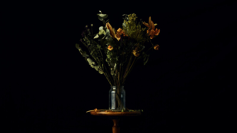
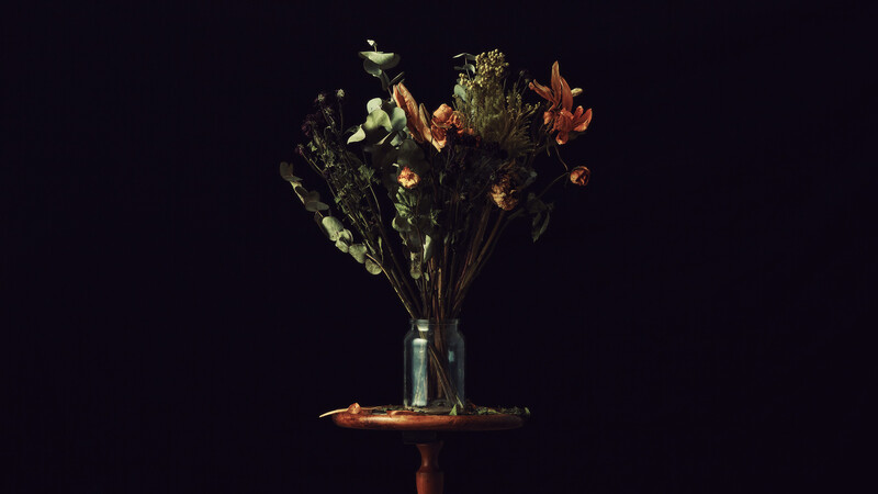
Using some old flowers I've stored away in a dusty cupboard for a moment like this, I switched on my studio lights, hung up the black backdrop and placed an old wooden table in the center of the frame. The idea behind the shot was to create an image with pastel-like colors to give the viewer the impression he or she was viewing a painting, rather than a photograph. The dried up bouquet of flowers seemed like a fitting subject for a shoot like this.
Once I was happy with the shot, I imported it into Capture One, made some basic adjustments such as color, contrast, clarity, leveling, and cropping the image before exporting it as a PSD for some Photoshop work.
With the PSD loaded into Photoshop, I proceeded to add some adjustment layers starting with the Curves layer at the top and working my way down with Black & White (set to Soft Light blending mode), Selective Color, Five LUT layers, and a Vibrance/Saturation Layer.
I also love using a technique called the Orton Effect, which is merely a duplicated background layer with 9% Gaussian blur and 15% opacity. When used properly, it smooths out the tones and creates that painted effect we wanted to achieve in the beginning.
Once I had my layers all set up, it was time to start tweaking the colors to make them stand out.
In my opinion, the color grading process should always be subtle. Build up your layers over time by using small tweaks on each adjustment layer and take care not to overdo it. It's often tempting to max out the values, but you'll find you'll either be crushing your blacks or create banding especially when dealing with something like landscape images where small adjustments could mean the difference between a great picture or a mediocre one.
And while this is one way to apply color grading to an image, the great thing about Photoshop is that it allows the user many different ways of achieving the same effect.
If you would like to see an in-depth, step-by-step process of the image from start to finish, check out the video I made detailing the process.
Have you used adjustment layers to grade your images, or do you prefer a different way?


Join the Fstoppers community for free
-
Post comments and join in the discussions
-
Browse the site ad-free
-
Share your work and get featured in the community
-
Compete in the photo contests for fun and prizes
4 Comments
I like your processing of the greens. Would you mind sharing your PSD file with layers?
Nice work :)
I don't know why I find it so infuriating that it's titled "make your Instagram photos pop." The idea that photos are only created just to exist on Instagram is... depressing or something. The point is using Photoshop to make photos pop, and photos can be used in any number of ways.
Maybe I'm just averse to the idea that Instagram popularity is the be-all-end-all, and isn't the only reason to take a photograph.
Or maybe I'm just being a Scrooge. The tips in the video are good. Merry Christmas.
Thanks for the inspiration! I took a walk in the snowy forest on Sunday and picked some dried grass and dead flowers for a still life.