

We often draw inspiration from several mediums; art, music, and film to name a few. These inspirations are blended together and found within our work. This article digs deeper into what may give our work moody undertones and makes us feel exactly how we feel when looking at it.
Finding your Style
While I do not believe that finding your style requires you to fit yourself within a niche and never stray, I do believe there are signature things you can sprinkle within your formula to leave a stamp. For me one of the most powerful being color. Color has a way of tying together lose elements that leave you with a lasting feeling that brings you back to the subject.
Is it in the Emotion?
When we set out to shoot there's usually an overall mood we seek to evoke in our work. Something to leave our viewers with. For me I found that photos that create a sense of nostalgia or longing are ultimately what I wish to create. It could be anger, love, sadness, or joy. It is in your hands to figure out what you wish to portray and from there utilize various tools to get that message across. A good starting place is looking back on what photos and films happen to be considered favorites. After making your list, go down them and figure out exactly what it was about these movies and pictures,that made them favorites of yours.
I've been drawn to a range of films, but when I narrow down their common factors it's the usage of color to further drive home, the overall message.

Danish Girl (2015): The colors began with beautiful pastels that slowly became more rich and bold as the movie progressed. Pushing us from the delicacy of new beginnings to someone who was bold and completely comfortable in their own skin.

Amélie (2001): The green utilized usually represents hope and nature. In this movie I believe it was done so clash with the vibrant and highly saturated images presented to us. Pulsating with exuberance as we continue down her path to finding love.
How do we bring this into our work?
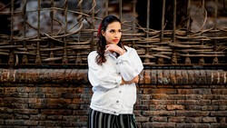
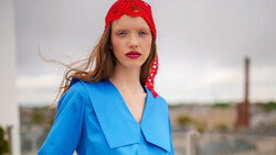
Beyond casting the right person to portray the overall look and feel, I factor in location as well as lighting. In the couple of images shown below I found a tucked away fountain and shed, that limited the amount of light that came in from three sides. The reflection of the water created beautiful blue undertones which I later enhanced via post-production as well as a light that let me expose my photos but kept the scene rather dark at the same time. As far as talking with the model Luke Armitage, we spoke about creating a feel that spoke of love lost and reminiscing.

How powerful is color?
The expression "seeing red", automatically puts you in mind of anger, frustration, and pure rage. It is nothing new that we connect emotions to colors and vise versa. Color has an extensive history with psychological relation which is a whole discussion in itself. I hoped to outline some of the colors that we may be used to seeing and the emotions they can directly correlate.

Brown: While not as robust as the others listed, brown can usually garner a sign of protection and structure. When balanced out with a bolder color it can create harmony as it, in itself is rather safe.
Purple: Is often a representation of luxury, loyalty, courage, and mystery. An intriguing one that can be both soothing but also create room for new ideas.
Blue: Is a dual-bladed sword. On one side it is considered a mental soother a reliable color within the world. On the other side it can correlate with coldness, distance, and sorrow.
Red: A bold and powerful color. It is a color of extremes whether it is portraying love or inflicting terror. It is a very energized color that can depict aggression or if used subtly a hint of something daring.
Yellow: A direct and powerful correlation of joy, happiness, cheerfulness, and optimism. Reveals brighter days.
Black: A color of seriousness and sophistication. Black creates high contrast that can cause sadness and overall negativity depending on how it is used. “Crushing” the blacks on a linear curve can create a sense of tension in any photo.
White: Speaks of completeness and purity. Bringing along with it purity, innocence, and cleanliness. It is a color that can exemplify many meanings as it is amassed by all colors.

In closing
There is many ingredients that go into creating a solid piece of work that promotes the overall feel we wish to leave with the viewers. I find watching films, regarding paintings, and listening to music paramount in pulling together a clear vision for yourself. I'm interested to hear below what things have assisted in stylizing your work to your liking.
Danish Girl and Améle photo strip gathered via Pinterest.

Join the Fstoppers community for free
-
Post comments and join in the discussions
-
Browse the site ad-free
-
Share your work and get featured in the community
-
Compete in the photo contests for fun and prizes
No comments yet