

You can push a photograph a long way before anyone notices. Shift the color of a jacket, a wall, a car, a plate of food, and most viewers will never flinch, because they have no fixed idea of what those things are supposed to look like. Three colors do not get that latitude. Move skin, sky, or foliage even slightly off, and the image reads as wrong immediately, often to people who cannot say why. Those three are the memory colors that matter most for photographic naturalness, and they are the reason a technically clean edit can still look broken.
This is not a rule of thumb that photographers invented. It comes out of decades of color science, and once you understand the mechanism, it changes how you should approach every edit that contains a face, a horizon, or a lawn.
What a Memory Color Actually Is
A memory color is the color your brain has stored for an object it has seen countless times under countless lighting conditions. You do not need a reference in front of you to know roughly what human skin, a clear sky, or green grass looks like, because you carry an internal version of each. The category is broader than these three: researchers have measured the effect for fruit, brick, sand, and even familiar artificial objects like brand logos. But skin, sky, and foliage are the ones that dominate photographic naturalness, because they appear in so many images and because viewers police them hardest. The stored reference is real, it has been measured repeatedly using exactly these natural targets, and it is specific enough to test.

The important part for editing is what those stored references do to your judgment. For a color you have no expectation about, you have no way to know it is off. Nothing in memory contradicts it. For a memory color, you are constantly comparing what you see against a tight internal baseline, so a small deviation that you would never catch on an unfamiliar object jumps out on a familiar one. Memory colors are not special because they are more common. They are special because your error tolerance for them is far smaller.
Why the Whole Image Lives or Dies by Three Objects
Here is the finding that should reorganize how you think about color work. In studies of perceived naturalness, observers judge the naturalness of skin, grass, and sky reproductions far more consistently than they judge other objects like clothing, and the naturalness of an entire picture tends to be governed by the naturalness of its single most critical object. One wrong memory color is enough to condemn the frame.
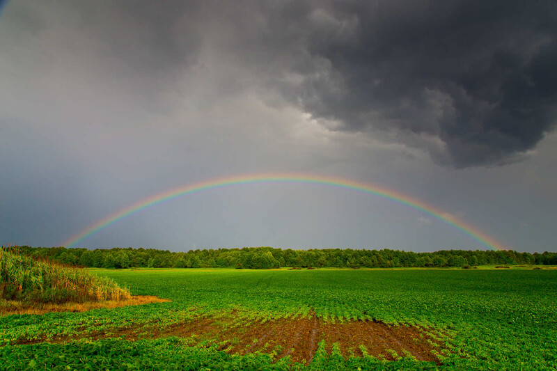
That is a strong claim, so it is worth stating what it does and does not mean. It does not mean a familiar object reliably helps your eye correct the rest of the image. The evidence here is genuinely mixed: some studies find that a familiar object's known color improves color constancy for nearby unknown objects, while others testing the same idea find no reliable improvement at all. What you cannot claim is that memory colors are dependable global anchors that fix your perception of a whole scene. Treat them instead as local plausibility checks. They do not repair the image; they flag it. An edit can be neutral and consistent across ninety percent of the frame and still fail on the strength of one greenish face.
The One Condition That Has to Hold
Everything here applies when the image is asking to be believed as natural. That is the load-bearing condition, and it is also the escape hatch. Your brain is not rigid about memory colors; it grants them large leeway when the visible scene justifies the shift. You accept orange skin under a sunset, blue skin under deep shade, green faces under stage light, because the lighting cue is right there in the frame explaining the cast. The strictness returns the moment that justification is absent. A stylized grade, a golden-hour portrait, a neon-lit night scene, an infrared conversion, all can push memory colors far from their ordinary centers on purpose. The rule is not that you may never move them. It is that when you do, the violation has to read as intent, supported by the light in the scene, rather than as an accident the viewer catches and cannot forgive.
Why Skin Fails First, and Loudest
Skin is the most punishing of the three, for two separate reasons.
The first is that the acceptable version of skin occupies a narrow band in one specific dimension. This is the point most easily misread, so it is worth being exact: it is the hue of skin, roughly the underlying red-to-yellow ratio, that is constrained, not skin color as a whole. Lightness and chroma vary enormously across skin types, and preferred-skin studies model whole regions that shift with skin tone, observer group, and lighting rather than a single universal point. But the preferred hue clusters tightly, landing around a CIELAB hue angle near 49 degrees under a D50 white point in that line of preferred-reproduction research, with agreement across ethnic groups to within a small color difference. There is very little room to be right on hue, which means a great deal of room to be visibly wrong.
The second reason is worse for an editor: the common ways skin goes wrong all map onto things your brain evolved to read off a face. Push skin green and a person looks ill. Push it yellow and they look jaundiced. Push it too magenta or oversaturate it and they look sunburned or feverish. You did not develop acute face-color sensitivity to help with photo editing. You developed it to read health and emotion in other people, and there is direct evidence that facial color memory shifts with facial expression, tying color perception to how you read the person. When skin is off, you are not evaluating a color error. You are reacting to a person who looks unwell, and the photograph fails as a side effect.
This is also why skin is where a global adjustment does its quietest damage. Any white balance move, saturation push, or tone curve applied to the whole frame drags skin along with it, and skin has the least tolerance for the ride.
The Sky Has a Problem the Other Two Don't
Sky earns its own section because it misbehaves in a way skin and grass do not. Blue sits in the part of CIELAB color space with a known hue inconstancy problem, where colors that look perceptually similar land on different hue angles, and colors on the same numeric hue angle do not necessarily look alike. A sky edit that the numbers say is fine can look wrong, and a correction that looks right can read as numerically inconsistent. Color scientists working on sky reproduction often move the work into a different color model, such as CIECAM02, precisely to get around this.

There is a second quirk stacked on top. Human vision treats bluish shifts differently from others: surfaces are far more likely to be accepted as neutral when their color varies in a bluish direction than when it varies toward yellow, red, or green. Your tolerance for blue is lopsided. Combine that with the fact that a real sky is not one color but a gradient, deep blue away from the sun and nearly neutral near the horizon, and you have an object that resists the single-slider fix. Pull the whole sky toward cyan or, worse, let the deep blues drift toward purple, and it announces the edit at once.
Grass, Gamut, and the Neon Problem
Foliage fails through a different door, and gamut is only part of it. Saturated greens sit near the boundary of many display and print gamuts, so a global saturation or vibrance push can send green out of range and force it to shift on the way back in. But the neon-foliage problem is rarely gamut alone. It usually combines gamut with hue rotation, the camera profile's own handling of greens, white balance, and yellow contamination creeping into the green channel, any of which can slide foliage toward a synthetic yellow-green or a sickly blue-green. Whatever the mix, the result trips the same wire: you have seen an enormous number of real lawns, trees, and fields, so you know instantly that nothing living is that color. Grass does not need to be far off to look fake; it just needs to cross the line where the green stops behaving.
The Twist: Accurate Is Not the Same as Right
Here is the part that trips up careful editors who assume the goal is fidelity. The color your viewer is judging against is not the true color of the real object. It is an idealized version. When researchers had people select the memory color of familiar objects from hundreds of chips, the chosen colors were all significantly different from the actual measured colors, and they leaned the same way: more saturated and a little lighter than reality, more characteristic than the thing itself. Remembered grass is greener than grass. Remembered sky is bluer than sky.
This has a direct consequence. Preferred reproductions are consistently brighter and more colorful than colorimetrically accurate ones, by roughly a unit of lightness and two units of chroma in controlled studies. A perfectly measured, neutral rendering of skin, sky, or grass can look slightly dead, while a modestly boosted version looks more real than real. This is why so much pleasing color work nudges memory colors toward their idealized centers rather than toward their literal truth. The naive instruction, match the actual color, is subtly wrong. The better instruction is to move each memory color toward the version your viewer remembers, which is a little cleaner and a little more vivid than the object ever was.
There is a limit worth respecting: those idealized centers vary somewhat by culture and individual, so this is a bias to exploit with a light hand, not a fixed set of target numbers to force every image toward.
What to Actually Do About It
The payoff of all this is a workflow that treats three objects as the gate every edit has to pass.
Protect the memory colors from your global moves. When you push white balance, saturation, or contrast across the whole frame to fix something, mask skin, sky, and foliage out of the aggressive part of the adjustment, because they are the areas least able to absorb it. The fix you applied for one problem is usually paid for in one of these three.
Do not trust your eye alone on skin, because your monitor may be lying to you. Sample skin tones numerically and check them against the known preferred region rather than judging by appearance on a screen that might not be calibrated. That argument runs through the whole discipline: color accuracy has to be established at capture and verified on a trustworthy display, not eyeballed. A shot of a reference target like the Calibrite ColorChecker Passport Photo 2, whose patches deliberately include sky blue, skin tones, and green foliage, gives you a real anchor to profile against, and a calibrated display like those built around the Calibrite Display Pro HL keeps the screen from introducing casts you then chase in the wrong direction.

Check the three last, as a final pass before export, and check your neutrals with them. Whatever else the edit is doing, the last look should be a deliberate audit of skin, sky, and grass, because those are the colors a viewer will check first, without knowing they are checking anything. Add the true neutrals to that pass, the whites and grays of clouds, teeth, a white shirt, since a color cast the eye forgives everywhere else becomes obvious the instant it tints something the viewer knows should be colorless. Memory colors and neutrals are the two anchors naturalness hangs on. If they hold, you have enormous freedom everywhere else. If they do not, nothing else you got right will save the frame.
The point of respecting memory colors is not restraint for its own sake. It is that getting these few objects right is what earns you the freedom to push everything else. Lock skin, sky, grass, and your neutrals into believable territory and the rest of the frame will tolerate aggressive, stylized, personal color, because nothing is contradicting what the viewer already knows. Fail them, and no amount of correctness elsewhere buys the image back. They are the cheapest quality control you have, and they tell you exactly where to look before anyone else does.
For going deeper on the part of this that is hardest to get right, skin, the numerical and controlled approach in Skin Retouching Course for Beauty, Fashion, and Portrait Photography and Color Grading for Beauty, Fashion, and Portrait Retouching are useful resources for building the workflow that keeps skin reading as a person rather than as an edit.


Join the Fstoppers community for free
-
Post comments and join in the discussions
-
Browse the site ad-free
-
Share your work and get featured in the community
-
Compete in the photo contests for fun and prizes
No comments yet