
One of the easiest and most beloved methods of color correction is a simple swipe of the white balance temperature slider. It can change the whole tenor of a scene. There are limits to what it can do, however.
The Situation
A few months back, Alex Cooke posted a video from the folks at MagMod illustrating an interesting twist on the use of color gels. Traditionally, gels provide a way to modify the color cast on a subject using a flash or strobe. The video from the MagMod folks asks a different question: what if we wanted to change the color cast not of the subject, but of the rest of the scene?
Nobody has yet made a lightbox big enough to turn golden hour blue across an entire valley. To accomplish that feat, the MagMod folks use the white balance adjustment in-camera to dial in the desired temperature and tint of the background (in their example, the environment is made much cooler than its natural cast). They then light the subject using a warming color gel to compensate in the opposite direction. The result is that even though the white balance has been pushed significantly toward blue, the subjects of the portrait still look naturally lit. This is a great tool to have in your toolbox when you’re trying to achieve a specific artistic effect.
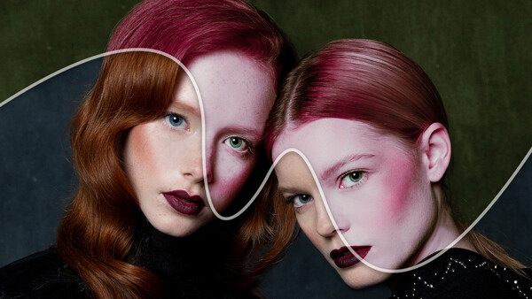
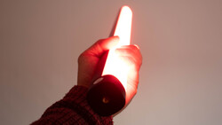
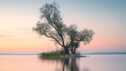
There can be some drawbacks, however, if it’s necessary to retain reasonably accurate color rendition of your subjects. As the lead image shows, it can go a bit wrong.
What Happens When We Apply a Warming Filter and White Balance Adjustment in Tandem?
Let’s take a look at an example that highlights the subjects’ skin tones and allows for a direct comparison between the color rendition of an adjusted photo versus the original. We’ll use a portrait taken by fellow Fstoppers writer, Mark Dunsmuir, that has a clean, complementary color palette.

A beautiful portrait by fellow Fstoppers.com writer, Mark Dunsmuir, is used as a realistic example of how effective white balance adjustments are at reversing the effects of a warming filter. Image by Mark Dunsmuir | Website | Instagram.
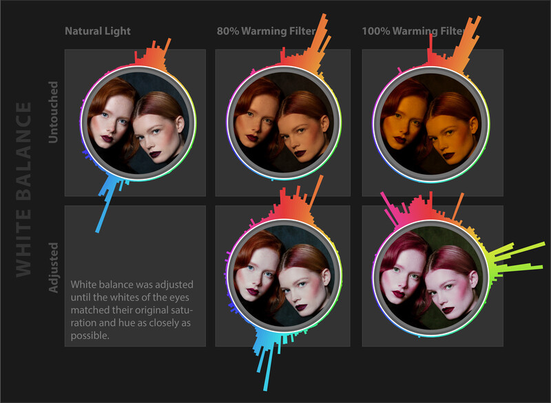
The application of a Warming Filter 85 was then simulated in Photoshop. It was applied at two different densities: 80% and 100%. A density of 80% corresponds to an artificial, warmed light source being about three stops brighter than the ambient light. A density of 100% corresponds to the subject being lit entirely with artificial light. The results are shown in the figure below.


Image after 80% (left) and 100% (right) application of a warming filter.
The question, then, is how close can we come to reproducing the original color palette using only a white balance adjustment? To make this determination the RGB values of a pixel within the white (but importantly, not blown out) portion of one eye were sampled in the original image. The temperature and tint of the two warmed images were then adjusted independently until the original RGB values were obtained for that same pixel.
Why should we base the color correction on the whites of the eyes? The reason is to ensure that they, above everything else, are correct. The color of some other feature could be used, instead, but that would necessarily throw the color rendition of the eyes off, say, giving the whites a green cast. Given how important the eyes are to our perception of people and their health, the effect can be a bit nauseating.
There are noticeable differences between the original and manipulated photos, even with an 80% application of the warming filter. Interestingly, the warmed and recalibrated image loses much of its warmth, its luster. There’s also a bit of a reduction in the overall dynamic range. Lighter portions of the faces give up some of their subtle variation in tone and saturation. They’re slightly washed out.

Comparison between the original image (left) and a white-balance corrected image (right) after the 80% application of a warming filter.
The results are starker following the 100% application of the warming filter. The original color palette has been significantly shifted and narrowed. The warm, red-orange skin tones have been shifted to a thin veneer of magenta. The blue background has become green. There’s also a further degradation of the subtle shifts in color and tone in the faces.

Comparison between the original image and a white-balance corrected image after the 100% application of a warming filter.
What’s actually going on here? The process of trying to reverse the effect of a spectral filter using a white balance adjustment can be a little more complicated than it looks at first, so let’s start at the beginning.
What Does a Warming Filter Do?
A spectral filter differentially reduces the transmission rate of some wavelengths of light. In the case of a warming filter, the shorter, blue wavelengths are partially blocked while the longer, red-orange wavelengths are allowed to pass more freely. The approximate transmission curve of a Warming Filter 85 is shown in the figure below.
The approximate transmission curve of a Warming Filter 85.
The result of applying a warming filter would be relatively straightforward if our eyes actually captured the full spectral information from a scene: the intensity of some wavelengths would simply be reduced. But our brains don’t see individual wavelengths. Instead, we sense the relative intensity of three broad convolutions of the light spectrum. Our visual circuitry then translates those three values into a perceived hue, saturation, and lightness. The result is that not only can a spectral filter shift the relative intensity of the light, but it can also actually change our perception of the color. Of course, that’s precisely the objective of the warming filter, to make it feel warmer to us.
But this can have some surprising side-effects, particularly when we try to reverse the effect of a warming filter with a white balance adjustment. Let’s look at the effect a warming filter has in a bit more detail.
How Does a Warming Filter Impact Hue?
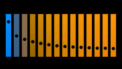
The answer is that it’s complicated. In the figure below, a warming filter has been applied to a fair portion of the hue spectrum, ranging from indigo through blue, green, yellow, orange, and on to red. In the center of each disc, you can see how the appearance of the spectrum is altered. A histogram of the hue frequencies surrounds each disc. The left-most panel shows the histogram of the original spectrum; the center and right panels represent 80% and 100% applications of a warming filter, respectively (modeled within Photoshop).

Application of a warming filter to a hue spectrum. A histogram of hue prevalence surrounds each disc.
Notice that the application of the warming filter doesn’t just lessen the frequency of cooler hues, it also produces new ones. Shades of violet and magenta not present in the original spectrum become quite prevalent in the 80% application. We’ll see how these effects play out in the actual portrait in just a moment. But first, we need to look at the other piece of the puzzle.
How Do White Balance Adjustments Work?
Shifting the white balance alters the relative importance of the red, green, and blue channels across an entire image at once. Actually, since white balance adjustments are typically luminosity preserving, there are really only two knobs to turn. The third degree of freedom is constrained so as to maintain the same brightness. By convention, these two knobs are the relative ratio of blue and yellow (the temperature) and the relative ratio of green and magenta (the tint) — two orthogonal pairs of complementary colors.
This provides a way to shift the color cast of an image, but without nearly the level of fine-grained control that a spectral filter provides. A white balance adjustment performs a single, two-parameter recalibration of the relative RGB weights of all pixels, regardless of their color. By contrast, a spectral filter generally takes pixel color into account, meaning that it essentially has an infinite number of degrees of freedom instead of just two. As a result, we shouldn’t expect simple white balance adjustments to be able to precisely compensate for the far more complex effect that a spectral filter can have on an image. Further, information can actually be lost during the application of the spectral filter. If the blue end of the spectrum is completely removed, for example, there’s no way for any physical or mathematical process to recreate that information. Even a partial reduction in the blues means that when they’re rescaled by the white balance adjustment, they’ll necessarily be noisier.

Impact of the application of a warming filter followed by a white balance adjustment. The white balance parameters were chosen so as to return the whites of the eyes in our example portraits to their original color as closely as possible.
The result of trying to use white balance to reverse the effect of a warming filter on the hue spectrum is shown in the figure above. Note that after an 80% application of the warming filter it’s still possible to regain something similar to the original distribution of hues, though, there are differences to be sure. After a 100% application of the filter, however, much of the original color information has simply been lost. The warming filter application can’t be reversed.
What Do These Distributions Look Like for the Actual Portrait?
Something very similar happens when we try to reverse the effect of a warming filter on the portrait. The figure below shows the original image at top-left followed by the result of applying a warming filter with 80% density (top center) and 100% density (top right). The corresponding distribution of hues surrounds each image. Note that the original image leverages a complementary color theme with a strong prevalence of both oranges and blues. This color theme occurs frequently in nature and is typically quite pleasing to the eye. The impact of the 80% application of the warming filter, however, is to dramatically reduce the amount of blue in the image (not surprisingly). A 100% application removes the blue portion of the spectrum almost entirely.
Original image and distribution of hues (upper left) followed in the top row by the 80% and 100% application of a warming filter. The results of applying white balance adjustments in an attempt to regain the original color distribution are shown in the bottom row.
A corresponding white balance adjustment of the 80% density image disperse the blues and oranges somewhat. There’s also a slight shift of the blues toward cyan and a slight shift of the reds toward magenta. In the image where we’ve attempted to compensate for a 100% application of a warming filter, the distribution of hues has shifted completely. Reds and oranges have become cool magenta, blues have become a sallow yellow-green. Many of these hues didn’t even exist in the original image. From an artistic perspective, the emotional tenor of the image has changed completely.
We can examine what’s happening in more detail by plotting a random sampling of the pixel values from each image in the hue-saturation space. The top row of the figure below shows the distributions of the original image (left), recalibrated 80% warming filter density (center), and recalibrated 100% density (right). Note the shift from blue toward cyan in the middle of the top-center plot (just as we saw in the distribution of hues above). In the panel at top-right, we can see a further shift toward yellow-green (in what corresponds to the background of the image) and a shift from orange-red pixels to magenta (in what corresponds to the foreground).
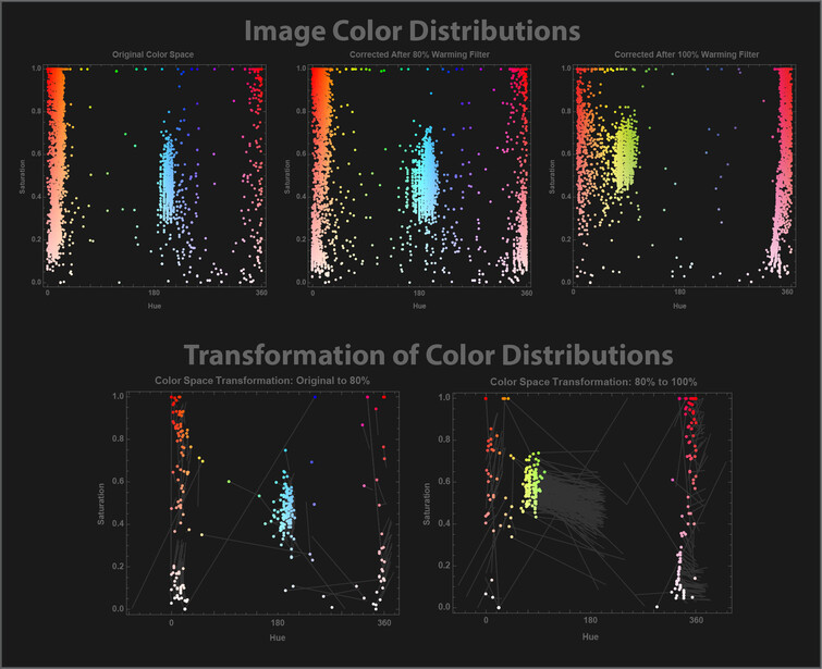
Top row: Distribution of a random assortment of pixels in hue-saturation space for the original image (left), recalibrated 80% density image (center), and 100% density image (right). Bottom row: How color has changed at individual pixel locations between the original image and 80% warming filter application (bottom-left) and the 80% and 100% warming filter application (bottom-right).
The lower panels make these transitions more explicit. In them, we’ve picked a random subset of pixels and drawn lines between the color values of the same pixel in two different pairs of images. The panel at the lower left quantifies the shift in color between the original and 80% density images; the panel at the lower right does the same for the 80% and 100% density images.
The effect of an 80% filter application (and rebalancing) is to largely leave the blue, partially saturated colors unchanged. The reds become a little cooler, however, tilting toward magenta. Existing trends in the saturation are amplified, with relatively unsaturated pixels becoming even less saturated and relatively highly saturated pixels even more saturated. The 100% application continues the shifts in hue but seems to partly reverse some of the shifts in saturation.
Discussion
The point isn’t to warn you off of a cool artistic tool to keep in your tool belt, nor is it that we should try to remember precisely how hues and saturations may shift when we follow up the application of a spectral filter with a white balance recalibration.
The point is that white balance sliders have limitations. If we’re using them for artistic effect and happy with the result, that’s all that matters! If we’re using them in hopes of recapturing subtle, accurate skin tones that will survive close inspection, there may be challenges. The less significant the spectral filter application, however, the more modest the challenges.
In cases where you'd like to alter the cast of the background, but the accurate color rendition of the foreground matters, one might explore alternative approaches. You could take a single image and use Photoshop to separately mask the foreground and background. As an astute reader pointed out in the comments of the original article, however, that can be time-consuming, especially if you’re on a commercial job and needing a high throughput workflow. It can also look a bit artificial unless the masking is done very realistically. To address this latter challenge, one might take two images in short succession, one with natural light and the other incorporating the artificial light source a few stops brighter than ambient (without a spectral filter). The two images could then be combined in the post, with the first adjusted so as to bring the desired color cast to the background. The second image would then act as both a full spectrum light source, ensuring a lot of available light for accurate, low-noise color rendition and as a potential mask to separate foreground from background in a physically accurate way. That doesn't get around the need for some post-processing, however.
Thoughts, experiences, ideas? Have you applied this technique in your own work? Was it close enough to keep your clients happy?
Join the Fstoppers community for free
-
Post comments and join in the discussions
-
Browse the site ad-free
-
Share your work and get featured in the community
-
Compete in the photo contests for fun and prizes
10 Comments
Whoa this is actually a really great read. Such a refreshing article to see around here. I loved every minute of this.
Just a heads up, the link to Mark Dunsmuir's instragram page doesn't work.
Glad you enjoyed it William! Thanks for the heads up about the link.
This reminds me of trying to color correct jpgs, which in essence have color filters baked in. Trying to get back to the original colors can be very difficult.
This is why I started using raws. I know there's tons of better reasons, but after having a few photos with the wb off and trying to fix it, I gave up on jpegs.
Early on in my editing career, I had a tendency to slap some good ol' funky Lightroom preset onto a photo. Eventually, I matured. If you're shooting people, do as much as you can to preserve skin tones.
Certainly an interesting attempt at discussing this topic but I think there’s a huge flaw in the methodology… which is that once the image hits Photoshop, you’re not actually changing the white balance anymore. You’re simply offsetting certain colors by applying other colors on top of them. It’s not the same thing, which is why you’re getting the results you’re getting.
You can only adjust true white balance in RAW. That’s why if you open an image in Camera Raw after you’ve taken it into Photoshop, your temp and tint sliders start at 0. You’re not adjusting the white balance at that point, you’re applying a blue or yellow, magenta or green color cast on top of the image using those sliders. It can certainly be used for interesting effects but again, it’s not adjusting the white balance. It may seem like semantics on the surface but under the hood it’s not the same thing at all.
Hi Dave! You bring up a couple of interesting points. One is the units on the white balance sliders. When the raw information from the sensor is captured in a RAW file, the color rendition is the result of actual physical processes where light with a certain spectrum is incident upon things in a scene and then reflected, refracted, or transmitted to the camera. It's assumed that the spectral distribution of the incident light follows that of blackbody radiation (not a bad approximation for the sun or tungsten bulbs, terrible for fluorescent lamps). At any rate, the RGB values in the RAW file represent something physical that is approximated as a blackbody temperature. Now, imagine we make a bunch of adjustments to an image in Lightroom, including gamma correction and whatever host of changes we make to the white balance (!!), hue, saturation, curves, etc, then ship it off to Photoshop as a TIFF. At that point, the notion of a color temperature doesn't really mean anything anymore. The color of the pixels needn't have anything to do with any physical reality. As a result, when we use the White Balance sliders in Photoshop Camera Raw on a TIFF or JPG, they just label things in terms of a unitless deviation from a starting point (and whatever that is depends on the manipulations we've made to the image). They can't assume there's any absolute, physically-based reference point we're working from that would actually correlate to a temperature of the spectrum. (See one of the notes in the article here, for example: https://helpx.adobe.com/camera-raw/using/make-color-tonal-adjustments-c…).
The second question is what's actually going on when we do a white balance correction. Everything I've been able to find suggests it's a pretty straightforward multiplication by a diagonal 3x3 matrix in either RGB or XYZ space. I just tried a test, though, which did yield some interesting results. I started with a raw image I'd taken in the Galapagos and cranked the temperature slider way left (so that the image was nearly all blue), then exported it to Photoshop and saved it as a TIFF. I, then, applied a Camera Raw filter in Photoshop and tried to reverse the pretty severe white balance adjustment I'd done in Lightroom by eye. I can come pretty close to retrieving the original color rendition, but it's not perfect. If I get the midtones right, the highlights are off a bit; if I get the highlights right, the midtones are smidge funny. Also, while I only adjusted the temperature slider in Lightroom, it was necessary to adjust the temperature, tint, and exposure in Photoshop. That makes me wonder if white balance corrections applied in Lightroom might not be applied to the original linear RGB values, while white balance corrections done in Photoshop are performed on the gamma-corrected colors. That could yield some interesting non-linearities that couldn't be trivially reversed.
I would still submit that the basic point stands, though. While there could be some slight quantitative differences between the Photoshop hack and the real thing, they seem to be fairly slight. Further, the general issue is the same regardless. A spectral filter (such as a warming filter) can have an essentially infinite number of degrees of freedom, while a white balance adjustment, regardless of whether it's applied in Lightroom or Photoshop, has only two. There's no way that a two parameter bit of math can, in general, correct for the use of arbitrarily complex spectral filters.
Thanks for raising these issues! I hadn't thought of them and they're important to be aware of.
I certainly appreciate your attempt at explaining this from a strictly technical standpoint, and while I agree that this type of analysis normally offers a superior understanding of an issue, I have to disagree here. Straight up editing experience seems to conflict with this a bit. Here's why:
“I would still submit that the basic point stands, though. While there could be some slight quantitative differences between the Photoshop hack and the real thing, they seem to be fairly slight.”
"Fairly slight" by your definition can have huge ramifications in certain real world scenarios. The most obvious (ironically, given your example), is skin tone. It's no secret that skin tone can be incredibly tricky to get right, and I've found that the further down the line in the editing process you attempt to get skin "looking right", the harder it gets and the more erratic the results are. I believe this starts with white balance RAW. Can you correct some of this later? Sure, but like I said, I believe it gets trickier and still looks slightly "off" from what would have happened if you started with a good RAW conversion.
"Slight" may have very little impact on landscape shots being edited creatively, but if you're shooting certain studio work it's a different story.
Hey Dave, yep, I was trying to do a quick simulation to illustrate some of the issues that could arise. In a real-world application, though, the WB adjustment is either done directly in-camera in the field (as illustrated in the Magmod video), or in LR/Capture One back in the studio (it wouldn’t be done in Photoshop). I was using Photoshop to simulate the warming filter application and, thus, had to use Photoshop for the WB adjustment. Neither is a perfect approximation for the real thing, certainly, but was hoping they could be used to illustrate possible challenges. Ideally, I would’ve done an actual real-world shoot to illustrate, but … only have so much time in the day and budget in the bank.
Love reading and getting right into the technical discussion!
Learning so much.