
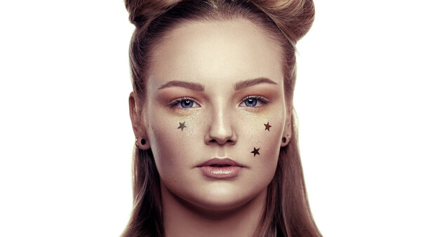
Going through retouching related Facebook groups, it seems like the frequency separation trend is fading away. Some people even call the images edited with split frequency "filtered" as if it was as bad as using some kind of filter. Instead, many are learning to grow some appreciation for the art of dodging and burning. It’s said that with the latter, you won’t lose skin texture and it’s not destructive. But if it really is this great, how can some people still manage to have a plastic-like effect on their model’s skin? Let’s have a look at the most common mistake that may keep your images from that sought after natural look.
If you don’t know what dodging and burning is, you’ve probably been living under a rock for the past, well… forever actually! Dodging refers to the action of brightening a part of an image, while burning is the opposite – i.e. darkening a zone of a picture. The area edited using dodge and burn layers can be as small as one pixel or as big as the whole photograph. The technique is used by most high-end beauty, fashion, and portrait retouchers to correct any ungraceful micro-contrast or global lighting transition. A typical workflow is to clean up any texture and shape issues with Photoshop correction tools – clone stamp tool, healing brush, patch, etc. – and then use multiple dodge and burn layers for the remaining issues that are not related to color. It’s meant to be non-destructive as you don’t touch the background layer and you don’t have a merged layer covering everything like with frequency separation.
Many also like to believe that the result obtained with this workflow is better than frequency separation. I must say I’m one of them. However, after seeing some people using dodge and burn to such an extent that the skin had become more plastic like than when using Gaussian blur, I started wondering if that was the case. Taking a closer look at some pictures that looked over-edited, I realized a few things.
Zooming in too Close is Like Retouching With Your Eyes Closed
The very first and most common issue with dodging and burning is people zooming in so close that they don’t even see what they retouch. All they see is dark, light, and mid-tones and they usually tend to even everything out to a mid-tone. Sure, then you have a theoretically perfectly retouched image. At least, that is if your goal is to create a big 2:3 rectangle made of 50% gray. By zooming in, you cannot see what you do. At this point, a surface blur would probably yield the same result if you go to the extreme.
A good habit is starting the dodge and burn process with the image fitted to the size of your screen – press cmd/ctrl+0 in Photoshop – and clean up everything you can without zooming in. Only then, if you see that you have some issues remaining that require a bit more precision will you zoom in and clean them up. But when you do zoom in, remember: edit what needs to be retouched, then go back to the initial view and look for other problems. Don’t stay zoomed in and search for issues! People won’t look at your image this close, and it’s by leaving the tiny details alone that your image will look natural.
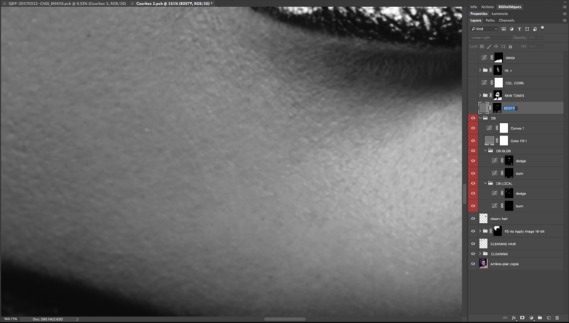
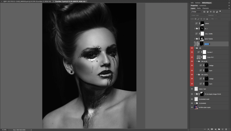
As you can see in the example above, when being zoomed in all the way in at 160%, there are issues remaining, issues that don't affect my image when zoomed out to 12%. By being zoomed out, you will probably spend less time in Photoshop and keep a lot more details in your pictures. The only thing to bear in mind is the final output. If you must print big, you may need to retouch a tiny bit closer than the full-screen view, if you retouch to post on Instagram, then don’t lose time retouching everything and anything you can see when zoomed in at 400% or even 100%.
Recreating the Lighting in Post
As retouchers, we like to think of ourselves as artists, as if we were painters. But the problem is, most of us don’t come from a painting or drawing background. While it’s not a shame and it’s true that retouching is somewhat an art, we just shouldn’t be doing what we have no idea how to do.
For example, so many retouchers and photographers try to recreate some kind of contouring on their model’s face even though they have no idea where to place shadows and highlights or even if they should. While it contouring in post can be done with great result, a solid knowledge of painting, drawing, or makeup is required, and it’s something most of us are lacking. Plus, if the makeup and lighting were good on set, it shouldn’t be necessary. There are better tricks to use in Photoshop to make the facial features of your model stand out but we’ll touch on it in a separate article.
For now, keep in mind that retouching for a natural result means just that: REtouching, not adding new elements! Alter or remove what’s existing, but don’t add, it’s not compositing.
When Do I Stop? And What Do I Retouch in the First Place?
This is probably the biggest issue of all: when do I stop retouching? Most people will keep going until they cannot see a single imperfection when zoomed in at 1600% and it’s great if your goal is to create a naturally unachievable result. Naturally achievable is key when retouching unless your goal is to create a surreal effect.
When you open up an image in Capture One, Lightroom, ACR, Photoshop, or what not, the first thing you should do before even touching a single slider is asking yourself what doesn’t look natural and what’s catching your eye first. Both questions will streamline your retouching. Make a list in your mind or on paper of everything that doesn’t look right. Then keep your retouching to that and don’t add anything else along the way unless necessary. It’s especially important when dodging and burning, because by going too far you may actually end up adding new issues, either in the form of color shift or weird looking micro-contrast.
One aspect that is often misunderstood when editing an image is that imperfections should exist, especially for a natural look! No skin is perfect, no hair is perfectly straight with no stray hair strands, and no one has an even skin tone across their whole body. Remove everything that is truly distracting, everything that couldn’t be achieved with makeup – spots, blackhead, etc. –, try to make it as perfect as possible but without removing those natural imperfections that make a human body what it is. Making a face perfectly symmetrical for example won’t ever look natural!
The three points above are general guidelines rather than exact science. I’ll come back to those points in future articles with more details, as I know, many people enjoy more thorough writeups that show exactly how to proceed. This is especially important for the very last point: when to stop and what to retouch. I believe it’s usually what’s keeping most people from getting that fantastic work they are capable of but that so few talk about! You can know as many techniques as you’d like, at the end of the day if you don’t know what makes someone look beautiful, old, ugly, fat, sick, etc. you won’t ever be able to get consistent results in Photoshop.
Because I want my articles to be as relevant as possible for you, I’ve created a discussion in the beauty group here on Fstoppers. So please, feel free to join the group and engage in the different discussions, share your work, and ask for comments and critics.


Join the Fstoppers community for free
-
Post comments and join in the discussions
-
Browse the site ad-free
-
Share your work and get featured in the community
-
Compete in the photo contests for fun and prizes
6 Comments
I struggle with this now that I've moved on from FS completely. Much needed read.
I think a combination of both can work pretty darn well. Everything in moderation is the key.
I must admit I use FS predominantly for retouching headshots. I find it quick and easy. Deal with major skin blemishes with healing tools, then run an action to set up my FS layers. Clean up the smaller textural issues, then deal with colour issues and blending patchy areas. Done.
D&B seems more focused on dealing with light and shade, and contouring etc. I'm interested to learn how colour issues fit into this workflow, or whether it's just a separate step. On the surface of it (no pun intended), it seems that FS is designed to deal with both colour and texture issues, albeit on separate layers, with the aim of retaining texture in the upper layer. D&B seems to be about light and shade, which also impacts saturation (?),thus requiring a separate step for dealing with colour issues anyway, some of which may have been created by D&B processes.
But I know very little about how to use D&B for high end retouching, so need to do more reading as time permits. Thanks for the post Quentin. I like how you question trends and norms, without dictating what people should and should do.
As you rightly say in the first part of the article, the problem is not the technique of frequency separation or dodging or burning, the problem is the plastic skin and the love for it amongst a great number of photographers who have learnt to use Photoshop and many photographers who can't use the software. Both techniques are absolutely fine for skin work. Like HDR was the awful nasty blip in human aesthetics in 2007-9, the plastic skin came to be that for a number of years. Don't criticise the technique, but the look.
The other important point you make is the non-painting or non-makeup related background for most photographers and retouchers. But this is not an insurmountable problem. We all have access to galleries, youtube and the internet to look up the past masters of portraiture and present demagogue of the makeup industry. It just takes a little more time and effort, but an avenue open to all who want a little more artisti background to what they are doing.
Lastly, in the published beauty sector, many magazines are after a certain look. Again, in the commercial beauty photography sector, the business owners are looking for a specific look based on what is the market trend in a particular geographical area. For standard wedding and portrait work, the typical cheap and nasty high street studio just use the Lighroom luminosity slider and blown highlights for an instant bit of flattery. These guys would not stop doing that. It is horses for courses.
What is "FS"?
It's short for frequence separation.