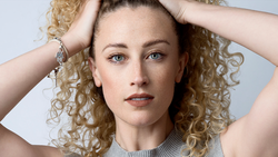
A lot of people are fans of the portrait look in which the subject really seems to "pop" off the image, as it's a striking and attention-grabbing style. This helpful video will show you three quick steps to recreate that look in your own portraiture work.
Coming to you from Nathaniel Dodson of tutvid, this video will walk you through the Curves and color toning techniques for quickly giving a portrait a little extra pop. Even if the look isn't one you particularly care for, if you're not used to using Curves, Color Balance, and Selective Color adjustment layers to put finishing touches on your images, I suggest you play with them, as they're quick and remarkably powerful ways to sculpt the mood of an image. As Dodson notes, it's generally a good idea to use opposite colors when toning the highlights and the shadows to help offset them and separate the subject; for example, if you add a bit of yellow to the highlights, try adding some blue to the shadows. This will generally help to separate your subject. And of course, it's always best to start with a well-lit image; this will allow you the latitude you need to make these kinds of adjustments effectively.


2 Comments
Great ideas. Thanks!
The Selective Colour as a last step is interesting, though I'm wondering if the same effect could have just all been done in the Curves and Colour Balance layers. Definitely something I'll try out in the next shoot.