
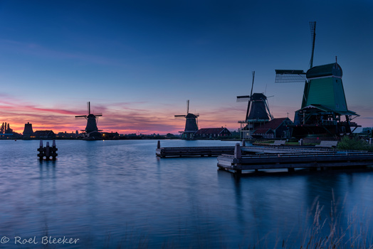


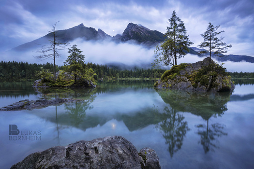


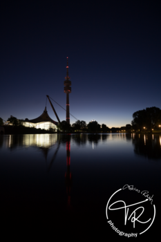


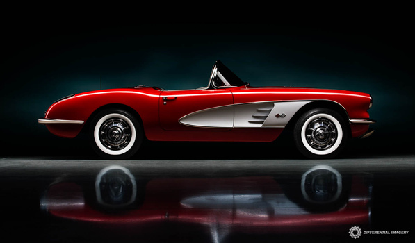

Most of the Signature is handwritten. I know - it may be better to buy a brand but i think my "T" is outstanding and very unusual - so i like it and think it belongs to me. What do you guys think about?
pls. let me know (hobby photographer - not commerial)
Cheers from Munich, Bavaria, Germany.
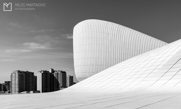
Click on the thumbnails below to comment and rate each image.
Click here to learn about the Fstoppers rating system and what each star value means.
4 Comments
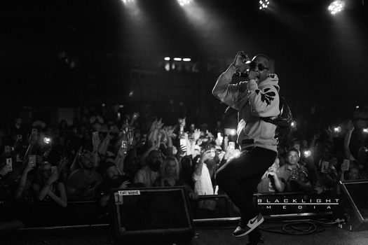
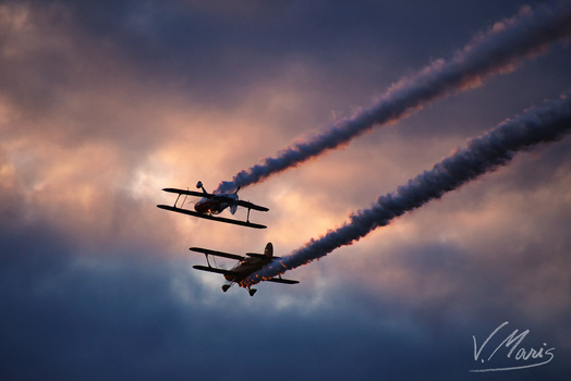
Such a moody scene and a cool logo to boot although a little large but at least I can see it - some logos are too tiny...
as far as i understood Lee he said to make a big logo...so he can rate the logo and the picture afterwards. So i decided to make a big Logo. But as far as i see almost noone listened to him :D.
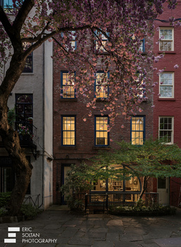
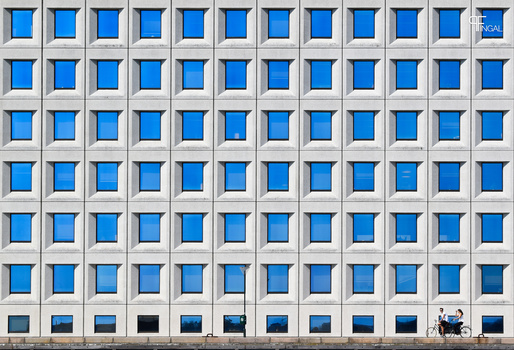
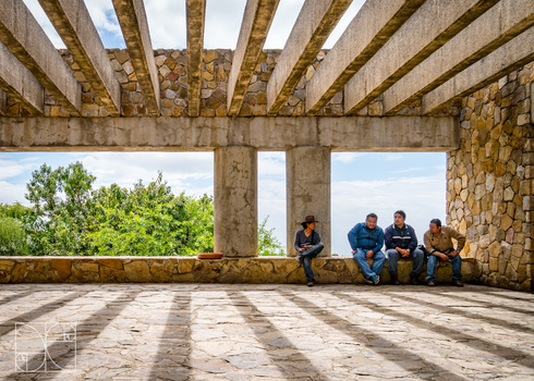
The composition itself is not too bad, but unfortunately your highlights are completely burned out even though your image is 90% pure black. You've almost got no information at all here. If this was sunset I would have taken the image half an hour earlier.
thanks for the critique. we wanted to take pictures on another location but my mate was late so i took a quick shot. I printed it out as a fine art 60x40 and still everyone loves the image. To be true there is literallo no black but all kind of different shades of blue... only close to the roof (under the lights) there is no information. But thank you for your critique - i will consider next time.