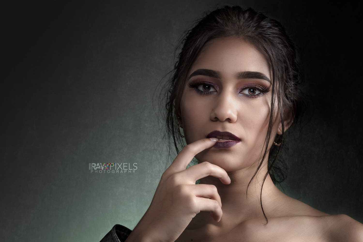
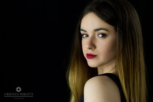
I was going for the look of a biker innocent girl...
Contest Submissions
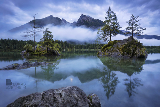
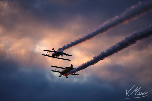
Click on the thumbnails below to comment and rate each image.
Click here to learn about the Fstoppers rating system and what each star value means.
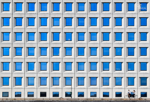
Click on the thumbnails below to comment and rate each image.
Click here to learn about the Fstoppers rating system and what each star value means.


1 Comment
The model and lighting are both beautiful. Great job with the logo, it's simple yet unique.
I do think that you could go easy on the editing; The hair looks "heavy" with the editing, yet there are still plenty of "fly-aways". The eyes look a little glazed over, because of the editing. BUT it's always better to learn how to do less than do more.
A couple other things I've noticed: there's a space between her mouth and her lips (where the makeup starts). Next time, either have her show less lip or extend the color through editing.
Lastly, something about that hand makes it look unnatural/it's coming out of nowhere. Show us a little more of the torso/zoom out just a little more to connect the hand--to the face--to the body.