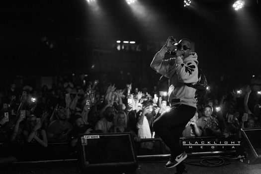
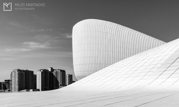
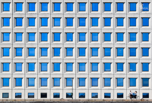
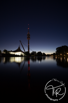
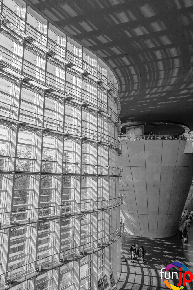
Thanks for your opinion . I didn't try straightening on Lightroom because of the inherited building architecture . Actually , the exterior glass walls are curved . But then , there's the fact that I used a 24 mm wide angle to take this shot . I know that the bright colors of the logo are distracting , but I wanted an opinion on the actual looks of the logo . I usually don't watermark my photos .


2 Comments
The bright colors of the logo on a b/w image are too distracting, you should consider a white, black or both.
I'd love the photo a little more if the vertical lines were straight.
Thanks for your opinion . I didn't try straightening on Lightroom because of the inherited building architecture . Actually , the exterior glass walls are curved . But then , there's the fact that I used a 24 mm wide angle to take this shot . I know that the bright colors of the logo are distracting , but I wanted an opinion on the actual looks of the logo . I usually don't watermark my photos .