

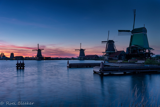


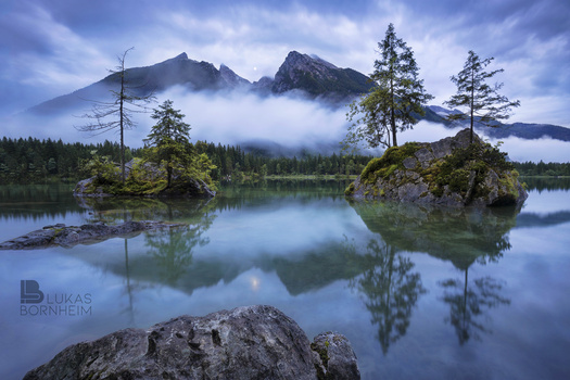


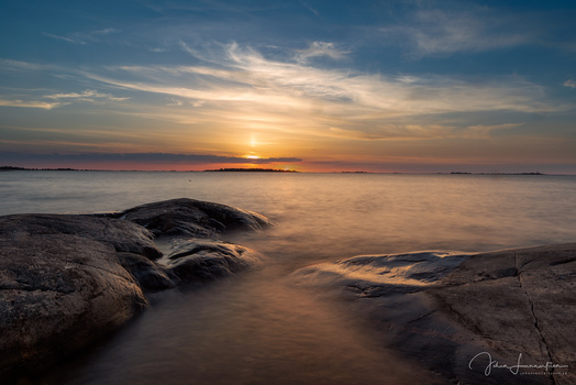


I've struggled quite a bit to put together a somewhat decent logo, and well, I'm still far from happy with this version. But I'd like to hear your thoughts on it.
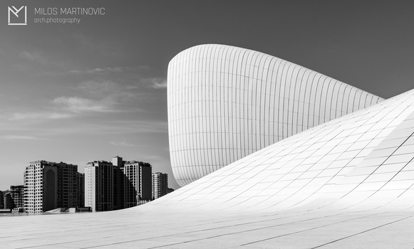
A problem I have with this particular application of the watermark is that it creates a slight imbalance (the left side is too "heavy").
Click on the thumbnails below to comment and rate each image.
Click here to learn about the Fstoppers rating system and what each star value means.
5 Comments
I think the balance issue is specific to this only because there is indeed more mountain and foreground on the left.
I like the transparent dark vs white a lot. Have you considered putting the LB on the right of the type? A thin horizontal graphic may seem less heavy.
Warning, cant un-see it: The L "going into" the B could be conceived as a little "inappropriate" – just sayin'...
Hi Jesse, thanks for your opinion! Yeah, I agree that most images aren't that sensitve balance-wise. Even without the watermark the shot is possibly a little left-heavy, although the right rock with the trees on it does help a lot for me. The watermark just sort of tips it over the edge. I haven't tried putting the LB on the right, but defenitely will now!
I hadn't noticed the L into the B thing at all so far, and I'm glad you pointed it out. Although I don't really notice it as long as I'm not actively trying to make it dirty.
If anyone else thinks the LB thing might not be a good idea please give Jesse's comment a like. Thanks for the feedback!
I don't think the L going into the B is the problem but that dot under the L just looks unmistakable. You should eliminate the separation between the dot and B, then it should be ok.
Yeah I immediately went there too...
I think it might be how the end of the L is rounded... as it "fits inside" the bottom of the B. 0.02¢ from a subconscious perv. ;)