Contest Submissions
Click on the thumbnails below to comment and rate each image.
Click here to learn about the Fstoppers rating system and what each star value means.
Click on the thumbnails below to comment and rate each image.
Click here to learn about the Fstoppers rating system and what each star value means.


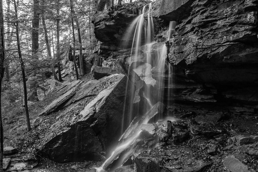


3 Comments
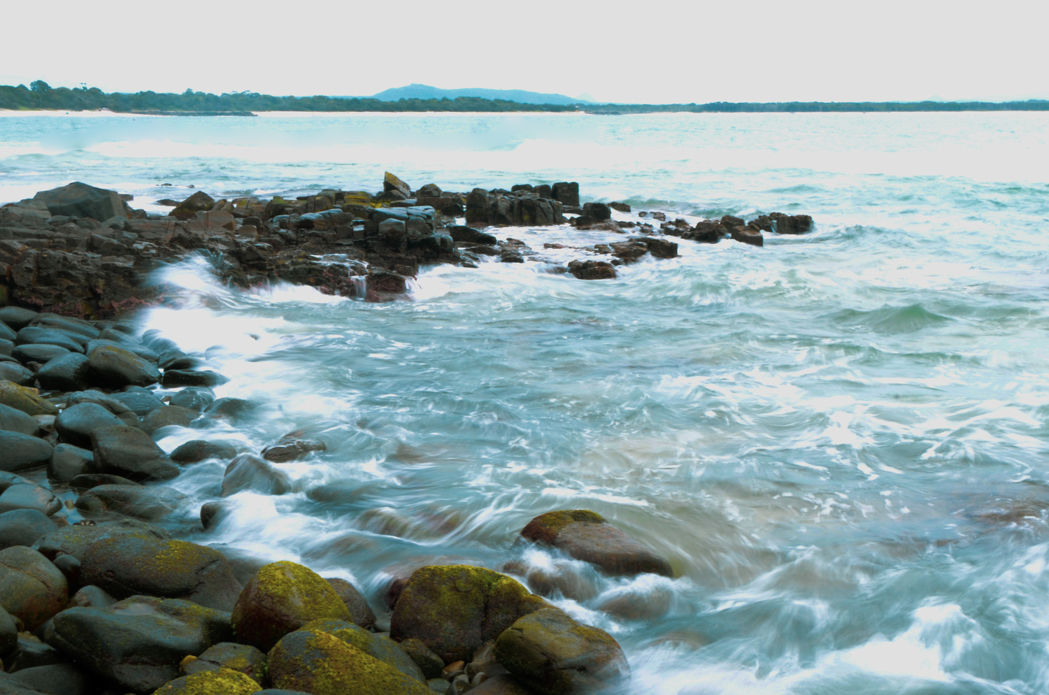
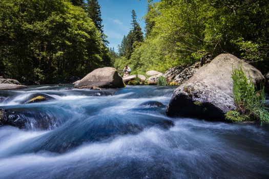
I see what you were going for with this shot but I'm not a fan at all sorry. Some of the water motion over the rocks looks nice but otherwise the composition doesn't do it for me, the rocks just aren't interesting enough to catch my attention, nor do they really lead me into the image and on top of that they're poorly focused. As for the water, you've lost almost all textural and colour detail, especially behind where the rocks end. As for the background it looks nice but it doesn't take up enough space, it looks soft and there's some fringing going on where it contrasts with the sky. The sky also just looks flat.
Was this taken as a long exposure on a smartphone? If so, there's not much I can suggest. If not, or if it was at least captured in RAW on a smartphone I would recommend increasing your clarity and contrast a bit, pulling up the shadows, lowering the highlights and the exposure and turn on remove chromatic aberrations.
Bottom line, I think you can make the photo a bit better with some basic adjustments but I wouldn't have it as a portfolio shot and don't think it's really usable for much but posting to instagram due to the low quality at larger size.
For the composition, if you have a chance to go back, I'd recommend trying to get the camera a little lower, it may help with the composition.
Keep doing your best!
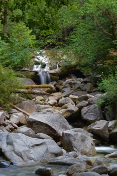
Maybe if you had done a vertical crop from the left-hand side of the image it would have been better, there really isn't much on the right side that is interesting.