Contest Submissions
Click on the thumbnails below to comment and rate each image.
Click here to learn about the Fstoppers rating system and what each star value means.
Click on the thumbnails below to comment and rate each image.
Click here to learn about the Fstoppers rating system and what each star value means.


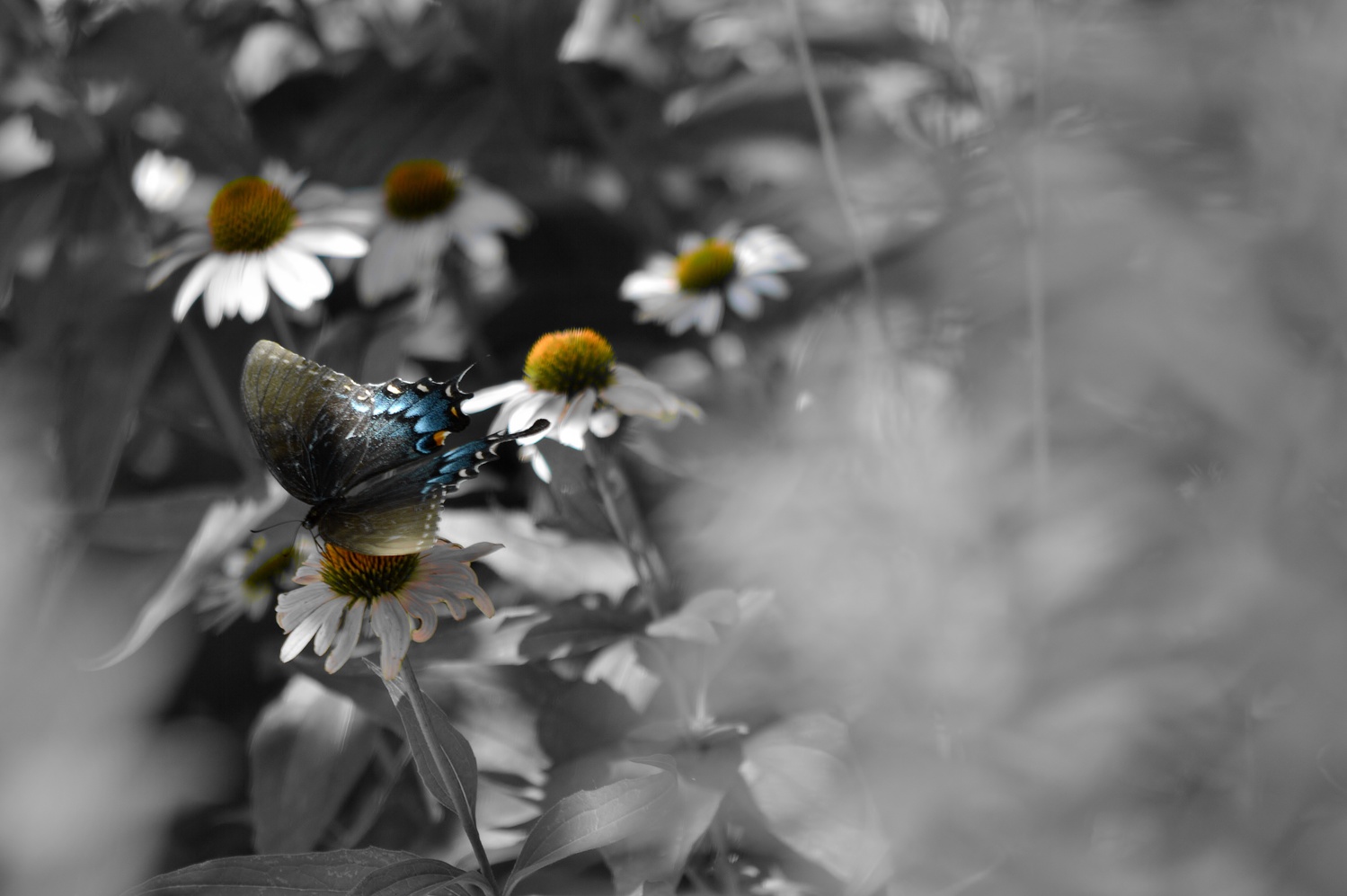
3 Comments
Just to give you some feedback, I feel like this would work better as a portrait crop. I personally find the majority of the foreground of blur on the right side to be distracting from the beautiful butterfly. I would just prefer a little less foreground .
I'll try it. Thanks. This photo was dominated by what was really too much green, hence the B&W. I thought the blurred foreground helped frame the subject
Just wanted to give you some feedback. It’s a really nice photo. If the worst critisim I can think of is cropping out some foreground, your doing a good job. 🙂👍🏻