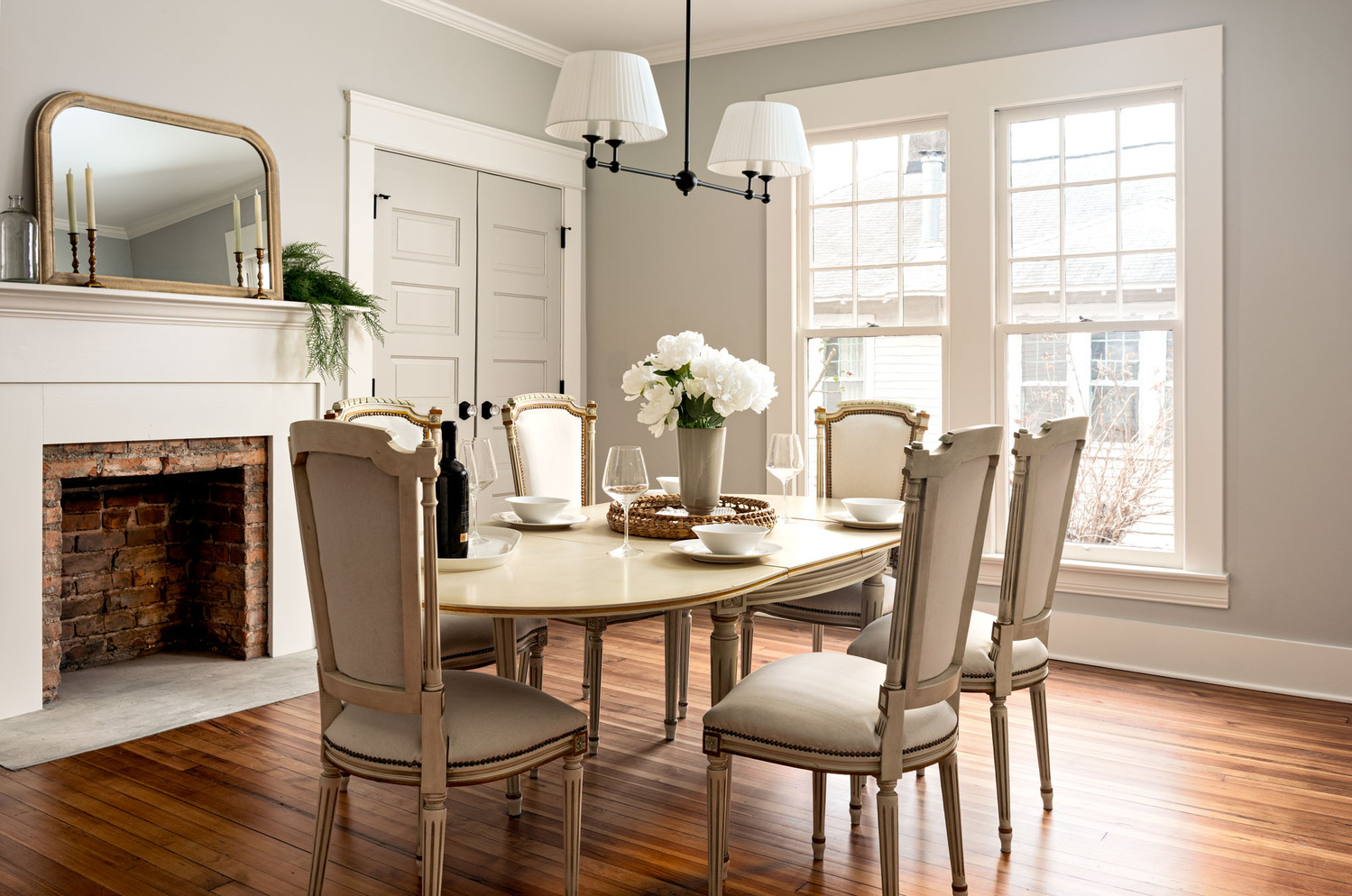
I know a couple of people in my hometown who are restoring old historic houses. They were gracious enough to allow me to photograph a couple of them to build up some kind of interiors portfolio.
This shot is a blend of natural light and several flash pops with a goddox ad300pro and a soft box. I basically walked around with my ad300 and softbox taking several shots with flash from different angles. I also went outside and flashed some light through the windows trying to mimic the natural light shining through.
I used my favorite flash shot as a base layer and built it up from there with other flash shots. Then I used my favorite natural light shot on luminosity blend mode at about 50% opacity to add some luminance back into the photo. Once blended I just did some basic edits with contrast and playing with the levels a bit in photoshop.


17 Comments
This is the kind of image that, after having put so much work into it, getting a score of 2 (needs work) drives you nuts. The only thing I would say is that you might consider lightening ever-so-slightly the chair closest to the camera. And the left side of the picture with the glass bottle feels a little pinched... compared to the empty space of the wall on the right, which throws the balance off just a little. Good job though... soft light can be really challenging with interior photos. I like the neutral colors and tones in the walls. Those can be hard to preserve.
Thanks! I'm not worried about the ratings in these contest. I know for a fact at least 1 person gave it a 1. Which is complete nonsense. And of course the coward doesn't have the balls to say it here. This image is in my portfolio regardless of what the nerds in here voting think.
Comment deleted...kyle does not want real critiques.
ok bud! This is a completely laughable comment. Judging by the other nonsense you've written on here and on every single other contest you wouldn't know soft light if it bit you in the ass. Light can be "nearly blown out", which this isn't, and soft. Tell me you've never shot any interiors at all without telling me. You'd be better served to just shut up sometimes.
Well you wanted to know. Now who got rude? This illustrates why comments should not be required. I'll delete the comment above.
Leave it up. I get it. YOU have an opinion. It's just, your opinion doesn't mean shit.
Truth to fiction here in that statement. Rude and denigrating comments are just that. This is nice work. There are people that think a critique has to be critical. Not so. Just be honest, if you don't like the image then just move on. This is a well exposed, well composed image. Color balance is as near perfect as it can be.
"Real critiques" like critiques from some nerd on fstoppers who has absolutely no experience shooting interiors what so ever. Does not submit his own work to said contest. Shows no understanding what so ever of what soft light is or can be. I could go on and on. You write on here like you are some expert on every matter photography wise. Every single contest you write pages of nonsense in the comment section. So yes, I could not care less about some so called "critique" by some doofus on fstoppers.
I have been down that road with that guy. Just sayin', that's all.
Now I'm curious what Robert said about your photo. From the sounds of it, I'm guessing that he thought the light was more harsh than soft. I think from what others have written, that people assume if there are bright highlights that it can't be soft light. While I disagree with that sentiment, I can understand where they're coming from.
PS to last... I was really surprised in the general comments section of this contest how different some people's understanding of soft light were from what I thought to be a pretty straightforward subject.
Right? I thought this was pretty straight forward as well. But maybe that's because I'm usually trying to achieve that look in my architectural work. I didn't think "soft light" was that complicated.
Rob basically said that the light wasn't soft at all, that it was blown out, and that the camera angle sucked. Which I just couldn't disagree more with. He also said something about the colors but I don't remember.
I don't normally engage with this type of stuff but he caught me on an off day. I also just find it hilarious when a "critiquor" gets upset when the person being critiqued pushes back. I would say 95% of the people on this platform are not qualified to give any critique what so ever. I'd include my self in that. Which is why I just avoid it unless someone specifically asks for it on a topic I have a good deal of experience with. In these contests I typically don't even vote unless I think it's at least a 3 and I usually give 4s. I don't see the point of giving 2s even if it is a 2. Plenty of others have usually already done so, so why pile on? That does not seem to be the norm however.
Rob really irked me by saying I don't want a "real critique." He may be a nice guy but that pissed me off. I've been critiqued probably worse than most people on this platform. I played classical guitar in college. Nothing like having the professor tell you you suck! I'm totally open to any critique, but at the same time, you better know what you are talking about. Otherwise it just becomes giving an opinion which is virtually useless.
It's unfortunate that the whole idea and process of commenting can turn into a train wreck sometimes. After all, the comments are as much interest to me as the articles and pictures themselves. I think it's what makes Fstoppers better than other photo sharing sites.
Nice work. I have done numerous jobs like this using large format cameras and film before we had digital. It is a difficult image to make. Everything is right, nice neutral color balance and well managed contrast. It seems there is no keystoning, or very little. I cannot imagine anyone giving it a low score. Not by way of criticism of any kind, but a thing to think about. I might have turned the house lights on to paint a little light into the ceiling fixture. Light the candles on the mantle, turn the wine bottle so the label showed and maybe even put a fire in the fireplace. IMHO, it helps breath life into this type of image. Nice job though, very nice.
Thanks Nathan, I can't imagine what doing something like this was like before digital! If I remember correctly I did try to add a fire using gen fill but I couldn't manage to get anything that looked natural so I just left it. Looking at it I do wish, as you and Ed both pointed out, that I moved or rotated or did something with the wine bottle. I feel like those little fine details are things I'm still working on the most. It's nice when the designer is on set with you. They usually catch things like that better than I can. But it was just me for this. The candles would have been a nice touch as well. I appreciate your thoughts on this, thanks.
What happens, as you do this a lot, is that you really will sensitize your vision to see things, details, that 95% of all people will miss. It is those tiny, seemingly insignificant, things are the details that make an image have life in it. IMHO, architectural work - particularly residential work - should look lived in, not pristine, but still very neat and clean, and that's a very fine line to tread. With that wine bottle for instance, think about making a second main exposure with the bottle uncorked and some in a glass with a table setting. I don't know how that would work out exactly, but at least you would have two versions to pick from.
As to using a view camera. I used to use a Toyo 45G with a series of Sinaron and Rodenstock lenses, and a box of Wratten filters. The box was huge, and heavy. The tripod was one of those immortal Bogen Tripods with a very heavy 3 way tilt pan head and usually 20 or thirty two sided film holders loaded, half with color negative film like Kodak Portra 160 and half with Kodak Ektachrome E100G film. Numerous wratten gel filters to balance bizarre lighting types like high pressure sodium lights with crazy color temperatures.
Life is much simpler with digital since we can customize white balance with the cameras built in computer, and we can compensate for keystoning in Photoshop. Though a bit of me is nostalgic for the times when a job like this might take a full day balancing multiple light sources for brilliance and color balance.
I gave it 4, if that makes any difference. Could easily have been a five if I had thought about it.