











Lately I have been going through some of my old lighthouse photos and editing them in this black and white "fine art" style. Why lighthouses? Because I like them and I think they work well with this kind of edit. There are several on my portfolio if you are interested.
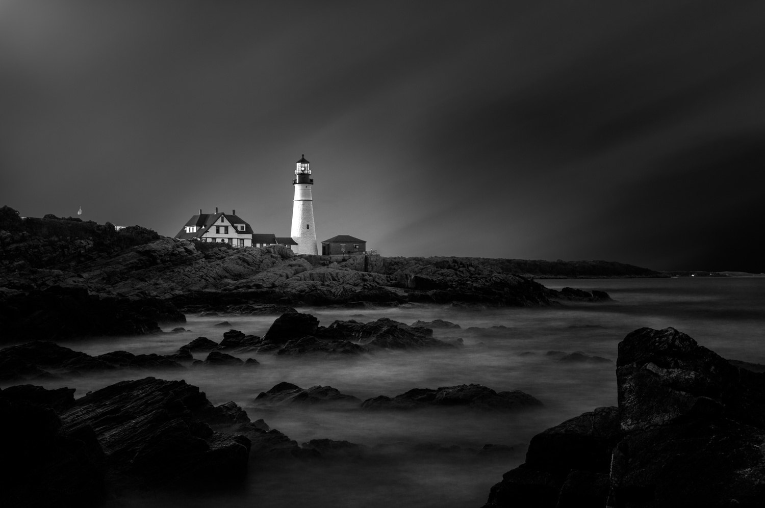
This one is the Portland Head Lighthouse in Cape Elizabeth, Maine. To create this I did most of the black and white conversion in Lightroom. Once I get where I want I open it in Photoshop. Once in photoshop I use the pen tool to meticulously cut out every thing from the sky. I find it's just more accurate than any of the other selection methods and it helps to have an accurate selection of sky and everything else. This just helps with applying some selective edits. Once I have my selection I replace the sky with various different things. In this case, I used a long exposure sky from a different photo I took. I experiment with transforming the sky in multiple different ways until I find something that I think looks nice. So this is really just a small portion of the long exposure sky.
Once the sky is in I used multiple level and curves layers to basically selectively dodge and burn the image. Once I got it where I want it I brought back in to Lightroom and did a few more basic adjustments to unify it a little bit more.
For those wondering if you can just take the blue slider and bring it all the way down to get the sky black. I've tried it and it just doesn't really work that well. Sometimes it does but I find most of the time it doesn't.
As far as how this would work as a print. I think this falls under "fine art" although I kind of cringe at calling my own work "fine art." But I could see this working in a local hotel, or really any kind of commercial space in Maine. It could also work well in someone's house. Fine art is subjective so I'm sure there are multiple areas where this could work as a large print.
Click on the thumbnails below to comment and rate each image.
Click here to learn about the Fstoppers rating system and what each star value means.
4 Comments
Beautiful shot. Here is my crop suggestion for what its worth. Just got that horizon out of the center.
Hmmm... don't think I agree with that crop. It seals off and diminishes the flow of water at the bottom of the frame, and eliminates the visual path into the photo. I do think removing the hint of light from the other building, and what appears to be a flag to the left of the main house, might be worthwhile. My eye keeps wandering over to them, distracting from the isolation of the lighthouse.
I like my crop better my self. This crop loses too much of the rocks and water for me. I debated getting rid of the flag but I liked it so I kept it. Also debated just getting rid of the house all together.
I, too, cringe at the label fine art photography. Sounds pretentious, and I've seen plenty of really ordinary landscape photography labeled as such. I tend to say that I make art photography or photographic art to differentiate my work from portrait and commercial photography, but skip the "fine" part of it. It's photography, not painting.