
The world is filled with presets. Everywhere you look, you can find presets that promise to give you a certain look. Hipster, soft skin, blue sky, Photoshop, Lightroom, Capture One — today, filters promise to do anything and everything. But what happens when a company like Totally Rad! promises to emulate film? A one-click solution to turn your raw files into Kodak Portra 400 shots? Is it possible? Let’s find out.
Introduction
I’m a big film shooter. I almost get paid more to shoot film than anything else. But as much as I love to shoot film, there’s a practicality that comes with digital photography that you can’t ignore for many clients’ needs. Yet, every time you go back to an analog medium, there’s the instant reminder of that look that you get with film.
I won’t deny, however, that digital imagery has come quite a ways, the most glaring of which might be the incredible dynamic range you can get with digital files. With this thought in mind, I was more than intrigued when I heard Totally Rad! had a preset system that claimed to "convert" your raw file to give it a look more or less identical look to your favorite film stock. But the big question is — or now, was — is this a gimmick? Or does it really work? Because, if it works, could I just maybe give up some of the magic of the process so long as I retain the magic of the final image — those colors, that gradient between shadow and highlight, that “this must be shot on film” feel that you just know when you see it? And then, at the end of all this, is that "feel" simply the largest made-up cliché in the photographic industry?
We’re going to do our best to answer all of those questions.
Setup
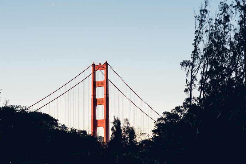
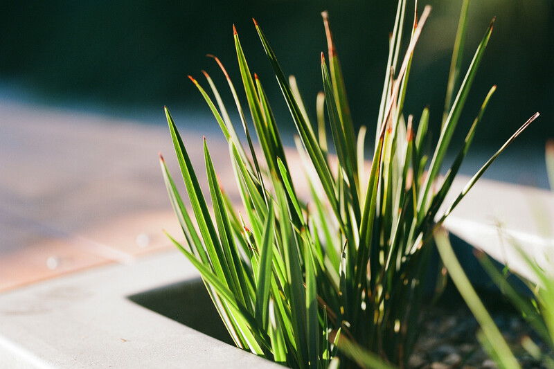
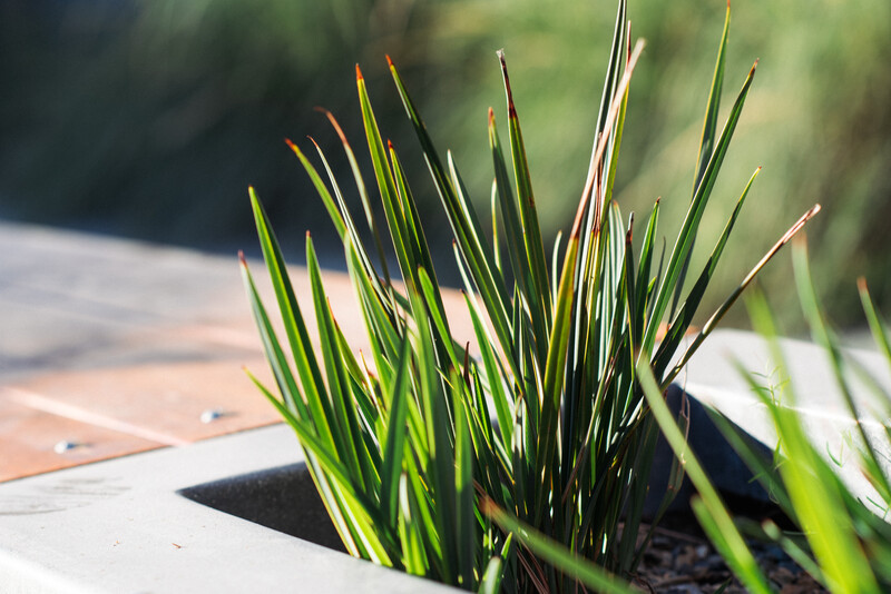
To set this up, I evened the playing field as much as possible. I took my relatively new Nikon F6 35mm body and a Nikon D750, put them side-by-side for each shot, ensured identical settings across the cameras (matched to the ISO of the film inside the F6), and fired each shot with the same Nikon 85mm f/1.4G lens. In each side-by-side comparison, the shots happened right after one another (in the amount of time it takes to change a lens from one body to the other).
The plan was to get the images scanned in, pull them into Lightroom, and compare the film scans with raw files with the preset for the right film stock slapped on them. Of course, there are a few challenges with this.
First, the images that were scanned in were color-corrected before I got them. While some might argue that shouldn’t have happened, scanners always scan in a flat profile anyway, and each operator will apply their own color correction to some degree. This is only natural and akin to (as far as I see it) Lightroom’s own profiles for handling raw files. Because of this color correction, as well as Nikon's automatic white balance setting, white balance, exposure, and grain adjustments were all allowed before adding the preset as a starting point for the raw file. This would also be indicative of a simple, three-click route to take to somewhat match the film look. Of course, that would almost never come close to being enough to do the trick. Do note, however, that grain settings are overwritten by the preset's settings once those are in effect. They're only added to illustrate the point that, although the grain effects change the look quite a bit, simply adding grain is nowhere near enough to get that film look.
Second, and of more consequence: film reacts to varying exposure levels in each shot differently in such a way that part of a shadow might take on a blue hue, but other parts of shadows might give a more true color rendition if they’re slightly lighter. Meanwhile, extremely bright highlights will remain white, while more controlled lights could take on a yellow/orange hue. That same film stock might see not simply all reds, but only a very small subset of red wavelengths and render them slightly more orange. While the point of the presets is to ensure that these changes are rendered accurately in the raw conversion when applied, there is simply no way to fully predict the effect of every possible shade. Regardless, we’re here to see if a preset can get us to the point where we might not know which image is the film image and which is from the digital file. This much, I hypothesized, a preset really should be able to accomplish. And this is what I’m really looking for.
Finally, I’m going to fess up to a small mistake I made on my part. For some of these examples, I underexposed the film by about two-thirds to a full stop. This was because I did the exact same thing on my digital camera (I do this for almost every shoot to save the highlights, since I can easily bring shadows up a hair in post with little loss in quality). Still, this error was corrected during the color-correction process while scanning. It resulted in some extra lost shadow areas in some film shots. But in the end, these cases serve as an interesting test of such conditions. Additionally, now that my review is over and my conclusions have been drawn, I am convinced this simply didn't matter with respect to accuracy of the presets.
Compare and Judge
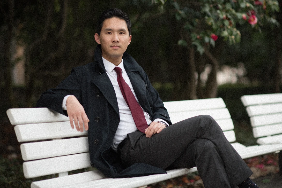
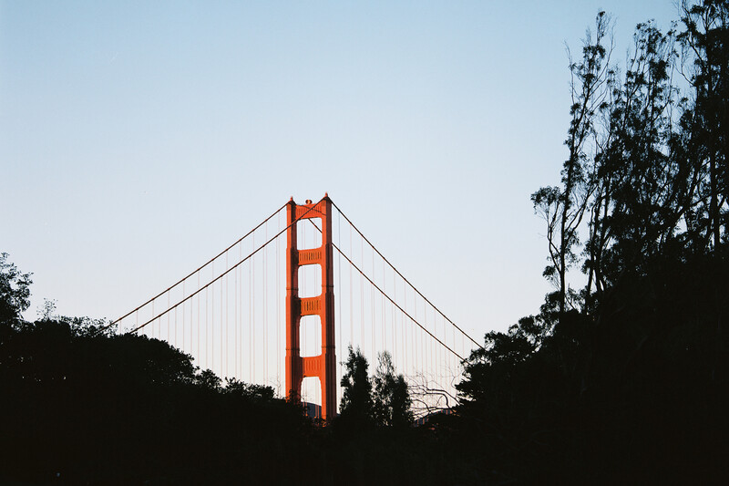
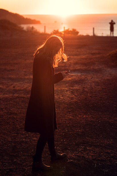
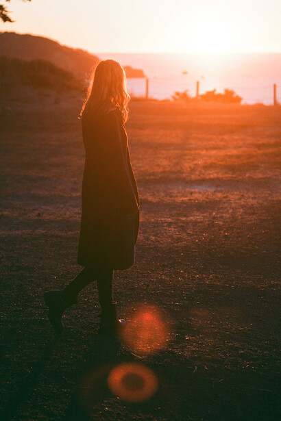
Jumping right in, let’s compare the first two images. Can you tell which is the film shot and which came from the D750? And if you think you have the answer, think really hard about whether or not you would know the digital image was not a film shot if it were posted on its own in a Facebook group that you frequent or on your favorite film photographer’s blog.
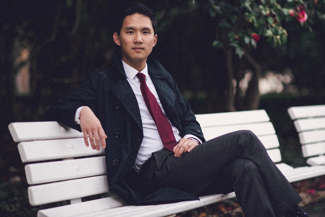
In this case, the second image (on the right) was the shot directly from the film scan, while the first shot is an edited NEF file with the preset applied. However, there are a few extra edits made on top of the standard preset from Totally Rad! that I added to get the image closer to the 35mm shot. Below is the progression of edits I made, each time with the same film shot as the "after,” so we can see how we progress toward that look.

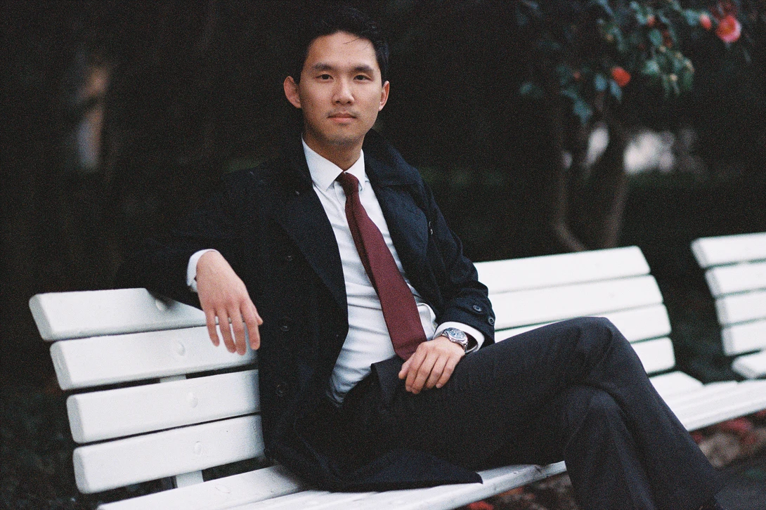
Here, I only added grain and mild exposure adjustments to match the grain and subsequent exposure of the film scan. Of course, this doesn't even come close.

Now that I've added a white balance adjustment to both images based on the same spot of the white bench (the film scan saw almost no change), both images are looking more alike. But of course, we're still far from any sort of real match between the look and feel of each image.
As you can see, adjusting for white balance, adding some grain, and matching exposure gets us close, but the digital file is still flat without any highlight/shadows and whites/blacks adjustments. Moreover, we're simply not yet near a profile or look that really matches the Portra 800 image.
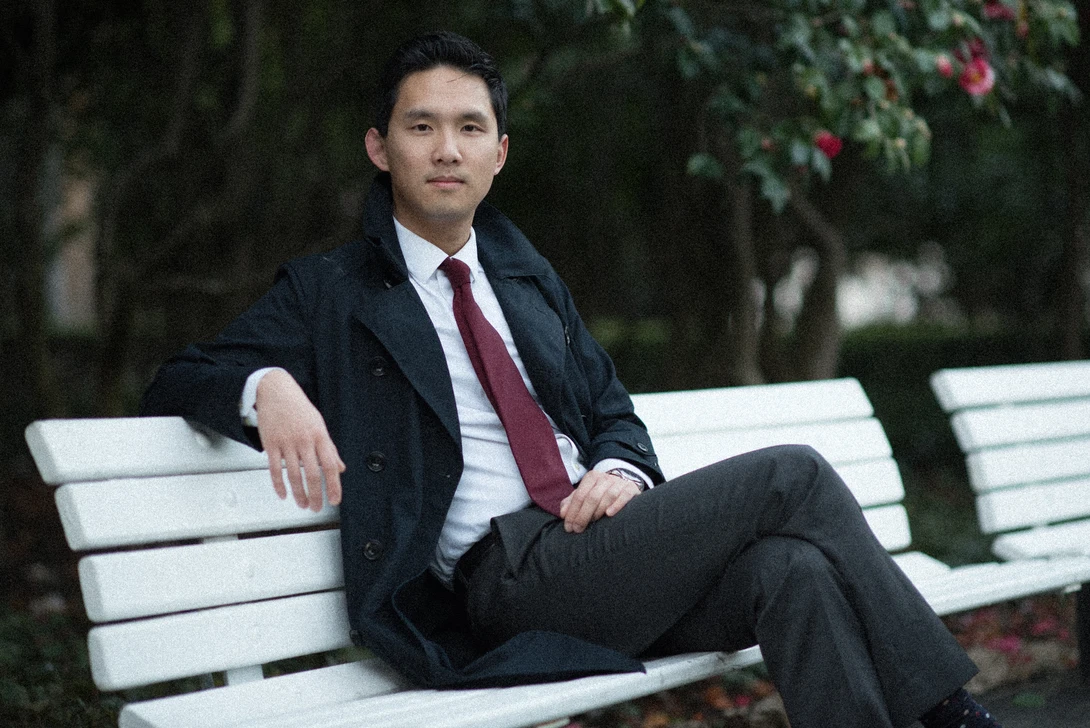
Below, we're now looking at the first file with the matching Noritsu film scan preset by Totally Rad!. The same white balance and exposure matching is present, but the grain is handled by the Totally Rad! preset in this case.
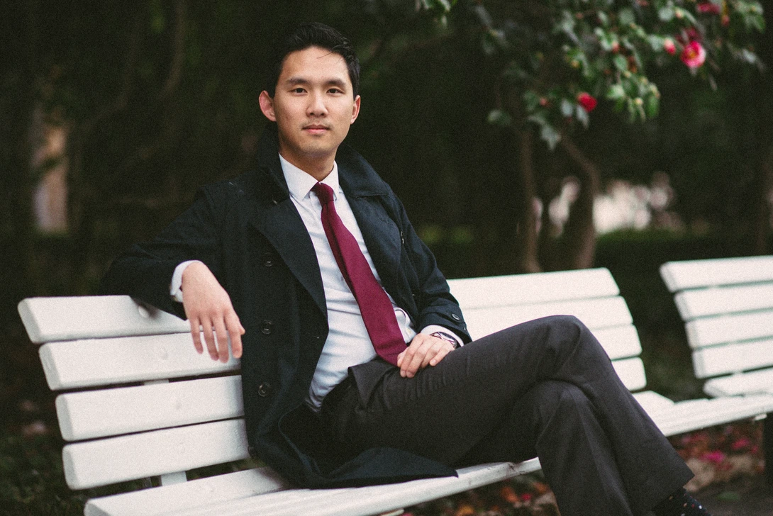
Both images look a lot more alike, this time with the digital image (left) having the Portra 800 (Noritsu) preset applied. The overall feel of Portra 800 is certainly there now.
Immediately, it's evident that the image now takes on a more filmic look, one that specifically resembles Portra 800. It's not perfect, however. The digital D750 file has more dynamic range. This is exacerbated in this comparison by the film having been underexposed, which subsequently decreased shadow detail in the film image. But overall, the shadows and highlights don't match perfectly, if we want to be picky. As another quick comparison, let's take a look at the same image with the Frontier scan and subsequent Frontier Portra 800 preset.

With no changes, apart from exposure, white balance, and the immediate application of the Portra 800 Frontier preset, it's obvious this didn't quite work as one might hope. And of course, the auto white balance based on the bench isn't working for us. But it's nothing a few additional tweaks can't fix. We're actually closer than it might seem at first.
What's important to note once more, however, is that no preset will be able to 100 percent perfectly "convert" a digital file into something that looks identical to a particular film scan. This is because film reacts to every single wavelength of light (i.e. every single color) slightly differently. Some films cool down shadows and warm up highlights. But at which point does a particular film not "see" a shadow to mark more blue? And at which point exactly does a highlight become a highlight? How much would the film react to the exact bright shade of orange the sun was emitting at 6:30 p.m. compared to the harsher and more yellow light of the four o'clock hour?
These are the things that contribute to the fact that not just presets, but also any and all adjustments one might make to an image would be virtually impossible to do in a way that would perfectly emulate film. What we can do, however, is get really close. Even with the differences seen in side-by-side comparisons, the question has to be asked: on their own, can you really tell which is the film scan and which is the digital file? In most cases, I can take a guess. But I can't honestly say I would know with certainty.
Below, in addition to the standard Portra 800 Frontier preset, I've made use of Replichrome's included "Tweak Kit," which comes in the form of a number of adjustmetns for things such as grain, contrast, saturation, how lush greens look, reduction of orange in skin tones, and more. I added extra grain, took the orange saturation down a level, and added a more intense fade in the shadows — all options in Tweak Kit. Separately, I got off of the white balance set from the bench and matched facial tones manually to some extent (without trying too hard, of course).
Here, color isn't perfect, but again, the general feel is certainly present. As soon as I lightened up on the magenta that I feel is too strongly represented in the shadows, the face became too green and vice versa. Yet overall, this is much, much closer to the scan file than one could easily do on their own without endless tweaking.
Based on the above adjustments, the general feel of the Portra 800 Frontier scan is now clearer. The level of grain and shadow fading in the film scan seems a bit too much for the preset to match (and it's likely exacerbated again by the original underexposure), but I'm not sure Lightroom accurately accounts for more grain and fading in shadow areas than highlights either. Nor do I know if Lightroom changes grain settings based on megapixel count. I believe this is expected to be done manually with visual confirmation on a per-file basis. A setting of 15 on the grain amount, for example, may not be the same for all files. So, this may be a limitation of the tools available within the program, although I found grain to be on the lighter side for most of my adjustments anyway. Regardless of the few changes I had to make to the file for my preferences, I can still get quite close with relatively little work.
Nonetheless, we have plenty of additional examples below for consideration, as these all have varying degrees of difficult lighting situations, as well as differing results. These are all final applications with similar tweaks as mentioned previously in order to get as close as possible to the original film scan look without too much thought or time (generally, these took well under a minute). These side-by-side comparisons also alternate randomly in terms of which side of the before-and-after the original film scan is on. See if you can guess which is which.
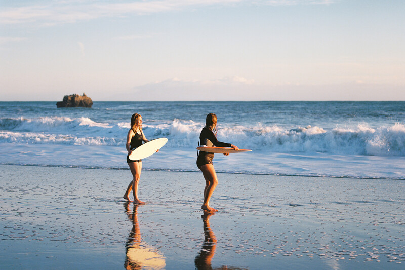
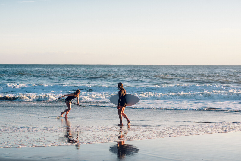
As we examine these images, notice the obvious pattern: while the presets might require minor tweaking after the fact as we've discussed, the truth is that they still allow you to get quite close to a final image that looks strikingly similar to a film image. Even a trained eye would be hard-pressed to note a difference in some images; making a distinction between the film and digital file isn't exactly easy. These last examples are all with Kodak Ektar 100 film and mix both 120 and 35mm film (I cropped the 120 to obscure otherwise obvious format differences). Some of the recent examples were scanned with the Nortisu scanner, while others were done with the Frontier (the corresponding digital files were naturally matched to the correct Replichrome profile).
That said, it is in more challenging lighting conditions such as direct, backlit sunlight that I really do prefer a straight-up film image. In this case, the digital file simply doesn't compare. The digital sensor simply didn't "take" the sunlight as nicely as the film did. And the matching preset couldn't do much to magically help it. Example below:
Here, we've shot Velvia 50 on a Hasselblad 203FE with the 120 f/4 CFE lens (right image) and matched it with a Nikon 85mm f/1.4 digital shot and the Replichrome Velvia 50 Calibrated++ setting, which does not have scanner type options. In this case, I found that it most closely matched the Noritsu scan, which is what is presented here.
Looking at the above image, it's apparent that the Velvia 50 preset did a relatively amazing job considering the tough lighting conditions. However, both the actual Noritsu film scan and the emulated digital file (above) pale in comparison to the Frontier film image. Notice how amazing the Frontier scan is with the sunlight here (presented below). This, by the way, is something I noticed right away with all of my scans: the Frontier scanner does a gorgeous job of handling sunlit conditions of any kind. If you're shooting around sunset,back or lens into the sun, I highly recommend Frontier scans. As for the rest, it's a preference I'm sure many fight over for hours in online forums.
For the full effect, I've provided the entire square image for this one. Again, this is the Frontier film scan to which neither the Noritsu nor the Noritsu-emulated digital file can compare.
Conclusion
Hopefully I've included enough information for everyone to come to their own conclusions (let me know in the comments), but I'll add my own two cents, of course. Are the presets absolutely perfect? Not really. But it is, in fact, fairly remarkable just how much easier it is to get that film look with this set of tools at my disposal. Playing with each individual curves adjustment would take too long and would likely not provide any results worth using. There are simply too many variables at play.
Perhaps there are ways to pull out the proper image with some fine-tuning for each of these examples. But at that point, we'd be getting away from the entire point of this: to get a quick fix for creating film-like images out of our digital files. To that end, there's no better experience than the fun that comes with shooting film and the amazing images returned from well-executed scans. But these Totally Rad! presets are superb if you have digital files that you want to quickly match as best as possible with just a few clicks.
As far as that film look goes, it's safe to say that there's more to it than faded blacks, grain, and the occasional lens flare. While these elements certainly don't hurt if that's the look you're going for, most true fans of film look toward it for the experience of shooting analog as much as they do for the fascinating color rendition. It's not necessarily more accurate; it might be far from accurate, perhaps. But different films absolutely behave differently with respect to every single wavelength of light. It's this unpredictable property that leaves its mark on film to give it a quality that is equally surprising and otherworldly. While I might personally enjoy the process of shooting film and will therefore continue to do so, these presets get quite close to giving that special feel to an otherwise flat image. I won't use them all the time, but I'll definitely supplement some of my film shooting with the aid of these kits.
Other companies offer similar presets that I'll be reviewing in time. But for now, I've already found myself using the Replichrome presets quite a bit. They come in different $99 packs that include standard slide and negative film stock emulations in addition to some rare ones, many of which you likely won't even be able to find easily anyway.
Naturally, I stuck with the Replichrome I: Icon and Replichrome II: Slide packs, as those included film emulations that I actually use on a day-to-day basis. But, if you really want to experiment and get some rather unique looks, Replichrome III: Archive is the one with quite an array of discontinued and generally older films that you'd be hard-pressed to find. That would make this pack just about the only way to replicate some of those looks if that's your thing. For more information, do also check out Lance's comparison of the three packs!
Join the Fstoppers community for free
-
Post comments and join in the discussions
-
Browse the site ad-free
-
Share your work and get featured in the community
-
Compete in the photo contests for fun and prizes
17 Comments
We've heard less and less (and still less) about film pre-sets over the past year. I'm intrigued to hear thoughts from others why. Market saturation? Film revival as fad?
Great writeup!
I still shoot film, but only for personal projects (no deadlines) and for my family (my kids will be one of the few in their generation who will have film negatives of themselves and their relatives).
Here's my conclusions:
- film is great in bright sunlight, overexpose only negative film
- film sucks in lowlight, never underexpose.
- Kodak Portra400 is almost like shooting filmLOG - amazing latitude.
- Kodak Ektachrome E100 VS was the best slide film I've ever shot and I haven't found a replacement slide film that can match it's rich colors. Recommendations?
Attached photos are
Cinestill 800T (pushed 1 stop) vs. Canon 5D3 (at 1600ISO)
identical lens, aperture, and shutter speed
Nailed it. got them all right, though it helps to have started on film and to still shoot it. The giveaway is often the dynamic range and shadow transition and rendition. As you mentioned, even in lower light, digital files will usually have more tonal range than their film counterparts. Also, especially with newer sensor, the digital images tend to look a bit crisper. Lastly, I find even the best presets do not render color in the same way as film. Where color is added/subtracted or tones are changed in the presets never seem to render as naturally as in film. All that said, I would still love to find a film preset that could come at least close to emulating Kodachrome, especially the stocks from the 40's and 50's, only because you can't process it anymore.
To your point, yes -- a Kodachrome preset would be amazing. I doubt we'll ever see one that comes close, though. Even if someone were interested, it would be almost impossible to do very well seeing as it's not even processed anymore. How sad...
For the slide film, I'm bummed out by the current offerings as well. Fuji Velvia seems to be the only real option these days. And as pretty as that is, it's not realistic in any way, unfortunately...
There are millions of Kodachrome slides in the world, why would it matter that it is no longer made if someone did a preset? There is plenty of reference material...?
Yes, there are many Kodachrome slides (and presets) in the world. I have watched a bunch of tutorials, used a bunch of presets, tweaked the settings on a bunch of them, and tried in LR, PS, and C1 (and various combinations of the three) to get that Kodachrome "look", but have yet to find one that is convincing to even the semi-trained eye. Maybe if I was better at it I would be in the business of making and selling presets, but alas, at least as for now Im just hoping someone else will come up with something better than what I can.
I only say it'll matter because you can't take a kodachrome shot right next to an otherwise identical digital shot as a baseline to then directly "translate" colors over. Maybe someone will get close one day, but as Raymer notes, I simply haven't seen any great/convincing Kodachrome presets. Most that take the name do only that and simply crunch the contrast and push saturation up -- as simple as it is pointless.
I am bummed by current slide film offerings as well, and haven't shot any in probably 5-6 years. As much as i loved kodachrome, I was actually equally, if not more saddened when AGFA discontinued RSX 50.
Although when I had a Leica IIIf I used it, I never was a big fan of Kodachrome. Maybe because it took a week to process... I am glad that my dad used it in the 50-60s as the slides still look great today.
Crunching the blacks and adding contrast will get you 85% of the way to a Kodachrome look but there's still that last je ne sais quoi that only the true aficionados will notice.
I got them all right as well. The dead giveaway for the digitally acquired image was the blue shift in the shadows/blacks. It annoys me to no end that people think "Film Emulation" means "lifted/faded/blue shadows".
The thing about both replichrome and the film scans is that the noritsu and Fuji were built for speed. They have a distinct 'look' which is somewhat independent of the film. I had scans professionally done using two different systems recently. The fast minilab style scans just aren't that great. Distinct yes, but just one interpretation of the film.
Hey guys - Doug here. I did pretty much all of the work for all the Replichrome products, and wanted to speak to some of the points raised here.
First, one of the things this process taught me is that even film doesn't always look like film. In other words, it's impossible to define, for instance, what the shadows of Portra 800 look like. You can kinda capture the feel of a film stock, but it'll never be exact. Part of that is because film itself is pretty nonlinear in its response. Part of that is that, for neg film in particular, the color response varies significantly with exposure. Another variable is the film batch itself, the way it's been stored, the ambient temperature when it was shot, the age of the film, etc. Then there's how the lab processed it - how old that batch of chemistry was, how well-run their line is, what other films they had run through that chemistry that day. Then there's the scanner - which model, how well calibrated it was. Then there's the lab's own special sauce - profiles and standard corrections they might add. Then there's the operator of the scanner - how they interpreted the color of the scene, how many rolls they had done that day, what a properly balanced sunset looks like to them, etc.
All of this is to say that, when you expose a frame of film X, it might end up looking dramatically different from the exact same film sent to a different lab. Or the same film exposed differently. Or on a different day. Some of those are big variables, some are small, but they all add up to the potential for the same film to behave very differently at different times. Commercial film shooters used to go to obsessive lengths to neutralize those variations - they would buy film in bricks at a time, and shoot test strips from that batch of film. They would keep it all in a fridge until needed. They would only use trusted labs, to the point of having religious devotion to them. And even after controlling for all of those things, they would still shoot test frames from a setup, and have the lab run test strips pushed or pulled in 1/3 stop increments to verify that, yes, this film is behaving the way they expect it to under those conditions.
All this means is that emulating 400H with a preset, for instance, is a bit like creating a gum that's supposed to taste like chocolate - you can only get it right for one brand of chocolate, and it will be varying degrees of wrong depending on which chocolate you compare it to.
With that in mind, I had to abandon any pretense of making our film emulation 100% accurate for every film shooter in every situation. For the batches of film we based the presets on - they are pretty darned accurate, but even then, it's impossible to get a single preset to match every scan on a roll (my test shots were done in a variety of lighting scenarios, with a variety of exposures). The goal was to get it right for properly exposed, full-tonal range, daylight lit images, and to get everything else pretty close, and I think I succeeded there.
But even that is tough. Most films have sensitivity well into the IR band. Digital typically does not. In practical terms, this means that it's really easy to get false colors, and weird metamerism issues that are impossible to sort out in a preset. Foliage greens are a great example of this. Film tends to render greens with much more cyan than they actually have, and it's part of the "film look" that shooters are looking for. But to do that, you have to move ALL the greens toward blue, which makes non-foliage greens inaccurate. Replichrome is full of compromises like that, where getting the color right for one set of objects means getting it wrong in another case. I tried to prioritize foliage and skin tones in building the presets, but doing so means other colors are necessarily wrong.
None of this is meant to be an excuse for places where the emulation falls short, as it necessarily will, but to explain some of what produces those differences, and why film emulation will probably never deliver a 100% accurate way to bridge the gap between film and digital. We can get pretty close for the most common scenarios, and for most shooters, that's a useful tool to have (I hesitate to say "good enough"). The question in my mind has never been "does this look exactly like an identical film shot," but rather, "does this capture the feel of the film it's trying to emulate." In that regard, I think we do pretty well.
Ask away with any other questions (and thanks, Adam, for the thorough write-up!)
Thanks for the reminder about the variables from the the film days. Maybe you should add in a random preset that will ruin every frame in the folder to emulate the film becoming unhooked and ending up at the bottom of a tank of developer! Oops, sorry....
Since many of the presets are neg film, how does that variable play into the look? Do you look at the original negatives as a reference regarding dynamic range and "native" color rendition, or do you judge from prints made from the films?
Since the film people are looking to emulate generally means "commercial lab scans direct from the negs," that's what I used. I've never been very good at reading C-41 negs by eye, and I'm not sure it would have contributed much anyway. IMO, scanned C-41 looks way better than optically printed C-41 ever did anyway (much less clear when it comes to Ciba or B&W fiber prints though).
Mostly, Replichrome (and the other similar products) aim to get the look of Frontier/Noritsu scanned negs.
OK, so if the films are all scanned with the "same" scanner set at "neutral" that would make sense...
Great article. I've been wanting to do a "shoot out" with film vs. digital. Did you put both cameras on manual exposure and shoot the same? I've been shooting film since 1980 and only started with digital in 2014.
Yes. For all of these shots, the exposure settings were identical to start. I cropped some of the Hasselblad shots, but for all of the 35mm shots, I even used the same Nikon 85mm f/1.4G lens (Nikon D750 vs. Nikon F6 with various films).