
Most photographs never leave a screen. We printed the same image three different ways and discovered how much presentation changes not just the photo, but the way you shoot.
Usually, photos get edited, posted, maybe shared, and then they live their entire life as a glowing rectangle in someone’s hand. That workflow has become so normal that many photographers never stop to question it. But while screens are convenient, they are not the full experience of a photograph.
Photography was never meant to exist only as pixels. It was meant to be physical. Printed. Hung on walls. Lived with. And once you start printing your work, something shifts, not just in how others see your images, but in how you see them yourself.
That realization is what led us to run a simple experiment.
We took one image and printed it three different ways. Same photograph. Same edit. Same file. The only variable was presentation.
What we discovered fundamentally changed how we think about printing.
The Experiment: One Image, Three Presentations
To keep things consistent, all three prints were ordered through the same professional lab we have trusted for years, Bay Photo Lab. Using the same lab removed variables like color management, paper quality, and production inconsistencies, allowing us to focus purely on how presentation affects perception.
Here is what we ordered:
- A fine art paper print with a white mat and black metal frame
- A framed metal print with a satin finish
- A nonglare acrylic print mounted to DIBOND
Same image. Three very different outcomes.
What we did not expect was how much printing changed the way we thought about the image itself. Details that felt fine on a screen suddenly felt much more noticeable at scale. Printing turned the image into feedback, not just a final output.
Print #1: Fine Art Paper With Mat and Frame
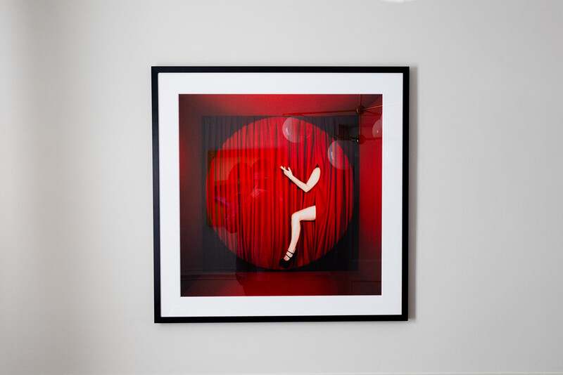
This one made an immediate impression.
Printed on photo rag paper, paired with a bright white mat and a simple black metal frame, this version felt museum-quality the moment it came out of the packaging. The detail held beautifully at a larger scale, and the colors matched our edit with surprising accuracy.
Nothing felt thin, dull, or compromised.
There is something about a matted, framed print that signals seriousness. It tells your brain that this image deserves attention. Seeing our own work presented this way genuinely stopped us in our tracks. It made us reassess the image entirely, not as content, but as an object.
That reaction alone reinforced how powerful presentation can be.
The only downside was glass reflectivity, which can be distracting in bright rooms and frustrating to photograph. Still, this option felt timeless, archival, and professional.
Print #2: Framed Metal With Satin Finish
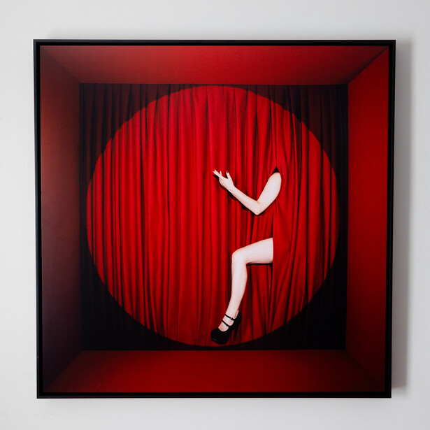
The metal print felt like the same image with an entirely different personality.
We chose a satin finish, which turned out to be a critical decision. The colors felt rich and deep, especially in the reds, without the harsh glare that high-gloss metal can introduce. The image was crisp, clean, and incredibly vibrant.
This print was floated inside a black metal frame, which gave it depth and helped it feel intentional rather than industrial. The presentation felt modern and architectural, aligning naturally with the physical sets and materials we often work with.
If the paper print felt like a museum piece, this one felt like a contemporary gallery wall.
For photographers working in fashion, commercial, or conceptual spaces, this format makes a strong case for itself. It feels current without feeling trendy.
Print #3: Non-Glare Acrylic Mounted to Dibond
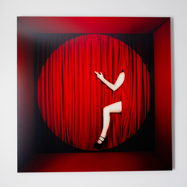
This was the wildcard. We had never printed our work this way before.
And honestly, it surprised us the most.
The weight alone changes your perception. This print is thick, heavy, and immediately reads as an object rather than a photograph—almost sculptural. The nonglare acrylic delivers the depth and polish of a glossy surface without the distracting reflections of traditional glass.
The colors absolutely popped, especially on the vivid surface. This version felt bold, confident, and self-contained. It does not need a frame, and that makes sense. Adding one would dilute its impact.
This print did not feel like a photograph in a frame.
It felt like art.
What Printing Taught Us as Photographers
Seeing the same image printed three different ways changed how we think about our work.
The fine art paper felt archival and refined.
The metal print felt modern and intentional.
The acrylic felt bold and sculptural.
None of them were better or worse. They were communicating different things.
And that is the key takeaway.
Presentation shapes perception.
It can make an image feel more expensive. More deliberate. More emotional. More serious. More playful.
It can even change how confident you feel showing your own work.
More importantly, printing changed how we approached the next shoot. We began thinking about final output while shooting, including scale, presentation, and how the image would ultimately live in the real world.
For photographers who feel stuck creatively, printing can become a diagnostic tool. Flaws become more obvious. Strengths become clearer. Composition, color, and exposure all behave differently when viewed off-screen and at scale.
Printing forces you to slow down and engage with your work in a way screens never demand.
A Challenge for Photographers
If you have never printed your work, or if you always print it the same way, try this:
Take one image you care about. Print it two or three different ways. Hang them up. Live with them for a few days.
Notice how your emotional reaction changes.
Notice what details you did not see before.
Notice which version feels most aligned with your intent.
Printing does not just showcase your photography. It refines it.
And sometimes, the way you present your work matters just as much as the image itself.
Check out the YouTube video to see the full unboxing and print review.


Join the Fstoppers community for free
-
Post comments and join in the discussions
-
Browse the site ad-free
-
Share your work and get featured in the community
-
Compete in the photo contests for fun and prizes
3 Comments
The pictures here in the article and the picture on your monitor are all dark red, but the prints in the video are all orange. Wondering if the color is consistent among the three prints that you bought, and if it was close to the monitor, or why the difference.
I tried a similar experiment a few years ago, submitting one image file to a photo lab in Colorado, and each of three substrates rendered colors a bit differently. Out of frustration with getting consistent colors from various labs, I ended up buying a 44" wide-format inkjet printer. I can't obviously print on metal, but can send the print out to be face-mounted to acrylic if someone really wants that. Very expensive though. I mostly encourage a client to have my paper print framed. I sleep a lot better with color issues under my control.
Otherwise, yes, I agree that printing changes your perception of an image. And it doesn't need to be just for a wall. When business is slow, I print various images of my own regularly on 13" x 19" paper to keep the nozzles from getting clogged. I store them in clamshell boxes and love holding a print. It's a totally different experience than looking at pictures on a monitor.
Great question, and I appreciate you sharing your experience with printing too.
The three prints came out really consistent with each other. The tone and color matched across all of them, which honestly impressed me. I've tried a lot of different labs over the years and Bay Photo has been the most reliable for me when it comes to getting prints that match what I see on my calibrated monitor.
What you're seeing in the video is mostly a limitation of filming and color grading video. Editing color in video is surprisingly tricky, and it can be hard to get it to match real life perfectly. I did my best when editing, but the camera definitely pushed the reds a little more toward orange compared to how the prints look in person.
In real life the prints were very close to what I see on my screen, and the color across the three prints matched really well.
And I totally agree with you about printing changing your relationship to an image. Holding a print is such a different experience than looking at something on a monitor. It slows you down in a good way.
For what it's worth, I would absolutely recommend Bay Photo. I've tried a lot of printers over the years and they are one of the only labs that consistently delivers the color I see on my screen.
I have used Bay Photo on a few occasions for metal prints, and have recommended them as well. One particular order came with a couple small scratch marks and they reprinted it, no questions asked. I generally use another printer called artbeatstudios.com, also in California. They offer a resellers discount and shipping is free on orders over $150 (which is no small advantage for some of those large metal prints). They have a guy there by the name of Charles who is on top of every question, whether from email, phone or chat. I value good personal service, right up there with consistent print quality.