
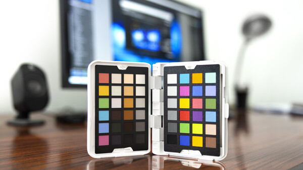
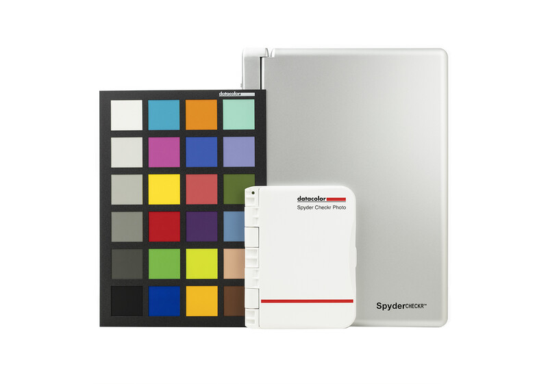
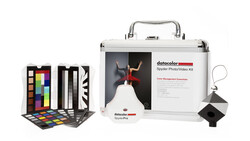
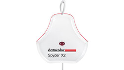
Datacolor’s new Spyder Checkr Photo is a sized-down version of the original Spyder Checkr professional color reference tool while also being a vast improvement over the previous smaller version, the Spyder Checkr 24.
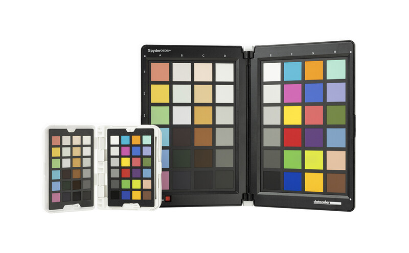
Consisting of a cellphone-sized hinged plastic case that contains two color reference cards with a total of 48 squares and two grey scale cards with another 14 squares, this new product is much closer to Datacolor’s original pro reference tool in features, just more affordable at $99 and considerably scaled down to be more portable. I think both its smaller size and affordable price point will make it a lot more usable for more photographers.
What It Is
Any color reference tool's main purpose is to ensure color accuracy, whether across multiple cameras, lenses, or even lighting, while also streamlining the production workflow by reducing the amount of editing that needs to be done. To achieve this accuracy, Datacolor used a new process, combining color-fast inks with museum-quality paper so that they could achieve long-lasting ultra-matte colors and a deeper black square. It is truly an impressively deep matte black.
Datacolor’s commitment to color accuracy was key in every aspect of Spyder Checkr Photo’s development, from the selection of premium paper that conforms to ISO 9706 standards, meeting exacting requirements for age-resistance, to high-quality inks that offer long-lasting color integrity.
What Is Included
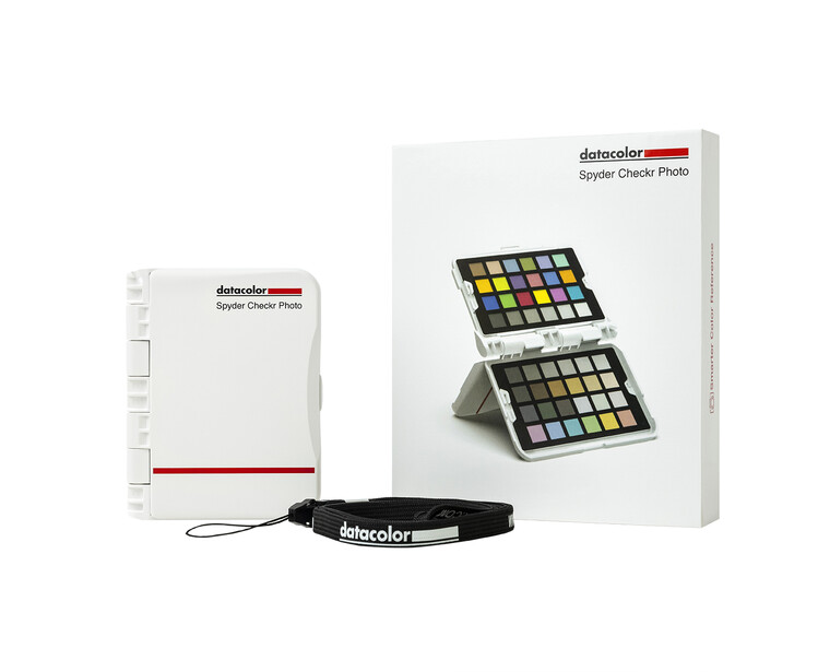
- Spyder Checkr Photo Case
- Four replaceable cards with 62 color targets
- Software download link and serial number
- Attachable lanyard
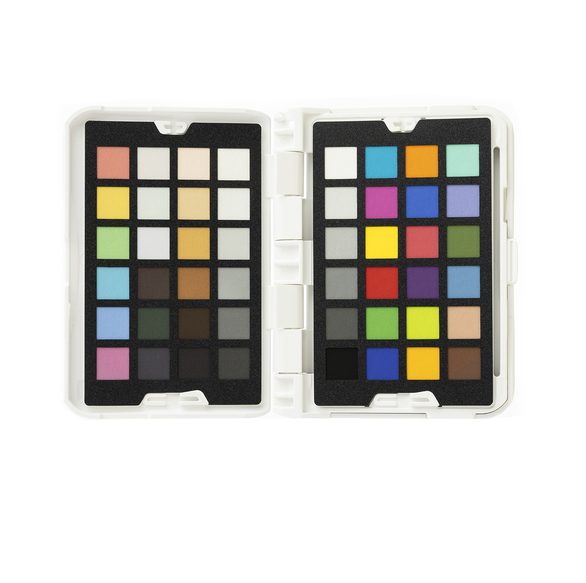
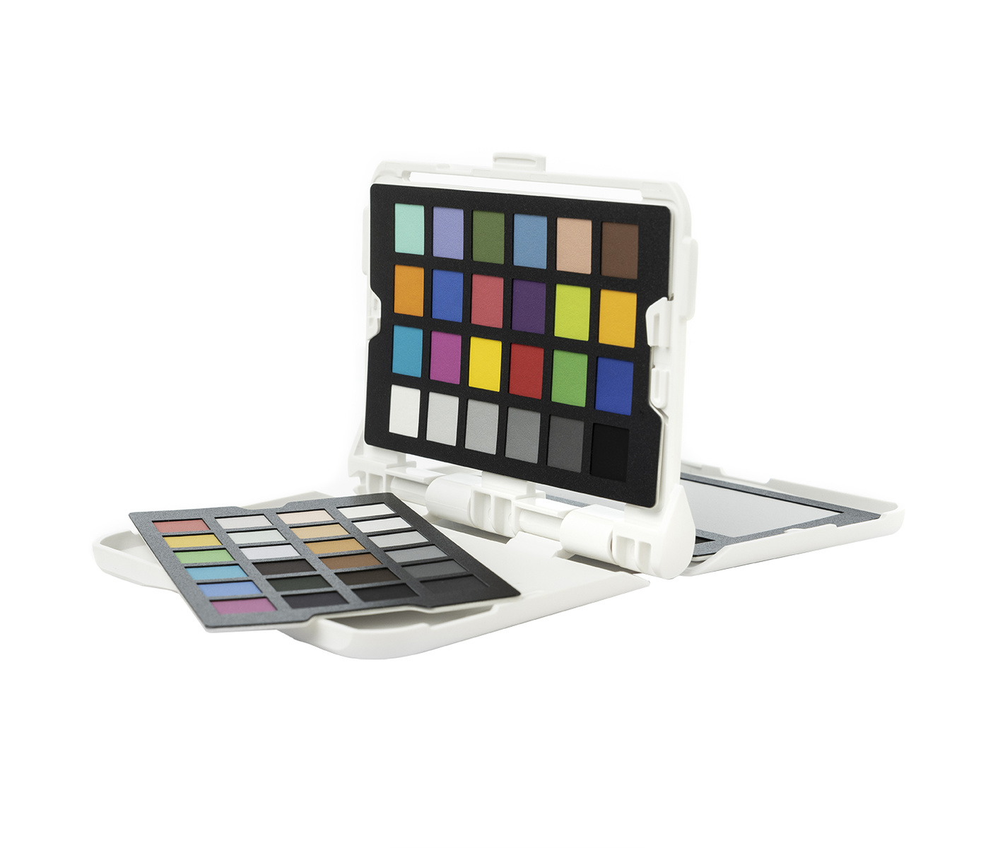
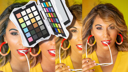
The two color cards include a right card made up of the standard 24 colors, all falling within the sRGB color gamut, and the left card made up of a variety of specific use colors. This left card includes six medium saturation colors, RGBCMY. Three near-white and three near-black tones help to improve tint and tone correction across a wider dynamic range. Also included are six additional skin tones, making for a total of eight across both cards. This is especially helpful for portrait and event photography.
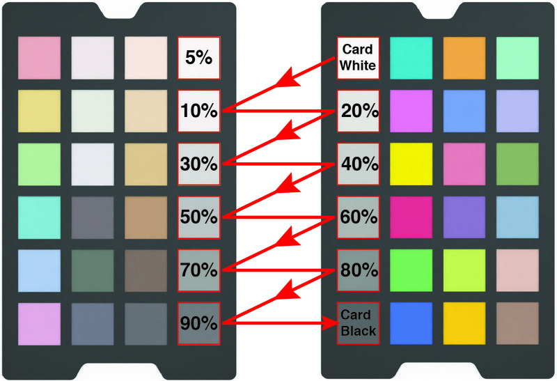
As you can see in the image above, each card also has six grayscale squares, each in varying increments. The standard color card on the right goes from card white to card black in 20% step, while the left card includes a 5% gray square and 5 squares in 10% steps aligned off the right card in a zigzag pattern.
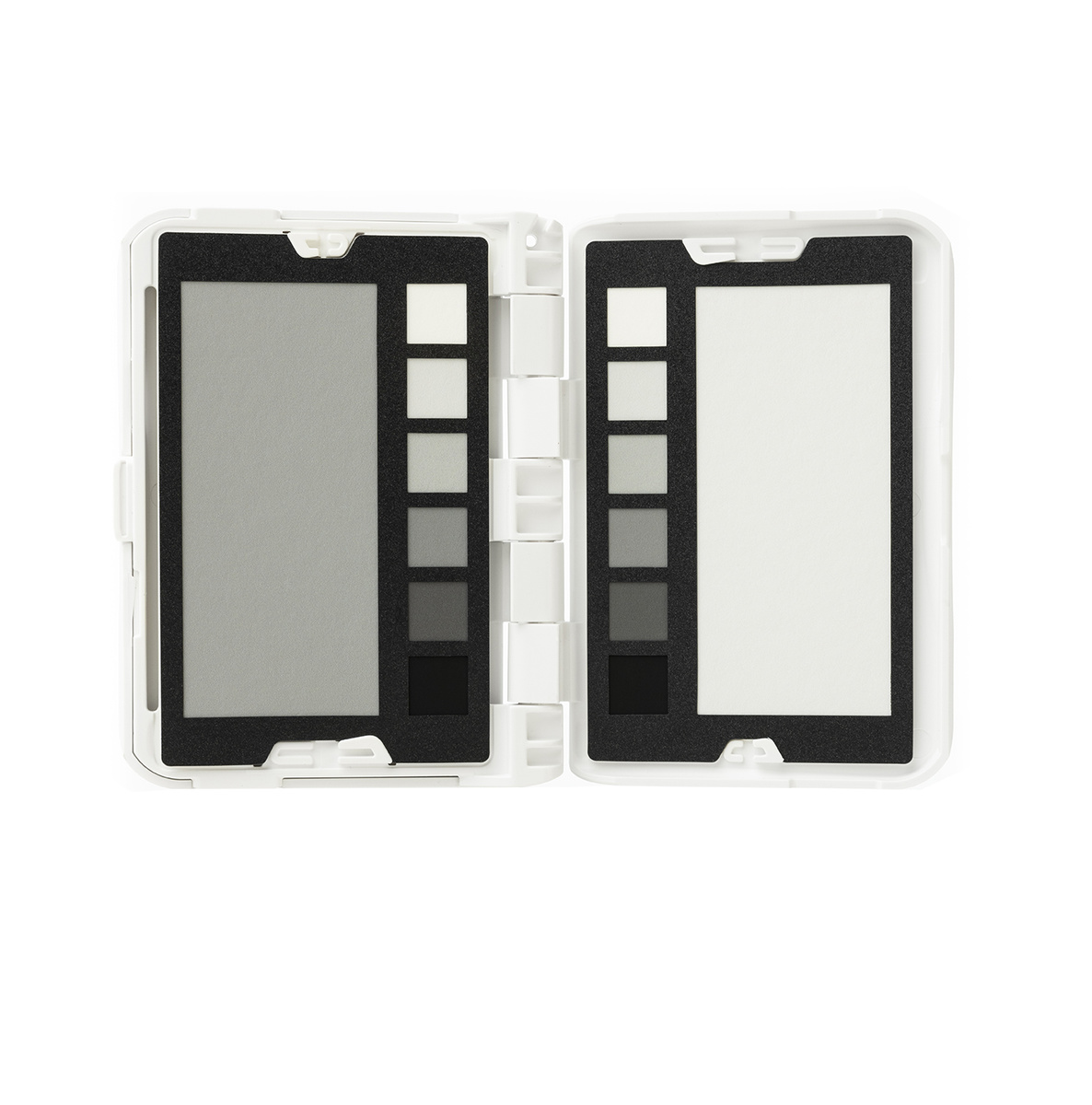
The two grayscale cards consist of one with a large almost full-size 50% grayscale swatch, with six white to black squares in 20% steps and the second with a large 18% grayscale swatch with the same six black to white squares again in 20% steps.
All four cards are well made with the printed paper sandwiched between stiffer materials for durability. They can easily be removed from the case, meaning it will be simple to replace any that might get damaged but also to swap in any different cards that might later be released. There is no official announcement, but it seems that Datacolor is looking into producing other card sets for things like video-specific uses. Most photographers will not need all four cards all of the time, and it would be nice to arrange the second set of cards based on individual needs. Additionally, a lot of photographers are doing both stills and video, so the possibility of buying additional cards for more versatility will appeal to a lot more people, myself included. So, Datacolor, please make this a reality.
The plastic case itself is a bifold design roughly the size of a standard index card. It opens like a book with the push of a button along the side. In its delivered configuration, opening it to the left opens to the two color cards, while opening it to the right shows the two grayscale cards. The hinge opens smoothly but closes with a kind of click, allowing it to hold various positions. This makes sense from a usage standpoint but has an unpleasant feel and sounds almost like breaking plastic. Once you realize it isn't breaking, it is fine. Maybe it will loosen up over time, but I wish it was smoother in general.
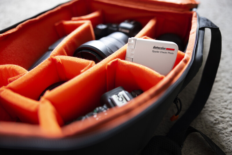
Overall, it feels well made and durable. I would not worry about having it in a pocket or occasionally dropping it during use. It does come with a lanyard for helping prevent said drops. Its smaller size makes it much more likely for the average photographer out on a job to keep it in their bag and use it as necessary. The bi-fold design, while making it smaller, also helps to keep the cards protected and clean, something that is essential for good color accuracy, so much so that when you open the package, the first thing you see is a card reminding you not to touch the printed squares so as not to leave fingerprints. They probably should have made it a sticker on the back so when I hand it to assistants or models, I don't have to remind them.
How To Use It
The reference chart is pretty straightforward: place it in your shot and take a picture of it. Datacolor recommends not filling the frame but cropping in later in post to take advantage of the sweet spot of the lens. They also make a note to keep the camera parallel with the chart, but if you're a little off, it is easy enough to fix in post.
Upon release, the Checkr software works with Adobe Lightroom, Adobe Photoshop, Adobe Camera Raw, and Hasselblad Phocus. Datacolor says each editing program uses different profiles and presets that have to be developed along with the software company. So, I hope this means they are looking into or working on adding more options like Capture One in the future.
Once you are ready to calibrate, you have a couple of options depending on the software you choose. This will mostly depend on your own personal workflow and what makes the most sense in integrating this process into that workflow. The Checkr software will launch from within Lightroom but needs to be launched manually if you use Photoshop or ACR.

After opening or importing the image in your editing software, you’ll want to rotate and crop it so that the Spyder Checkr fills the frame and is squared off. Using the eyedropper tool, you have to sample one of the light to medium gray squares to get a white balance measurement. Again, Datacolor recommends the 20% grey square located below the card white square as a starting point.
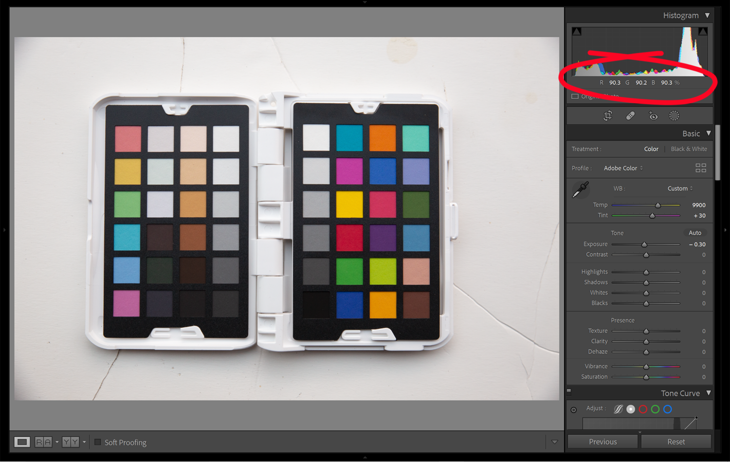

Next, you adjust the image's overall exposure. In Lightroom, adjust the exposure slider until the card white square reads about 90%, then adjust the black slider until the card black square reads roughly 4%. The process is pretty much the same if you are using ACR, except you’ll want to get the white values to RGB 230, 230, 230 and the black values at about RGB 10, 10, 10.
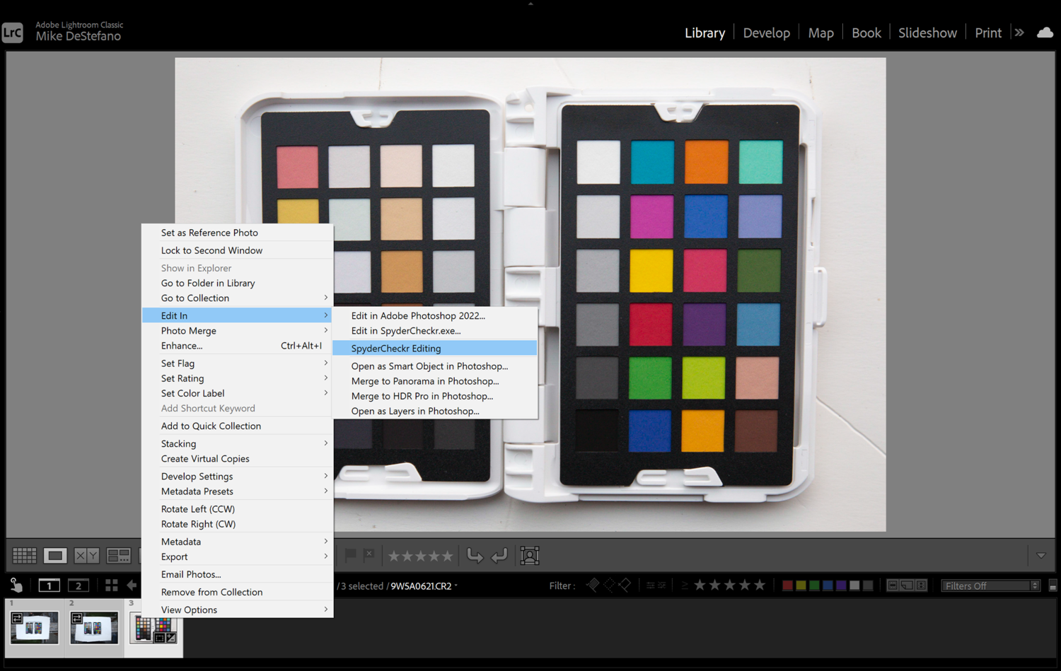
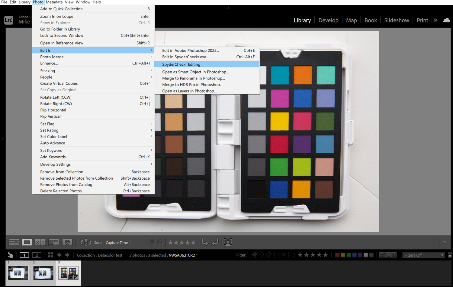
From there, you can launch the Checkr software from within Lightroom by going to the “Edit Menu," selecting “Edit In”, then “Spyder Checkr Editing.” My preferred way is simply by right-clicking, “Edit In,” “Spyder Checkr Editing." Make sure to select “Edit a Copy with Lightroom Presets” so that it creates a TIFF file with your adjustments.
If using Photoshop or ACR, all you have to do is save the file as a 16-bit TIFF file, then manually launch the Checkr software and open the file you just saved.
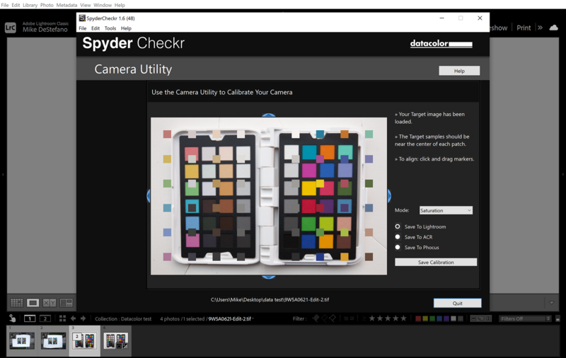
Once you have the image in the Checkr software, there will be a matching set of smaller color squares superimposed above the image. By dragging the corners or sides, you need to line up the smaller squares so that they align with your image and are roughly centered on each square.
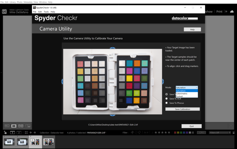
There are three rendering modes to choose from in the dropdown menu along the left: Colorimetric, Saturation, and Portrait. Datacolor lists Colorimetric as the most accurate reproduction for when color accuracy is most vital. Saturation has a small boost to the saturation for general photography and landscapes. Portrait reduces the saturation, giving the skin tones a more natural look.
The final step is to either save for Lightroom, ACR, or Phocus and click “Save Calibration.” The software will do its calculations and create a new preset that you can then name.
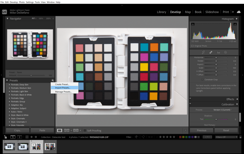
The Checkr Software creates an HSL profile to correct and adjust the colors. To use this new preset in Lightroom, simply go to the preset panel in the develop tab, click “New Preset,” and select “Import Preset.” You could also close Lightroom, and when you reopen it, Lightroom will automatically import any new presets found in your “User Preset” folder. This method may be helpful if you create several new presets so you don't have to import them one at a time.
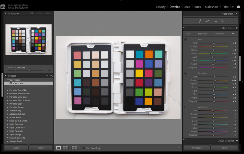
Having the color adjustments done in the HSL panel is excellent because this gives you the most adjustability over the colors of your image. You can easily make tweaks to the presets for personal preferences or adjust the colors even further, which is something I often do when I have mixed lighting conditions in the same image.
Who It Is For
Not every photographer needs to use a color reference tool, and I’m sure many have gone their entire careers never having to. This, of course, doesn't change the fact that for a lot of other photographers, color accuracy is a high priority and essential for their work. Food photographers, product photographers, and most advertising photographers all often are required by the client to get near-perfect reproduction of color. On many of my commercial jobs, I have been provided with specific color pantones that a product must match in order to be compliant with an ad campaign or a client's branding.
That being said, once you learn the process and find a good method to incorporate it into your workflow, I believe a lot more photographers could benefit from using a device like the Spyder Checkr. Creating camera or lens profiles can reduce the amount of color correction on larger shoots, even for portrait sessions or events. I often use one when shooting events to make correcting images shot in differing lighting conditions easier in post.
To really get the most out of your image's color, you need to do more than just white balance the image. If that is all you are doing, you are probably missing out on a lot of color depth in those images. A color reference card provides you with accurate true color values without any bias from the user. We don't all see color the same, and we inherently lean towards either warmer or cooler colors individually. When I first started as a photographer, I worked as a post-production artist for larger photographers in the Boston area. I learned quickly that some of my clients preferred their edits to be warmer and others cooler. If I edited everything based on my own preferences, which have changed over the years, some of my clients wouldn't have been happy.
A color reference tool gives you the truest color base to start from, correcting any tints or discrepancies from a sensor, lens, or any lighting scenario. From there, you can make your personal adjustments to meet your own photographic style or vision.
What I Like
- Smaller size and compact design
- Versatility
- Price
What I Didn't Like
- Stiff hinge
- Lack of alternate cards at launch
Datacolor's new Spyder Checkr Photo is now available.
Join the Fstoppers community for free
-
Post comments and join in the discussions
-
Browse the site ad-free
-
Share your work and get featured in the community
-
Compete in the photo contests for fun and prizes
11 Comments
Sooo, it doesn't even have an option to produce an ICC profile to use for Capture One?
That can't be right, I must be missing something.
Unfortunately not at release. The older versions do and they say they are working to expand to other programs. Since each program handles color profiles differently they have to work with each company to make it happen.
Same basic product as Calibrite's ColorChecker Passport Photo2, which has been around for many years as an X-rite product. There are one or two much cheaper competitors that I'd love to see reviewed.
P.S.: I assumed this would make a .dcp profile, but it appears not to. Useless. DxO PhotoLab can use ICC and .dcp profiles but not HSL "profiles".
I have both and while you are correct Data color's has a lot more color options for building a more accurate profile. Especially in the skin tones. Since this model is being advertised as a photo product X-rite works better for video calibrations.
After using both if you're using Lightroom or ACR I prefer the data color software over the x-rite.
What have they updated? looks exactly like the one I have been using for a decade (except it's in white)
It sounds like the one you have been using is made by a different company, X-rite.
yes, exactly
Well, it is an upgrade for anyone who has been using Datacolors older models and is already familiar with their software.
That being said as I mentioned above I own both and I prefer the data color over the x-rite. It has a lot more colors, especially skin tones for the software to build its profiles from and I prefer the HSL profiles.
If you have the x-rite then its probably not worth getting, its works better for video and if you use capture one currently.
thanks for this. yes I'm a capture one user
Each time I photograph hockey games in indoor arenas, I struggle to get proper skintones. Even if our arena is lit by LED lights and not old high pressure sodium lights. I thought of getting a reference card, but I wasn't sure enough before spending $100. Would that help in that situation?
My guess is yes. I'm not a sports photog, but my recollection of hockey arenas is that the rinks are pretty evenly and consistency lit. Shoot a reference card at the side of the rink, use it to set an in-camera white balance, then, before processing, generate a custom camera profile and apply that in your RAW processor of choice. I find this very helpful in my event work. It's not bullet-proof, though. Sometimes I find PhotoLab's default profile for my camera yields better skin tones, even if other colors look better with the custom profile. Maybe I need a card with more color patches...