More Posts in: Architectural Photography
A few shots from the winter of 2025. The last one was inside of the Acropolis Museum. (Unfortunately, I could get everyone to walk exactly where I wanted them to. hahaha)
For iPhone users - a new version of Bluristic has dropped (v1.8) which offers new features and significant improvements in stability & useability.
I am interested in learning Macro/Closeup photography and understanding that Focus Bracketing is a good part of the process, I thought I would give focus stacking a try.
Another visit to our garden using a vintage lens (Canon FD 50mm f/1.4) on my Canon R5.
NOTE: With this lens the minimum focusing distance is 18" at which point you have 1/4" depth of field.


5 Comments
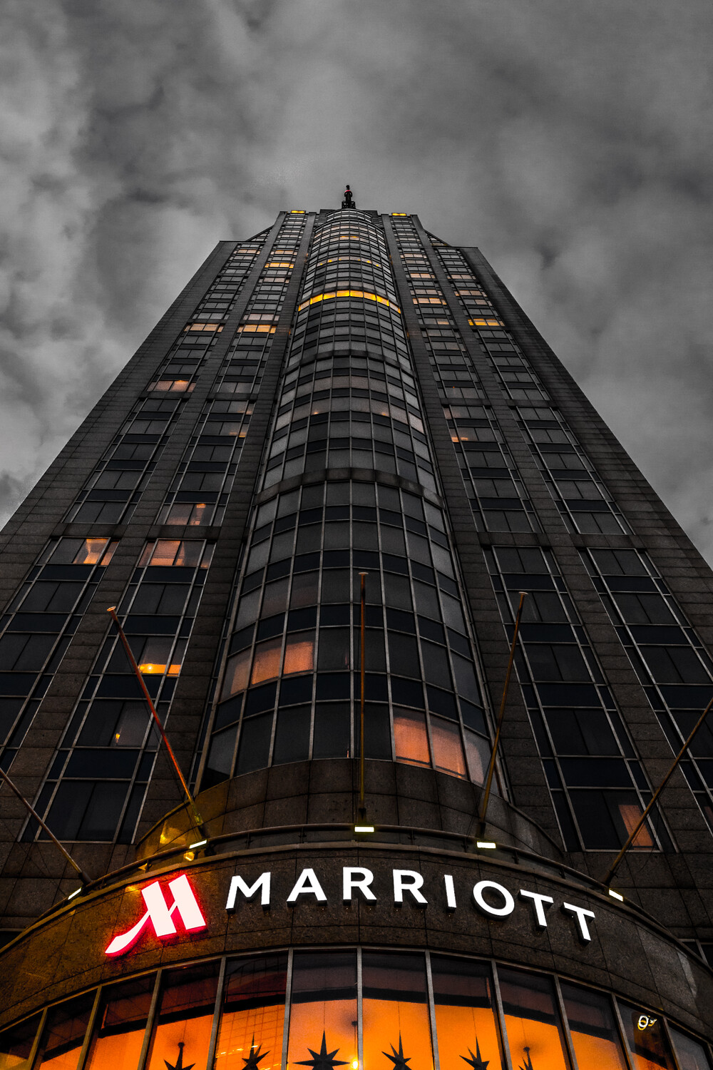
Interesting shot - remember that symmetry is very important when working on single point perspectives like this. it looks like its a degree or so off. I wonder what it would look like if there was a little more brightness coming in off of the windows. would it still look kind of dark and foreboding? regardless, keep it up!
Yes, thanks for you comment! I saw that when, looking at it in LR.
The building looks off a bit. Also before criticizing its important for your audience to know what was the goal of this image. Like was it commercial image or just a travel photography? For example as a Marriott photographer I can say that Marriott marketing dep definitely won't accept this image, because the color tones gives negative feelings likein horor movies ) but for travel photography it's an interesting image.
It wasn't an commercial image, but a travel image like you said.
Yeah, the color is a bit 'dark', but that was on purpose because the color was terrible in the original image.
But you're an photographer for Marriott? Nice!
Gotham City is interesting, the question is do you want to make art or do you want to make money. The late great David Collins said the person with the check book is always right.