help me with your critique!!
so I am new to architectural photography but not photography in general, so I want you guys to give me some valuable feedback, (and Image of the founders memorial in AbuDhabi ,UAE)
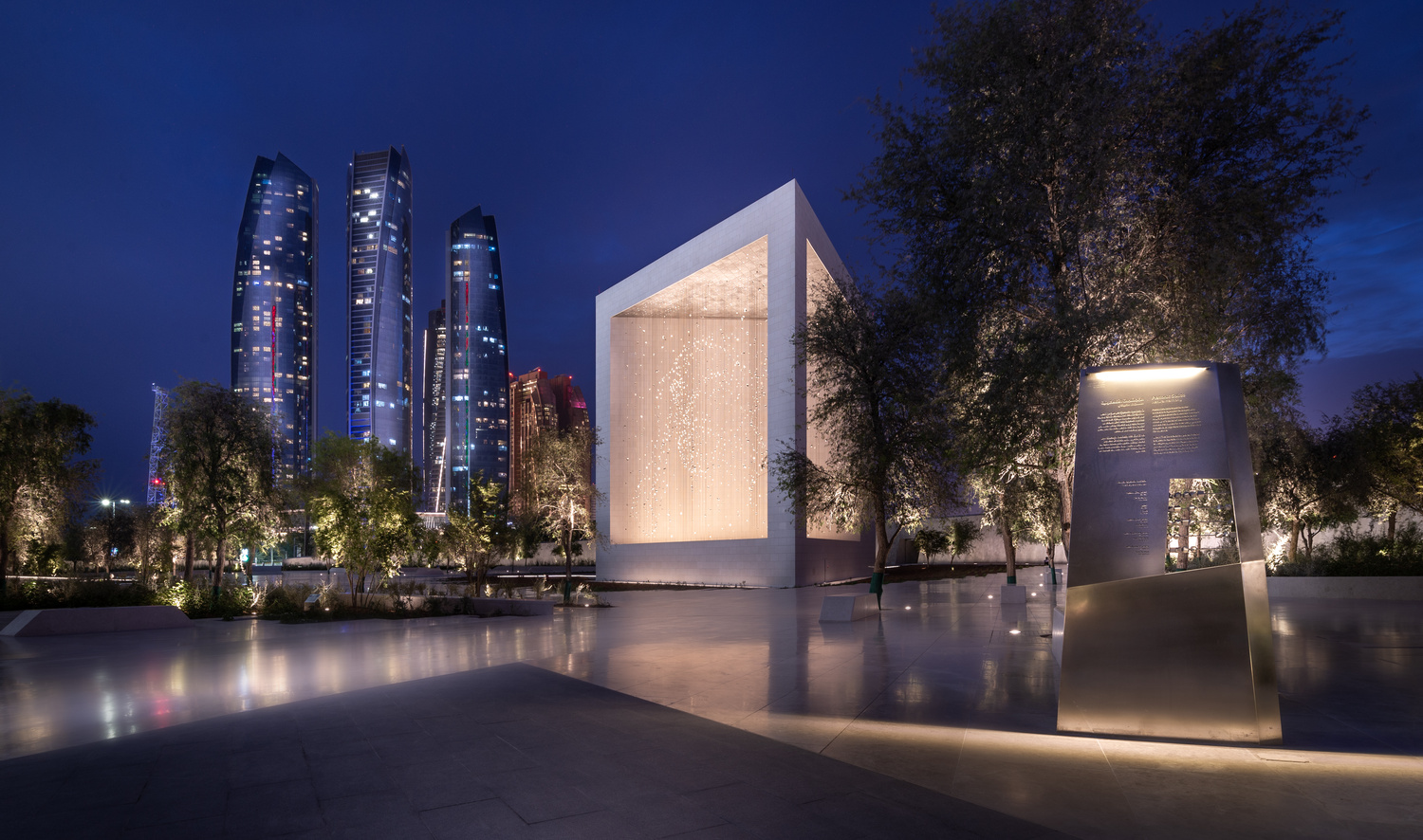

so I am new to architectural photography but not photography in general, so I want you guys to give me some valuable feedback, (and Image of the founders memorial in AbuDhabi ,UAE)
A few shots from the winter of 2025. The last one was inside of the Acropolis Museum. (Unfortunately, I could get everyone to walk exactly where I wanted them to. hahaha)


For iPhone users - a new version of Bluristic has dropped (v1.8) which offers new features and significant improvements in stability & useability.
I am interested in learning Macro/Closeup photography and understanding that Focus Bracketing is a good part of the process, I thought I would give focus stacking a try.
Another visit to our garden using a vintage lens (Canon FD 50mm f/1.4) on my Canon R5. NOTE: With this lens the minimum focusing distance is 18" at which point you have 1/4" depth of field.


11 Comments
Help with what? This is beautiful!
I'm no expert but maybe crop in a little more and or try a different sky
you mean more panoramic crop?
I mean, I can see your focus on the monument and the cityscape. The sky is not too interesting and I think a more panoramic crop might be cool. Just my opinion. It is a solid photo overall though.
I think it's a great shot. If i wanted to pick something, assuming the center sculpture is the intended subject, the right side being covered by the trees is a bit off-putting. Viewers who are interested in that particular sculpture are going to want to know what the right side looks like and if it's basically the same as the left. With the amount of tree cover, that's difficult. A little less cover would result in a shot where you can see enough that it's assumed to have the same features as the rest of the facade and that would be good enough.
Thanks for sharing it!
Agree with you Rob, this high frequency textured object ( tree) is too much distracting from the viewer from the main sculpture, that is what I thought while retouching the photo, thanks for the feedback.
I like it, but it looks like it's either got some diffraction from too small of an f-stop, or it needs a tad more sharpening.
Love the lighting and feel of the image but for my taste, I find it a little loose. The smaller object on the right for me is distracting. if you moved in on the buildings and the monument I think it would also solve your problem with the trees on the right. Look forward to seeing more of your work.
Thanks for the feedback :)
I agree with most of the others. I like the light and clarity of the image. But the composition is a bit ambiguous. There are 3 main subjects in the photo. The text-thing on the right might not be as important as the square. The city-scape in the background is good for context and very cool! Alot of clients these days would probably want some people, but I lke it more without!
nice ps work