Constructive Criticism
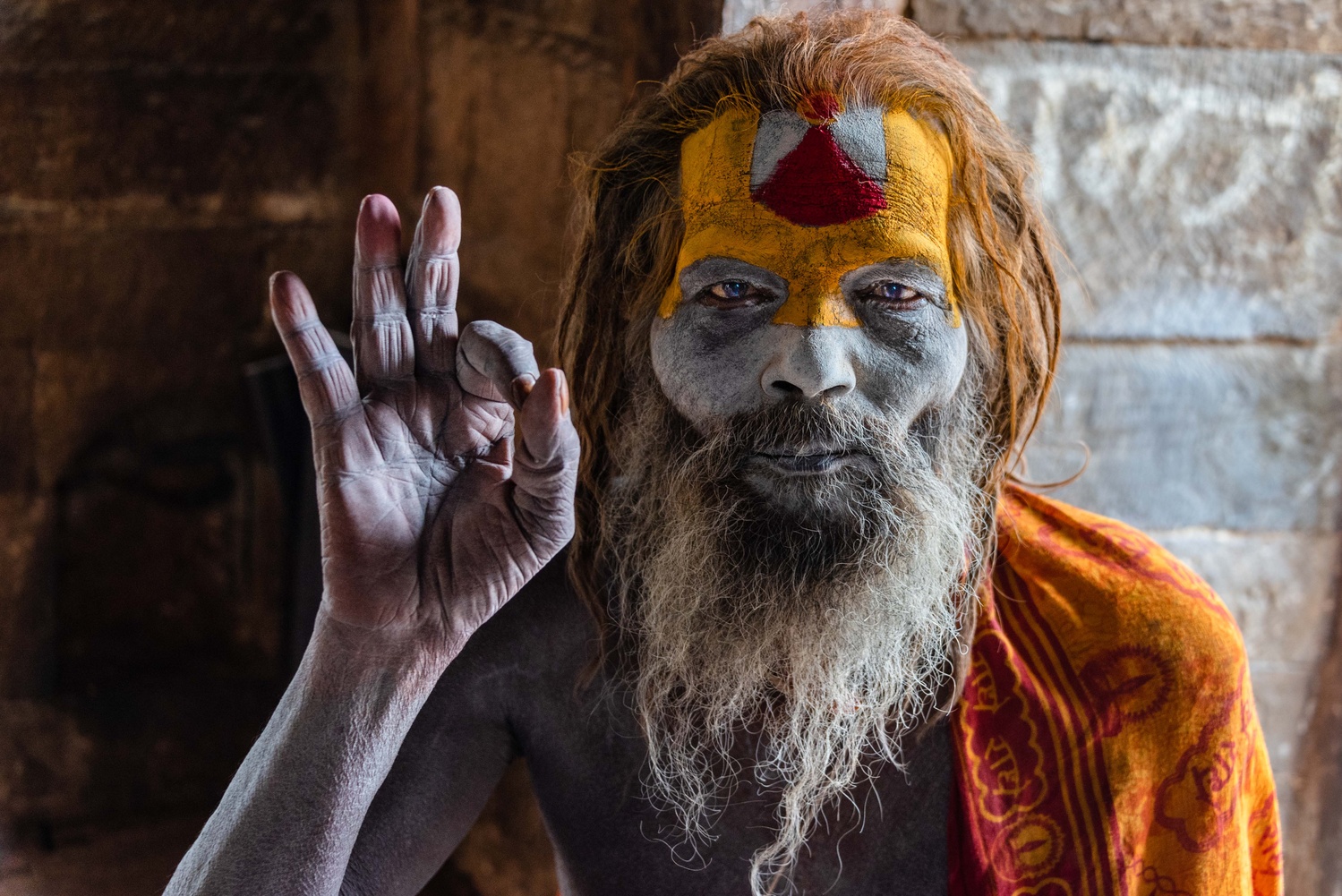
Hi all, I've submitted a couple images to recent Critique the Community posts, but this is my first foray into the discussion boards. I'd love to get some criticism on this portrtait of a Sadhu (Hindu holy man) taken in Nepal. I'm not generally a portrait photographer, and this is obviously not as refined as a studio shot, but I think (hope?) that lends it some level of authenticity and works for this particular subject.
I'm happy with the final photo, but also interested in suggestions for post processing. I'm still pretty new to LR and PS, and even newer to using them for portraiture.


8 Comments
I think this is really nice. The crop feels just ever so slightly off; I'm not sure if it would be better to get rid of some of the dark space to the left of his hand or not. The transition from the light part of the wall to the dark part just above his head is a little distracting. But really, this is very nice.
Thanks Sennia! Yeah, you may be right - a bit unbalanced to the right side of the frame. It was initially more centered, but there was a much brighter portion on the right side where there is an open archway that was distracting. Perhaps I'll go back and play with it more to see if bringing the crop in from the left helps.
I agree that the transition from light to dark is a bit distracting too. I'm not sure repositioning would have helped since it was a very tight space (there is another window/opening just to the left of where the frame cuts off), and moving into the shadows I would have lost the dynamic lighting on his face and hand. Can't win them all I suppose.
Thanks again for the feedback!
This is pretty great. I think the colors are a bit much. Maybe tone them back to give it a more realistic sense because its a little animated. Also, did you change the color of the eyes?
Thanks for the feedback Richard! I'll try toning the colors back and see how it looks. No color changes, but I did pull up the shadows around the eyes significantly and add saturation.
I think pulling up the shadows around the eyes wasn't a bad choice. I'm just seeing blue in the eyes that I thought was colored in. Is that because the light was blue?
Hmmm... the shadows might have created some blue light even though it was midday. On closer look, it seems like that might have caused part of the pupils to also turn blue when I pulled up the shadows and saturated the eyes. Is that what you were referring to?
As I said, I'm new to editing so I don't quite have the eye for that kind of detail yet. Thanks again for the comments!
Hi Josh! I think it's a great shot as is. You're very modest.
I'm no good with people shots myself, but interested in composition, so I was struck by Sennia Kyle's comment. I understand her reasoning, but personally I think his hand gesture in the void is beautiful, so I'd crop a little off the RIGHT side, if anything to emphasise it, and reduce the impact of that (possibly) over-bright area. This also makes the image more "off-centre", something I prefer generally.
I've fiddled with that light-to-dark transition and saturation as well in my edit, which having said all this, is not necessarily any improvement on your original!
I think the bluish lights in his eyes add mystery - is it a light from his soul? I love the effect!
Just my two bob's worth, and I'm ready to be shot down.
Well done. Beautiful.
Thank you so much for the kind words! I really like your edit - looks like you pulled some of the shadows/blacks down in his face in addition to easing the background transition from light to dark. I think the colors look more realistic too with a bit of desaturation, as all of you have said.
That's an interesting point about the crop, and not one I would have thought of. Obviously a personal preference, and I'm honestly not sure which I like more. I think the key here is to make a clear artistic choice, which my initial crop lacked by being *just slightly* off center making it unbalanced. I'll have to keep working on it.
Thanks again for the comments and critique!