Finally making a portfolio, feedback?
Hi! So, I've never asked for critiques before, figured this place was great to try, as some of the images here are outstanding. I can subjectively compare my work to others, but I've literally never gotten any feedback from other photographers. Just looking to see if I'm doing this right! I don't take it all so seriously, but I do enjoy it. Feel free to pick apart the rest of my work as well. Or don't. :)
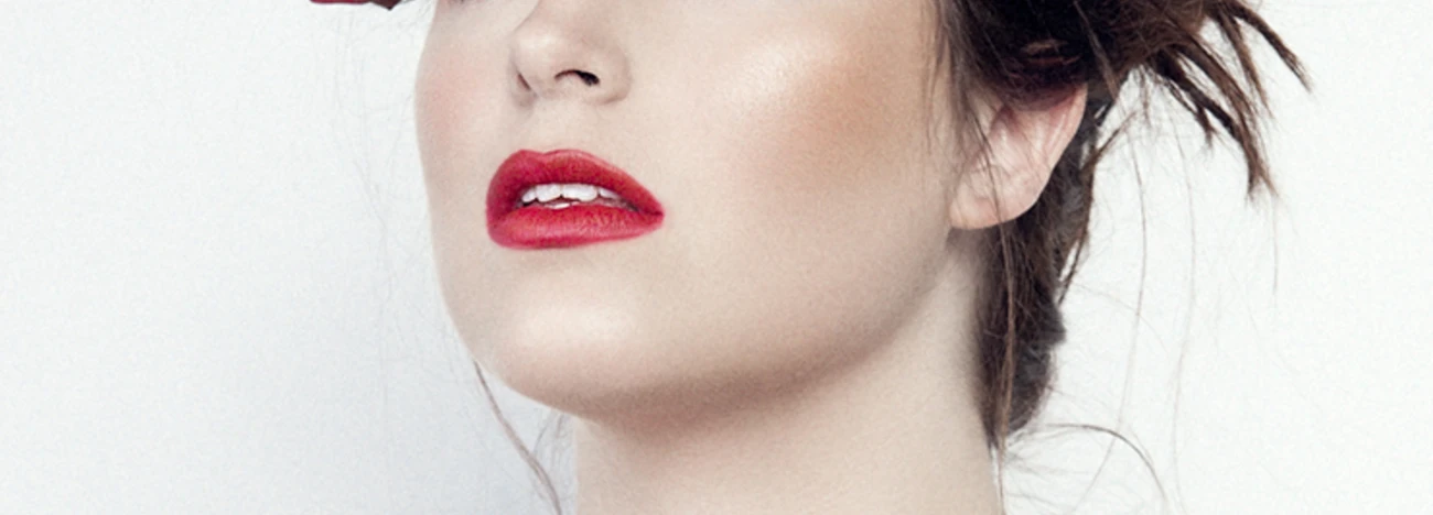
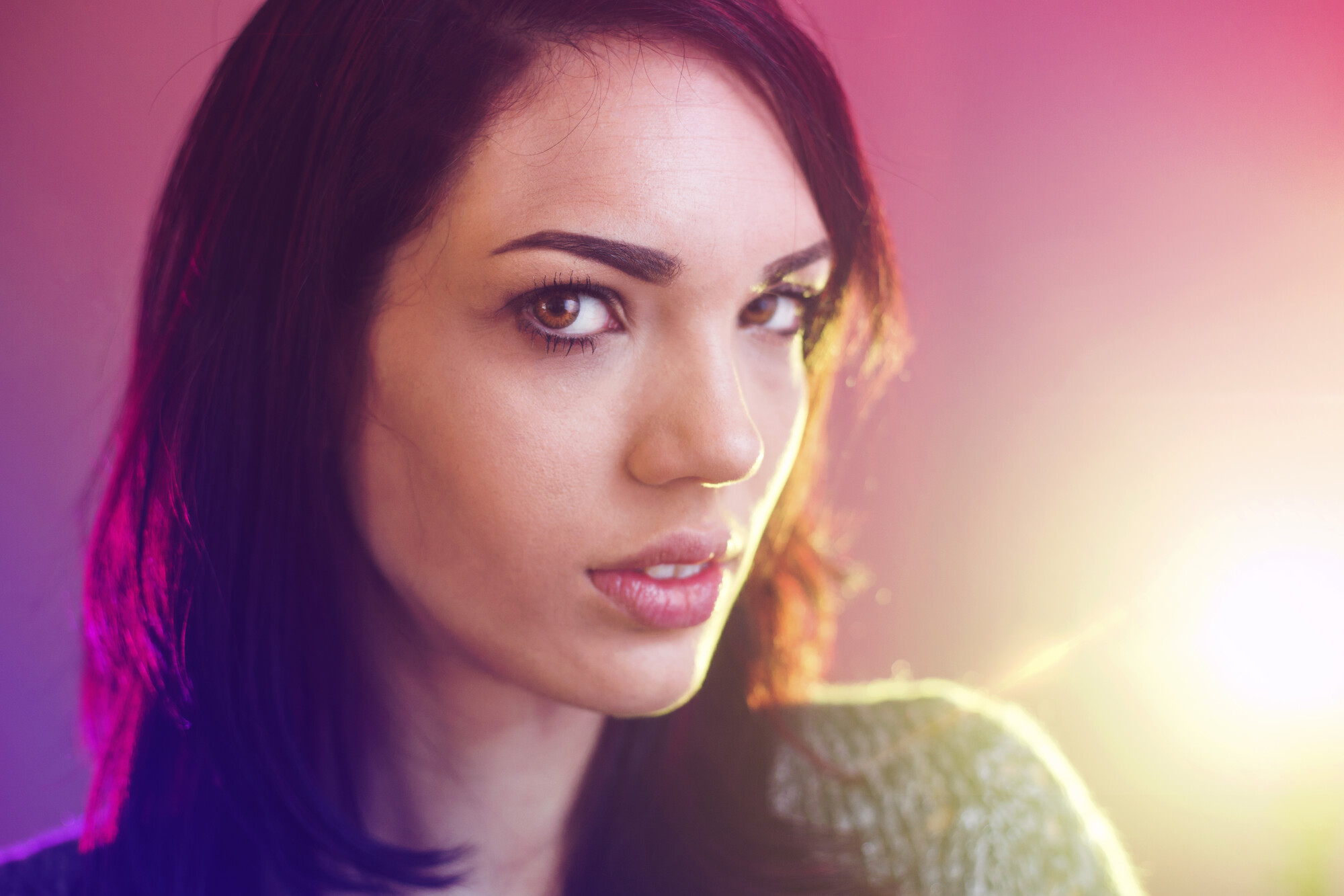
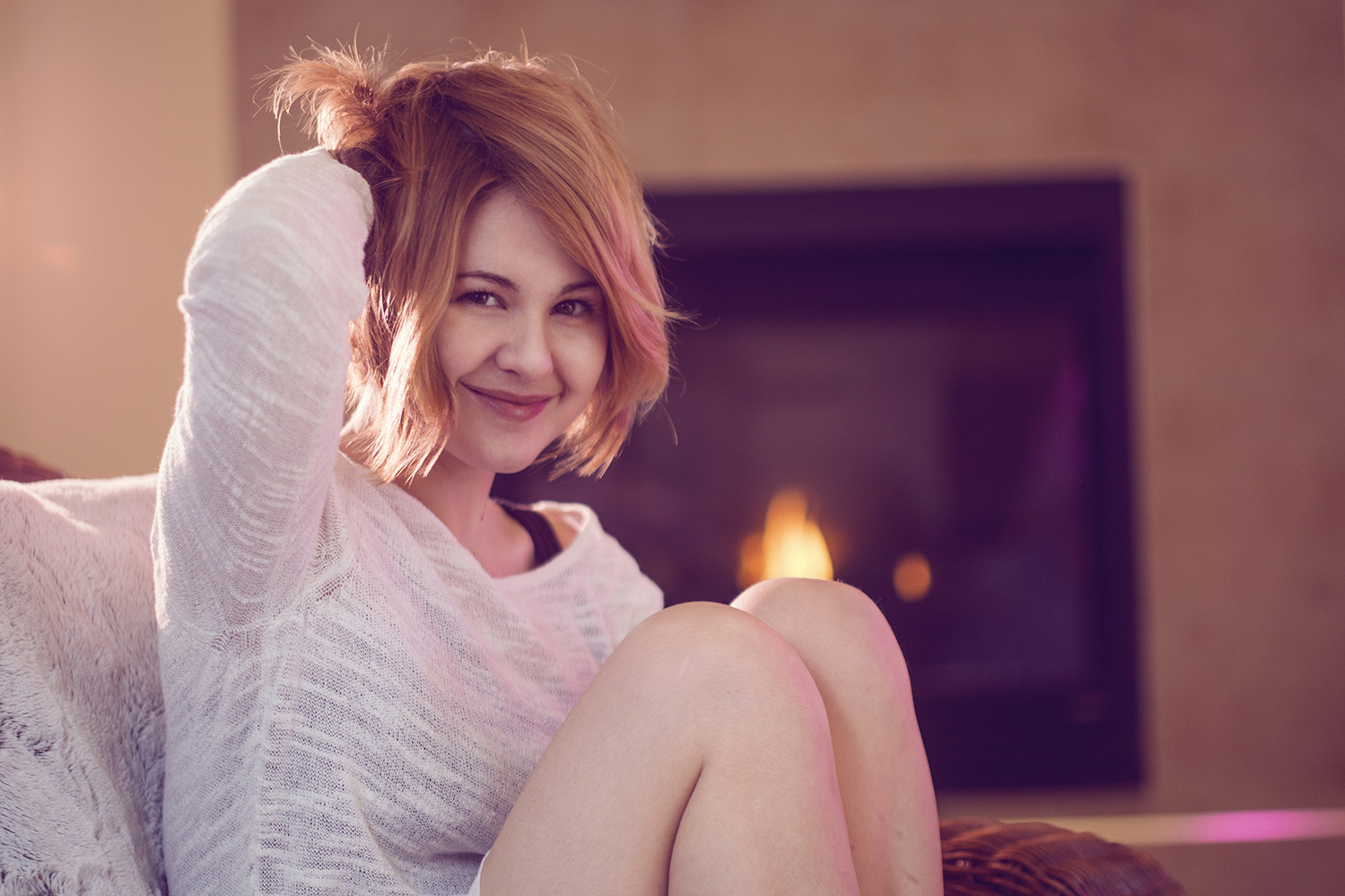
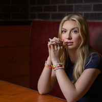
These were all shot with only Canon speedlites. Octabox, umbrellas, etc. Actually used HSS on most of them. Anyone who wants to discuss that further with me is MORE than welcome to! Opinions on it?


4 Comments
I hope these feedback can help you grow as an artist.
Technical - Great way of using gels on both the images. I love the mix of colors that you delivered but the images are a bit flat. What I suggest is going down 1 stop towards under expose. I like the bokeh effect that your using on the images but there's a miss on focusing. Try to keep your focus on the eye, and if your dealing with a pair of eyes try to keep them both focus. I can tell on your first image that you went all the way down to the lowest aperture you can achieve with the lens you have. If you focus on 1 eye on a portrait it makes the subject look deformed. It works sometimes but most of the time it doesn't. Try googling Martin Schoeller, you can see he focuses on both eyes while using the lowest aperture. The images also can use more shadows.
Composition - The composition is great on both images. I can definitely tell that you either use the grid or you know how to lay out your images. I do have a critique on the second image. The background is a bit distracting. If the subject is a bit to the left and the background is a bit shifted then it might work. Try to get your background straight as well. These can ruin your image if you don't notice.
Impact - On the first image, the subject has great emotions. I would love to see if the subject was looking at something else instead. If your gonna have the subject look at the camera then I would suggest just turning her head slightly looking at the camera. The head turn that she's doing is too much. The second image I can tell that your telling her to be more fun and playful. This works if she had both hands up, the one hand thing looks forced. Maybe if she had one up but she doesn't smile or if it's 2 arms up then it might work. I feel that you need more on the image like more body or switching the hands. But I definitely can say that the background is throwing me off.
Overall the images are good but it can definitely use more tweaks. I also suggest to play with more colors to see which ones work well together and which ones don't. Yes there's a color wheel but sometimes it's better to experiment than looking at the wheel. The colors can be base on your images and style you produce. You never know unless you try them out.
This is merely a feedback coming from someone that cares. I hope you can take this as constructive criticism and use it to better your craft. I hope to see more of your images here. Keep on shooting and mastering those three elements.
Hi Isaac,
I stopped checking this and forgot all about it, but your feedback is very much appreciated. I've been shooting more recently, and everything you mentioned has become more prominent in my process. Thanks a ton for the drawn out critique, your work is fantastic!
Glad to help Josh
I completely agree with Everything Isaac said. The only thing I have to add is:
1. On the first image, the eye pull looks weird. Maybe turn her head a little more toward the camera or don't have her look as far to the left.
2. On the second image, I feel as though her face needs more light. How bright the one piece of hair and the fire are is distracting from her face