Introduction
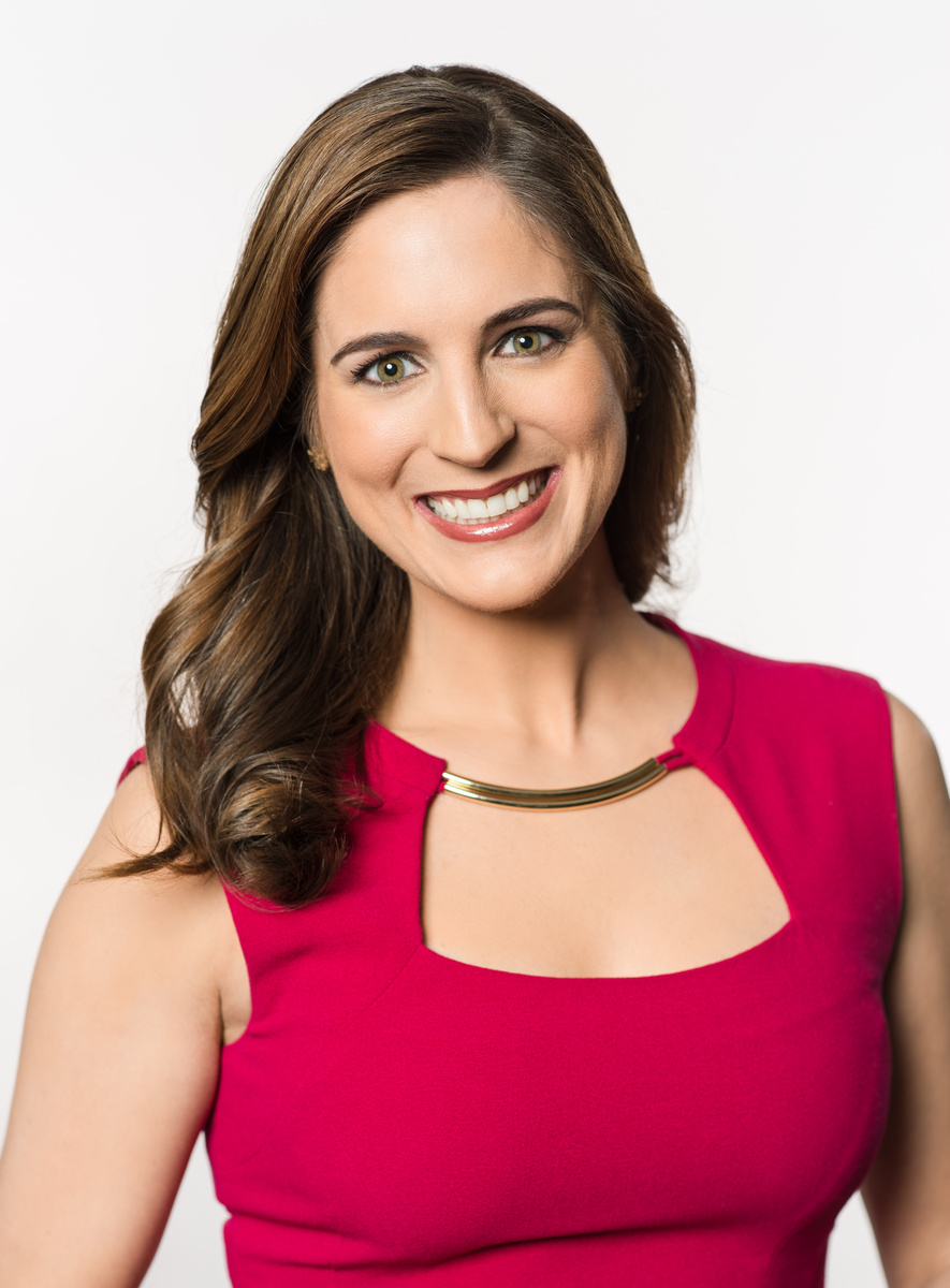
What's up Photogs. I am David in Atlanta, GA. Headshot/Portrait photog. Trying to better my craft everyday. Critiques always welcome. Thanks for the love.
What's up Photogs. I am David in Atlanta, GA. Headshot/Portrait photog. Trying to better my craft everyday. Critiques always welcome. Thanks for the love.
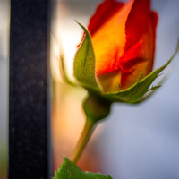
Another visit to our garden using a vintage lens (Canon FD 50mm f/1.4) on my Canon R5. NOTE: With this lens the minimum focusing distance is 18" at which point you have 1/4" depth of field.
Hi all, I was looking for such a group but see that although there are many members there hasn’t been a single post. Is there interest out there in getting this group going?
I thought I would try out my 50 year old lenses: Canon FD 50mm f/1.5 SSC and Canon FD 28mm f/2.8 on my Canon R5 with the use of the appropriate adapter.


These photos were taken just outside of a small town in central Portugal.


6 Comments
Lots of good things here.
The lighting is generally very good with almost perfectly even background light, too. However, there are two lighting issues:
I would have prefered a bit of reflected fill on the shadow side as the shadows on her face and neck are a bit intense, making her look a bit strongly defined for my taste. This exact lighting might have been more suitable for a man but for a lovely young woman, it is too much.
I would have slightly flagged, darkened, the light on her chest, so as to focus the viewer on her pretty face. It is a head-shot after all.
However, all other aspects of the lighting are very good for a Head-Shot. Her hair looks naturally presented, which needed lighting, to get the result, well done and nicely judged. Her gold necklace, thing, is fairly well handled, easy to make it black. If you had put-up a white reflector, camera right, to add the facial fill mentioned aboove, this would also have added more golden sparkle to the necklace but you do get away with it as is.
Her skin is amazing, so whoever made her up did a great job and the edit has been skillfully handled. I think her sclera are too white and as a UK citizen I think her teeth are too white too. They are perfectly even so this might suggest she may have spent a huge fortune on the work of a Beverly Hills Dentist for all I know and her teeth may actually be like that, so this may be a cultural thing but they look unnaturally white from my point of view, which makes this Brit. think over edited.
Composition, you have turned her shoulders slightly off square, which has reduced their apparent breadth, a good thing for a women. She looks as if she is an athlete and her shoulders are pretty broad, so moderating their visual impact was a good move.
Finally, was the smile put on or is it real, I can't be sure.
All together, I think you have shown considerable skill and I congratulate you.
Thank you for the critique. The smile is all hers.
I think you are using one light from up front which is not enough to lighten a woman face. Because that gave her more wrinkles around her mouth.
1- Next time if you have only one light use reflectors and soften the light more.
2- No direct flashes and harsh lights. You could have downed the exposure a little more.
3- pay attention to shadows.
4- I don't like the composition, her shoulders looks wide and her breasts looks too big. You need to slim women in photographs so they look pretty.
5- Watch more portraits videos online and you will learn a lot.
Thanks and good luck.
Thanks for the critique. It is a 4 light setup plus one reflector. 2 background. 1 main with parabolic with softener. 1 hair light. and reflector the light a little on shadow side. Thanks again.
I don't subscribe to the "she is a woman so no shadows" stuff. This was lit perfectly and you truly captured her. I am getting either a realtor or news anchor vibe from her. If I had to offer any critique it would be to be mindful of the catch light creeping into the center of the iris.
Thank you for the post. She is a TV host in Atlanta. A news show called "Hot Topics"