Let's pour in the very technical critiques..... or maybe just say "nice" :-)
Hello guys, I want to get better at what I do. Please give me your comments for me to do so.


Hello guys, I want to get better at what I do. Please give me your comments for me to do so.
Another visit to our garden using a vintage lens (Canon FD 50mm f/1.4) on my Canon R5. NOTE: With this lens the minimum focusing distance is 18" at which point you have 1/4" depth of field.
Hi all, I was looking for such a group but see that although there are many members there hasn’t been a single post. Is there interest out there in getting this group going?
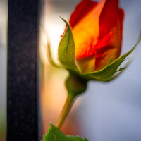
I thought I would try out my 50 year old lenses: Canon FD 50mm f/1.5 SSC and Canon FD 28mm f/2.8 on my Canon R5 with the use of the appropriate adapter.


These photos were taken just outside of a small town in central Portugal.


9 Comments
Hello. I would have cropped the image more tightly and presented in "portrait" orientation. Than the large dark area below the chin is much reduced. With the light, yet somehow undefined background the contrast is too strong in my opinion.
Thanks Veith. i will probably look at a square crop. Also I have noted the contrast, and now I realised I should have used a reflector to reduce the dark area below chin. Much appreciated.
Like the pose, makeup and model. Weak part is hair not tight, maybe photoshop?
Thanks Jeff. Still learning hair treatment in photoshop. I guess I should be quicker with learning then. Hahaha, much grateful.
i like the image but here's a few things i would change.
Clean some stray hairs especially the ones by her left shoulder.
the background has some noticeable banding in the top left of the frame.
no need for watermark, it's distracting.
i would change the background to a very desaturated yellow just to complement the blue hair.
Thanks Mario
Nice shot. Fix the hair strands a little. On her arms. Hanging off the right (her left).
Well noted David. Much appreciated
Nice :-) no i really like this shot. the way she looks, the way you did your lighting..