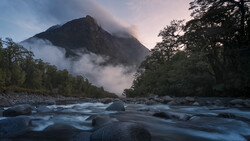
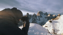
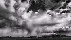
Rarely is a landscape photo finished when you take the shot; most such images require some level of editing to create the finished product. If you are new to landscape photography and interested in improving your work, check out this fantastic video tutorial that discusses some of the most common landscape photography editing mistakes and what you can do to avoid or fix them.
Coming to you from Mark Denney, this excellent video tutorial discusses some of the most common editing mistakes landscape photographers make and how to fix them. No doubt, the most common mistake I see newer landscape photographers make when editing their photos is simply overdoing it, particularly when it comes to color. There is a fine line between a photo that pops and one that is gaudy, and it is always better to err on the doing a little less, particularly with things like the saturation slider. If you find yourself struggling a bit with that, make a habit of using the before/after function (backslash key in Lightroom) to keep tabs on how far you are pushing your edit. Check out the video above for the full rundown from Denney.
And if you really want to dive into landscape photography, check out "Photographing The World 1: Landscape Photography and Post-Processing with Elia Locardi."

5 Comments
This would be a cool subject for an article. Unfortunately, it's just a link to a video.
I find the monitor brightness level and interesting subject. I guess you also have to ask who is the audience? And maybe how do you want the subject seen? A mid level brightness and paying attention to the histogram seems like a good idea for personal viewing and for an image you may want to print. But for online viewing, it may not work. I think it is still a good idea, but how are others viewing your image? If it is for other photographers, and they think like you, then it is probably a good idea. For a wider audience, I'd ask what is the average way they view images? If that average is a fairly bright screen, be it phone, tablet or other computer, then setting your own monitor to a more bright setting might be good. You'll still run into the problem of what you see and what the histogram tells you may differ.
I find your reply interesting as it point to a sign of the times and ignores totally why monitor brightness is important. It’s got little to do with viewing on other devices as you have zero control over that. Instead it had everything to do with printing the image. Having your monitor set correctly is to ensure a good quality print.
A very good video with a set of pretty solid tips. It points to why creating great images is not easy as there are so many pitfalls along the way. Getting everything right at all the stages is a challenge no matter the genre.
Good list. Most difficult one is the crop.
Dark shadows are not as bad as too bright shadows imo (yikes).
And one more thing to add: halos! Those are like a spreading disease. Photo's looking like her's from a distance or very unnatural color edits are a good way to ruin everything.