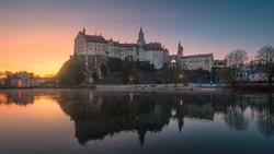
Color grading is a way to refine your photos by adding tonal richness and mood. Lightroom allows you to adjust shadows, midtones, and highlights separately, and here's how to make the most of its capabilities.
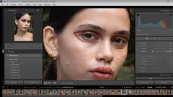
Coming to you from Mickey with Eastern Shore Photo Instruction, this detailed video explores Lightroom’s color grading tool and its practical applications. The tool divides your image into three tonal ranges—shadows, midtones, and highlights. Each tonal range has its own color wheel, where you can adjust hue, saturation, and luminance. You can either use sliders for precision or drag within the graphical interface for a more visual approach. This flexibility lets you target specific areas of your photo, adding depth and balance.
The video demonstrates how blending and balance sliders refine your adjustments. The blending slider smooths transitions between tonal regions, creating a cohesive look. Meanwhile, the balance slider shifts dominance between highlights and shadows, enabling you to tailor the overall effect. These features ensure that your edits don’t look harsh or unnatural, especially when working with subtle tonal shifts.
The video also explains the difference between the color grading tool and the HSL panel. While HSL adjusts colors globally, the color grading tool applies changes based on tonal regions. This distinction makes it better for stylized edits or corrections tied to specific lighting conditions. For instance, you can add warmth to highlights while introducing cooler tones to shadows, creating a more dynamic look. Check out the video above for the full rundown from Mickey.


Join the Fstoppers community for free
-
Post comments and join in the discussions
-
Browse the site ad-free
-
Share your work and get featured in the community
-
Compete in the photo contests for fun and prizes
No comments yet