When the colors in a Lightroom edit look gray, muddy, or garish, the first instinct is to open the color mixer and start pushing hue and saturation around. That approach can stack up 20 adjustments that cancel each other out, and the result often looks no better than the raw file you started with.
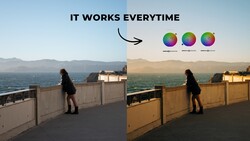
Six seconds and a few steps to the side can separate a file that practically edits itself from one that fights you at every turn. Belinda Shi shows this with two frames shot at the same spot, on the same afternoon, with the same camera. One faces into strong backlight, and the other was taken moments earlier from a different angle. The backlit version is washed out and gray in some areas and harsh in others, with almost no separation between colors. Pulling highlights, opening shadows, and nudging individual color sliders don't rescue it. The earlier frame, under the same light, has richer color and cleaner tonal separation from the start. Treating your position and timing as part of the edit is one of the most practical habits you can build. Shi's golden-hour examples come at it from the other direction: many of her Lightroom panels stay grayed out and untouched. Those edits come down to white balance, an exposure slider or two, a tone curve tweak, and maybe one local adjustment.
Her second decision is about how much usable color your file actually holds. A blown-out sky is pure white, and no amount of highlight recovery or color slider work will put color back into it. At the other end, near-black shadows give you little to work with, and brightening them tends to drag in noise and strange color casts. High-contrast scenes are the hardest, since you end up sacrificing one end or the other. Overcast days are the opposite case. They're easy to expose, but the raw file looks flat and desaturated, and saturation seems like the obvious fix. Running the checks in order, exposure first and contrast second, is a quick filter to apply to every flat file before you go near the color tools. Shi adjusts only the tone curve on her overcast example, and once the tones separate, the colors already in the frame come forward without her touching a single color slider.
Your camera's histogram and highlight warnings are drawn from the JPEG preview it generates, including its picture profile and white balance. A raw file usually holds some highlight headroom beyond where the blinkies start flashing, though the amount varies by camera. A single channel can also clip before the others, often red in a sunset or blue in a bright sky, while the overall histogram still looks safe. Setting a flatter, lower-contrast picture style can make the preview a more honest guide. Shooting a few test frames of a bright sky and pulling them into Lightroom shows how far your own camera can go before detail and color disappear. Automated tools are becoming a bigger part of editing. Lightroom's AI masks, such as Select Subject and Select Sky, and its Adaptive: Color profile can make targeted changes in a click, but they can only work with the information the file contains. Shi brings up AI directly, noting that software makes the adjustment while you still decide what a good result looks like.
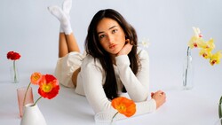
Once exposure and contrast are working, Shi turns to direction. She asks what the photo's story is, how it should feel, and what colors are already present. She describes years of loving muted, moody edits and why that look falls apart on a sunny day full of running kids. Warming and saturating a foggy, rainy scene creates the same mismatch in reverse, because you end up fighting what you captured. Color harmony still has a place in her process, used to refine a result after those questions are answered. From there, she gets into color hierarchy: deciding which colors deserve attention and which should step back. In one flower example, she barely touches the flower itself and quiets the surrounding green instead. She follows that with a frame where a small accent carries an image dominated by a much larger color, and she explains which kinds of presets hold up across different shoots.
Shi's remaining color hierarchy examples, along with how she batch processes similar shots to keep her editing time down, are in the video above.


Join the Fstoppers community for free
-
Post comments and join in the discussions
-
Browse the site ad-free
-
Share your work and get featured in the community
-
Compete in the photo contests for fun and prizes
No comments yet