A sharp subject against a background that's one flat wash of brown can feel lifeless, even when the exposure is spot-on. Lightroom's Point Color tool includes a Variance slider that spreads or squeezes the range of colors in a selected area, and it gives you a fast way to put life back into a backdrop without opening Photoshop.
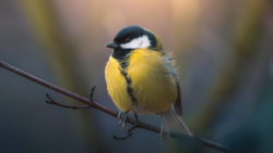
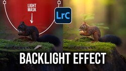
Pushing the Variance slider all the way to the right, on a mask that covers only the background, pulls a surprising amount of color out of an image that looked almost monochrome. Christian Möhrle shows this on a bird photographed at a high ISO, set against soft autumn foliage that had gone dull and even. Before any of that, he runs Denoise at a reduced strength of around 30, since the full-strength AI result can leave the frame looking like plastic. He then crops tight to make the bird appear larger and places it on a composition guideline. His basic adjustments go in a direction that might feel backward: brighter exposure, lifted blacks, softer highlights, and a gentle drop in overall contrast. The flatter base is deliberate, with contrast coming back later through masks that target specific parts of the frame.
The Point Color step starts with a subject mask, inverted so that only the background is affected. Möhrle samples a dark brownish tone with the eyedropper, then opens the range controls and widens the hue range from one end to the other so the selection catches far more of the background. With the selection set, Variance does the heavy lifting. Dragging it left makes the colors more uniform, which is a legitimate look if a calm, single-tone backdrop is what you want. Dragging it right separates the tones, and the background suddenly carries a color variety that suits the bird much better. A small hue shift brings back some autumn warmth, and a touch of luminance brightens the area without piling on more saturation.
A portrait shot against a painted wall with blotchy patches, a product on a mottled tabletop, or a landscape where scattered green and yellow foliage fights for attention can all benefit from pulling Variance down instead of up, unifying the color without cloning or painting. Using Point Color inside a mask lets you shape color in one region while leaving skin tones or a subject untouched. The HSL sliders in the Color Mixer shift every pixel of a hue across the whole frame, while Point Color in a mask confines the change to the area and color range you pick. Think of Variance as a dial for how much color spread a region carries. Lower it where you want calm, such as a busy backdrop behind a face, and raise it where a flat area needs some movement in its color, like an overcast sky or a stretch of out-of-focus water. Brightness and sharpness are the usual tools for directing the eye, and color spread works the same way once you start setting it region by region.
Möhrle treats that Point Color mask as a base rather than a finished background, since its brightness still reads too evenly across the frame. With the background mask still selected, he lowers texture and clarity to soften leftover noise. From there, he stacks linear gradients that darken the bottom and the left edge, each with the subject subtracted so the bird stays untouched. The bottom gradient also drops the whites, which darkens the brighter parts of the background without pushing the shadows any deeper. A large radial gradient, centered outside the frame, adds light from above, and lifted blacks with negative Dehaze in that mask create a soft glow. Since Dehaze affects color as well as contrast, it shifts the background's tones, too. Later passes through the Color Mixer and the Calibration panel rein in overdone oranges and give the bird's blues more presence.
Möhrle's full edit is in the video above.
Join the Fstoppers community for free
-
Post comments and join in the discussions
-
Browse the site ad-free
-
Share your work and get featured in the community
-
Compete in the photo contests for fun and prizes