Warm highlights, cool shadows, and a foreground green cast that has to go: this is the color puzzle behind most sunset landscapes. Getting those tones to feel intentional rather than accidental is the difference between a flat raw file and an image people stop scrolling to look at.
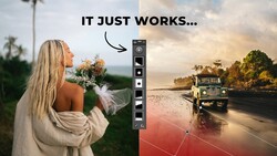
The full walkthrough comes from Christian Möhrle - The Phlog Photography, who takes a heavily cropped wide angle shot and rebuilds it into a warm, glowing scene. Möhrle starts with the basics, switching to the Adobe Landscape profile to lift the base saturation, then raising exposure hard while pulling the highlights back to hold detail in the brightest areas. He lifts the shadows and gently raises the blacks for a softer, lower-contrast look. The white balance push warms the whole frame and starts steering the image toward sunset tones, though it exposes a greenish cast in the foreground water that needs its own fix later.
Masking does the heavy lifting before any color grading begins. Möhrle uses a linear gradient to darken the bright water in the near foreground, then a landscape mask with the water checkbox to target the whole surface, correcting the tint and pushing texture to bring out fine detail. He darkens the too-bright top left corner of the sky with another gradient, adds clarity to give the clouds structure, and drops a large radial gradient over the center to brighten it and pull the eye inward. He keeps a close watch on the histogram near the brighter parts of the sky, staying just short of clipping while building a glow with the blacks and dehaze sliders. These are small, stacked adjustments, each one modest on its own.
The color grading is where the image earns its warmth. In the color mixer, Möhrle drags the yellow hue toward orange, brings down the green hue to kill the cast in the foreground, and nudges the aqua hue to turn the corner water more blue. Then he moves into split toning, warming the highlights with an orange hue and deliberately overdoing the saturation because he likes how it reads. The midtones get tested both warm and cool before he commits to warm, and the shadows go the opposite direction, a cooler tone at low saturation to preserve color contrast across the frame. This warm-highlight, cool-shadow split is the backbone of the whole edit.
Split toning built its reputation in cinema before it ever reached landscape work, and that lineage explains why the technique works the way it does here. Colorists have long pushed highlights toward orange and shadows toward teal to separate a subject from its background and give footage a mood the eye reads instantly. Applying it to a single still frame borrows that same logic: warm and cool tones sitting in different tonal zones create depth that raw color alone can't. The principle carries to almost any scene with a natural warm-to-cool range, sunsets, autumn light, city dusk. Once you start seeing an image as separate tonal layers you can tint independently, you stop chasing a single global white balance and start shaping color with far more control. It's a shift in how you think about a photo, not just a slider you drag.
Möhrle closes with the luminance sliders inside the split toning panel, a step he admits he doesn't reach for often. Dropping shadow and midtone luminance deepens the image where there's room on the left of the histogram, while a slight lift on the highlights brightens the warm tones without blowing out the sky. A blue primary hue shift in the calibration tab and a saturation bump push the vibrance further, and standard detail-panel sharpening with masking finishes the file. Watching him toggle each layer off shows how much the color work carried the transformation. See the entire edit come together, split toning and all, in the video above.



Join the Fstoppers community for free
-
Post comments and join in the discussions
-
Browse the site ad-free
-
Share your work and get featured in the community
-
Compete in the photo contests for fun and prizes
No comments yet