
We've planned for the aurora and captured a ton of images in the previous episode. We've left the arctic and are back at home under the soft glow of our calibrated screen. It's time to process these babies. Be aware that there's advanced editing stuff ahead. If this goes straight above your head, I recommend that you stick with processing in Lightroom until you've got that under control. We have a lot to cover, so let's get started.
The Fine Art Approach
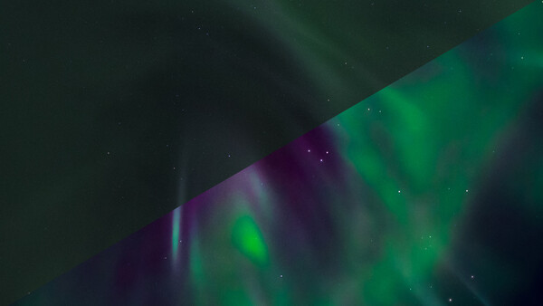
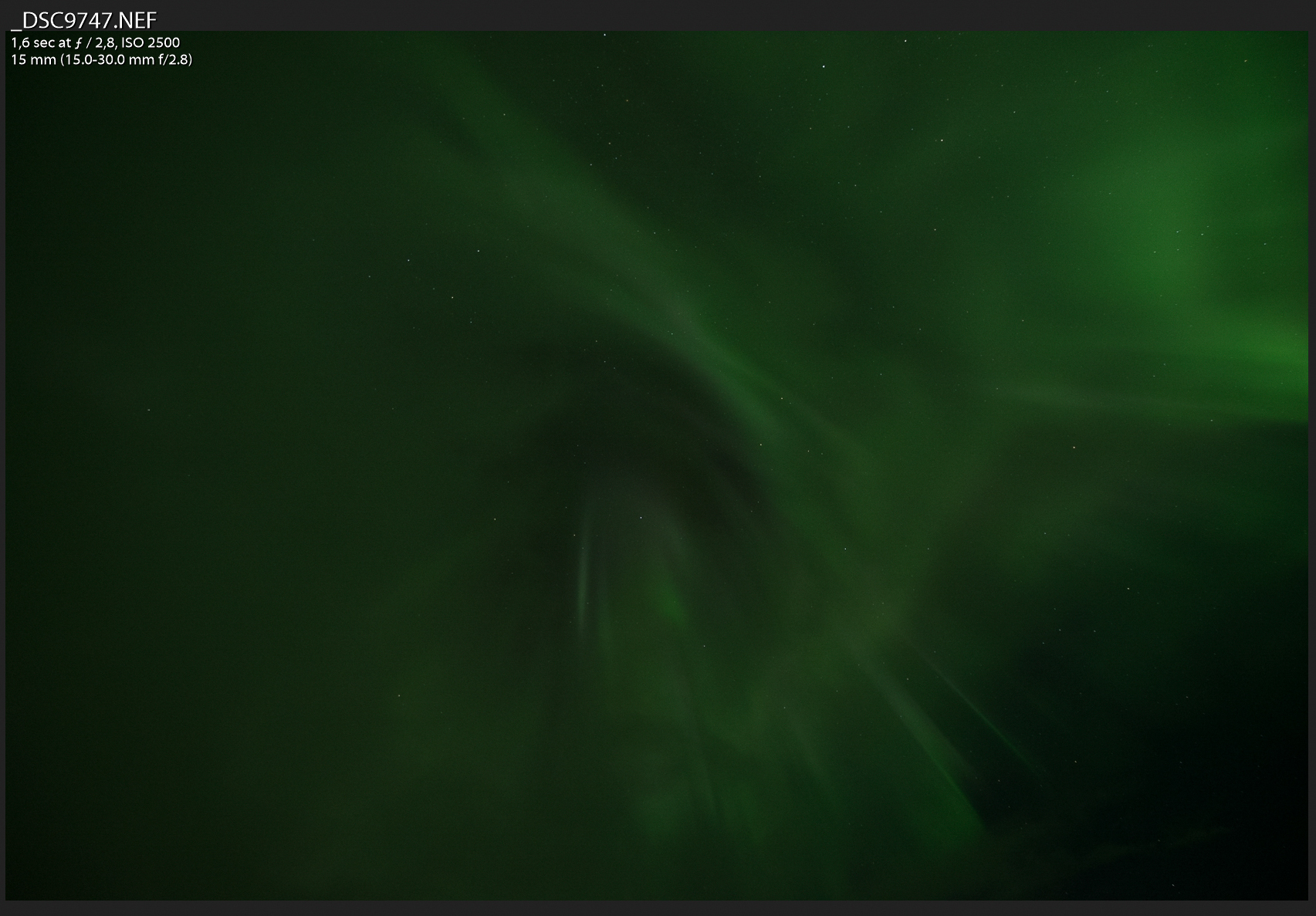
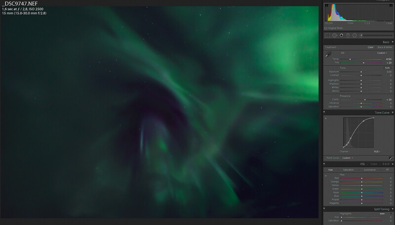
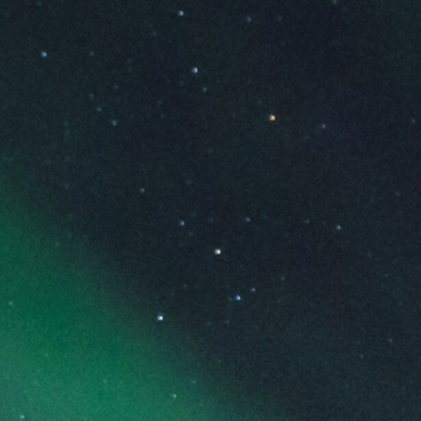
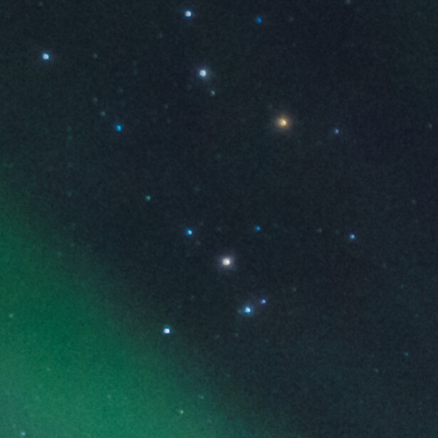
Let’s see what we got here. This shot was fired straight up, with a nice green corona flaring around a more magenta center piece as clouds started to roll in. But the magenta is well hidden beyond the veil of the white balance. Personally, I want to create images that I enjoy looking at. I’m embracing artistic freedom with this abstract photo of the northern lights.
I would like to emphasize that magenta offset color to obtain a good amount of color separation. So let’s take a look at the color wheel before we make any adjustments. This will help to guide our processing more than anything.
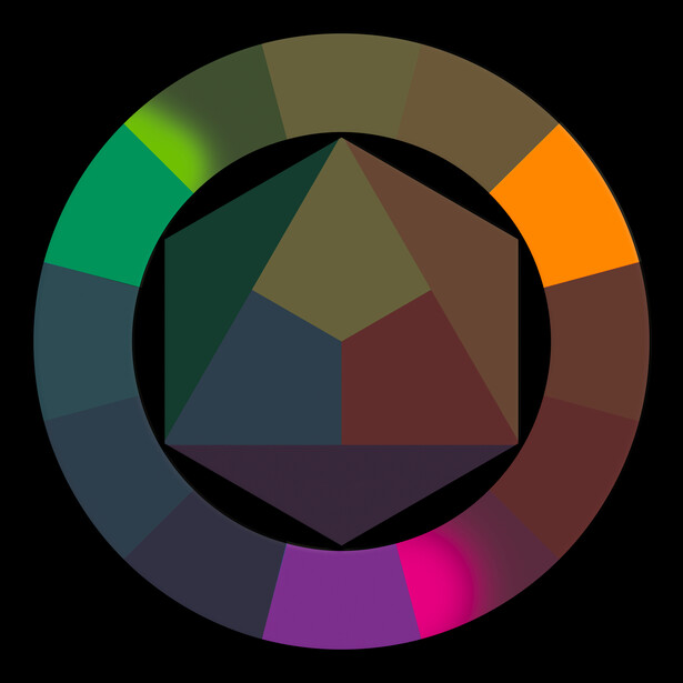
We’re going to pursue a triad color harmony for this image. The most important (or key) color is obviously going to be a shade of green. To offset the bright greens, I like to flood the shadows with a shade of magenta. And orange? Well, there’s a single star in this field of view that looks to be a red giant, but we’ll get to that later. There isn’t much detail at all in this image. That’s because I shoot my aurora images at a faster shutter speed while keeping the ISO lower. That will underexpose your image, but for Nikon, Sony, and Fujifilm, it’s good advice to do so in night photography. If you shoot Canon, you’re better off to raise the ISO and not increase the exposure to much in post.
1. Boost the Signal, Suppress the Noise
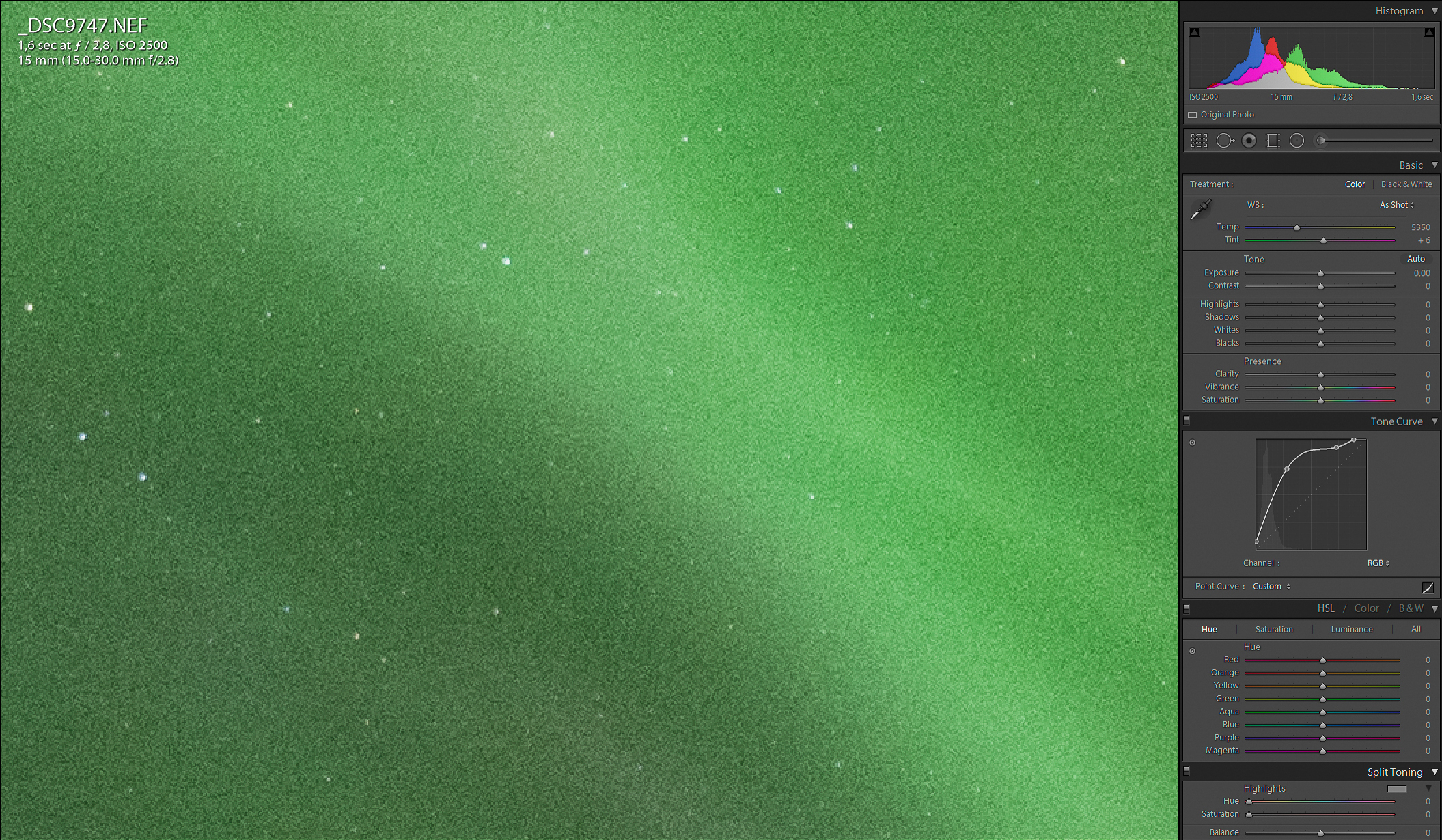
First, we’re going to increase the exposure. Curves are better to do this with than using the sliders, because sliders target specific areas of brightness. Curves are more gradual, as they target all tonalities, but make sure you select “Custom” in “Point Curve.”
So I’ve raised the black point here, upped the midtones to create more contrast in the darker areas, and lowered the highlights a bit to protect the greens there. The slightest amount of highlight clipping is needed to separate the stars from the noise before we get into noise reduction.


Unfortunately, we can’t stack multiple photos to reduce noise here, because our subject isn’t a static one. Instead, dial in the following settings at “Noise Reduction” to suppress that unsightly noise:


Without telling you what the screenshot already shows, there’s one trick I teach at every workshop: Capture sharpening. Because of the way DSLR sensors are constructed, we lose sharpness during raw conversion. Specifically at the demosaicing (or debayering) step. I remedy that by dragging “Radius” in the Detail tab all the way down, while turning “Detail” all the way to 100. The other sliders under Sharpening are different in every image, so be sure to tweak those until you’re happy with the result. Your goal here (as with any early step) is to take it slow. Be wary of wanting too much too soon. Gradually build up your image as you go along is key advice.
2. Finding the White Balance Sweet Spot
Now crank up both the “Vibrance” and “Saturation” sliders, save the image, and don’t look back. We’re done!


Kidding of course. This temporary increase will help to locate the point where there’s nearly as much green as magenta in the image. The aurora is almost never perfectly green, so I find it important and satisfying to extract as many tones from my shot as possible without compromising the color harmony. Play around with “Temp” and “Tint” and zero “Vibrance” and “Saturation” again when you’ve found the sweet spot.
3. Mind the Corners Before Applying Clarity
Let’s scroll down and turn on “Lens Correction” and select your lens’ profile. Oh, and put a check mark in “Remove Chromatic Aberration.” These adjustments will mostly take care of the colorful halos around stars and reduce the vignette in the corners.
Back up again to the Basic tab. Increase the overall structure of the aurora by dialing in a conservative amount of “Clarity.”

4. Artistic Local and Global Adjustments
Let’s get creative and emphasize the center a bit. Drag a radial filter around the part of the image that deserves the most attention and dial in the settings as shown in the Before:
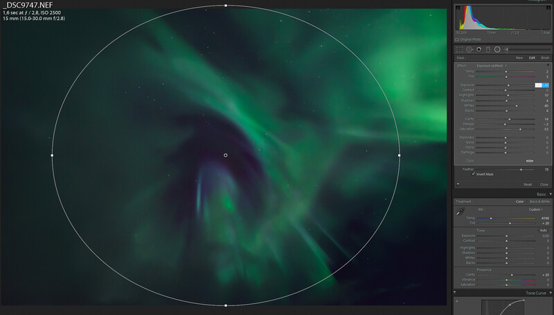
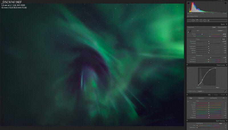
Your goal now is to separate the greens from the magentas, so close the radial filter and apply the settings showin in After to make the image pop. I’ve only slightly increased the hue of purple to make it more magenta, while lowering aqua into the green. There are your first two of the triad color harmony. Now it’s time to pursue our third but minor color. In order to do that and a couple more enhancements, we’ll jump into Photoshop.
5. Making the Stars Bigger
Before I ever got into photography, I was a huge fan of so-called space art. You might know this by artist’s concepts that support a story about newly discovered exoplanets. Space art doesn’t have to be about anything though. It can as well be just a pretty picture. It’s art after all.
One of the things that I’ve picked up from that period is enlarging “hero stars,” the stars that play the lead in your image. The way we do this is by making a selection based on the brightness, or luminosity, of the stars.
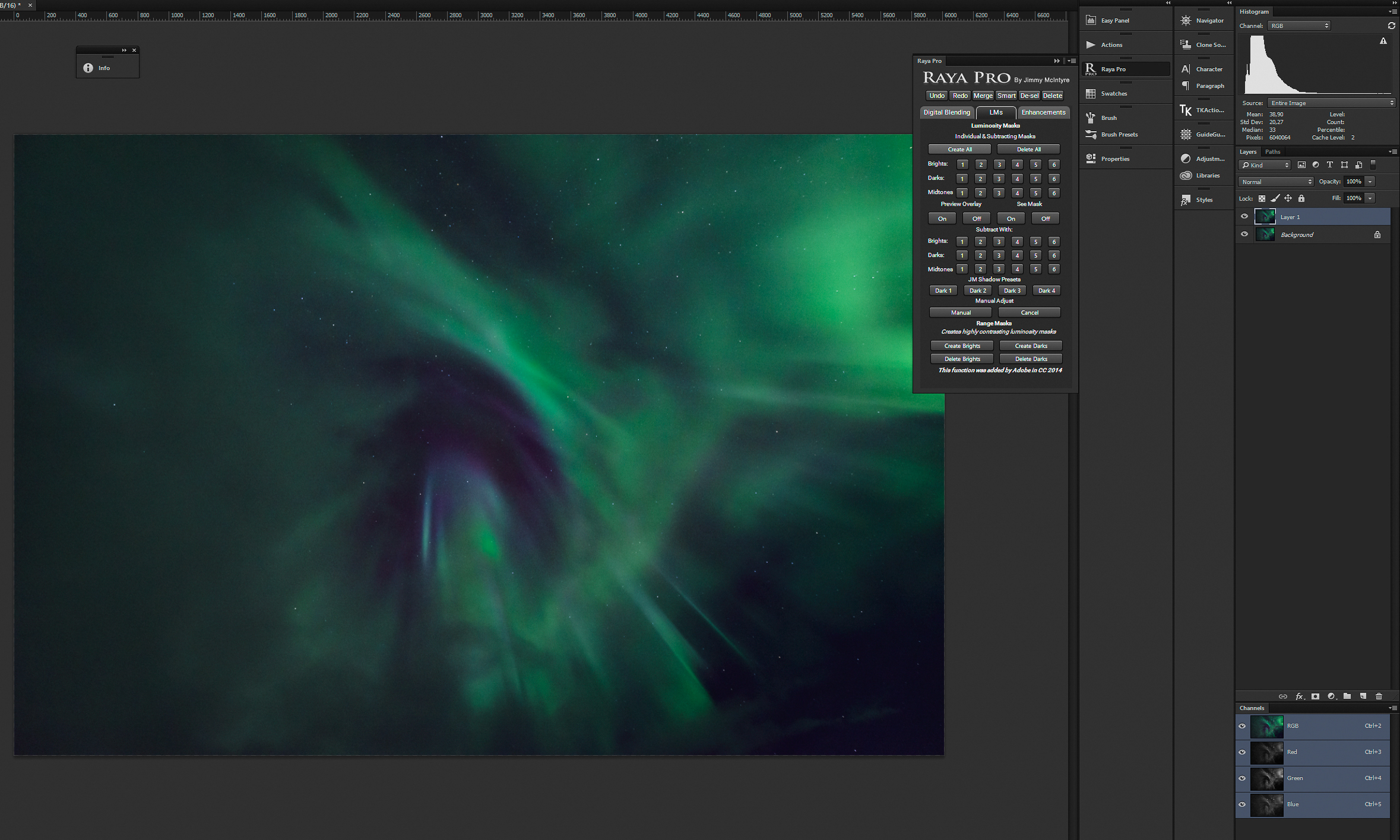
Now, I use Jimmy McIntyre’s Raya Pro to create luminosity masks, but Tony Kuyper’s TK action panel works just as well for this. I’m not going into creating luminosity masks here. Both Kuyper and McIntyre have excellent tutorials available for this.
I’ll hit “Create All” and start looking for a luminosity mask with the best separation between the stars and the brightest parts of the aurora.
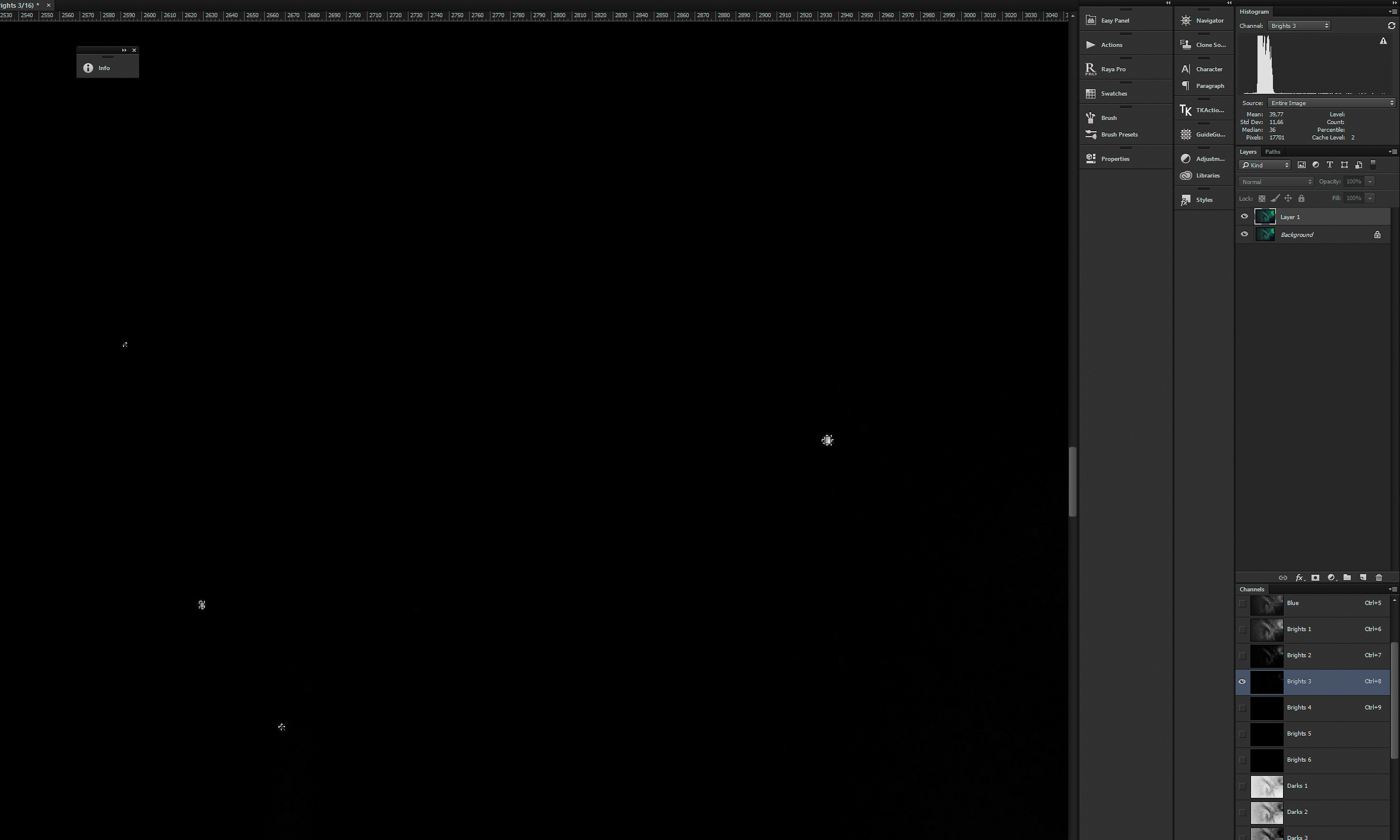
Brights 3 fits the bill well enough. With that selection load, create a new Curves adjustment layer and feather its mask 1 px to make smooth transitions between the already pixelated stars. As for the curve shape, increase the midtones with a single point.

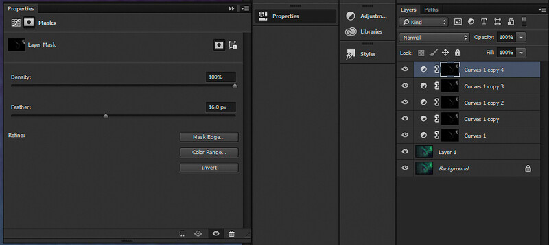
Here’s the kicker. Copy that adjustment layer five or six times, where you double the feather radius of the mask each time. The fifth layer should be feathered at 16 px and a sixth at 32 px.
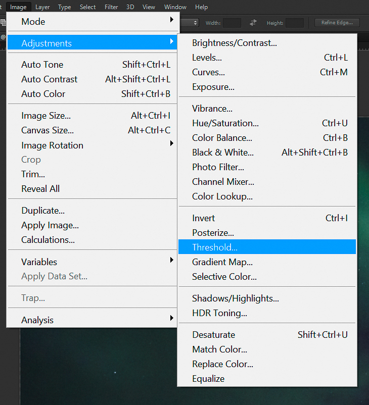
It’s not a pretty sight. The adjustment also targets the highlights in the aurora, but to a lesser extent. Here’s how to correct this. Make those adjustment layers invisible and copy the base layer. Select the copied layer and go to Image > Adjustments > Threshold. We’re going to restrict our glow to the stars.
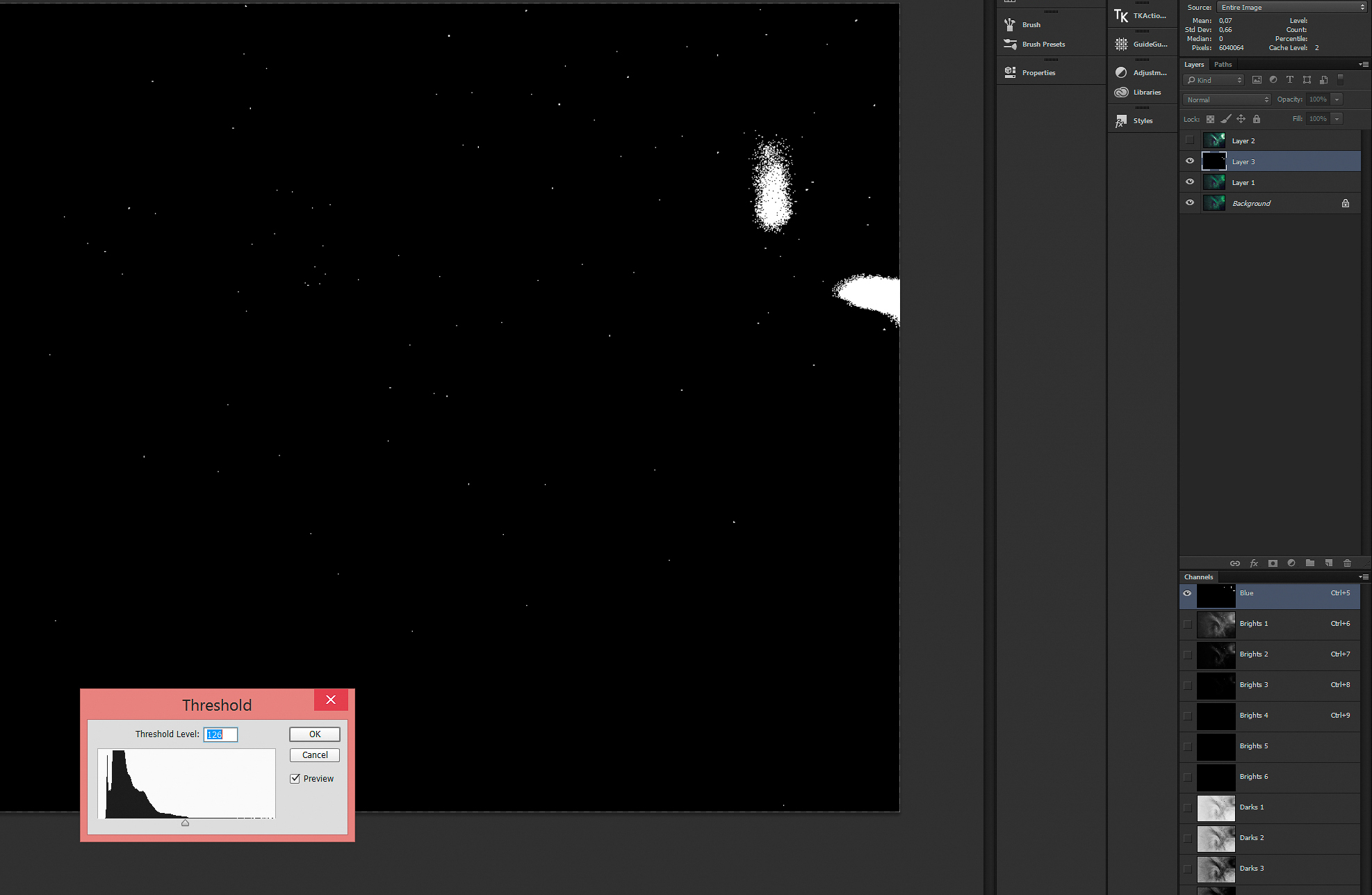
The threshold level should just about leave everything looking black, except for a couple of white blotches. Hit OK and paint with black over the aurora highlights. We’ve created a star mask, but it has two values; either black or white. This only targets the brightest stars of the image, so the effect we created earlier will be restricted to these “hero stars.”
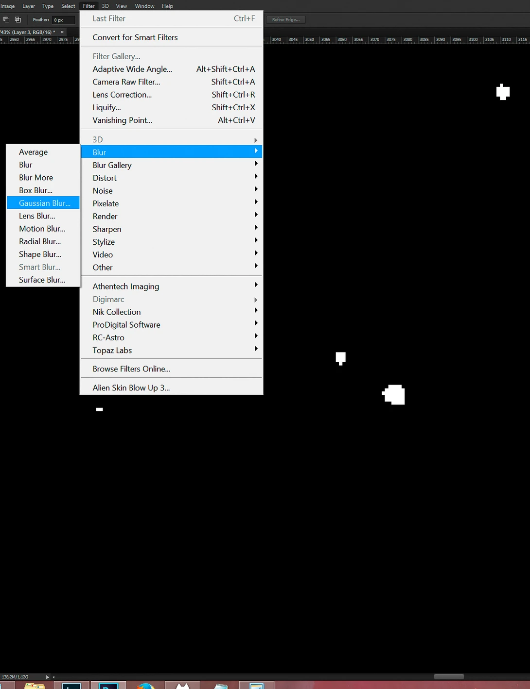
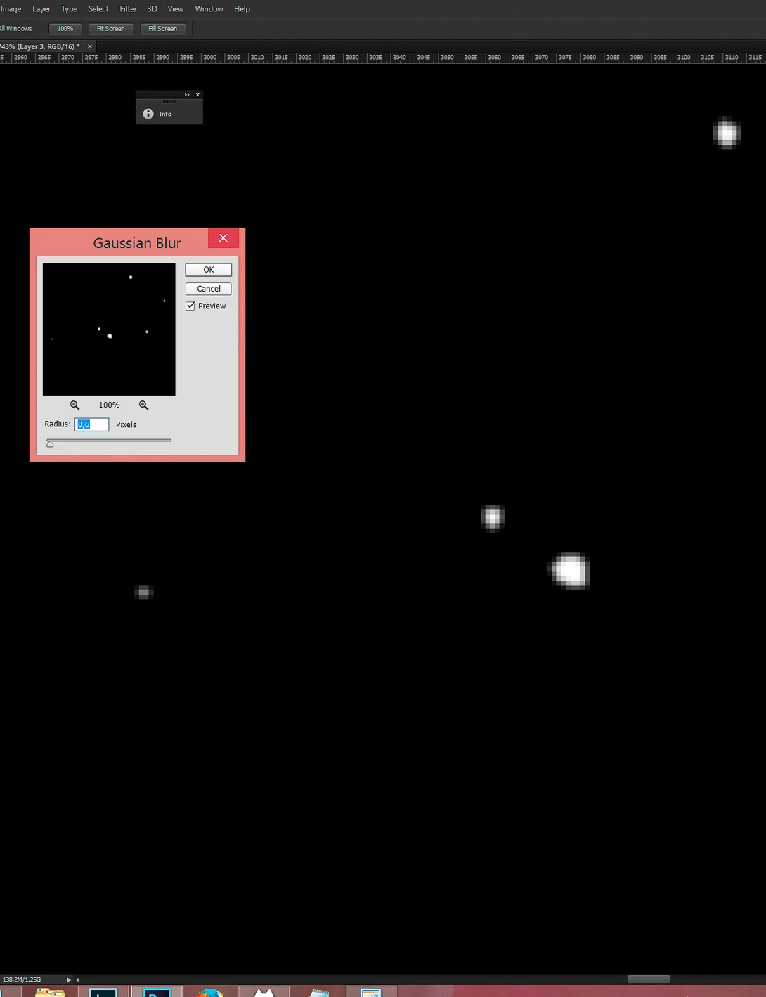
Apply a Gaussian Blur (Filter > Blur > Gaussian Blur) with a radius of around 0.6 px to make the stars retain their brightness falloff.
You will end up with something looking like a proper star field, but as a selection, it isn’t feathered enough. We’re going to stack six copies of this layer. Let me show you what I mean:
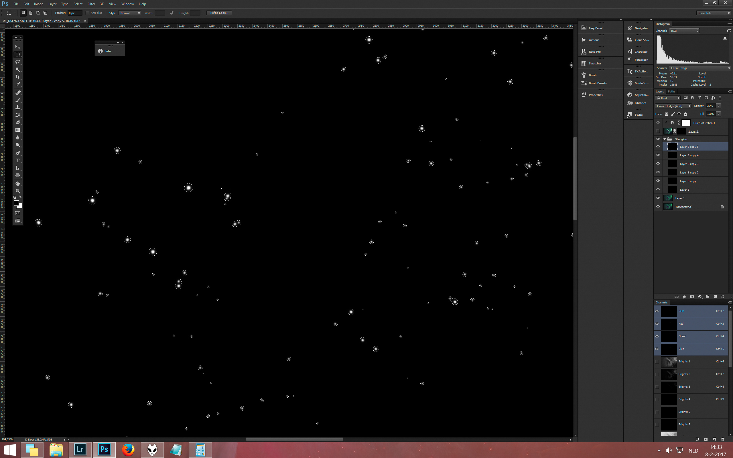
Copy the layer five times and set all the copies to the “Linear Dodge” blending mode. Average them out by setting each subsequent layer to an opacity that is 100 divided by that layer’s position.
The original goes to 100% and the second to 50% opacity. The third and fourth go to 25% and 20%, respectively. We will leave the last layer at 20% though. Hold control (command on a Mac) and select the opacity of this stack by right clicking the RGB thumbnail in the Channels pallet. Now create a new mask on the previous star enhancement effect:
To enhance the color of these stars, you could apply a simple Hue and Saturation adjustment layer. And there’s our third color to subtly complete the triad color harmony.
6. Pareidolia Time
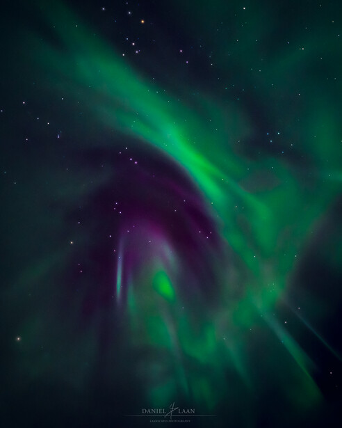
Like clouds, aurorae can be hosts of imaginary figures in the skies. From animals to fiends, you can make anything come alive with these shots. I found there was some sort of angelic figure with forward swept wings in my image, so I cropped in on the image to emphasize that.
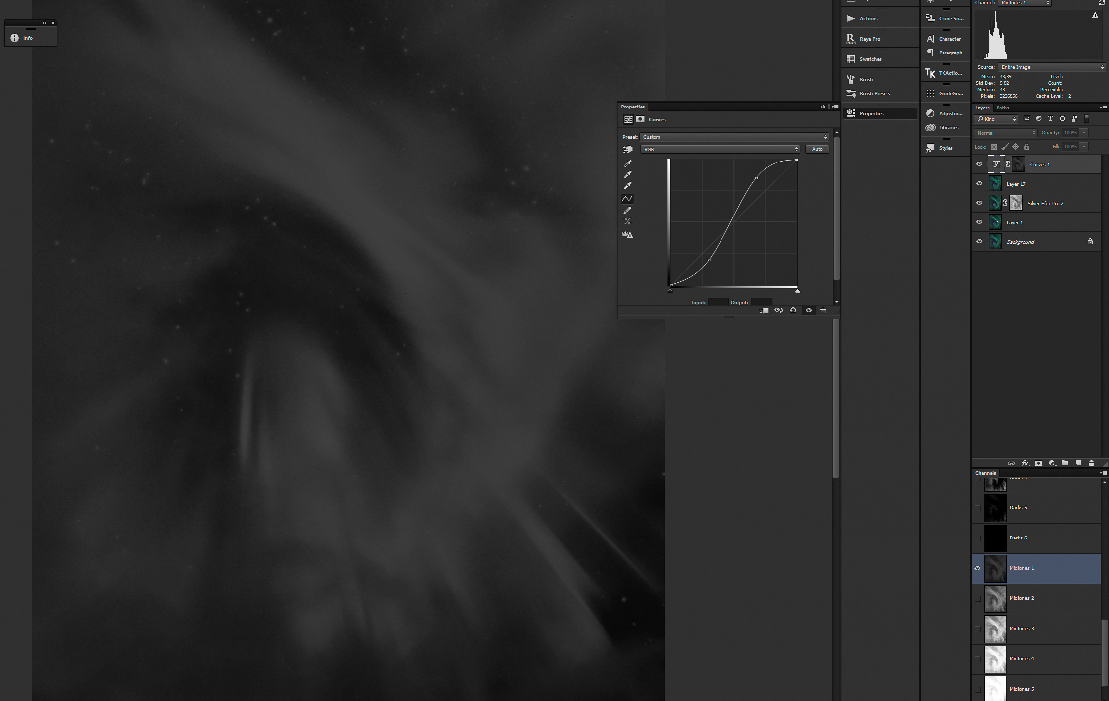
To finish it off in Photoshop, we’ll add contrast by applying an S-curve. Select the Midtones 1 luminosity mask and add a curves adjustment layer to it.


Closing Words
You could go back into Lightroom and do some more adjustments before exporting it for the web, or leave it there. It’s a good amount of work, but in the end it will be worth your time. At least you will learn some new tricks from a field that’s related to astrophotography. Personally, I love to combine the tricks of space art with a photograph as my canvas to maximize the fine art potential of a single exposure.
So this is how I go about post-processing my auroras. I hope you’ve picked up a trick or two, because that will certainly help when we dive head first into editing landscape astrophotography (nightscapes) in the near future.

Join the Fstoppers community for free
-
Post comments and join in the discussions
-
Browse the site ad-free
-
Share your work and get featured in the community
-
Compete in the photo contests for fun and prizes
7 Comments
Thank you so much for sharing your tricks with us :)
You're welcome! Thanks!
Great piece of work Daniel. My processing is very basic compared to this. I must learn how to do it your way.
Cheers Fergal! One step at a time though. :) You could visit my website. That's a start. :)
http://Laanscapes.Photography
As soon as I have time, I'm going to revisit my aurora shots, near Chena, AK, from 2012
I may as well try commenting, hoping that someone sees this. The part where you use the luminosity masks to make the stars larger is a bit unclear. I've been practicing Photoshop quite extensively for the past few months and I've learnt a lot but for some reason, I am not able to achieve the effect you're doing.
There's a bit of information missing in your tutorial and judging by your screenshots, you're skipping steps, like the one where you're using Silver Efex Pro for example.
Like I mentioned above, the part where you're creating the glow around the stars, isn't very clear.
I have to say that all these steps are all unnecessary. Simple editing in lightroom is all you really need.