

You've probably seen thousands of articles on screen calibration and you may strive to deliver perfect images and videos. Unfortunately, in the end, your client views them on their non-calibrated way-too-blue or way-too-orange screens. Sometimes they say "looks good to me." Other times the response may be "it's too dark," or "it's too blue." They may even edit your photos to make them look "better." How do you handle these situations and is it really critical for you calibrate your monitors?
The majority of visuals we as photographers and filmmakers produce are displayed on screens that are not and won't ever be calibrated. Watching the statistics from the last two years, it is clear that most people use mobile devices to watch images and videos. Forget about anyone calibrating these devices.
The Truth About Color Calibration
You are using a display that hasn't been calibrated for some time or hasn't been calibrated at all. Do you think it shows proper colors? Come on, don't be shy! Of course you do. But once you calibrate it, you get that "before-after" shock and try to get used to the more blue or more orange tint. A couple of days later you are used to the new colors of the screen.
That's exactly how our clients perceive the colors on their screens: as being normal. The most sensitive case is when you deliver saturated real-color images without any color grading, and especially when there are elements of known color, like skin tones. When viewed on non-calibrated screens, they may look with the wrong colors and you can't do much about it except for making sure your saturation is not way overboard.
If you know your images will be printed and you will present color-critical subjects (like products), there's nothing you can do about it when screens of the viewers are not calibrated. Probably having different images for digital screens and print is a good option.
If the images are with altered colors, that's clear even on a non-calibrated displays, and the viewer is more inclined to accept the grade technique as a form of art. But if you deliver real-color images, the client may think they are wrong. Not saying all of your images should be color graded, but when they do, it's less likely they look off on non-calibrated monitors. For video color grading is a must.
Brightness and Contrast
Hardware color calibration is something good, but it's of less importance than the brightness and contrast of the monitors you are editing on. For me, brightness and contrast of the screen are the most critical settings. Our professional screens, and especially the calibrated ones, are not of extremely high contrast and of high brightness, while the majority of the consumer displays are usually advertised at high contrast and high brightness settings which grab the attention of the average buyer. Most people have their screens at 100 percent brightness and at a very high contrast. This means if your images are overexposed or low-key, they will look awful on the consumer devices. In order to cope with that you need to distribute the luminosity density of your image so that the histogram is not too far to the right or too far to the left.
Below is an example of an image that is supposed to look like a nighttime shot. Although the histogram looks way to the left, the image looks more like twilight than nighttime.
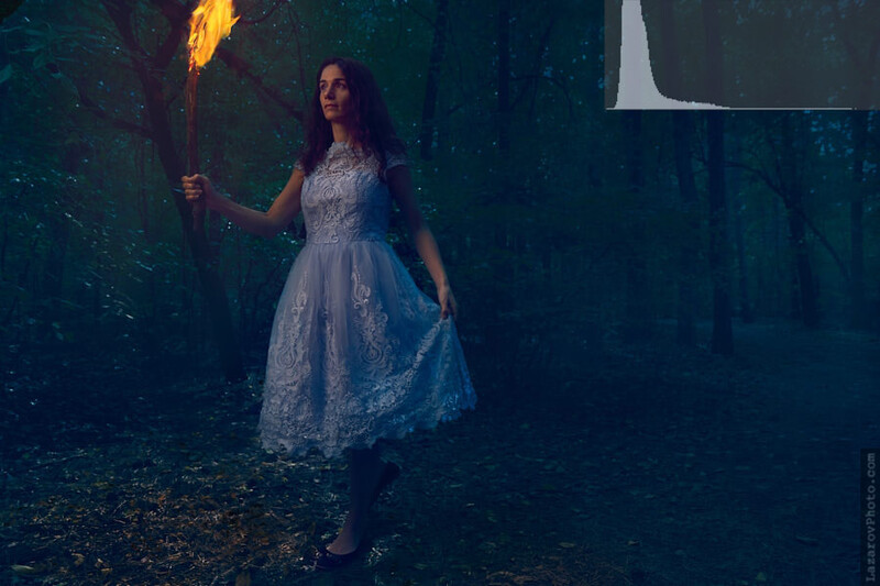
If I wanted to have it look more realistic like being during the night, it had to be edited the way shown below.
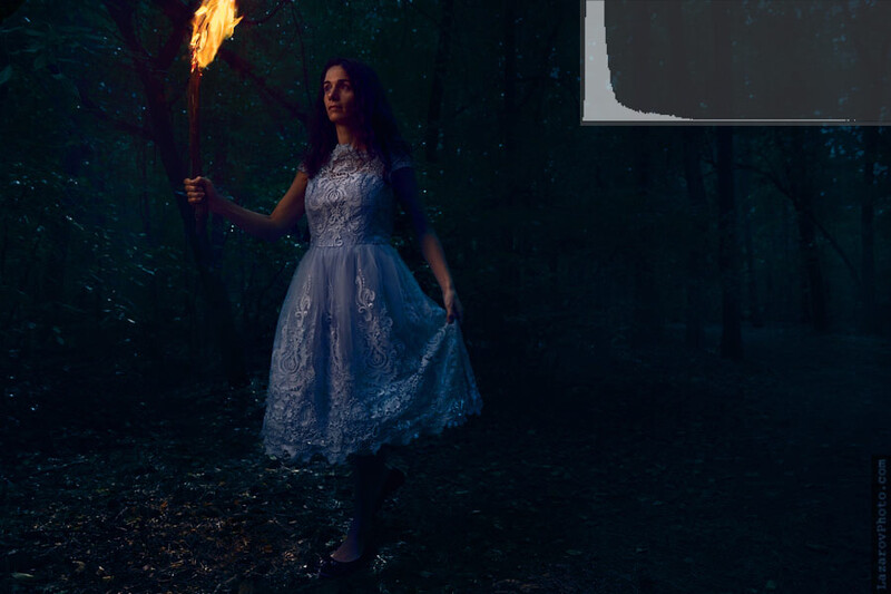
The problem is that on non-calibrated screens, and especially on mobile devices, the second version would be 90 percent black. This is the reason I keep my low-key images with less contrast and the blacks are "lifted" from the real black point. I learned that technique from the examples I see in the film industry where they keep their whites and blacks a little more distant from the border values than photographers do.
Conclusion
Color calibration is a good thing especially if your work will be printed and you expect an accurate color. However, the more important factor is what is the amount of brightness of your final products and their contrast. You can do a proper judgment if your screen's brightness and contrast levels are in the ballpark of right values. Always think about the limited or extreme settings of the screens of your viewers. They don't really care about calibration.


Join the Fstoppers community for free
-
Post comments and join in the discussions
-
Browse the site ad-free
-
Share your work and get featured in the community
-
Compete in the photo contests for fun and prizes
24 Comments
My problem with this is that there’s not a consistent offset between consumer and professional monitors; you can’t say “consumer monitors are typically 500 K too cold and 40 nits too bright,” so all you’re doing is shifting the set of people who approve of the image to a different set (though admittedly, the new set may be larger). And for anyone who does have a proper calibration and knows what they’re looking at, your edits will look incorrect. I think it’s better to edit properly and have a conversation about calibration if a customer is seeing something really different.
Yes, if there was a constant offset, we could calibrate the monitors just by "turning a few knobs" after a three-steps tutorial.
And yes, in the article I state that if your images are intended to be with real colors, they have to remain like that, and that you may have more "problems" in that case (customers with non-calibrated monitors) than when having images with an artistic choice of color.
But my most important emphasis in the article is on the brightness and contrast which seems to be more of an issue with clients than the colors.
At one point my wife had the old iPhone 4 and the new iPhone 6 Plus and I had my old Samsung with my new LG. It was a day or two before she returned the old iPhone and I sold my Samsung. I did a little experiment.
I looked at a photo with:m iPhone 4, iPhone 6 Plus, Samsung, LG, iPad, MacBook, my PC and my Google 7" 2nd generation. Although some had very similar colors, tint and exposure, it was still different. it was obvious that every machine had it's own version of what is "right" when presenting an image.
Saturation and contrast are the other variable components. Remember that these two are the keys to selling a product with a display to a non-tech-savvy person.
And that is exactly it, there are too many variables to get an image "right" in every single display.
Most of my cosplay images are printed and shown at conventions so I see how they look in print and it's not a calibration problem as much as bad printing. They run them through their auto settings and contrast and desaturate the hell out of them. Drives me nuts. And when I watch people flip through the prints, they always stop at the images printed correctly. Brighter, more detail and more color. The rest are dulled down with no pop left and they skip right over them.
In general printing companies should not edit the images unless they print non-commercial materials.
The situation you describe sometimes happens when an image is converted to CMYK. Are you sure they didn't run a non-CMYK through their workflow converting it to CMYK?
No idea as I'm not behind it but I tell the cosplayers to tell them to print as is.
Sometimes printing happens only in the CMYK color space and even if you give Adobe RGB, RGB or some other bigger than CMYK color space, you will have a different end result. This depends on the type of printing process the companies use.
Photo printers use a wider gamut and can print more colors than CMYK while with offset printing only CMYK color space is used. That's why you have to be aware what kinds of files the printing company requires.
In my experience, whenever my work is going to be printed in large quantities or larger format than just a magazine, I provide a 16 bit TIFF with a CMYK profile. If you have issues with the colors after that, you can tweak the image and deliver that format. It will be printed as-is.
Useful article. In my small family we have diversified devices with no two similar displays, and I always check how the picture looks on each of them before presenting to a wider audience. I think it is a good approach to play it safe and move a little from the extreme settings especially for brightness and contrast. Thanks for the advice
That's how sound recording engineers work too. They mix and master, then run the song through different speakers: phone speaker, car speakers, laptop, headphones, to make sure the core of the audio frequences that make the song are audible.
At my workstation I have 4 monitors. One is a Wacom Cintiq 24HD. The Wacom is the only one I've calibrated hardware. The others have different settings.
When I publish an image on Facebook or other platforms on the internet, I try to compare the images on different monitors with different settings.
I try to adjust the color and contrast, which is the approximate average value.
When I prepare images for printing, I only use the calibrated Wacom.
To find the best settings for a picture is a hard thing.
I'm glad to hear I'm not alone in that process.
The video ( professional cinema and TV grade videos ) keeps the "very dark" and "very bright" ( until HDR came out ) not just to prevent black clipping, but in order to hide equipment/elements they don't want to be seen by the viewer ( such as boom microphones, light stands, etc ).
To be exact the values "allowed" on cinema, video, dvd/br, material are confined within the (RGB) 16-235 range ( whereas our PCs have the full 0-255 range ).
Photo-wise, the best one can do regarding color tint, is to find a site with lots of monitors tested professionally, and extract the average white balance delta value, and compensate for that on his digitally viewed photos, that doesn't guarantee proper results for every single monitor, but decent results for most.
Nice info, however I don't really get how one would hide a boom mic or a lightstand by shifting the white and black point a little. When there's a boom in the frame it's removed in post (if that's the best take and there's no other suitable available). If I could remove it by altering the luminocity of the image, that would save a lot of time in post for everyone of us.
Can you clarify how shrinking the luminocity range helps in these cases?
The values below 16 are being pulled ( clipped ), which makes it look total black on your TV/projector screen.
So instead of doing frame by frame editing ( remember today we can do magic with software, back in the 80s-90s, there were little to none technologies allowing any kind of automated masking apart from green screens ) they use very dark black equipment which is easy to totally hide from the viewer by clipping it.
AFAIR from back when I read about that trick, it was from a behind the scenes of a 70s to late 70s movie.
Might be able to find a reference one of these days ( sadly, I have to go to work in a few minutes :( )
Merry Xmas guys!
p.s. forgot to mention that it was only possible in dark scenes, not bright, daylight scenes obviously :)
Thanks for the clarification. Yes, it's clear that it's all about black scenes when it comes to black hardware.
I was confused, because I thought about modifying the existing footage by LIFTING the black point and lowering the white one, not about clipping the original 0-255 range while keeping everything else as is.
Today it seems that this exact range is a must because of the high-contrast screens on consumer devices.
I'm with you on this.
Stopped nit picking these a few years back except when I am in control of an actual print.
My commercial clients don't care much these days, and the rest.. well we know how the current trend when it comes to images is especially with the advent of social media filters etc. so hardly is a matter.
So much of our work now is being viewed on devices other than actual monitors and as such we are at the mercy of these displays.
Good stuff written!
This reminds me that I've forgotten to write the following customer reaction after an image or a video with perfect real colors is watched on their mobile phone: "Hey, nice Instagram filter!"
I get that a few times on my photo works. It is hard for many to see decent quality as anything not being filtered these days. But such it is.
So long as the client is happy why should I obsess about things.
I've slowly but surely accepted the notion that trying to make images appear online the same way they do on my calibrated monitor in PS is a losing battle.
In addition to the excellent points you've made in this article, it seems to me there are a couple others worth noting as well...
1) I haven't studied this objectively, but have the distinct impression every Social Media site compresses images uploaded to their service in a different way...potentially resulting in a perceptibly different viewing experience at each.
2) Then toss in the vagaries of how different browsers manage color (or don't) on the same pc.
Bottom line, I felt like a dog chasing my own tail until I accepted I can only control what's printed. What's posted online is a crap shoot.
Somewhat oddly...to me anyway, I find my own images look best, or at least closest to my calibrated viewing in PS, in the Safari browser on the iPhone 6+.
You are right about the compression, although in theory it should not alter the colors and luminocity of pixels, just their density.
Also, in theory, browsers should not change the appearance of images when they are saved with an sRGB color profile. If a browser shows an image in a different way and it's in sRGB, it's browser's fault.
Last, but not least, I'm surprised how many people in the craft echo the same feelings about having a "correct color on all devices."
I think there is an even more important question that was missed here. How many of the screens out there are even sRGB compliant? I suspect the correct answer is "not a lot". I have seen some information from a credible organization that estimates that the majority of displays out there are only 50% - 70% sRGB compliant.
So not only is one dealing with a lack of calibration (most screens are running much too bright straight out of the box ) or profiling (which is really the gist of this article) and the viewing area comes no where close to being ideal (looking at one's iPhone outside on a bright sunny day takes care of any contrast ratio that there might have been in the image).
When I get a complaint about image colour, brightness, contrast, etc. My first questions to the person asking is: Is your screen sRGB or AdobeRGB compliant? Has it been calibrated and profiled with a screen brightness in the 80 - 120 candela / square meter range (sometimes candela / square meter is referred to as "nits")? Does your screen have a contrast ratio of at least 1000:1? Are you viewing your image in an area where the illumination is below 70 lux? Because I am and those conditions are required to make an accurate assessment of an image. That usually shuts them up and hopefully gets them thinking and we can have a conversation their comments.
That's a good argument too. I agree with it.