
The first thing you should be doing when editing landscapes (or any kind of photo) in Lightroom is to apply a new profile. By adjusting this base render of your raw files, you’re providing a solid foundation on which to edit.
Profiles can powerfully change your image through color and contrast adjustments. Click through a few different profiles in the Develop Module in Lightroom Classic, and you'll see what I mean. But what are they? Josh Haftel, Principal Product Manager at Adobe, describes it like this:
In photography, and digital imaging, the term “profile” can mean many different things. There are color profiles, display profiles, printer profiles, working profiles, and so on. Within ACR [Adobe Camera Raw] and Lightroom, a profile is used to render your photograph, converting it from raw camera information into the colors and tones that we see.
Unlike profiles that limit color range for display devices like computer monitors or restrictive printing profiles that allow photographs to be converted from an additive RGB format to a subtractive CMYK format, Lightroom (and Adobe Camera Raw) profiles work by developing your raw image to something that has been processed. JPEG files have this process built into the image automatically either via in-camera processing or from another raw-processor. The same goes for TIFF. So, now you know what they are and that they're designed for raw image files, so let’s take a look at how Profiles work in the real world and what they can help with or prevent you from achieving.
1. They Help You Achieve Better Results
Normally, I find the Adobe Neutral profile a little too bland for my editing style. It washes out the photos and makes everything look a little gray and uninspiring. However, in some cases, it can actually be useful. For example, low-contrast landscapes in the shade can benefit from the Neutral profile treatment. These types of images may be taken in deep forests, at twilight, or even at night when there are no bright highlights or dark shadows created by the sun. Switching to a profile with harsher contrast can actually remove a lot of the detail in the shadowed areas, thus detracting from the shot.
2. They Hinder Your Workflow
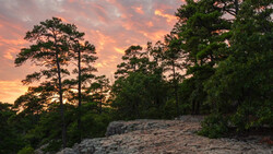
Adobe's Landscape profile, as you might’ve guessed, is designed for landscapes. But it doesn’t always make the best adjustments, because exposure levels and color vary wildly between landscape types.
For example, in this forest shot, the tower at the top is bathed in warm sunset light, but the Landscape profile makes it look too orange. Switch over to the Portrait profile, however, and the warm hue is toned down to an acceptable level, but still contains enough contrast in the image to look as punchy as the Landscape profile.
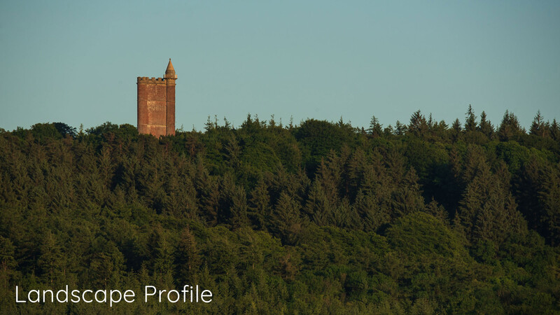
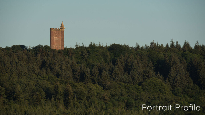
You can see then how diving straight into your editing without switching profiles could actually be holding you back from achieving the best edit. If you wanted cooler tones but stuck with the Landscape profile, you may have spent longer fine-tuning the white balance, messing with the HSL/Color panel, or trying to convert it to black and white. A quick switch to the Portrait profile, however, and the job is done.
3. They Stylize Quickly
Lightroom Classic CC has more than the shortlist of profiles you see in the first drop-down menu. Click on "Browse," and more than 60 show up. They’re categorized under different subheadings. If you find yourself going back to certain profiles time and again, you have the ability to add them to your favorites to quickly recall them on other images.
If you don’t see anything you like there, you can import more by clicking the + down arrow in the top-left of the panel and going to "Import Profiles." These are not the same as Lightroom presets as they are presets saved, which may alter any part of the Develop Module’s settings such as the Basic panel, Tone Curve, HSL/Color, Split Toning, and the others. But they do have a similar effect in that they alter color and tones in the shot.
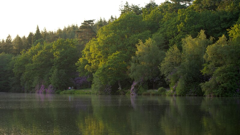
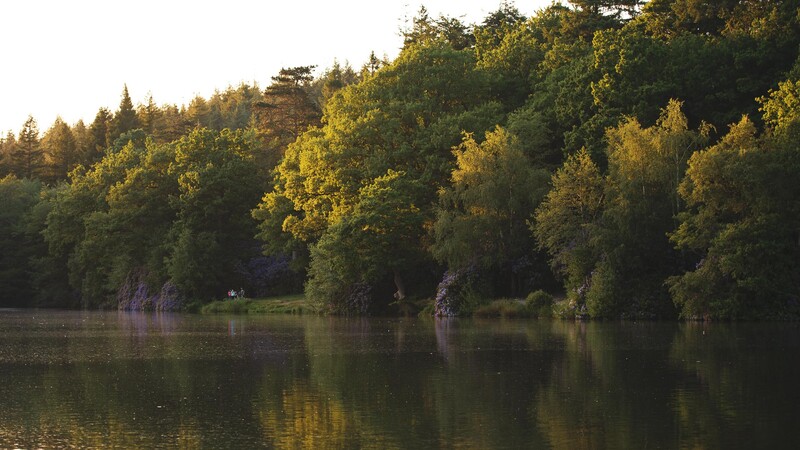
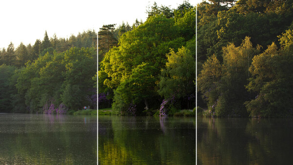
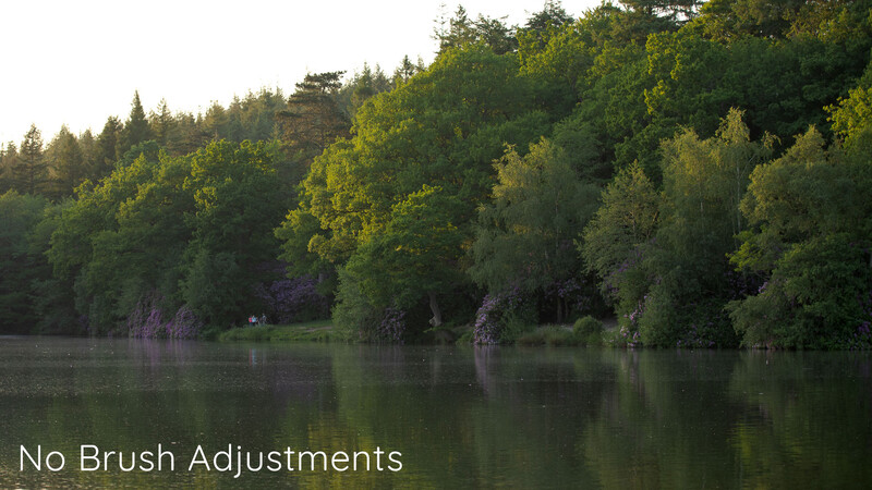
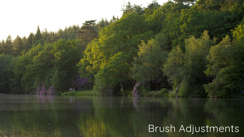
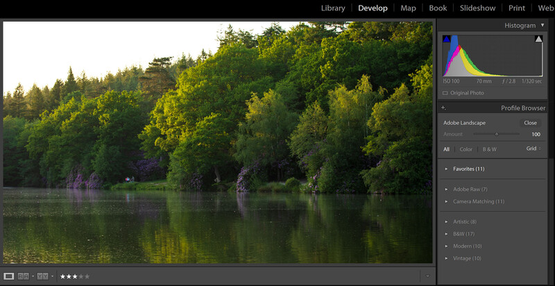
You can see above that a quick profile switch from Neutral to Modern 08 (click the drop-down and head to the Modern category) appears to transform the blackest parts of the scene into a matte gray, giving it a film-like quality. The tones are warmed by enhancing yellows and oranges already in the picture and even boost the cooler shaded areas in the trees and rhododendron bushes from a milky blue to yellowish-green. Overall, this makes the scene more inviting and better reflects the balmy late spring evening sunset that I felt while at the lake taking the shot.
By experimenting with these profiles first, you can see their effect on an image before continuing with the rest of the editing process. Then, if you have several photos in a sequence and want to unify the style across them, you can highlight the given images in the film strip with click + Shift before pressing the "Sync" button in the bottom right of the Develop Module underneath the editing settings to apply the profile treatment across the range of shots quickly.
Of course, editing is subjective. What looks nice to me may not be your cup of tea. But hopefully, by trying this out, you may save some time and even a headache or two!

3 Comments
I don't use Lightroom - I use Bridge > ACR > Photoshop - but I make my own profiles for every camera, e.g. I have a Nikon D810 profile, a Z6 profile, a Ricoh GR profile, an Olympus PEN-F profile, etc etc. I always apply that and then work from there. It's the best way, at least for me, to achieve a consistency between photos if you shoot different cameras (and especially if you shoot cameras from different manufacturers). It takes a while to really develop a good profile - you have to shoot a lot under different situations - but it's incredibly valuable.
With that said, if I were to use one of the built-in profiles in ACR, it would be the Adobe Neutral. Bringing the file down to that "washed out" look is the best jumping off point. I just wish more companies would tune their imaging pipelines to get that kind of neutrality. The only one that does it is Hasselblad with their excellent "Natural Color Solution."
Wow, I can't believe that I haven't notice the profiles dropdown after years of lightroom work. Thanks for opening my eyes to it. After playing around with it I realize it is going to completely change the way I edit. Great article, thanks again!
It's so easily overlooked, I know because I did the same for years. Makes such a difference when it comes to workflow and time editing. Glad it helped!