
When it comes to landscape photography, preparation and using the right tools go a long way to get that perfect shot. Tripods, filters, or even drones can all take your image to that next level. However, many photographers don’t give enough importance or time to the editing process of their images. With software that combines multiple tools into one program and simplified non-destructive editing, ACDSee Photo Studio Ultimate 2018 can make it easier to experiment with new edits on overlooked images and even save some of those over or underexposed captures.
Everyone has their own workflow and vision when editing, but whether you want to recreate the scene just as it was or get creative with your edit, it’s always smart to leverage the flexibility of the raw file first. Within ACDSee, this is done in the Develop Mode panel. Editing in Develop Mode is similar to working in Camera Raw, Lightroom, or Affinity Photo in the sense that it’s a non-destructive editing environment.
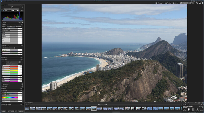
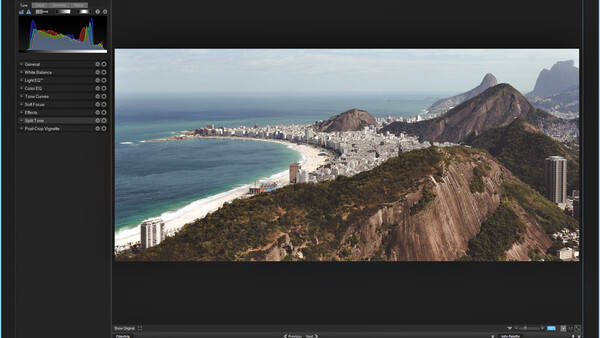
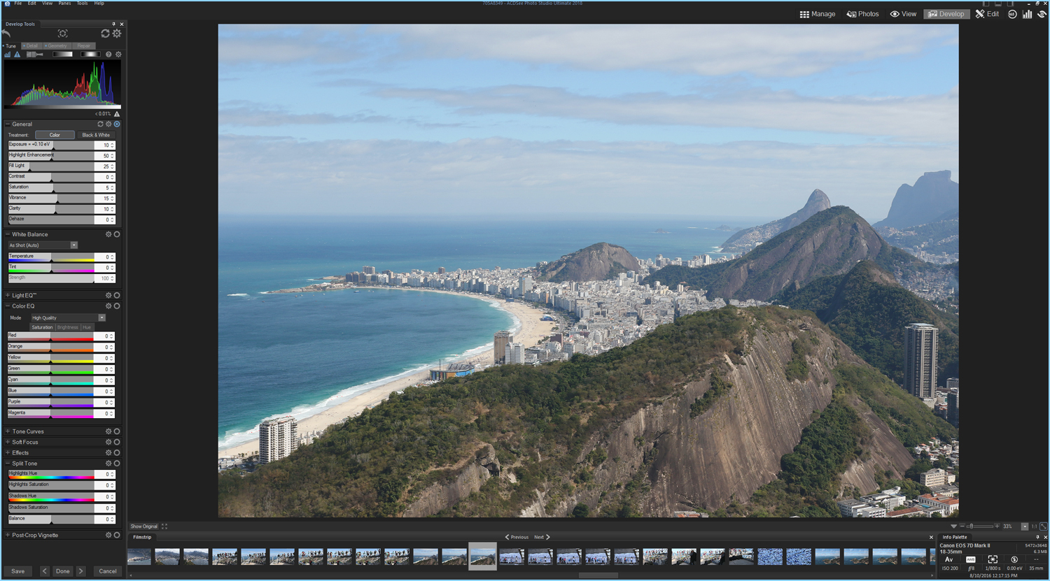
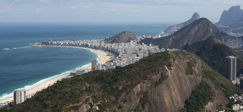
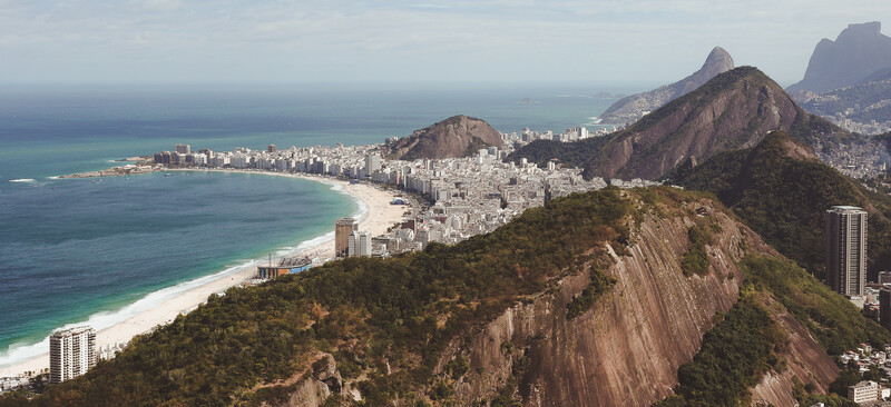
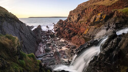
For this example, I chose an image I shot while in Brazil for the 2016 Olympics. My schedule was packed with events which left me with little time for exploring outside of the Olympic venues. The one free day I did have was spent seeing some of the big tourist hot spots, the Christ Redeemer, Copacabana Beach, and a view from Sugarloaf mountain, which I will use for this tutorial. The view of Rio de Janeiro is absolutely spectacular. When I sat down to edit this picture, I wanted to get creative and try to create an image that reflected what it felt like high to be above the city with the warm summer sun shining down on me.
Raw Image Corrections
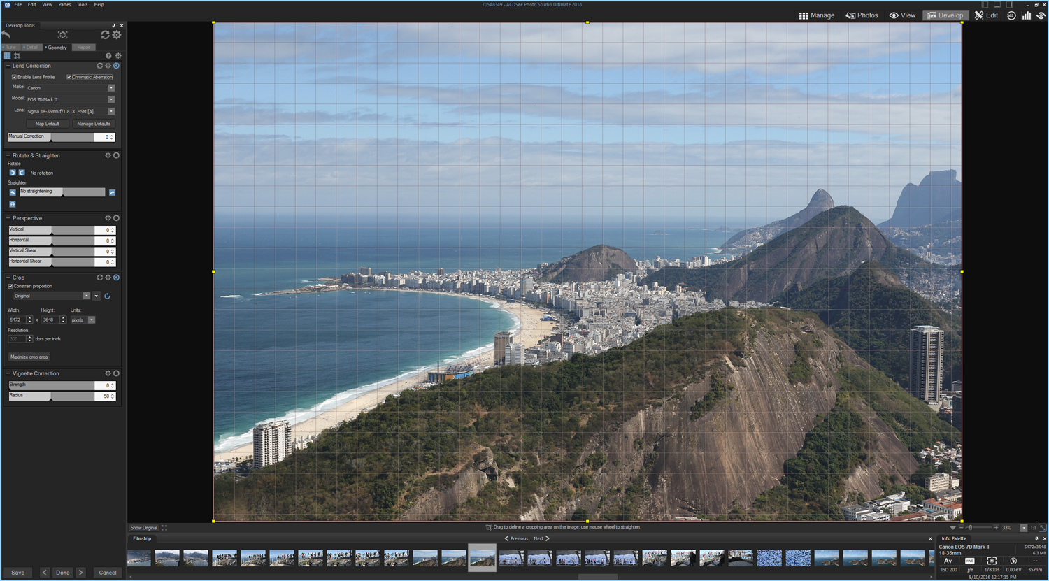
Once in Develop Mode, I switch to the Geometry tab located at the top of the left side panel. This takes me to a series of controls that lets me make image corrections based on camera profiles or manual controls. This section also includes horizon straightening and crop tools. I almost always check the lens profile corrections and chromatic aberration boxes. I find that the results vary from lens to lens, but apart from a few exceptions, I prefer the corrections. At this point, I also take a second to straighten the horizon.
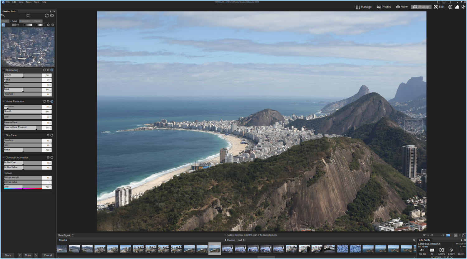
To the left of the Geometry tab is the Detail tab. With all raw files, it is necessary to add some sharpening within post. Whether this should be done first or last in your workflow is can be debated but I like to add it right away.
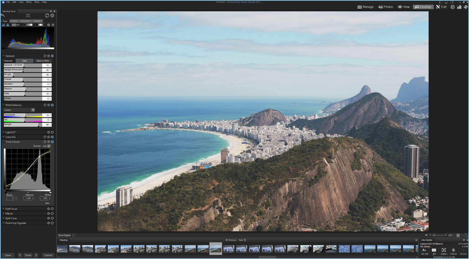
General Corrections
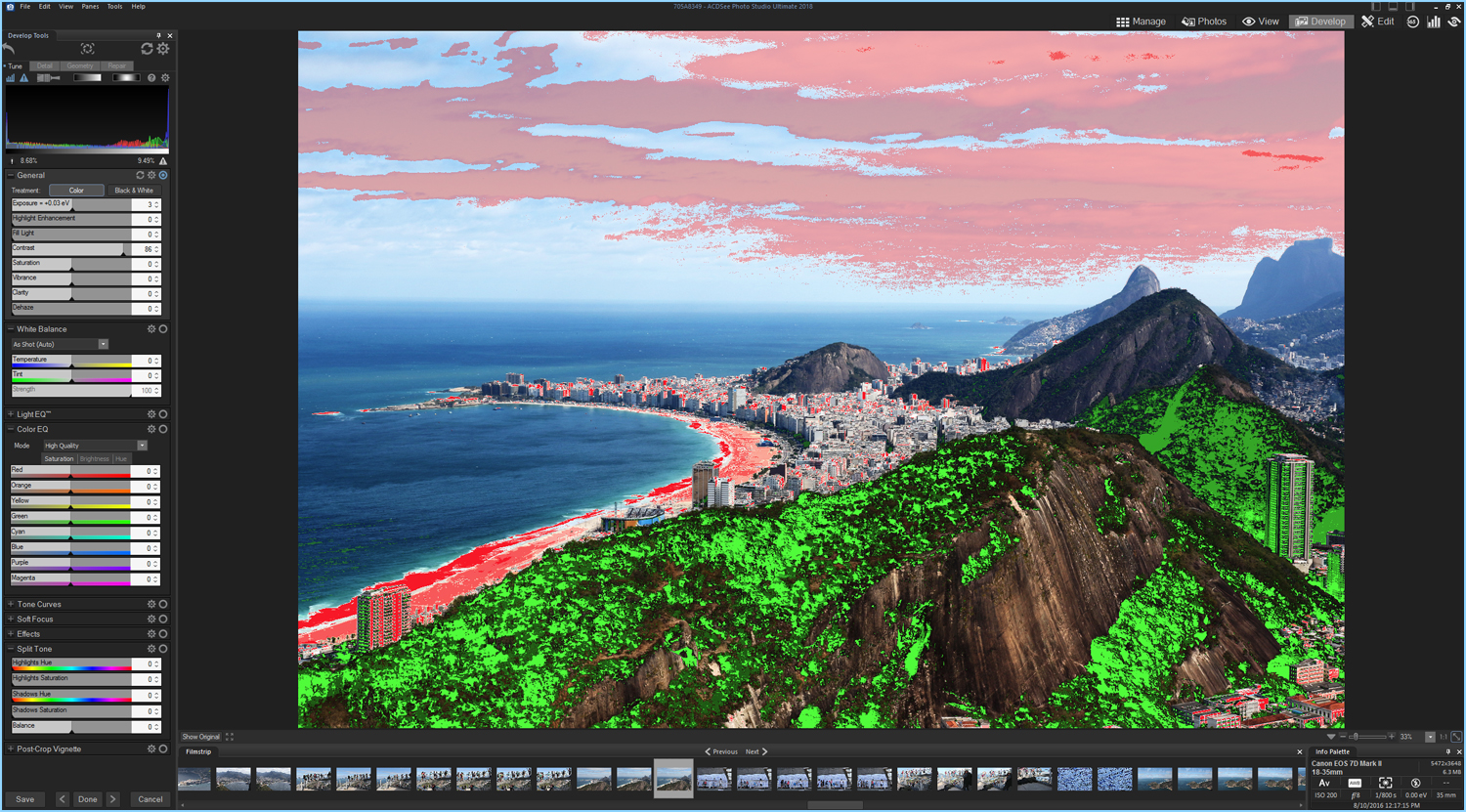
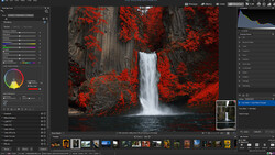
When it comes to exposure corrections, the histogram is your best friend. How to read a histogram is a topic for its own article, however one quick tip to utilize it well is to turn on the clipping alerts. This is a small blue triangle icon located next to the histogram icon. These alerts will highlight on the image the over and underexposed areas.
I’m pretty happy with the detail in the sky but I do want to move the histogram a little further to right, specifically opening up the shadows in the foreground mountains. I adjust the highlights to counter the new exposure and leave the contrast slider alone. I prefer to adjust contrast in the curves panel later as I feel this gives you more control. I really like the haze in the distance; I feel it blends the water into the sky really well, so I don't touch the dehaze slider. I add a touch on saturation, vibrance, and even clarity to boost the colors. Clarity is a touchy slider for some people, however, when it comes to landscapes or architecture I have no problem adding a little.
White Balance
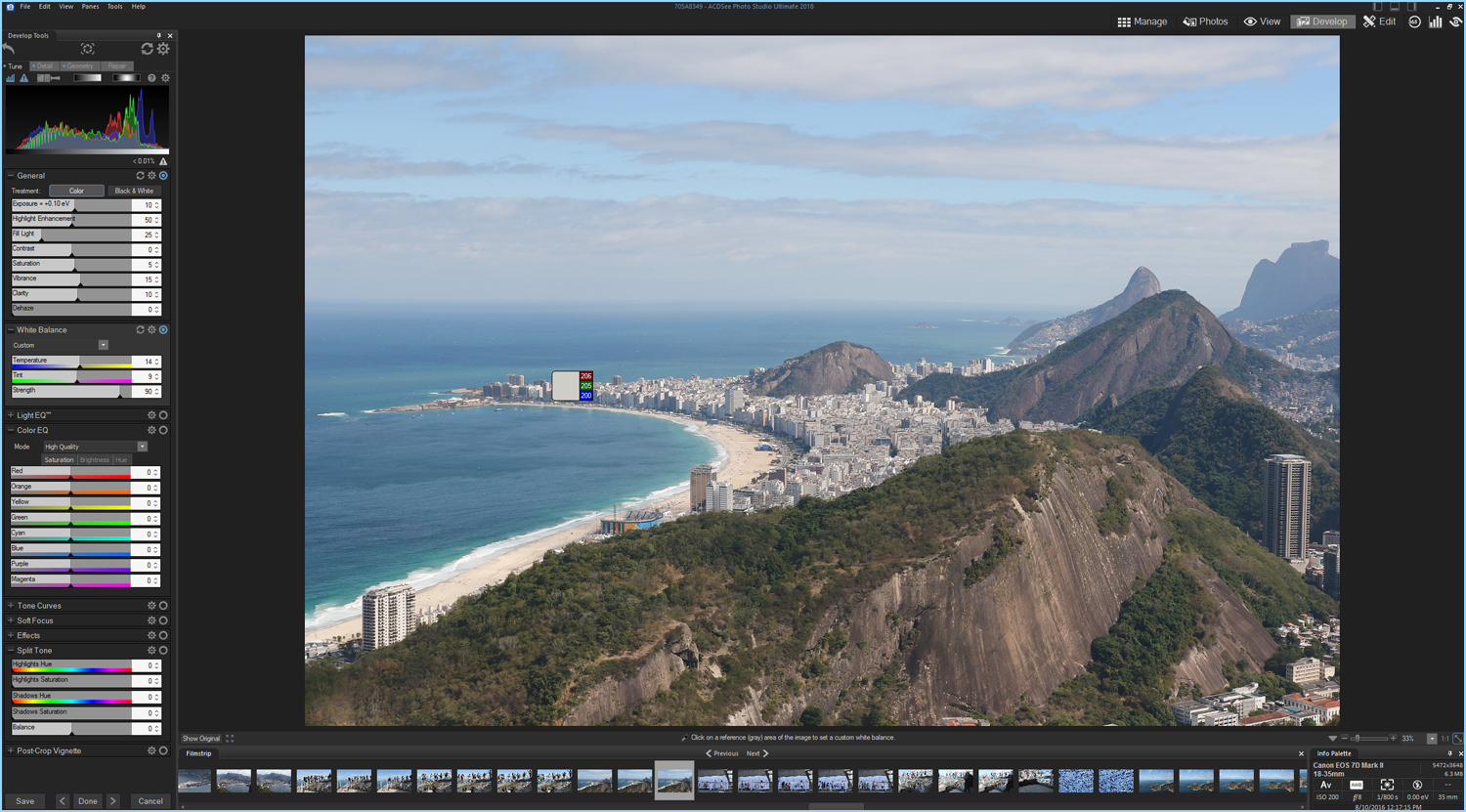
White balance is often a matter of personal taste. Over the years working as a digital tech, I've learned individuals tend to lean one way or the other when it comes to choosing warmer or cooler tones in their edits. When it comes to landscapes, there is always room for either depending on the season and the mood you want the image to convey. I personally lean toward cooler, more neutral tones. It took me many years before I warmed up to the idea of anything different. I encourage everyone to experiment with tones that make you uncomfortable. For this image, I am going to get really creative in the Color EQ and Split Tone panels, so I just add a little warmth here.
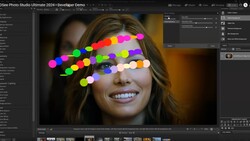
Color EQ
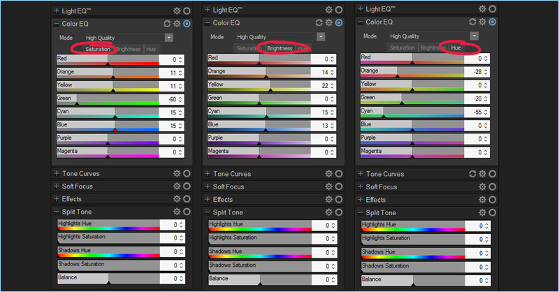
The Color EQ panel can be overwhelming for first-time users and the best way to learn how to use it is to just start playing with the sliders and see how they affect the image. A little change tends to go a long way but since this is all non-destructive, feel free to get a little weird. Sometimes, I enjoy making super bright pastel versions that resemble some sort of poster that might have hung in a 60s doctor's office.
This panel is divided up into three categories: saturation, brightness, and hue, each with eight different color designated sliders. A great feature within this panel is you can move the mouse cursor up and down over any color in the image and it will adjust the corresponding sliders. For this image, I decided I want to emphasize the soft colors in the sky while muting the greens in the mountains. I also want to bring out the warmer tones in the rock faces. This will also give the image a cold and warm diagonal split. These changes are very subtle but will really show their impact after we bring some contrast back using the curve panel.
Tone Curves
A popular look on platforms like Instagram is to flatten the blacks and whites giving the image a slightly washed out effect. I don't always like this look but it seems to be a good fit for the strong mountain foreground. I start out by creating a typical three-point “S” curve. This will bring back some of the contrast I took out in the General adjustments and start to really show those color tweaks in the Color EQ. Taking farthest points and bringing them up and down respectively will produce that slightly flat and washed out feel. Essentially it is removing the true blacks and true whites. One feature that the Curves panel is missing is a way to click on tones in the image and adjust the curve. This is something I would love to see added.
Split Tone

The last panel I will play with for this edit is the Split Tone panel. Here you can add a tint of color to the lights and darks independently without affecting its brightness. Just like with the Color EQ panel, there is no real right or wrong method and many photographers use this tool to get very creative results. Experimentation is the key here. I know I want to emphasize the warm and cool tone so I will pick two hues in those ranges and play with the Saturation sliders until I find something I like.
Final Edits
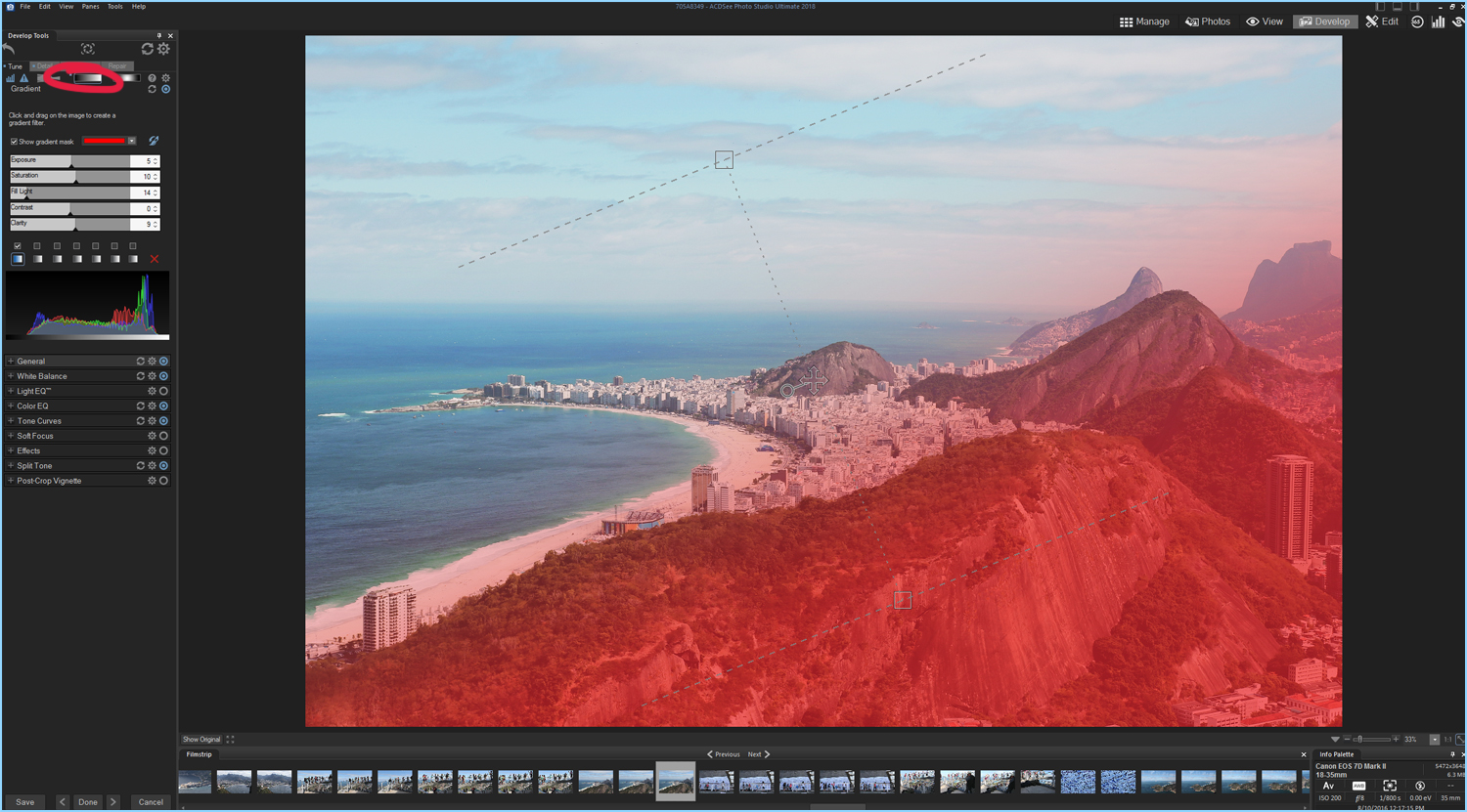
Once I’m done working my way through the different panels, I like to walk away and take a break. If I’m still happy when I come back, I know it's done. This time, I think I’d like to open up the mountains some more and deepen the warm tones. I don't want the water and sky to be affected, so I’m going to do this with a gradient. At the top of the panel are the brush icon, linear gradient, and radial gradient tools. ACDSee’s gradient tools are very user-friendly and intuitive. With the mask turned on I move the gradient so that it feathers the shoreline. I then make my final adjustments increasing the fill light, saturation, and clarity just a little more.


Join the Fstoppers community for free
-
Post comments and join in the discussions
-
Browse the site ad-free
-
Share your work and get featured in the community
-
Compete in the photo contests for fun and prizes
1 Comment
Wow beautiful!!