
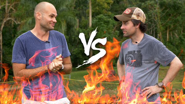
Patrick and I recently had a shootout to see who could take the best photograph at a Waterfall. We need your help determining the winner.
Below are two images taken at two different waterfalls in Puerto Rico. To help us determine the winner please vote on your favorite image below, and then see if you can guess who took which shot.
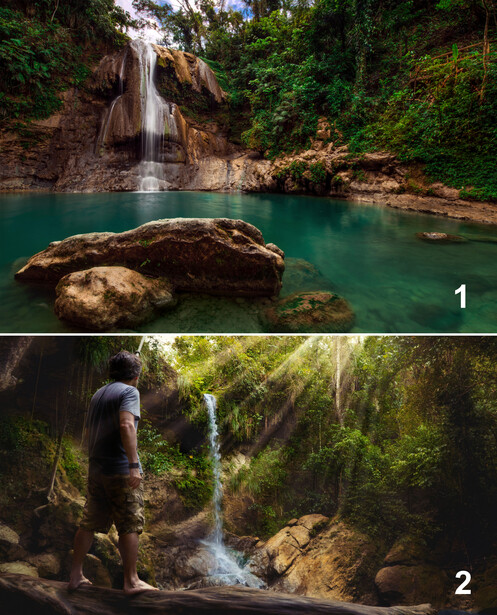
Please write your opinions below and we may read your comments in the final video. We hope to have the video released in the next few days.
Related Articles


43 Comments
1 - Tilted slightly clockwise?
2 - The beams of light look fake.
No. 2 might have won if there was a sexy model in a bathing suit gazing at the sun rays. :-)
Does anybody else see the huge face in the rocks behind the waterfall in No.1. Similar face to Easter Island statues or Mt. Rushmore.
Good eye!
I like shot 1. I think Lee took shot 2, Patrick took short 1.
I think I would prefer shot 1 if it was vertical to include more sky, and was shot at a higher height.
This poll seems a little pointless when you’re not even shooting the same subject/waterfall. The question almost then becomes which waterfall do you prefer more? And beyond that, one isn’t even a picture of a waterfall, but of a guy standing by a waterfall. Apples and oranges really. The comparison where you both shot the same beach house was much more interesting.
Kind of a silly question since they're both, umm... adequate. Don't quit your day jobs! But since that's not your thing, they're both pretty good with each having pros and cons.
Quite frankly I don`t know enough about either of you to have any idea other than a random guess as to who would have taken the photos.
As for the pictures themselves I prefer #1, the waterfall is much just more picturesque, and frankly I almost always prefer a shot of nature without some Bozo standing there ruining the shot.
I find the modern trend of the look at me here selfies annoying, occasionally it is good for size context, however just having someones back or feet in every shot is tired, and way overused.
I find the first image to be a nice photo of a waterfall. But it isn't all levelled out. The second image is less the portrayal of a waterfall than telling a story, so that it works for me for a different reason. The rays of light seem just a bit too fake, thpugh The second image as a whole catches my attention more than the first one, even though I am not a fan of "I've a quest to fulfill" poses. If the first image is straightened out, it would make for a nice decorative printout.
I think Patrick shot the second photo and Lee the first.
I prefer the first one because I feel like the person in the second photo is actually making the waterfall look smaller and less impressive, due to the perspective. This kind of defeats the purpose of having a person for scale.
As for who shot what, I’m going out on a limb and saying Lee shot the second one, because based on his battle with Mike, he likes the photoshop wizardry.
this only proves that you both really miss me!
ahahahahaha
The light rays in image 2 add more depth and feeling to the image.
I like the slightly long exposure to smooth the water in photo one also well composed and exposed, that was my vote.
The second one is not bad but Patrick could have slowed the shutter a litrle since he used himself as a model and set the camera on a tripod.
Ops... I am having second thoughts now, maybe Lee took the second one becuse I think Patrick would have thought of slowing the shutter down if the camera was on a tripod.
You guys always come up with ways to make the site fun and interesting...thanks. My opinion for what it’s worth, I like number one the best because it provides interest throughout the image. But personally I would like to see just a bit more detail in the water.To me it looks like white paint spilled over the rock. Number two, as already stated, loses power because of the relative sizes of the waterfall and Patrick. Both are better than I could do however.
Butch
Both are good, not spectacular - sorry guys. But, I like the first a lot better. It has composition elements I like without being cluttered. The second just looks too busy.
Hey, is this some kind of a game that you two came up with? It looks like a study in composition - what to do and what not to do! First one looks more thought out, but the second one looks like a bunch of composition subjects and techniques that, alone, would work well, but were thrust together into the same, overwhelming photo to the point that they blend together. A case that justifies "less is more"? If I'm wrong, sorry guys, but this is just the way I see it.
Were the light shafts added from Luminar?
I'd say lee took the first shot (no idea why) but its also the better image in my opinion. By modelling in photo 2 the waterfall looks small and the light rays are a bit fake. Also the waterfall looks blue which puts me off a bit. In photo 1 the photo should be tilted counter-clockwise a bit. Overall nice photos!
Image 1 for me( Lee?), for image 2, why add light rays? ;)
( btw i see the face too )
Image 2 is more interesting but looks like the god rays were added in post (too fake) and the water fall looks less grand.
Photo 1 isn't mind blowing, but it is a very nice image that captured the subject well.
Both are better than what I can do for now tho!
Both are good pictures. But #1 isn't anything I haven't seen a thousand times. That's not bad! It's very beautiful, picturesque, and very well done. But it looks like most pro photos I've seen of waterfalls.
#2 tells a story. I don't care for the light rays (removing them altogether would make the photo nicer, imo), but even still, there's a real intent with that photo. I really like how the placement of the guy + the wide angle seems to dwarf the size of the waterfall. #2 says a lot of things, #1 says few.
But, after voting, I realize I'm in the minority here.
#1 is better, technically. But #2 is more interesting because of the inclusion of a person.
So many beautiful chicas in PR.
So why did you put Patrick in shot #2 ?
I know you guys are just having a bit of fun, but I am sure you could have came up with better images, just my opinion, great site nd tutorials keep up the good work.
Definitely like no. 1 more and I think it was taken by Lee. Like some people commented, the second image is attempting to tell a story but I'm one of those people that prefer a cleaner landscape image over this anyday. Having in mind that Patrick is more focused on storytelling photos in the latest critiques, that's another hint.
Ha, looks like they're trying to uncover some unconscious bias here!
I prefer the 1st image. In the 2nd picture it doesn't look like Patrick being in the frame was planned in advance. Seems like it was an off the cuff plan B for him to jump in the frame, especially when you look at the choice of clothing, the potentially fake light beams, the insta-repeat concept... hopefully this doesn't crush Patrick's dreams of a career in lifestyle / adventure modelling.
No idea who would have taken either, I reckon the fact Patrick is in one of them is a red herring and he probably took that photo, so I'm saying Lee for no. 1 and Patrick no. 2. Look forward to the follow up
Being able to see where the water is going and the color I felt made for a more interesting shot.
If No. 2 had a lady in a bikini then maybe I would've vote for that one. : ]
Reluctant, because vote for #2, the person in that photo is a take down from the beauty.
Prefer the first image, without the moon boots the second image isn't as good.
No2 is a much better image in most aspects.
#1 feels a bit heavy weighted to the left for me, and the foreground rock seems a bit cramped against the edge of the image, but I really like the detail in the water and rock face. Also, the wide shot really makes the waterfall look much more prominent than it likely is, but since the waterfall is the key interest in the image, that's probably a good thing. For me, this is the more interesting of the two images.
#2 the light rays feel a bit synthetic to me, and while it is again more heavily weighted to the left, it feels less off balance than #1 for me. I really like the work to try and create some sort of epic feel to the image, but it seems misplaced for such a small waterfall. The smallness of the waterfall is made to look even smaller because the model is so large in the frame by comparison, so for me it comes off as dressing the location up as something it's not, which pulls me out of the image/story a bit.
My $0.02, for what it's worth!
#2 looks very forced.
Tough call: fake sunrays, or tilted horizon?
Maybe not portfolio images, but still good to learn from...
¡Bien hecho muchachos!
Los dos son buenos pero me gusta mas #1 porque nunca puedo conectar con la espalda de una persona en un foto. Y también pienso que este estilo de "selfie" es... hacido demaciado. Lo siento Patrick.
I personally like #2 because i am tired of seeing the "silky smooth" water. I think Patrick shot #2 because i know he likes the Alien Skin plugins and I suspect he used it to put in the flare from the top right.
1 – The rocks in the water give some depth to the picture, but they are too big for my taste and not that interesting. The flow of the waterfall is nice, but the light is boring. My guess would be Lee because I think the second one is a self-portrait.
2 – Looks like a self-portrait without focus. The three elements (person, waterfall and sunrays) don’t come together enough. Slower shutter speed could have improved the flow of the water.
Probably like the second one better because the light is way more interesting even though it looks like the sunrays were added (or enhanced) in post.
#2 was my favorite. For me, adding the figure gave it drama. There something about the tension in the body as this person looks up towards the sun that is interesting. He is not looking at the beauty of the waterfall but upward instead. Why? Who is he and how did he get there?
How about when the contest is over you let us play with the images.
I too would like to clone Patrick out of an otherwise good image.
Sadly I was going to have some fun with it.
"2 Stars, we agree."
Both pictures need work.
Picture 1:
+ The smooth water looks nice, so the long exposure and maybe the Polarizer are well put together.
+ Nice light on the waterfall's rock
+ Good composition (Nice balance of foreground + "middle ground" + background)
- Halo / Chromatic Aberration & Fringing in the background branches against the sky (purple/green)
- The whole greenery looks HDR-ish, (isn't that what Lee always says himself?), very dull, neon in some parts.
--> Overall post production could be way better.
Picture 2:
• The composition is okay, not really anything special, as a lot of the scenery is covered by the branch and the guy.
- Fake light beams --> Over-processed
- The whole light situation does not match. The beams are coming from the front but still the guy is side-lit from the right and has even some light on the left side. There's a possiblity that he was not even in the picture and has been composited into it after. But I rather think it's just the light beams that have been added afterwards. The waterfall is also lit from the top and not from where the light is suggested to be (light beams) Basically the whole picture is lit from straight above and the light beams have been added. That does not look right at all.
• Don't know what to say about it "positively"
My conclusion: Picture 1 is better than picture 2.
Thinking back of the video where Lee composited a car into a scenery, picture 2 would be on the same level of compositing (which isn't believable - neither was the car scenery). On the other hand, When Lee had the shootout with Mike Kelley, he did not go THAT crazy. So it's really hard to tell who took which picture. I guess, Lee 1, Patrick 2. But well, it's just 50-50. Anyway, both should work on their post-production skills, which they always critique themselves to be sloppy in Critique the community. If the HDR-ish look is fixed in picture, I clearly give the picture 3*.
I think they're both really good shots, but better for different contexts. I think 2 has more of a story to it. So for someone's personal branding, if they travel the world or wrote a book, this would be fantastic marketing materials with it. But 1, without context is just a good photo for print. Something you'd see in a motivational poster or something. I ended up voting 1, but I do like both.
Also Lee took the second photo because he complains about the person in the frame in every critique.
Though I like the idea of the 2nd photo, the placing of the person makes the waterfall look small. The sunrays are fake and over the top. Pretty sure Lee took it.