
The perfect black and white conversion technique will vary from photographer to photographer and rightfully so, because there’s truly no perfect technique. it’s subjective. However, there are three key areas that many photographers will overlook before exporting their files that directly influence how their final image will look.
Your Monitor
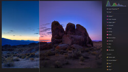
Beyond what software you use, whether that’s Adobe Lightroom, Photoshop, or Capture One, you should really consider what monitor you’re using to make your conversions on. Every monitor can and will display color, brightness, and contrast differently from another, even within the same brand of monitor. For example, when I’m on the go, I personally always have my Macbook Pro Retina with me at all times. I know that my Macbook displays really vibrant colors and more dramatic contrast than my monitor at home (EIZO CG2420), and that means I have to account for those settings. That means that I’m pretty much making an assumption of what my final image will look like without seeing it beforehand.
And for those of you who will jump down my throat about Apple computers, I love Apple. I wouldn’t go as far to say as I “bleed” Apple, but all my computers and handheld devices have the Apple logo on them. But even with that in mind, Apple isn’t known for color accuracy. It’s a brand known for vibrant color, because that’s what the consumer market wants. Your average consumer wants to see beautiful, vibrant colors. As a photographer, you’re not seeing an accurate depiction of what your final product will look like, which directly impacts it.
Color Casts
Yes, it’s a thing. A color cast is a visual tint of color in your image (usually unwanted) generally due to lighting or bright colors in the room. So, why is that important if you’re photographing in black and white? Well, for those of you who, like myself, add a tinge of blue to your image in order to get that silvery appearance in your digital black and white images, you’ll want to be very conscious of the environment you’re working in.
When you’re viewing your monitor under tungsten light for example, the warm temperature of the light can trick you into adding more blue in the image than actually needed. The same is true for the opposite. Additionally, really brightly colored walls in the room can do the exact same thing. For more information on that, check out my video here on color management considerations while editing:
Final Output
Believe it or not, I’m still surprised by how many photographers forget about how important their final product is going to be for creating any image. Usually, it’s an afterthought, when in reality, it should be one of the first things that you think about. If you’re printing, remember that every paper type will show color and contrast differently and the final finish of the paper will further accentuate those differences.
In the video above, I show you a perfect example of how the cover of my book, "Photographing Men," looks quite different than the original digital file. Had the original image been used solely for digital use, I would not have needed to retouch the image as much as it was compared to that which was used on the cover. The print used for the cover wasn’t as dark as I had originally intended, showcasing every part of the shadow areas to be seen. This meant that things like blemishes were easily visible. The point is, keep your final product in mind when thinking about converting your image to black and white.


9 Comments
These are not specific to b&w. They are important for color too.
Agreed! I included and mentioned the color tutorial for that reason. :)
Jeff,
Great informative video. I've watched your prior videos about monitor calibration.
There's some things that I know that I need:
1) Monitor calibration system. I have a dual monitor setup HP 23" and 20" monitors and I can't calibrate them manually.
2) Better monitors
Regarding the use of B&W, if I want to photograph in B&W, I'll load B&W film in my camera. So far, I haven't converted a color photo to B&W. Towards the end of 2011, I decided to photograph the year 2012 exclusively with B&W film. I found that traditional silver-based B&W film like Kodak Tri-X or TMAX or Ilford HP5 or Delta films looks like B&W. With the C-41 films, Kodak BW400CN (no longer manufactured) and Ilford XP2, I have to adjust the color casts in Lightroom. Scanned images from BW400CN have a sepia cast and scanned images from XP2 have a cyan cast.
For my DSLR, even though I'm not printing (yet), I've got it set to capture in Adobe RGB. Why lose information if I want it later? That's my thought process as a computer developer.
My wife may say "You want what?" when I mention about a calibration monitor. But photography is not my vocation. She did buy me a 5D Mk III and she knows that I want a zoom telephoto that goes beyond 105mm.
"Believe it or not, I’m still surprised by how many photographers forget about how important their final product is going to be for creating any image. Usually, it’s an afterthought, when in reality, it should be one of the first things that you think about."
Believe it or not... everything you said in those 2 sentences is obvious or wrong: the "final product" is the LAST thing you think about as a photographer, because photos today are not final. In fact they never decades ago (darkroom exposures, paper choices, baths, etc.).
You work in RAW for a reason. Each exported FINAL should be tweaked for the viewing device, printing process, and size that your audience is going to be viewing it.
Even then, in the case of printing whether it be offset or digital large format in a perfectly calibrated profiled workflow, there's an age-old thing called "press checks" and "on-press adjustments" to take into account humidity, paper, ink, water percentages, etc. etc. to compensate and bring the image as close to ideal as possible for the medium it's being printed on and the venue it will be viewed.
Photographers: create your art, ALWAYS shoot RAW... and you're good to go. Calibration and profiling is helpful... but it is NOT perfect and never will be with literally 100's of variables to be considered.
***@JeffRojas - This is like the 3rd or 4th video you've made about calibration and color theory, that just goes into far too much detail, worry and bad suggestions about getting ONE photo squeezed into a very small moving set of goal posts. Why?
You're entitled to your opinion. :)
Have a great day! :)
First: I really like your photography, beautiful BW book "Photographing Men", and your dedication to the technicalities of getting the most out of your photos.
Out of curiosity, have you ever sent any of your production photos to multiple labs (mid to pro outside of NY) choosing similar paper quality and size? I'd be very surprised if the resulting prints all came back looking similar in tonality.
I actually have done this, as well as work with a number of photographers and print shops to know that within a perfectly calibrated workflow, there will be variances... some larger that others... many times based on the day the print is made (climate, paper ge, number of printes processed on the day of the order, etc.)
It's these variables that obsessive calibration and tweaking can't fix, which is all I'm trying to get across. Also, that the photograph itself also has to stand in artistic quality with or without technical quality perfection.
Working photographers absolutely SHOULD be thinking about their final product throughout the process. Doing everything you can to get the photo right on the front end reduces time spent editing, and time is money. Having a focused idea of what exactly you're shooting for sets you up for success in any type of business.
I think there's some confusion here as to what FINAL PRODUCT actually means. You and Jeff are absolutely correct in getting the picture as perfect as possible in-camera and in post.
However, because the picture most likely will be viewed across multiple devices and differing final products, each export should take into affect each device... which Jeff is proselytizing about. I agree with him, up to the point where he goes into superfluous calibrated scenario details for calibrating towards ONE final product.
Using his BW examples: how many non-photo people do you know that can view a low-contrast 10-bit BW without a color cast correctly on their phone, PC or laptop? Now take that to a printer that prints in CMYK and let him/her tell you what needs to possibly be tweaked to make it come out the way you want it to, let alone be printable, on press.
Once again, the variables above including viewing environment are so vast, that the technical ability and time needed too tweak them all is more time consuming, than say... shoot some more awesome photos instead.
Jeff, thanks for a great article. Where in the post process are you adding a 'tinge of blue"? Are you shooting in color, tinging, then converting? Or are we talking about something more complex?