
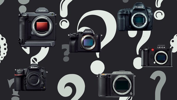
Well, let’s open this huge can of worms and see what happens.
Over the last few years, Sony has done something incredible. They managed to make people care about the most boring thing in a camera: the menu. The first few mirrorless cameras that Sony produced were terrible. I hated so much about them that the menu was too far down the list for it to ever be anything I discussed.
Since then of course, Sony has made some huge changes and updates to almost all its cameras. The current mirrorless cameras from Sony are so good, that we now argue about the minutest, tweezer plucking points ever.
Does it Matter?
Yes, it does. Although I am poking fun at this discussion, I do think it’s important for camera manufacturers to offer a well-designed user interface. Cameras with a bad menu system, or a convoluted interface, end up frustrating people away. This is something that Sony has been working hard on and in my view, its cameras have come a long way. The abundance of custom buttons make for a pleasing overall experience.
For a long time, cameras only had the ability to take pictures. Designing an interface for that was pretty straight forward. Now, we have cameras that require multiple settings for just the viewfinders, let alone anything else. Due to this, menus from most camera manufacturers have become bloated and difficult to manage.
It’s more important now for manufacturers to figure out a simple and easy to use interface. Cameras now, offer a great number of features and I have a feeling this number is yet to increase. It’s not enough to simply add another page in the menu, a complete overhaul is probably required in order to keep things manageable.
What Do I Think?
I’ve now shot with most of the current major manufacturers on the market. Based on my experience, I have drawn a few conclusions on what I think is the best menu system.
1. Hasselblad
In 2015, Hasselblad hired Perry Oosting as its CEO. Oosting was previously the CEO of a cell phone company called Vertu and this I think, has had the biggest influence on current generation Hasselblad cameras.
The menu systems used in Hasseblad cameras are without a doubt the best on the market. There is a familiarity to it because it’s been influenced by smartphone operating systems. The whole menu has been optimized for touch screen use, making it incredibly easy to understand. Simple swipe gestures allow you to move from one section to another. Couple that with the dials and buttons that Hasselblad cameras have, and you have the best menu system on the market.
https://www.youtube.com/watch?v=3SCdkoBd8Fk
Nothing else comes close.
2. Canon
Almost anyone who has shot with a Canon camera, probably agrees that Canon have a very intuitive and easy to use menu system. Everything seems logical and easy to understand. The easy to use menu system is one of the reasons, I still prefer to shoot with Canon for any meaningful projects.
Canon is one of the few manufacturers that offers a proper and fully useable touch screen. Most other manufacturers only allow you to use the touch screen for swiping through images or selecting AF points. Although this is useful, it’s frustrating to have a limited touch screen.
https://www.youtube.com/watch?v=W4MKmXXJBn8
I can comfortably say, Canon has the best menu system from any full frame camera on the market.
3. Pentax
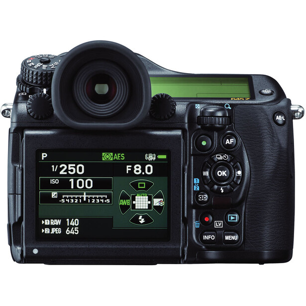
It’s the little things that really caught my attention. For example, the camera screen will flash if you leave the lens cap on. Yes, I’ve left the lens cap on a fair few times. This is more to do with the camera warning you about exposure, as opposed to it being about the lens cap, but still, very useful.
Everything about the camera, like the buttons and the fact that it had two tripod mounts, just made me enjoy shooting with it.
4. Sony
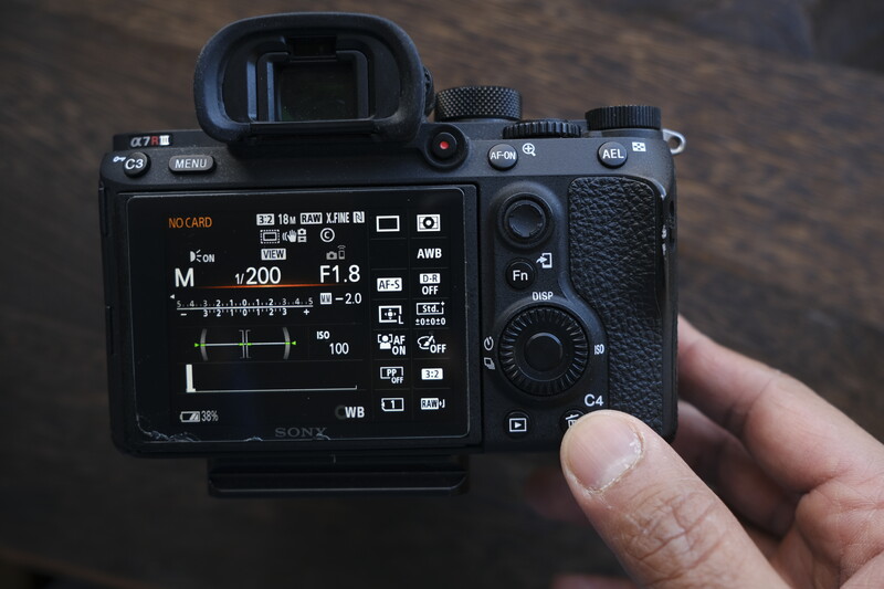
Sony is somewhat of a mixed bag. The a7 series of cameras started off with having the worst menu and user interface. Since then, Sony has worked hard to improve the overall experience. The menu system remains relatively unchanged; however, Sony has added a whole bunch of customizable buttons. It’s these buttons that have made the overall experience significantly better. I almost never need to go into the menu, because the custom buttons offer me almost every feature I need, for most shoots.
Also, the favorites menu is extremely helpful for quick access to my most used features.
If Sony can improve its actual menu and offer a proper touch screen, it could potentially take Canons spot.
5. Leica
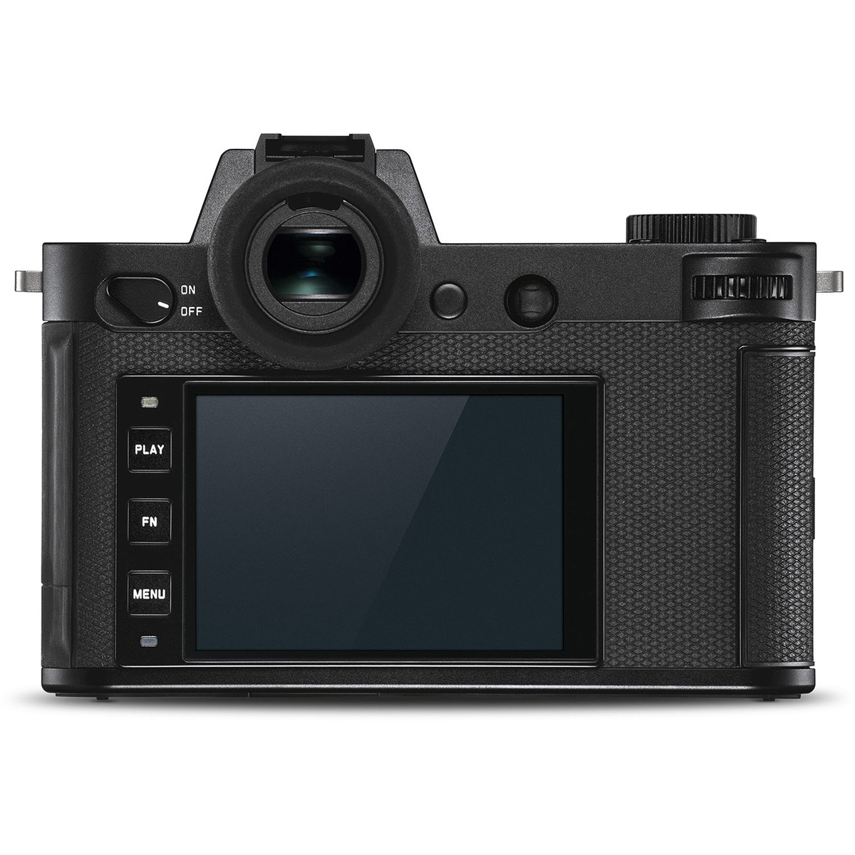
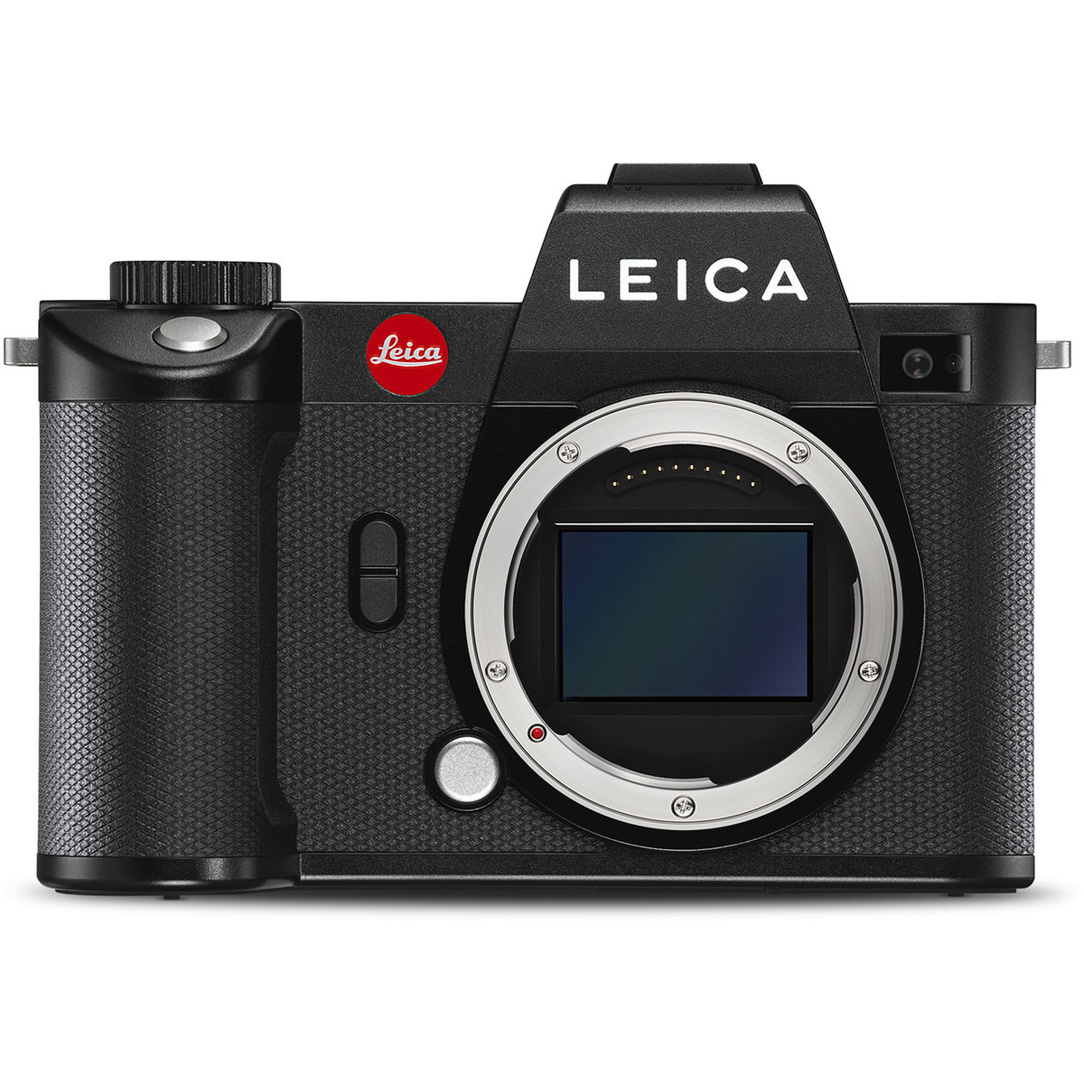
When it comes to Leica, it seems to depend on the camera you shoot with. I would rate the M series of cameras much higher than Sony; but then, those cameras are far simpler with far fewer features.
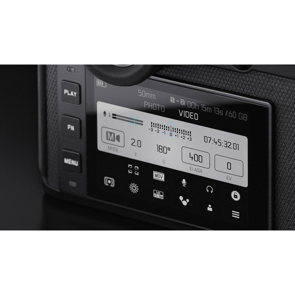
Cameras like the SL2, however, tend to be a little frustrating to use. It’s not the menu because the menu in the SL2 is fantastic and incredibly easy to use. The problem is the lack of buttons on the camera body, which in my view, detracts from the overall experience.
The camera doesn’t have a front dial which is something I always miss. Although the SL2 does have a top dial, it’s less than comfortable to use. The camera also doesn't have a D-pad, which does make quick access to features a bit of a pain. The minimal design looks beautiful but, from a practical standpoint it can be a little slower and less effective to shoot with. A fully useable touch screen would go a long way with the SL2.
6. Phase One
https://www.youtube.com/watch?v=mbJB_JUwHi4
The menu system in Phase One cameras are about as good as Hasselblad, potentially even better. They both offer similar swipe gestures and a fully useable touch screen. The menu has also been optimized for touch and I absolutely love it. You may be wondering why I’ve ranked this camera so low then. Well, there are a few issues that I experience with Phase One that pushes it down the ranks for me.
Phase One tends to over complicate its menu system. There are settings within settings, within settings. I prefer something a little straight forward. I can appreciate that some people would describe this as a benefit, and I wouldn’t disagree with them either. I just personally prefer a simpler design. Also, the time it takes for Phase One backs to load images in the playback screen is ridiculous. I appreciate the files are huge, but a Hasselblad camera with the same sensor has never had a problem.
Finally, the number of crashes and shutdowns I have to go through just to use the camera, is too much for me. Admittedly, this is mostly because I shoot with a technical camera, so it’s an unfair point against Phase One. The technical camera is essentially a huge adapter. I appreciate the back would work better on a Phase One camera, but this is based on my experience and what I think.
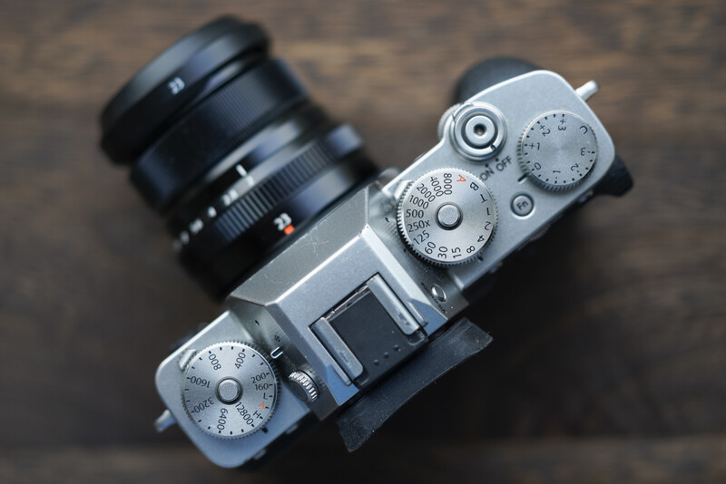
7. Fujifilm
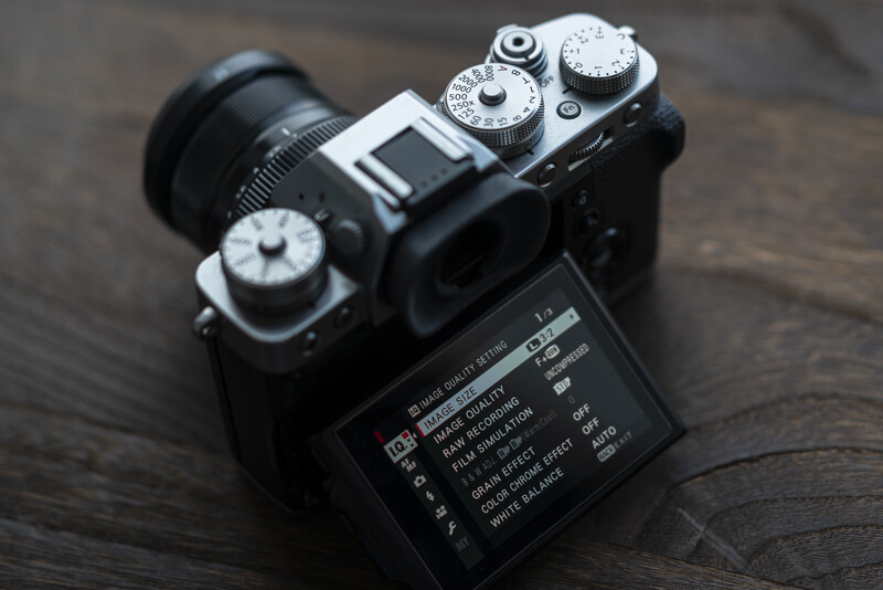
I hate Fujifilm’s menu system. Fuji's menu system is kind of like Argos here in the UK. Every retailer decided on one way of running a shop and Argos thought, no, we want to be different.
I hate the fact that Fuji made Auto ISO more complicated than it needs to be. I also hate using top dials because you can’t use them while holding the camera with both hands, ready to take a shot. The top dials are a terrible idea; I mean sure they look great but, there's a reason why every other manufacturer moved away from that design. Honestly, it's the most impractical camera I've ever used in a professional setting. It's a beautiful camera and I love the results it produces, but I hate the menu system and overall interface.
The Q menu feature is ok, but I never use it because you can’t actually go into the settings from that page. Instead you have a few surface level settings available for you to control. Why couldn’t it just be a shortcut? Also, the user settings are so long and so over the top, that I’ve never been able to find anything I wanted the first time around. Finally, the camera doesn’t have a fully useable touch screen.
So many photographers keep talking about how great the Fuji menu system is, but honestly, it’s by far the worst I’ve ever used. Despite this, Fuji cameras produce such wonderful results that I completely overlook these “quirks”.
8. Nikon
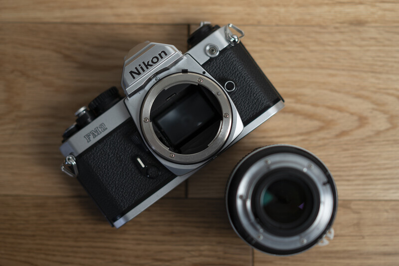
Immediate disqualification for having the lens attach the wrong way.
Panasonic and Olympus (Nikon)
I simply haven’t built enough experience with Panasonic and Olympus cameras yet, so, I can’t really comment extensively on them. What I will say is that my impression of their interface was mostly positive.
The same is true for Nikon, they’re just an easy target.
What Do You Think?
If you conduct a poll online asking people which camera menu system is the best, more than likely, Canon will win. This happens pretty much every time but, I don’t think we can conclude that Canon is the best just yet. The reason I say this is because it could be down to the fact that more people shoot with Canon; which essentially means that more people can vote for Canon.
Even though Sony has been generating a lot of sales, more people own Canon cameras than any other current manufacturer. What we generally see, is people tend to vote for the brand they shoot with. Due to this, It’s difficult to make any objective conclusions about which camera has the best menu system.
Nevertheless, here is a poll to see what you all think.
Final Thoughts and Suggestions
There are a couple of things that camera manufacturers need to change. Firstly, stop limiting touch screens. Dear god, this is such a punchable offense. I don’t care what the nonsense excuse is… stop it. If you’re going to put in a touch screen, then let it be useable across the whole menu and not just to select focus points. Sony and Fujifilm, I’m looking at you.
Almost every camera on the market right now needs a larger screen. The tiny, low resolution screens need to go. Sony is the worst for this. The screens in every a7 series camera is garbage level bad. What’s even worse is that Sony has no excuse. I’m pretty such they have more experience in screens than almost any other camera manufacturer.
Ultimately, it comes down to your own personal preferences. I’m sure many of you will vehemently disagree with me about my preferences, but that’s what they are. Whatever camera you’re most comfortable with, is probably going to be the one with the best menu system.


Join the Fstoppers community for free
-
Post comments and join in the discussions
-
Browse the site ad-free
-
Share your work and get featured in the community
-
Compete in the photo contests for fun and prizes
63 Comments
The Canon menu system is amazing. It's so extremely well-organized and they don't have crazy subnesting of menu items (looking at you, Sony). Also, if you pick an item on Canon, you will even get a little description of what that menu item does. And yes, every item on a Canon touchscreen is selectable and Canon touchscreens support things like swipe, pinch to zoom, etc. Just like a smartphone.
Is the menu system from the T5i and the full frame Canon cameras different? Curious only used the T5i and I found it a bit cumbersome
the menus are mostly the same, just more options the more advanced the camera.
I think its a good thing, you get used to one body and using another or an upgrade is really easy
I've only putzed around with other cameras, but Canon's menu system is easy to use.
Your topic is interesting. The article is less than adequate. Whatever your reasons for not reviewing Nikon are not suitable reasons to not review Nikon's menu system. Of course, if you have no knowledge of the system, it is your responsibility to learn it so you can offer your opinion. Any article with this topic must have Nikon's system included in sufficient detail.
It’s not a review or a matter of not reviewing. I simply haven’t had a chance to shoot extensively with that camera. I also haven’t shot much with Panasonic. I doubt there are many people who have shot extensively with every brand.
It’s not my responsibility either lol. I work as a photographer and I’ve had a chance to shoot with a bunch of cameras for my work. The article is about my experience so far.
Except the title of the article is "Which Camera Manufacturer Has the Best Menu System?"
It's just lazy and you are trying to mask the lack of effort you effort you put into this article by making a joke.
fstoppers is such a weird site; the founders produce such amazingly high quality content...and yet their contributing authors write the laziest articles with pure click-bait titles. I wish lee and patrick would insist that the photographers/writers they work with approached the gig with the same work ethic they do
Lol it’s a question...
There’s a poll and it includes my thoughts with more than 1800 words.
Seriously, where do you get off with such entitlement?
I don't feel entitled to the contributing authors of this site doing a good job; it's just a desire of mine. I really enjoy lee and patrick's content -- I think it would be cool if the contributing authors produced equally high quality content.
Maybe it would require increasing compensation for the authors (if you're being compensated at all) because right now there appears to be very little incentive to write anything more than lazy, un-researched opinion pieces with controversial titles
Maybe you should work on your profile before pointing at other things and calling it lazy...
Yes, my fstoppers profile is incomplete. Fortunately, that has no bearing on the quality of the articles featured on this site.
Ok I'll bite, how would you improve the article? Is it purely because it's lacking my thoughts on Nikon?
I think what Dale is referring to is from the journalist perspective. A journalist with a title similar to yours would establish a set of criterias, would review each camera individually and list the pos and cons for each system based on the standard set in the criteria.
Saying that Dale has to remember this is an opinion piece. You are simply listing your experience with each of the systems. This is more a failure of the site, as the article should be listed as an opinion piece rather then an actual review of the camera's menu systems.
It has been listed as an opinion piece and not a review. It's even written as one with sub headings that literally say what I think.
I personally understand you tried to make some jokes with this particular article, but I also think it's actually a legitimately interesting topic. A more robust look at it would be very helpful, especially for those who aren't familiar with camera menu systems (and I'm definitely not).
To address a more serious attempt at "menu system" review article you would probably want to explain components of user interface design, which is a pretty huge, serious and well-researched field. I have interest in UI-design from a software engineering perspective so I can throw in my 2 cents:
To start off with, you'd have to explain the qualities of what a "good" menu system "should" be - basically some sort of rubric. Then you would grade the camera systems against such a rubric.
Ideally, you come up with common user scenarios and grade the cameras on their ability to activate the feature.
For example, you could count how many steps/button presses to enable some commonly-used feature or switch a commonly-used setting. Eye-auto-focus is all the rage - how do you set it up (let's assume no special customizations)? For that matter, how easy is it to setup custom buttons/functions?
Maybe you assign scores to quality of the lcd/viewfinder screens in some way (flips, touch-friendly, does well in bright light, etc.)
The tricky one to me is how to figure out how well the manufacturer grouped/categorized certain features together in a "intuitive" manner.
You could go REALLY deep into this if you wanted (weighted user scenarios, user modelling for experienced/novice/specialty users), but that's probably not necessary. For the purposes of a site like this, it'd be nice for interested people to get a good relative feel of the camera menu systems to make their purchase decisions accordingly.
The reason I kept it somewhat light is because it's not really possible to make objective points about which manufacturer is the best. It's based predominantly on preference and as you can see from the poll, my prediction came to pass. Canon is as usual number one but I don't think Canon is the best.
Here's an example, I would score a flip out touch screen much higher than just a tilt screen. Many people disagree with me and consider a tilt screen to be superior. How would an objective scoring system be feasible when there's no consensus on what is better between features.
The only thing I could objectively score is how easy it is to change ISO, Shutter and Aperture. Every camera I shot with have dials with easy access to that. Other than those features Every photographer seems to have their own preferences.
A design feature of a camera that's properly loved by some is deeply hated by others.
If I did something like what you describe the effort would have been for nothing. People would then attack the scoring system itself to negate the article.
Most people have already made up their minds, they just want me to agree with them.
I liked the Canon menus better than Sony but I honestly think every camera menu sucks. There are just so many options to keep organized and everyone prioritises different things so no one's really happy. Honestly, dumbing down the menus but then letting you add any option to any field/row would be the best. You should also be able to save and share these menu layouts from camera so others can try them. You could download a wildlife menu from your favorite photographer and give it a go. This way if you're not sure what you need or why it's important you can learn from them.
Side note:There are the some no brainers though. Should I really have to add "Format" to My Menu on Sony just so I can find it and use it faster? Absolutely not.
As a former Canon person who moved to Sony, I would say you've got Canon in the right spot, but not Sony. (I would put Nikon up there at #3 or #4.). Sony added enough customizable buttons and a quick menu so that you don't have to go into the main menu often. But if you do, it is confusing and illogical. And the absence of a true touch screen in the most recent iterations of the A7 and A9 is is shameful.
I haven’t shot enough with Nikon to determine its spot for my list but I’m sure it’s up there.
I like programmable buttons because the menu is really confusing. The a6600 still only has two wheels
Good topic, Usman. My take would be a bit different. First I would choose the major metrics upon which I would base my judgement.
For instance...
1. Ease of navigation.Clear logic and intuitive operation.
2. Responsiveness. Fluidity of touch interface or button operation.
3. Operational proficiency. Synergy between menu system, ergonomics and button layout.
Then rank every brand by the an overall sum.
My preliminary list (highly subjective, take it with a grain of salt)
1. Leica/Hassi/P1
2. Pentax/Canon/Lumix/Nikon
3. Sony
Full disclosure: I primarily shoot Nikon.
Olympus might be one of the worst that I've used, things always feel buried or unintuitive. Unlike the Canons that I have for work and fun, I feel like I can never find what I'm looking for despite owning four Olympus so far and regularly using them for a few years now. For example, my E-M1 Mark II has a setting where you have the option of one fish or three fish. Most settings if you leave the selector on them long enough will explain what you're changing, but not this one! For the record, it's "Underwater Wide" or "Underwater Macro", not that the camera will tell you that. It's only obvious if you already know what it does.
One fish or three?? Haha
i've abandoned olympus and sony within a week of buying one of their models because of the opaque menu systems and user interfaces. i still own an rx100, but i shoot it on /AI/ mode so i don't have to go into the dungeons and get lost and eaten by a cave troll. and it's not just that sony model, it's all of the 5-6 i've owned over the last 10 years.
if anything, the olympus i tried was worse. i know i sent it back after a week and buying 3 ebooks to try to figure it out. i haven't owned a canon since the long ago d30 and never owned some of the listed cameras such as leica, fuji, and hasselblad. at least not in digital models.
i won't say panasonic is perfect, but it should be much higher in your list and it's much easier for me to understand than any other brand. combine that with the flexibility of their function buttons and my s1 is one of the most configurable, easy to use cameras i've ever owned, and that is hundreds over 55 years. it takes the trophy from the gh5 which had no flies on it, but the s1's larger size means more and easier to reach and use controls.
/guy
Panasonic isn’t on the list though, I don’t have enough experience with it to list it anywhere just yet.
The Nikon bit was really petty.
Oh lighten up.
As a recent employee at a major camera shop, we had a number of pro photographers move to Sony for the technology but then switch back when Nikon and Canon (kinda) caught up due to the menu system and UX of the Sonys.
Is there anything the Sony menu did that the Nikon menu couldn’t in a different way? That seems like an insane reason to take the financial hit of switching systems.
I haven't worked with all these brands, but so far the best I've worked with is Panasonic, and the worst I've worked with is Sony.
Everyone will be attracted to some system for whatever reason, so I'm sure they'll be someone who feels the exact opposite of my two choices.
As a Fuji shooter, I'm quite envious of that Panasonic remote app. It looks useful and fairly comprehensive.
RE FUJI: Sadly, I agree mostly with your comments about Fuji. That said, as an ex-Canon user [and its menu is better no doubt], it's the X100F I always take with me. As so many have said before, it just 'feels right' in your hands. I love it. But 'yes' I'd like its menu to be a lot more intuitive. Ha! like the Hasselblad's? Wow .. it is mind-blowingly good. Thanks for your stimulating post.
Usman Dawood
I didn't vote as all I have ever tried is the menu of 4 modern cameras from 2 of the manufacturers.
Looking at the votes though - it seems you are wrong.
You know; the majority are always right or are they just the majority?
I’m wrong about what I like?
You could easily be wrong about things you like.
900+ people think you are :-)
You're getting opinions and preferences mixed up here lol.
The poll is not about whether I'm right or wrong cause that wouldn't make sense haha. The poll is about what other people prefer.
The conclusion you can draw is that my preferences don't necessarily match other peoples preferences which is kind of normal...
The most counterintuitive thing is Nikons ... menu banks on d cameras and lack of custom button selected mode af activation on the z series.
I haven't used many camera systems, but I've never had any trouble with Pentax and Fujifilm. When I shot Sony, that was a killer ... their menus was the main reason I left.
Best menù? Nikon.
Worst one: Sony.
In between Fuji and Canon.
Really stop this "sony best bla bla nonsense". Or are you paid from them?
Sony came 4th...
People will say I'm crazy, but I think Olympus is great. Most of the stuff buried in menus are items I'm not going to change on a regular basis. The Super Control Panel has everything I would access on a regular basis in one screen. And you can set it to stay on the rear screen. As soon as I take by eye from the viewfinder, the screen turns on with my most used settings.
Nothing crazy about liking something :)
I would say hasseblad has the only usable ui and the rest is so far behind and bad that it is embarassing to rank them. We have 2020, 13 years after the first Iphone the camera interfaces are so bad, like they are stuck in the 80/90s. really good retina ips displays are costing nothing - you can get a 1080p iphone ips replacement touchscreen for 30 euro - no camera back display comes close to this quality ……… why? I want to have big 5 inch touchscreen displays on the back of any camera. with a good interface you can remove a loot of the tiny buttons und the back. less stuff which can break. make a good contextual ui design by ui professionals. I wanna have a camera from the post iphone era, not a bulky vcr interface. and if I can make another wish, make them easy user replaceable like on the pre x iphone, just two screws and a connector.
I have to agree -- hassleblad is great but the rest are kindovan embarrassment to the decade we live in...
Regarding his take on Fuji:
>hate using top dials because you can’t use them while holding the camera with both hands, ready to take a shot
You can actually configure the camera to select aperture, iso, and shutter speed (and even EC) using the front and rear dials -- just like every other camera. It just has different defaults than the author was used to.
I'm sure he'd argue that its a failing in the menu system that he didn't know that -- but the section on Nikon makes me believe he's not the most patient when things are different from what he's familiar with.
I think opinions like this are why cameras are not as progressive as they could be; everyone is resistant to change and innovation. they want what they had before. Consequently camera technology and UI stagnates. I'd like to see someone really give this some thought and make a truly compelling user experience. I find almost all camera menus quite dated -- as if we are still living in the 80s.
There will be naysayers who don't like change (and who can't even handle a camera mount turning in a different direction) but I embrace innovation...and progress. hassleblad leads the way; the rest are variants on how _not_ to build a user interface in 2020
"I think opinions like this are why cameras are not as progressive as they could be"
Really?
Hasselblad got the number one spot...
I feel like you're intentionally being obtuse or missing vital parts of the article to create your own narrative.
Also what are you on about with Nikon? It sounds like you're taking my tongue and cheek comments about the company, personally. Also for a bit of context, my experience with Nikon is limited to the FM2. You're making some huge leaps and lots of unfounded claims about me.
Are you a troll?
> I feel like you're intentionally being obtuse...
Yes, I know hassleblad got the top spot in your rankings; if you left it at that, I'd have nothing further to say on the subject.
However, you undermined yourself with this quote: "I hate Fujifilm’s menu system. Fuji's menu system is kind of like Argos here in the UK. Every retailer decided on one way of running a shop and Argos thought, no, we want to be different." That was the part that I was referring to when I stated that opinions like this make camera manufacturers risk averse.
> Also what are you on about with Nikon? It sounds like you're taking my tongue and cheek comments about the company, personally
I don't even shoot Nikon so I don't see how or why I'd take it personally. I feel like it's the manufacturer that's most likely to go bankrupt in the next 10 years because they're slow to adapt to a rapidly changing camera industry...
> Are you a troll?
If you're implying I'm here to just stir up drama, no. I'm genuine in my opinions. It may appear that way because I did not enjoy this article...and you can't understand why
the tl;dr is -- its something I really care about because I've shot quite a few different brands and because, professionally, I work regularly with very talented UX designers. I was excited to read the headline.
Addressing camera usability is the biggest thing holding the industry back (and would bring it back from its recent, massive downfall)...but the content of this article was pretty superficial, incomplete, and sometimes even misinformed
I don't understand an article answering the question of which camera OEM has the best menu system but then males this statement, "I simply haven’t built enough experience with Panasonic and Olympus cameras yet, so, I can’t really comment extensively on them. What I will say is that my impression of their interface was mostly positive."
Many reviews have been written about the Panasonic LUMIX menu system being one the easiest, most intuitive menu systems in the market. By contrast Sony has been stated to have the worst of any of them for years.
I would strongly suggest properly reviewing Panasonic, Olympus and Nikon. Then come back with an update to this article.
I agree about Sonys menu system but the custom buttons make up so much that I would probably still rate it higher than Panasonic. I have some experience with those cameras but I didn't feel it would be right to list them at this stage.
It's an opinion piece about what I've found and what I like up to now. I'll consider getting the last three in at some point too.
Wait. Nikon just has their lens mount backwards? I've only ever shot Nikon and Canon, usually Nikon, and just assumed Canon's was backwards. Are there any others that mount in the same direction?