As photographers we like to believe that everything we shoot is flawless straight out of the camera. The truth is that, most of the time, each of us spends more time and effort editing our work than actually shooting it. We will completely change the color or the crop of an image without thinking twice. Why then don't we at least consider one of the easiest way to completely change an image; the "horizontal flip."
A few weeks ago I saw a post by Ash Ahuja on the Fstoppers Facebook Group asking the community to choose between 2 images. The images were both the exact same, but one had simply been "flipped" horizontally in Photoshop. The community was split as to which image/composition was better. This got me thinking about why, during my 10 years as a professional photographer, have I not flipped a single image.
I asked Ash to help me with a little test and he agreed to let us use his awesome images. Below are 11 different images "flipped" both ways. Sometimes "A" images are the original, and sometimes the "B" images are the original. Below each set of images are 2 polls. You can vote for which image you think is the original and which image you believe is best. Maybe you will like the original best, maybe you will prefer the "flipped" image. At the bottom of the post you can view the correct answers.
I honestly have no idea how this small quiz/poll will go. I would assume the majority of people will prefer the original unflipped images, but only time will tell.
1.


2.


3.


4.


5.


6.


7.


8.


9.


10.


11.


I just took this test myself and for simplicity sake I voted the same answer for both questions (which is original and which do I like best). I was pretty confident that I could tell which ones had been flipped as I was taking the test and I was very wrong. I was wrong about numbers 2, 5, 7, and 8. I'm also ashamed at how long I looked at number 11 trying to figure out which one wasn't flipped.
I think you should label the photos with numbers....its not easy figure them out
Great article Lee. It really makes a big difference to the photos. I think the thing catching my eye with some of the shots is that when the images are flipped the direction of the sunlight/shadows seems to change the time of day I would guess the photos where taken.
So all the set of pictures are labeled A then B except for 8 and 9. I cast my votes with the assumption that all the pics were labeled A then B in that order. So for 8 and 9 my votes were opposite of what I thought were the original pics and which I liked best. Not a big deal but I didn't catch the transposition of the letters until I went back to check my answers to compare my votes to the "original" key.
Thanks. That was my mistake. It has been fixed
I think that, for the most part, when scrolling down a page, we tend to vote for whichever one we see "first" as our favorite, regardless of whether or not we believe it is flipped. We automatically tend to see that as "correct", and somehow as preferable to the "incorrect" image that is otherwise exactly the same.
The big exception here, of course, would be in cases where the "flip" is obvious. In some of the images, many features were obviously mirrored from what they should have been. This is especially the case with all of the images with text in them. All other aesthetics aside, I would be willing to bet that most people would find the obvious mirroring of recognizable features as bothersome, and thus prefer the original images.
The ones with letters, the woman with the belt, and I figured the cigarette was in the right hand - these were easy. The others, I liked the ones looking to the left - I think that shows my reading left to right. I liked the fountain on the right because again reading from the left it was as if it had a whole front with the back cut off. I definitely like photos with the subject looking to the left, which I guess shows my western reading bias. Has anyone done a study seeing if women like their photos flipped so the view is the same as they see in the mirror?
I think flipping an image only really effects the person doing the flipping. After you've been looking at the original image for so long, deciding to flip it will be a refreshing take on something familiar- really just effecting your own perception. The viewer, not knowing that it was flipped will not he effected by the idea - they will only perceive the end result. It all comes down to the photographers preference in the moment.
On the flip side of this idea (pun totally intended), there's some psychology at play when you change the association of left and right, but again, some people might not infer those meanings or emotions at all. But one simple example involving someone deep in thought, looking to a side of the frame. Gazing to the left might imply creative / imaginative thinking, and to the right might imply analytical critical thinking for some. Changing an "eye roll" to be left or right might have a similar effect. A politician looking left or right might invoke associated left or right politics respectively.
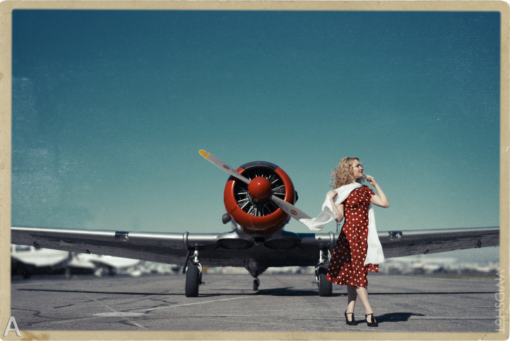
People have a subtle awareness of others with left dominate hands. Flipping an image of a right handed person writing could attract more attention by deviating from the "norm" of perception. I had this effect when looking at the vintage fighter plane image - I noticed the flipped image first because i was distracted by the backwards lettering on the plane. You've effectively drew me closer to the image with a a head scratch moment. So flipping something familiar might grab someone's attention unknowingly
Anyway there's tons more emotional mood type associations with the direction of scene elements, and those would be my reasons for flipping an image.
As an art director I'm forced to flip pictures every day. Sometimes it works out, others not so much. I agree with the others here that it's an initial reaction to the first picture you see.
In addition to flipping, color-grading also becomes difficult to get used to if you've lived with a layout for a while, say in the famous Teal-Orange, and then the client wants a Lime-Peach. Everything looks "off" for quite a while. To those that haven't seen the initial layouts, they're wowed and you go, "but they never saw the awesome Teal-Orange". Imagine their reaction to a natural color and then a color-grade. I have to step away for a day or so to finalize a retouch or layout to be honest. It never looks right flipping between left/right facing or before-after coloring in PS or LR.
BTW: I was one of the few folks that chose B-B for picture 10, because I immediately saw my opportunity to fit the headline to the article knowing it was coming from *my client standing right behind me*... regardless of which looked better. ;)
*The Ghost of Approaching Monday*
I was completely biased towards images that the line of sight trailed to the right. I wonder if that is a left-to-right reading bias. That felt more natural to me in every case.
I'm a righty, so whichever image that leads my viewing direction to the right, I like it better than the other. I also find myself composing my subject on the right of the frame a lot more often than the left.
I would give a word of warning to those who want to try this. Really consider it before doing this to portraits. I've had people notice before that they are facing the wrong direction. They can sometimes pick up on the fact that "something ain't right" immediately, but it is usually the hair that gives it away. Some people get a little offended by the change.
I have actually had the opposite as well - as people like how they look in the mirror a lot more than in photos, as what they see in the mirror seems more real to them.
For me this was a hard test because I naturally lean towards moving from right to left in photos and tend to frame the photo accordingly. Def an eye opener of a possible limitation/bias on my own part.
For me it has a point only when object are in a picture , like the airplane or the Car ... And it is interesting.
Thanks
"during my 10 years as a professional photographer, have I not flipped a single image."
You have to be joking Lee. I often flip landscape and 'arty-farty' files just to look if it makes a better composition; although I usually decide when photographing the scene if it will/can/should be rotated PP. I have even "cheated" by printing a negatives upside down; however we need to be careful what files are rotated. Wedding rings end up on the right hand and as we can see from the above images words end up back to front. There have been times I reversed the writing back to how it should be. I have flipped images when giving CC on forums as it shows the less experienced how composition affects our photography. There are no laws in photography and cheating is good for the soul; as long as we don't get caught lol
Cheers
Haha it's true. Obviously I've played with the option in Photoshop but I've never exported a final image "flipped"
They were fairly easy, by assuming all the models were right handed and then examining which pose would feel most natural. ( I actually put my self in each pose) The cigarette one was the easiest under that assumption. She's holding it in her right hand. The city scene and #2 and 7# were the toughest as there wasn't much to judge handeness on. So I had to think about how a right hand photographer would frame the picture.
Love your articles!
Always very helpful.
-chris