
A question to ask yourself before composing your landscape photos is: what's the subject? Having a clear answer to that will help you create good photographs. But there are situations where no matter how you position your camera, some elements in the frame will distract from the main subject. In this article, I share editing techniques you can use to alleviate that problem.
Before we dive into those, I want to stress three points I made in a previous article about retouching. Don't default to fixing problems in photos via editing. First, put in the work in the field and try to avoid the need for such edits. If that's not possible, make sure you do everything you can to make those edits easier, and while doing this, know your post-processing capabilities.
While visiting Kapas Biru waterfall in Indonesia, I spend a lot of time searching for the best angle to photograph this magnificent cascade. The subject was obvious. But I did not only want to show the waterfall. I also wanted to include its surroundings, which make Kaps Biru special.
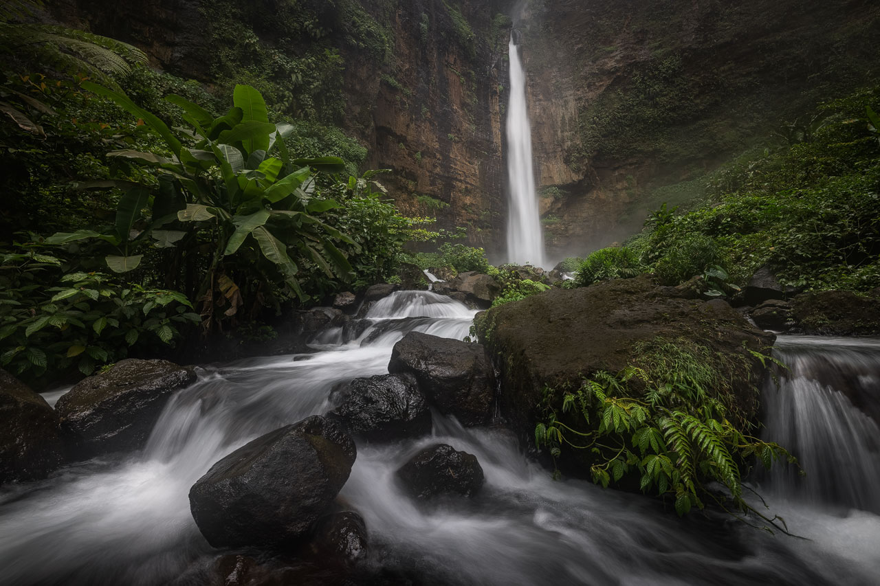
After an hour in the area, I found a beautiful section of the stream leading toward the waterfall. I positioned myself in its center and captured the photo above. The idea was for the river to draw the viewer toward the massive waterfall in the background. But right out of the camera, it didn't work. Let me show you the photo I started with and point out the problem I had to solve.
Selective Image Transformations
When you apply selective image transformations, try to keep the integrity of your subject and its surroundings. Don't let those manipulations become a distraction themselves, and try to keep it realistic.
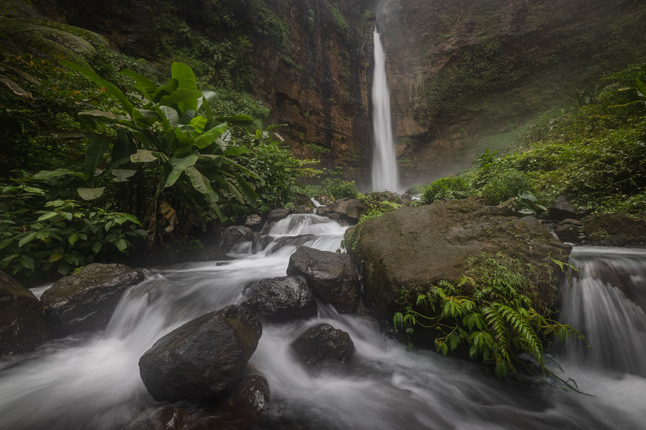
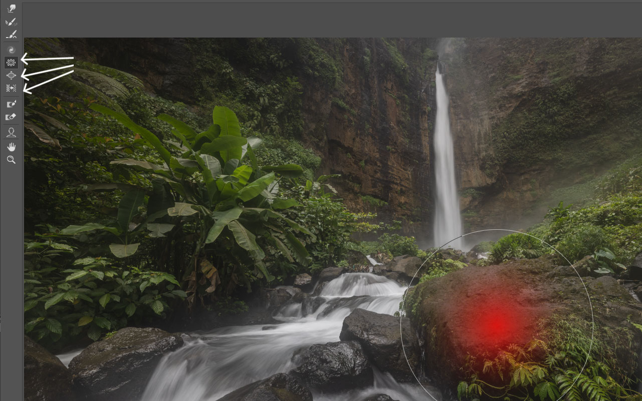
With the photo of Kapas Biru, I had to apply more severe transformations than I typically do. The foreground rock had too much weight in the composition. So, instead of working with the commonly used warp tool, I went for the Liquify filter. It's great to reduce the size of an object anywhere in the frame. A precondition for Liquify to work is that the element you transform does not contain straight lines or have a defined shape. This would give the manipulation away.
Randomly shaped rocks work great, though. In Photoshop, create a flattened copy of your current edit or convert it into a "Smart Object," The latter will allow you to apply the filter non-destructively. Then, head to "Filter - Liquify," which will open a new panel. Ignore the settings on the right side. The tools of choice for resizing elements in landscape photos are the "Distortion Tools" on the left. Of those, you will find the "Pucker," "Bloat," and "Push" tools to be the most helpful for landscape photos. You can combine them with the "Freeze Mask" tool, which lets you preserve certain areas.
Dodge and Burn
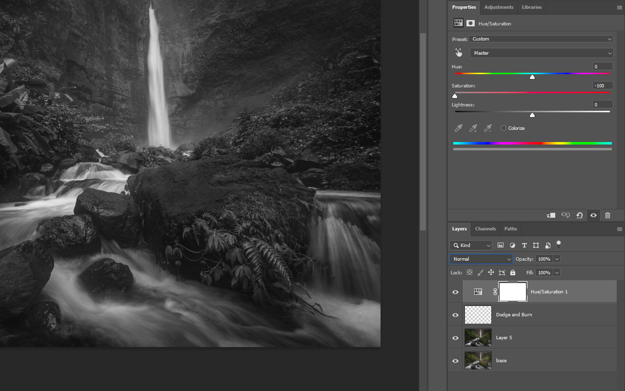
I feel like dodge and burn comes up in every other article I write for Fstoppers, but rightly so, because it's an invaluable technique. You can use it to darken areas of a photo that contain distractions and brighten those toward which you want to draw the viewers' attention.
Create an empty layer on top of the layer stack and set its blend mode to "Soft Light." Then, use a black, soft brush to paint over areas you want to darken and a white, soft brush to brighten important elements. In the Kapas Biru photo, I darkened the rock to bring its tonality closer to the smaller rocks next to it. This way, it no longer stands out. I intentionally brightened the waterfall to draw the viewers' gaze past the rocks.
Micro-contrast
The third tool I want to share with you affects micro-contrast. The eye is not only drawn toward brighter areas in a photo. It's also drawn toward contrast. Hence, selectively decreasing and increasing micro-contrast will help guide the viewer in a similar way as dodge and burn.
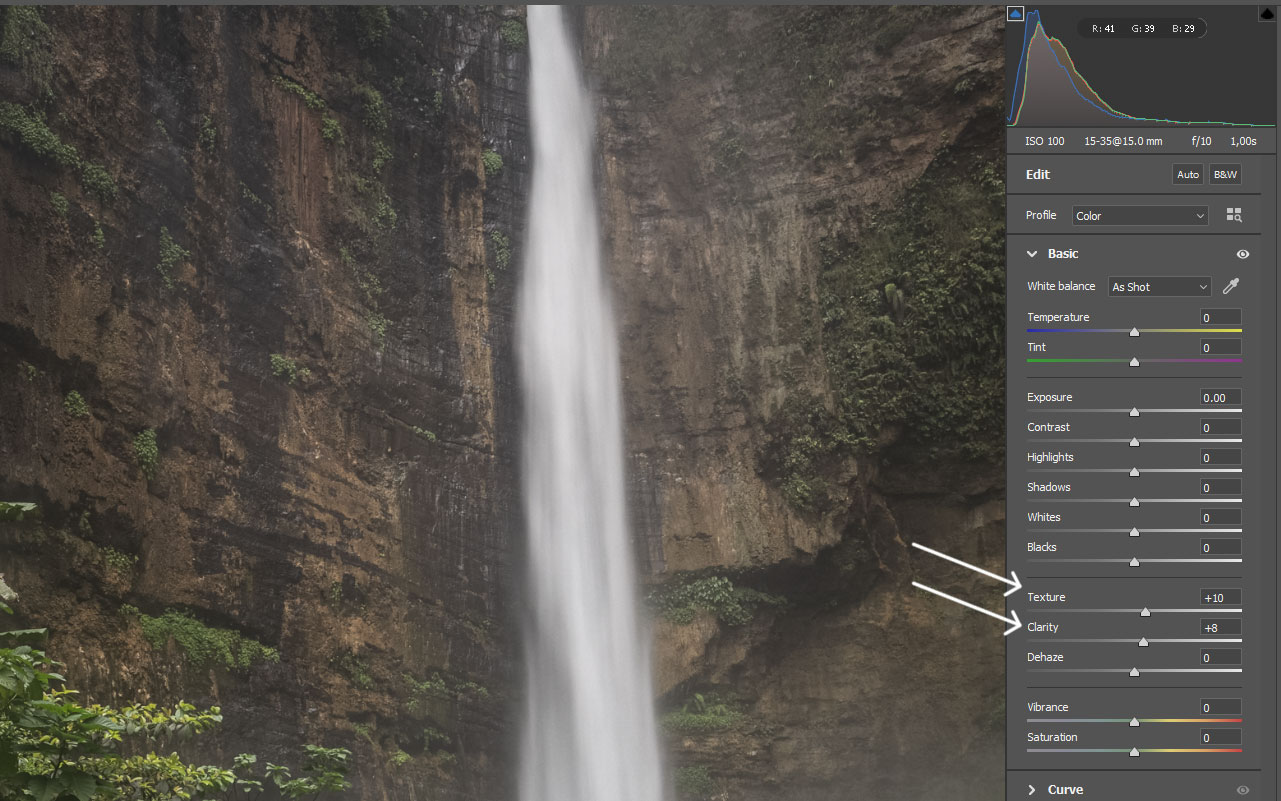
There are different ways to change micro-contrast. I like to use the Camera Raw Filter. With the Texture and Clarity sliders, I can emphasize and diminish details by adding and reducing micro-contrast. In the photo of Kapas Biru, I added both texture and clarity to the rocky cliff around the cascade by applying a mask.
Conclusion
In this article, I showed you three tools you can use to reduce distractions in your images without having to remove them completely. For small distractions, using the clone tool might be the best solution. But once the distracting elements are too big, removing them is no viable solution, not only from a technical perspective, but because you'd compromise the integrity of the scene. While the techniques above also bend reality to some degree, I find they still allow us to retain a result close enough to reality to still count as photography.
Finally, I want to point out that the techniques from this article work very well with those I shared in my article about How To Add Mood to Your Landscape Photos. If you haven't read this one, check it out.
Join the Fstoppers community for free
-
Post comments and join in the discussions
-
Browse the site ad-free
-
Share your work and get featured in the community
-
Compete in the photo contests for fun and prizes
No comments yet