
For decades, I have struggled with retouching my headshot images. I deal with a variety of problems, ranging from fixing crooked neckties to removing flyaways. The biggest problem for me, however, is evening out skin tones, or more specifically, reducing redness in the skin. A new Color Variance slider in Lightroom may help anyone dealing with this issue.
The Color Variance slider is a user-friendly tool that enables you to adjust the blending of color tones. You can choose to make tones of different hues blend together or stand apart from each other. Recently, I spoke with Ben Warde, Principal Product Manager at Adobe Lightroom, who demonstrated how the slider can be used to make subtle color differences more noticeable in a landscape photo.
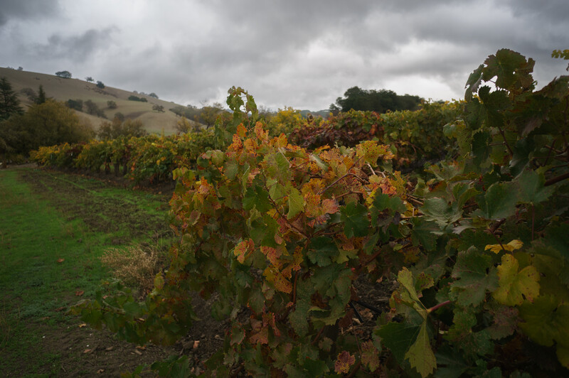
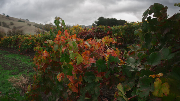
First, we start with a photograph showing green and yellow leaves. As might be expected, there is some variation in color hues present in the leaves. Depending on your artistic intent and the subject of the photograph, you may want to increase the difference between these hues, or you may want to decrease the difference.
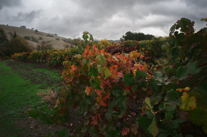
To use the new tool, select the Masking tool and navigate to Point Color. Then, use the eyedropper tool to select one or more tones in the image to be used as a color reference. For this photograph, Ben selected a few leaves showing different hues of green and yellow. He moved the Color Variance slider to the right, and the difference between the shades of green and yellow became more apparent.
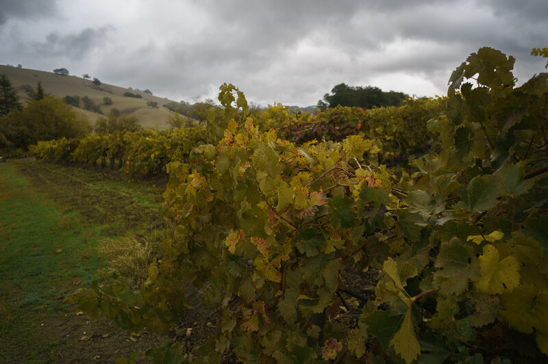
If you move the slider to the left, the colors will become more homogeneous. Art is subjective, and each photographer is entitled to their own artistic interpretation of a scene. In this photograph, a photographer would likely want to move the slider to the right so that the different color gradations present in the leaves are more apparent.
Next, let's examine how I utilized the Color Variance slider to balance the tones in a headshot. As a portrait photographer, this is how I intend to use the tool.
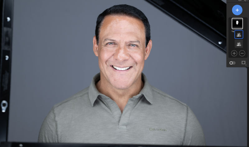
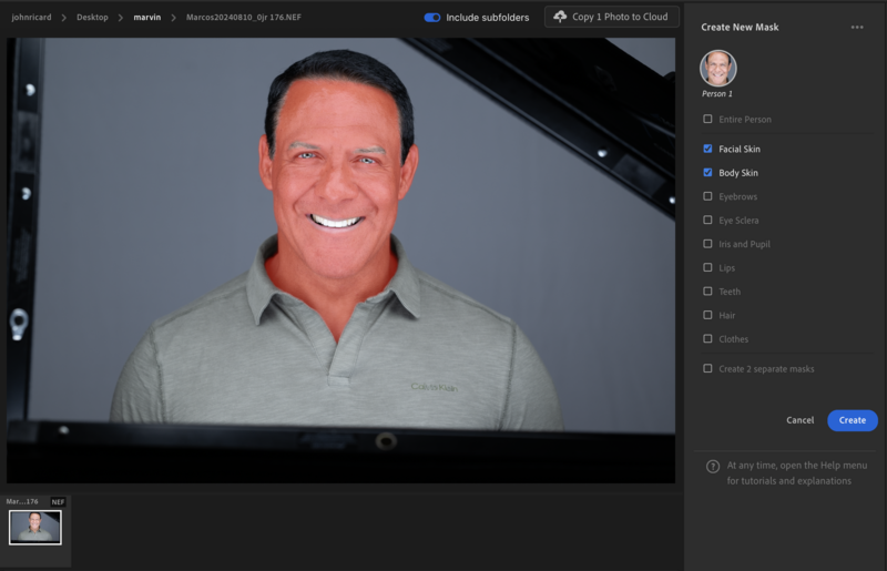
In the unretouched photograph above, you can see uneven skin tones and redness in the face. First, I used the Create New Mask tool to create a new mask. I selected the Subject and refined that selection to include only Facial Skin and Body Skin.
The Color Variance tool is found in the Point Color dialog box. I used the eyedropper tool to select three areas of the face that represented the range of tones present in the face. Next, I made adjustments to the Hue, Saturation, and Luminance.
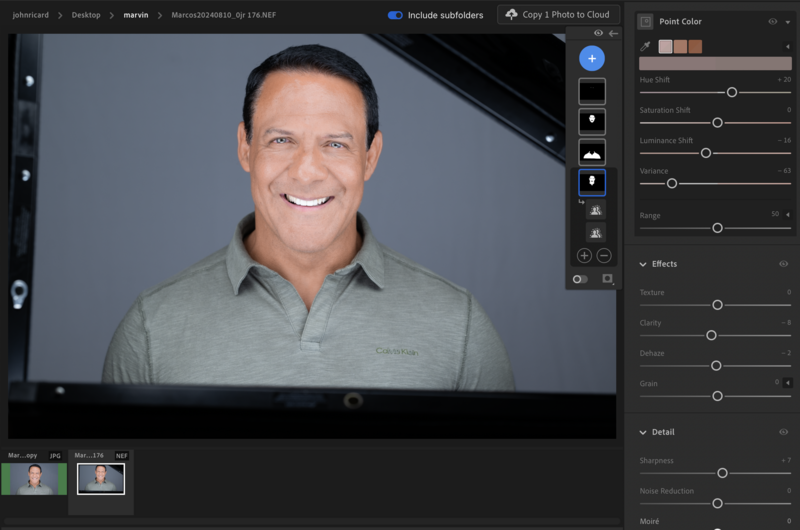
I didn't have a game plan for these adjustments. I just moved them around until the colors looked pleasing to my eyes. Finally, I applied Lightroom's Smooth Facial Skin.
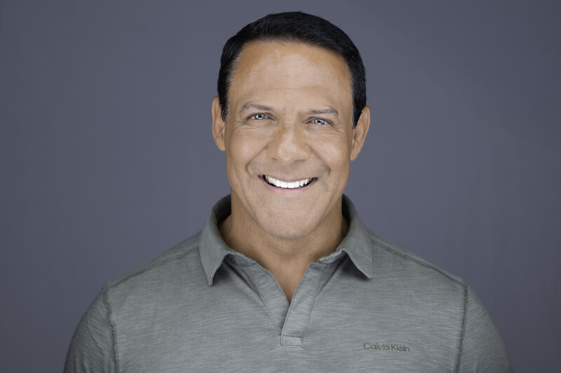
As someone who continues to struggle with retouching, I welcome any tool that reduces the need for mastery of the retouching process.


Join the Fstoppers community for free
-
Post comments and join in the discussions
-
Browse the site ad-free
-
Share your work and get featured in the community
-
Compete in the photo contests for fun and prizes
No comments yet