Color management is a critical skill that can significantly impact the final outcome of an image. Mastering this aspect of photography is especially important when dealing with colors that subtly influence a photo's mood and tone, such as blue. This helpful video tutorial will show you how to carefully manage the blue hues in your photos to produce a more polished final product.
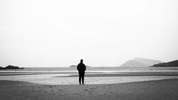
Coming to you from Omar Gonzalez Photography, this informative video addresses a common but often overlooked issue in color photography: the overbearing presence of blue. The narrator showcases various examples where blue, despite its natural and unobtrusive nature, can become distracting in an image. This draws attention to how even subtle elements can significantly affect a photograph's overall impact.
Through a series of image edits, Gonzalez demonstrates how to manipulate the blue channel in post-processing to balance the image's color palette effectively. This technique is especially useful in scenarios where blue tones overshadow other important elements in a photograph. Even nuanced post-processing can enhance the realism and aesthetic appeal of a photograph, and the more you work on developing that eye for subtle details, the more creative control you will find you are able to take over your shots. Check out the video above for the full rundown from Gonzalez.


Join the Fstoppers community for free
-
Post comments and join in the discussions
-
Browse the site ad-free
-
Share your work and get featured in the community
-
Compete in the photo contests for fun and prizes
2 Comments
Lunatic.
I'm primarily a real estate photographer, and stray blues are like rusty needles in my eyes. I get rid of them every day all day. My method is using layers in PS and brushing in my adjustments with a 75% hardness brush, 100% opacity, 5% flow.