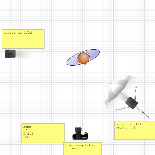
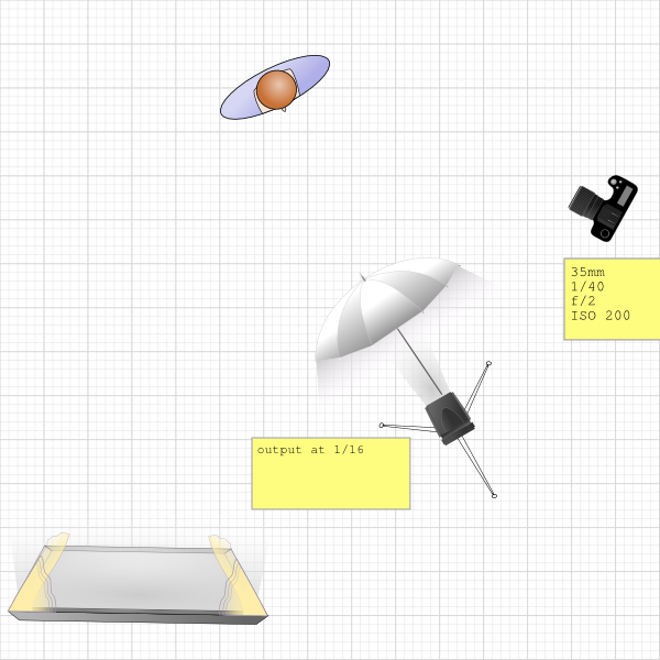
A couple weeks ago I was fortunate to work with Tina Hughes, a talented local clothing designer. Her latest collection blends vintage and modern elements. I thought that my friend's modernist house would be the perfect location for the shoot. We were limited to doing the shoot during the (bright and sunny) day so I used speedlites, a polarizing filter and orange gels to add a moodiness to the images. You may note the I used a fairly wide open aperture in the images. This allowed me to blend the lights evenly with the available light. Watch the behind-the-scenes video to get a better look at the shoot.
Lessons similar to this one as well as 25 other lighting diagrams are available in my new e-book, RGLR, The Run & Gun Lighting Resource for $10.


Great work :)
Why did he use a polarizing filter? For the window?
To darken the sky and reduce reflection in the windows.
Btw, can I ask you which polarizing filter did you use?
Presumably to eliminate reflections on the glass. Great work as always, Nick. The orange gel / crazy blue exterior was a nice touch.
great has always !
Doesn't look very retro.
Very nice Nick
Awesome work!
Great work :-)
VERY VERY GOOD!!!
Minimalistic photo equipment, everything is simple and final results are staggering. Great ;)
I think we are all in agreement that this is solid work without tons of equipment.
Your the man ! I seen u standing on your pelican case i do that all the time and sit on it ... Which insert do you use in your i destroyed my foam
I think this is a good example that gear isn't everything. No critique to the photographer. The images are really great but in this case I also really think the fantastically beautiful model and that awesome house has a lot to do with the end result.
Not impressed with the light, or the poses. Same shoes in every shot? Why is everyone freaking out over these?
I hate smoking ughh so gross, I really hate the glamourising of cigarettes in imagery but I understand it adds to the retro look, I must admit I smiled at the end when the model pulled it out of her mouth and made a face at the taste - gold! Again Nick, solid work - I think being minimalistic in terms of lighting and equipment can actually be quite liberating! Thanks for sharing :)