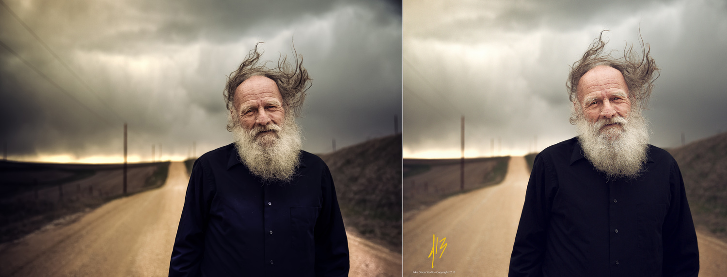
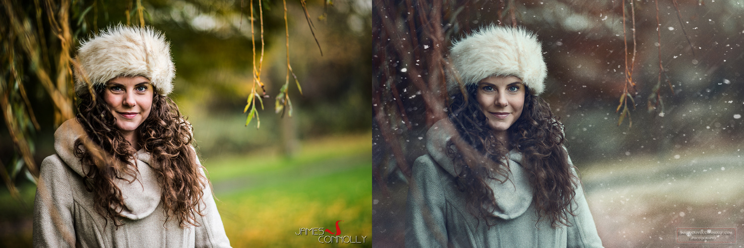
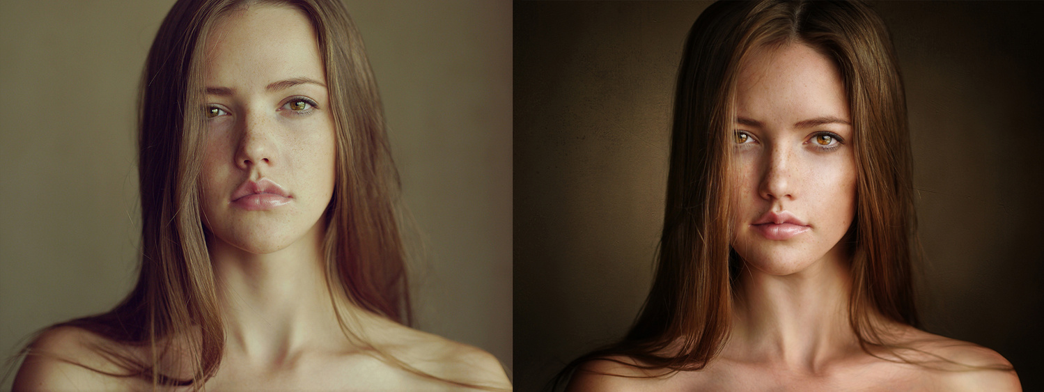
People often forget that all successful photographers started from the bottom. This knowledge should be an aspiring photographer's motivation that fuels every action and re-touch. Each person has the ability to exceed beyond expectations; to set goals and reach them. In the future, you may look back at your work with embarrassment. Remembering where you started from should be a source of pride. The growth of 20 popular photographers in their retouching skills might be the greatest source of inspiration.
20 popular photographer were asked to go ahead and re-edit a photo they took a while back. Both the original edit and the new edit are placed side by side for comparison. When viewing this article, it's important to remember that the intended purpose is not to showcase these photographers. Instead, this collection was put together as a form of inspiration in its rawest form. They were very kind to share their work and time to learn from. The difference between now/then range anywhere from 9 months to a few years.
The majority of people jump into photography thinking their photo edits will be flawless with the click of a few buttons. But just like photography, retouching takes persistence starting with endless hours in front of a screen and the patience to try and learn how to master it. There is no action, preset or shortcut to make an image an amazing one; each photo needs its personal attention. The successful artists in the field get asked countless times what the secret is. But there is no secret. If there was a secret, it would be somewhere on the internet by now.
(Photos are clickable and can be navigated via the keyboard arrow buttons)


Dylan Patrick - "I've been a beast since day one"
I was thinking the same thing.
Lol mine was more about skin for me, harder to tell than the others but lots more skin texture retained in the current edits :-)
<3 love this!!!
Sean Archer most improved in my opinion. But really everyone has improved! Great job!
Are Sean Archer's photos really the same? (I think the hair is too different and facial expression too...)
Nevertheless, notable improvements on every photo!
You're right) It's not the same. I lost original file, so I worked with the next one fom the same photoshoot.
The second one is nicer IMO. Do you like it better (reguardless of editing?)
Yes, crop is much better)
Thank you! Really, it was only 3 months after I bought my first camera) Two years between these edits.
It seems to me in the last few years there has been a real focus on skin detail preservation and less overuse of the contrast slider among many other more subtle refinements. Cool post!
Adam, are we being asked to accept true craftsmanship or stylized effects? WHAT was improved? IF the "look" of the small web sample was improved / changed, is that an example of "improvement" or just change? What if the actual retouching work viewed at larger file sizes is NOT improved but rather degraded (see my posts previous for a "few" examples? Do we then say that these "artists" have improved something? What if the viewer is looking at these on a horrid, non calibrated monitor? What is then the improvement? Sean Archer's images above are not even the same image, so what was improved? For all we know, the exposures were different, various things were different? I just say Prove It vs. Hype It.
Hi Ed,
I understand your arguments. I don't totally disagree with you either.
However, I think you're overshooting the intended scope of the article. I think we are being asked to accept that each photographer has shown growth, although subjective, in their retouching/style over time. You're obviously very analytical and more comfortable with objectivity, facts, specs and the like.
I don't think the article is hyping anything really. I don't think the article is claiming any one of these photographers produces flawless images with zero destructive editing. in the context of the article I don't think it's necessary to prove it either.
I think the scope of the article is confined to web viewing (of course there are loads of quirks) since we are looking at these images online and at the chosen display size. If the purpose of the article was to compare large prints, to view the images at 100% and compare each pixel then you may find some of the flaws you suspect are there, maybe not. I can appreciate your desire to find out for sure, though.
It's kind of like watching an action movie, sometimes you just need to suspend belief in order to enjoy it. Sometimes the point is not to analyze the plot to death or to determine if the exploding car really would have flown 100 feet in the air. There becomes a point where you suck any enjoyment out of it, where you lose the message or point of it altogether. Rather, sit back, relax and take from it what you can and move on. You may actually enjoy the show.
What a perfect example of how experience and taste can be unrelated. Some people became heavier handed, others much lighter. Some improved their color awareness (or maybe just upgraded their monitors), others now desire the depressingly cloudy color treatment.
Great post Dani. Loved looking through these and seeing the changes.
Thanks Dani ! Curious to see this post in a year time and compare them again !!!
Odd. In just about 1/2 of these, I prefer the first edit over the second.
What is noticeably on every set is that recent edits are much more subtle : less contrast, less highlights, more shadows, details and more neutral white balance. So... Can we say that improving is going to a more natural result ?
I will totally agree with that... I'm now much more subtle!!!! When we start in this we all tend to "overcook"
our post processing.
Every time I see a overooked image I ask the shooter/editor if they just discovered those settings / plugin, the answer is almost always 'yes'
Very true ! ! !
Great post, fascinating to see the evolution and progress of the work in 3 years. Congratulations to all of you posted there and thanks for being inspirational :)
I love the change and evolution from Jay and Sean i must admit. and some have switched drastically which is interesting as we see that our taste evolves and our vision develops.
Thanks for the post
But what does the work look like at 100%? They look fine small, for the web, but what does the work look like at 100% file size, that would be impressive to see, either the whole file or sections? Is there cloning damage, or slopping blending, is there cut & paste edge errors, is there banding, are any channels clipped, or how about pixel smudging, noise mismatches, etc., etc.. What never seems to be discussed is that retouching or nearly every type of image processing is a destructive process to the pixels & yet all we ever look at is small views on often poor monitors & we're to take the image at face value as being of high quality & integrity. Also, what were the intended OUTPUTS of the end files. Pretty sloppy work can be hidden by making small for the web. So, I'm not impressed yet.
Well the fact that the after images look better even though they are small means that there's been improvement. What would take to impress you?
Siyana, I guess that you didn't read my post? Just because it looks "better" small, doesn't mean that there IS an improvement to the overall file. IF the intended output was to be this size & all looks well, then maybe so. But what if it was worked on in a small size & "improved" as YOU think, but then is later output to 20"x30" to hang on a wall & the retouching flaws make it look like hell? Would you then also say that the image was "improved"?
Your view or blind WYSIWYG acceptance is like wanting to buy a piece of fine furniture, supposedly built by a hyped craftsman but you can only ever look at the furniture by viewing it at a distance, as a small sample of itself, vs. actually touching & feeling the real piece before deciding or believing if there is indeed true craftsmanship & quality in the piece & if the value or "improvement" is real or not. Up close you may really see that the fine piece of "improved" furniture, may actually have joints that don't quite line up, that the stability is suspect, that there is sloppy gluing or sloppy staining, or that the wood advertised is actually only a small part of the furniture piece, or that the upholstery is not the true quality hyped. Inspected up close & at 100% in real life, you can determine quality better than you can just because some salesman, here FStoppers, says so.
Do you buy things & announce that they are improved or great or quality by only looking at them from a distance, such as a small web sample or at a distance, say through a store window? Your eyes may be deceiving your mind of what is true craftsmanship vs. what looks nice on first glance without inspection, or what you want to believe vs. what is real.
FStoppers has a flawed (IMO) pattern of announcing greatness based too much on "opinion" & not on fact. That is the reason that I remain skeptical. I am so sick & tired of HYPE vs. FACTS.
I say, if something is announced & HYPED as GREAT, IMPROVED, ULTIMATE, then do your friggin' research & PROVE IT. Liking something tiny doesn't mean that it is an example of improvement or true photographic retouching skill & craftsmanship. Well not unless maybe being tiny is the point.
Okay, I agree with some of your points. No, I wouldn't buy a piece of furniture without looking closely. But what makes you think everything in photography is about buying? And why nitpicking when nowadays most people shoot for web, and not for print?
Second, don't you think that the author of those images looked at them in full size before putting them in an article? Why do you assume they haven't done their research?
The point of this article is to show the progress of those 20 people. Does the image on the right look better? Yes it does. Does the author try to sell you something by putting up this article? No he doesn't. I don't see your problem here. This is not a store where you buy something. Dani is just showcasing the progress of those people.
Just because he wrote this article doesn't mean you have to agree with it, I get it, but don't blame FStoppers for doing their job. If you want to buy high quality product (retouching) FStoppers is not your catalogue.
Whoa Siyana?, No one said anything about "buying" photography as being THE POINT. The furniture example was about buying or rather "accepting" a piece of furniture or more to the point "SKILL & CRAFTSMANSHIP" to make furniture, so maybe "buying into", but buying isn't the point. We're told in this article to accept these retouching examples as inspiration? REALLY? They aren't that much of or at all an improvement to be "inspirational", they are just different, at least IMO.
What could also have been added to the article is what the photographers actually learned or do different now vs. then to have them change their look.
As a small WYSIWYG jpeg web image, it could just be a matter of moving a few sliders in some cases, or actual compositing or retouching skills but we don't know.
Where is THE CRAFTSMANSHIP & SKILL? What your are "buying into" is maybe WYSIWYG effects? Look at the Scott Kelby Quick & Dirty crap tutorials, fine for small web work, but his examples & techniques look like crap enlarged & for high res outputs. But crap can still be inspirational to those that don't know any different. Sad that here, we aren't shown what is really different. But hey, if that's what you are "buying" into, then that is your choice. Good luck with your high res outputs when the time comes cause you won't know how to achieve them based on these small "inspirations" of ???? changes.
This comment was harsh and got voted down! heheh
I love using this image.
You make a good point. If this was to truly be a comprehensive review more detail, high resolution and pixel peeping would be necessary. However, I think for the purposes of the post, as shallow as it may seem, the point is made. Since we're on the internet and images are tailored for this medium I would say it's acceptable, no?
Yup, and the intent of the article is much more on style than on getting the technical details right. But I'll give a point to Ed, a lot of photographers that retouch their own images can be sloppy with the details. But then again, it's easy to get hung up on technical details that get in the way of creating meaningful images ;)
Jay Russel and Craig Lamere the most improved for me! Great Post!
Awesome ^^
I always wonder how they get those less contrasty, more greyish tones like in the James Oliver and Tina DiCocco photos
Great post Dani. Once again, a picture (or 40) are worth a thousand words.
This is amazing.. I'd like to see how Michael W and Julia Kuzmenko Mckim started out!! :D
great post!! glad to see we have to keep improving our technics to achieve better results
I enjoyed seeing these images. What struck me is that for a number of them we can see an arc of market context. The first images being more contrasty and with a colder balance the follow-up being warmer, lower contrast, lower saturation, quasi- film look that is currently popular.
This is not a criticism as they all show good skills but my feeling that our "vision" is more affected by market forces than we may admit.
As someone who also goes back to old images and gives them the 'George Lucas' treatment as I like to call it, it's fascinating to see the growth we all make with our post-processing skills.
Very interesting. Seems to me the main growth being illustrated in most examples is more ability to focus the viewer's attention on a key element. This is achieved in differing ways, depending on the image.
It's not always true that the newer versions are less contrasty. In Trevor Dayley's, for example, there is stronger contrast around the head of the model. It helps draw your eye to her face more, compared to the flat processing of her in the original image.
In the Jake Olson example, the reduced contrast within the clouds and face, though, reduces distractions. It lets the inherent contrast between the black shirt, white beard and whiter clouds help guide you to subject's head.
Thanks for the post.
What a fantastic idea! Thanks Dani! The tendencies for skin tones is more natural now it seems! ;)