As we all know, the human experience is unique. Your life and your opinions will never be the same as any other persons. This is why there is a subjectivity to art. When viewing and creating art, there will not be two artists who imagine the same piece. Since photography and retouching are both art forms, it would be plausible that the same applies.
Curious to see whether or not this theory was true, I posted a RAW file for people to download and edit. I was astounded to see that this theory is in fact a very real, present concept. After going through hundreds of images, here are 20 who show how diverse and how differently we all view things.
There was a total of 2200 downloads of the RAW file and 465 submissions. After spending hours carefully sifting through all the edits, I narrowed it to 20 final edits. Originally I was going to pick 10 but that was far too hard. There were so many great choices! I was totally mind-blown by how differently every person managed edited the same exact image.

Before I go ahead and post the images I'd like to share a great idea by Jermey Dexter. If all those who submitted an edit can post their edit in the comments on Facebook here, everyone will have a chance to see each others edits. If you'd like to participate in future articles or follow me, my personal Facebook page is your best bet. (You can scroll through the images quickly by just tapping on the photo. Photographers name are credited under each photo starting with the SOOC image.

Zalmy berkowitzStephanie MassaroRonny Lorenz Olga RadzikhNele Suurna Estonia Michael Del PrioreMax Jan Heinrich Kazi Mizan


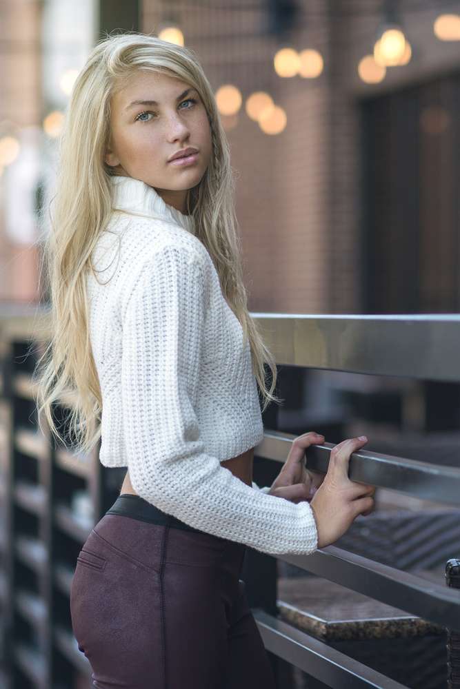
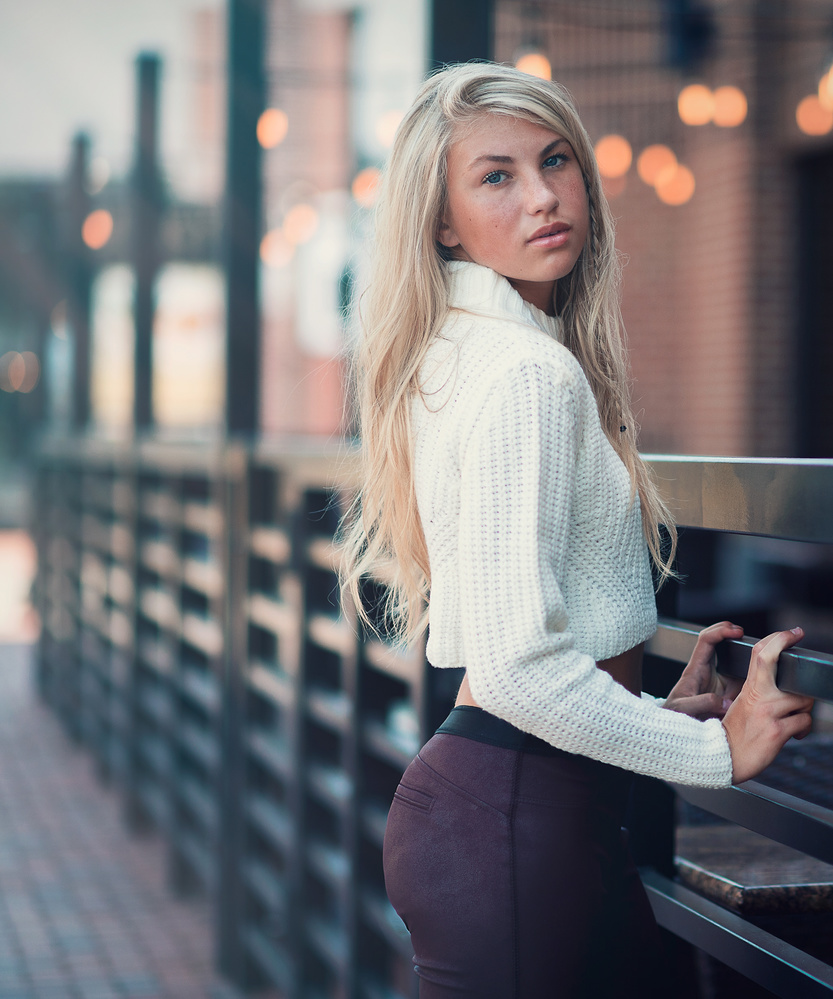
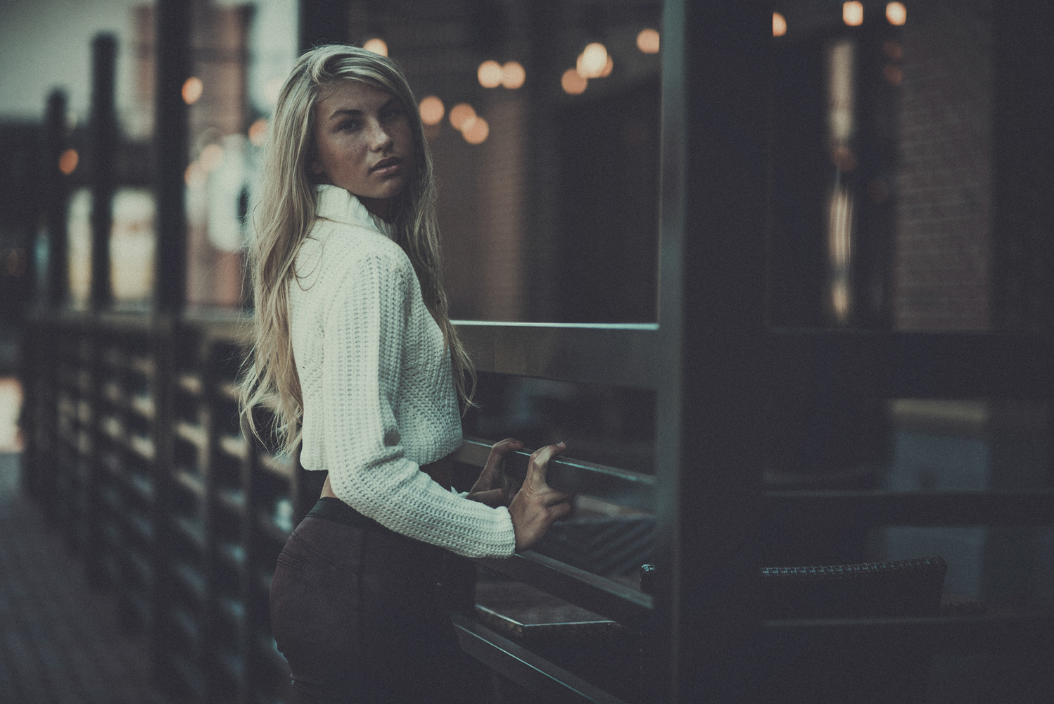
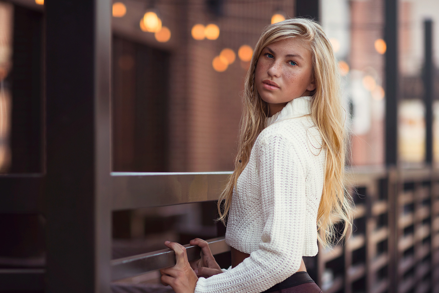
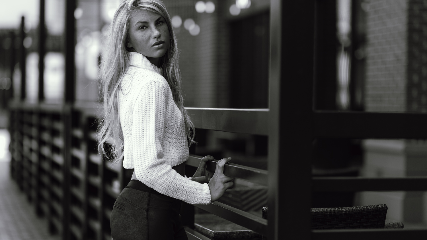


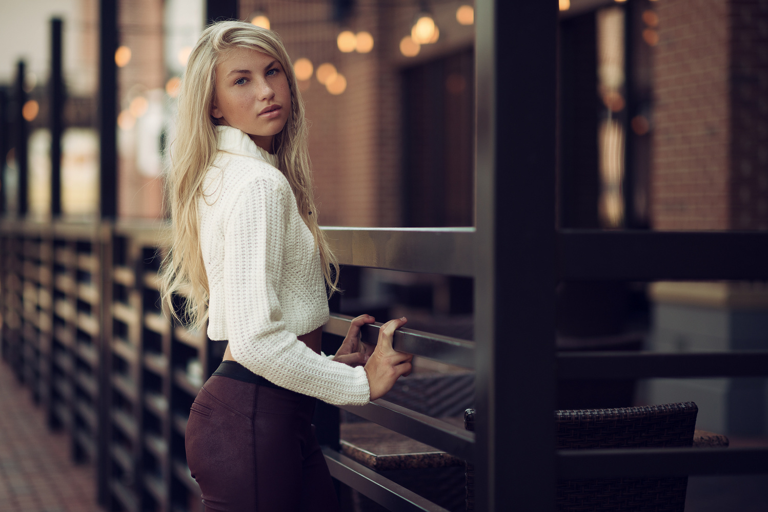

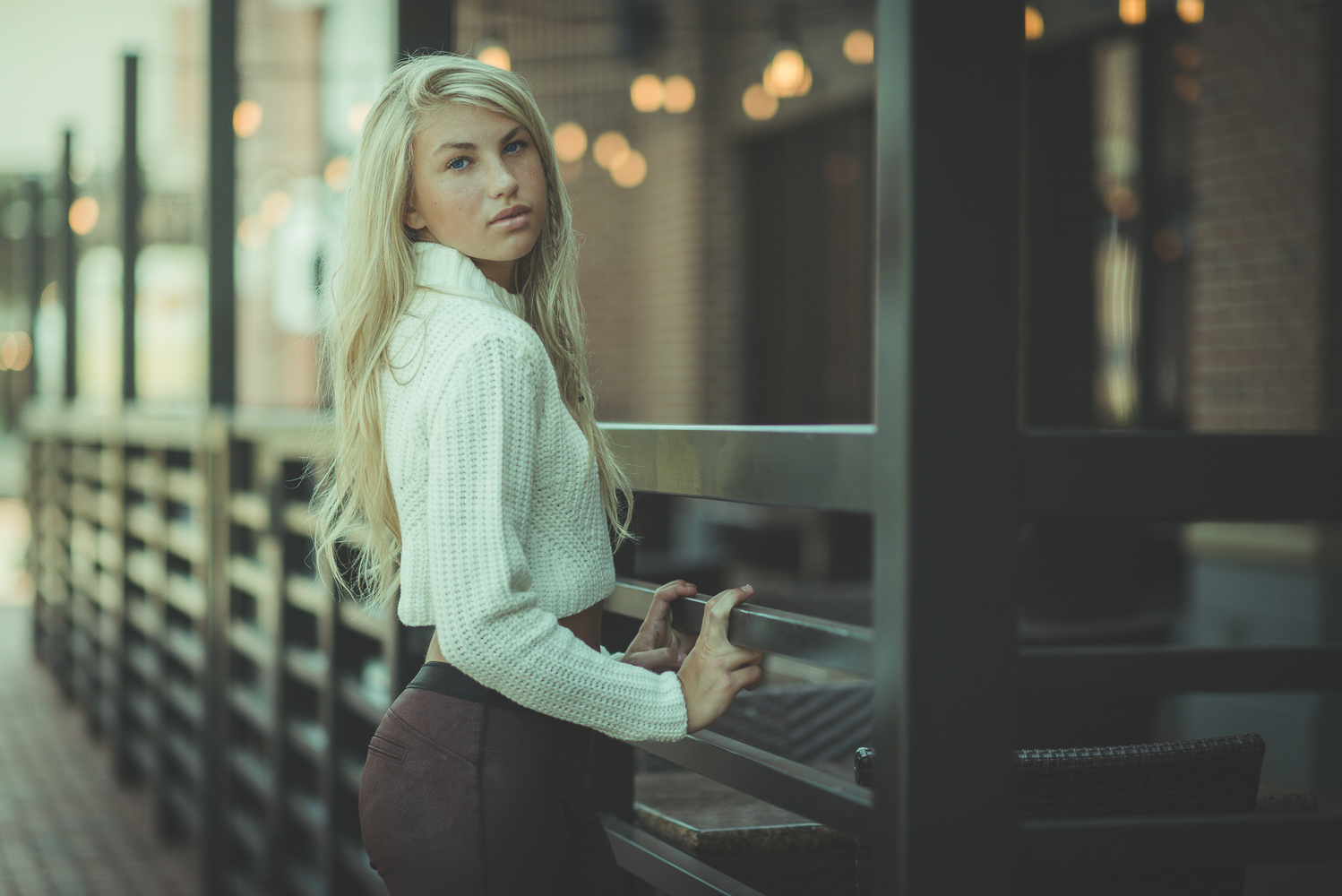

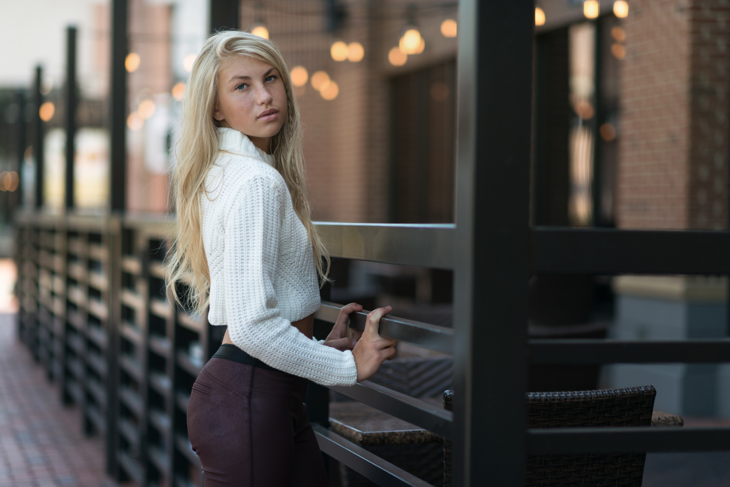

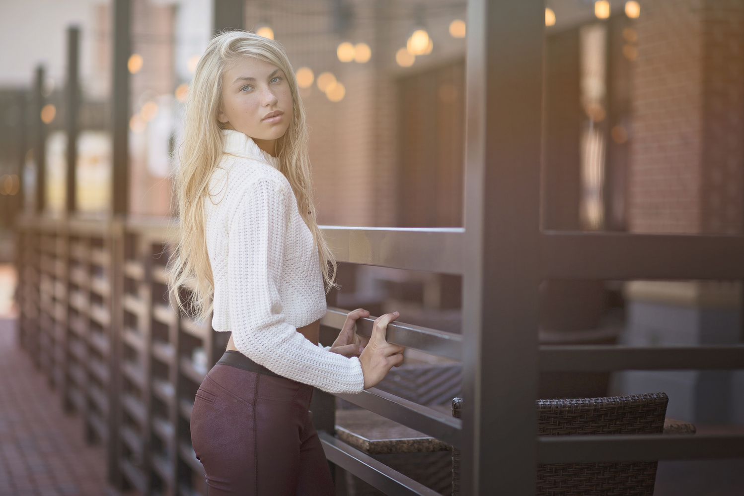

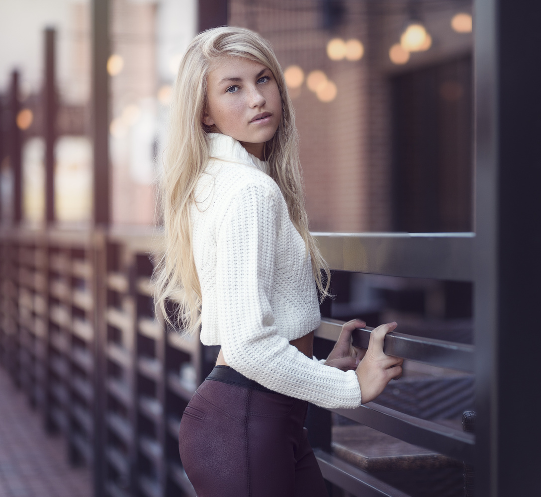


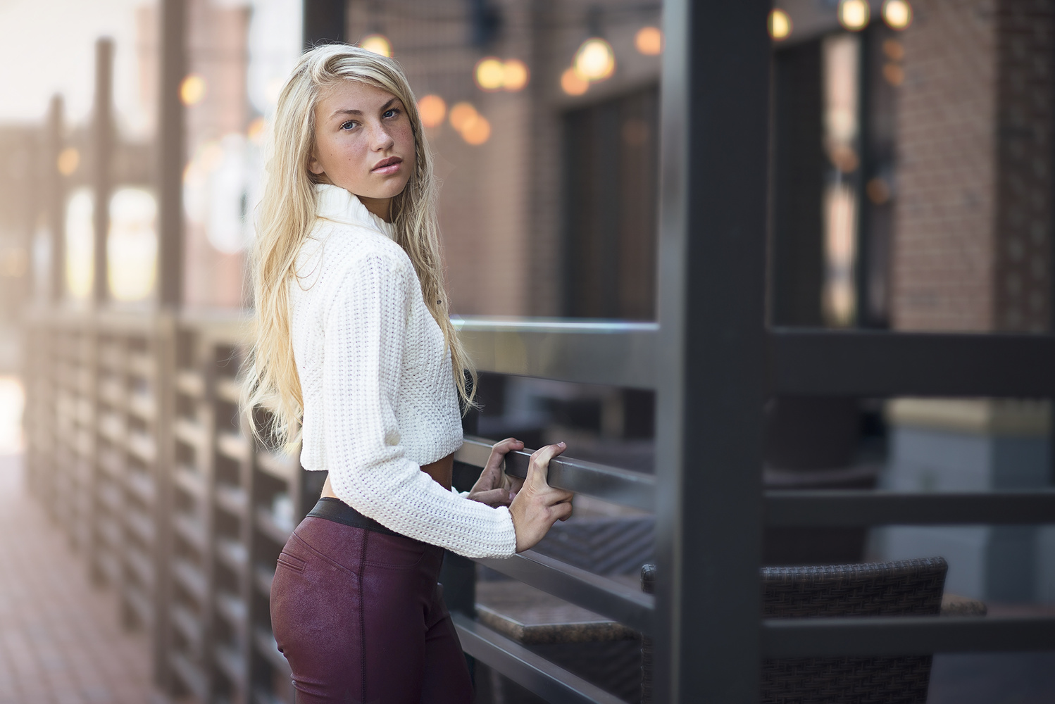


Great selection, I appreciate the fact that it shows variety as well as different cropping styles. Alessandro De Luca photo caught my attention because of his subtle approach and the natural resonance of the tone used. Brilliant piece Dani!
...
Very nice idea Dani. Even better you choose my edit!
Thanks for that!
We've had a good laugh or two on FB in the past and that's how I always remember you. The group we belonged to got too nuts so I kind of bailed on it. Though I don't shoot portraits much at all I've always been a fan of your work. What you do fascinates me. You keep one upping yourself and that's freakin awesome. This project is the icing on the cake. What a great idea. It actually taught me a bit about myself and how people perceive my work and that my friend is a life lesson to me. Thank you. I'm going back to my cave now but I'd like you to know before I go that... in the dark shadows of the internet you have fan that looks at your work with great admiration. Cheers brother.
Most of these images aren't even edited, just some insta style filters... :/
I totally agree. I spent about 45minutes retouching my spin on it. Did not make the top 20;(
I appreciate the opportunity, but was disappointed in seeing most of the ones chosen. My entry below..Maybe next time..lol
Good job Chris! :) I can see you took out the distractions from the image that the most of the others failed to do so. I think Dani choose randomly the 20 images because of the lack of quality control(distractions, no skin retouch/D&B on half of them, filtering instead of color grading).
Dani said he would only do it once, and never again. He said this also on other thing and did it a few days later (like never posting on his page again). :D
I think this contest is a good idea, just didn't work out the first time.
Very interesting. And results were about expected. Over half had basic filters while more than half didn't even clean up her face. Some way overdid it. And about 3 or 4 made the girl and image as a whole look really good.
It's quite hysterical to say the least. lol.
That which stood out to me was how many chose NOT to change the basic composition of the image. I think those that did by cropping, showed much more diversity in their creativity. Great post!
I find it most ironic, that many of the comments here from the "pros" echo the exact disdain that many moan about their clients: that a normal person doesn't have an "eye for detail" to know a great photo from a mediocre one.
It was an honor to make the top 20...THANK U for selecting my edit. I have fallen in love with portrait photography once again because of u SIR!!!! ....thank uuu for being U........... David Guzman ; )
Nice job man.
I like Olga's crop best. I can't get past the awkward lobsterclaws.
"awkward lobsterclaws" - me too, and why only 2 people* decided to fix the glaring highlight on the knuckle, many making it even more pronounced with their choice of contrasty, goopy color grading.
* the complete close-crop and the flipped one.
I thought I was the only one that noticed the horrible hands! I did my best to correct in my edit. Funny though that it seems NO one else touched them and...with their random addition of filters...they made them worse.
So cool! I can't believe I made the cut!! I was so close to not submitting probably every other minute as I edited this image. Very Happy I just sent it in! Thanks again!
I can't see any proper editing, all I see it tonality and hue changes. As a photographer myself, get a little pissed when seeing stuff like this. Of course retouching doesn't have to be an in your face thing, but I see so much stuff In these photos that i would have removed or dimmed down. Fashion photography has its own set of demands to retouching, and I see none of it here. Seriously this competition is a joke. I would have loved to see a competition that set or showed a standard. Most of the stuff I see these days, caters to amateurs. Although there is a lot of semi pro/Amateurs who know what their doing, a lot of the stuff I see just lowers people's understanding of what photography is.
Thank you just happy i made the page was a fun idea :)
One of the better edits. Good job man.
Thanks mate :)
Congrats my friend!
thanks mate :)
Damn!!!! I missed that! I would have love to do it! ;) I absolutely love this idea!
Ok, am I the only one who is like... totally bothered by the way her fingers are clenching onto the railing? I can't get past it!
As far as editing Dani, I would've like to see some distinct attributes applied here. After all, if these edits were done by photographers (and not retouchers), their style should've been more apparent. I hate to say this, but this looks more like a gallery of action presets for Photoshop than edits done by photographers. Wouldn't you agree Dani?
I kept seeing the same thing, and had I seen the contest, would have surely struggled with a way to soften or remove that. So yes, I totally saw it too. I really do like some of the edits, but as a retoucher myself also found myself being hypercritical of the other photographers. As soon as I reminded myself that not all photographers are also retouchers.... I softened my critique a bit.
The hands, the hands! The horror, horror! Yeah man, can't believe that few are even mentioning that. And as far as the edits...you're dead on.
I'm a very, very amateur who found you on Flipboard so take this for what it's worth (love this kind of stuff though!)
I really am drawn to Olga's first because it shows the beauty of the model, and more specifically, her blue eyes. However composition-wise, I like Vera's as it includes the eye-catching length of the railing (I know I'm not saying this right at all) even though it's blurred...it's still there to make the photo interesting. I like that it's blurry actually. And I really like the filter she used as the bulbs are a good color and stand out nicely.
Again I apologize for my sincerely bad layman's terms but I enjoy learning from all of you!
We grow personally and professionally when we help one another become a better photog, retoucher or amateur. So keep up the good work Dani Diamond.
If anyone is wondering about my edit. I processed Dani's RAW file manually in ACR and PS. Personally I shoot fully manual (RAW of course) and post-process the images manually in PS. I don't like actions and presets but I do own several sets. Early in my photography I used presets. But as I've learned more over the last couple of years I strongly prefer to be in complete control of my image with my own vision.
Thanks again Dani!! Since this is your first contest with your RAW file and possibly the last I feel extremely honored to see my name at the top of the page!!
Here is my submission guys.
A few really good ones and a couple of horrible ones. Not bad. Less is more people!
This was a fascinating idea, and what it illustrates for me is that a photographer will have an idea of how they expect an image to look. These "volunteer" photogs are going into this "blind", and thus are bringing their own tastes to what can be done with the images. It's a wonderful experiment in creativity. I would never turn over a RAW file to a client because only I know what my intent was with the look of the photograph, even though the client and I will have discussed what was wanted. I mention this because there has been discussion recently in regards to clients demanding the photographer's RAW files.
Here you go... DXO Optics Pro 10
very bad lightroom presets.to bad u didnt pick mine:)
Che collezione di filtri orrendi...
Here's my attempt.
I'm amazed about the horrible quality of the retouching. Retouching a picture does not mean to crop and fumble around as much as possible using all possible hues and filters. It means to retouch as little as possible and as much as needed for maximum results.
A retouching should always be the servant of an existing (good) photograph. It should support the photograph and not by all means try to completely alter it.
Nowadays people think photography happens on a screen.
I don't entirely agree with that statement . I think it is a combination of both. Art is Art and it can come from the alteration of a media through a second medium. But I get what your saying though. I just think there is room for everything. When i retouch certain photos, i do it to match what he eye perceives but other times I try to push the image where the camera cannot
i hope I'm not 2 late?
I spent about 15 minutes on lightroom only... no plugins only lightroom tools :)
what do you guys think ? :P
Better late than never!
I love this 70s b/w... almost a newpaper look! very cool
Better late than never!
Just a teeny whine: Only three of the finalists cloned out what looks kinda like a bug in her hair. Great exercise!
I didn't make it to the contest because I read 9PM instead of AM, but here's my edit. CC welcome :)
I am glad that you liked my take and considered worth including. It was, kind of a trick question, to include the hands or not to. I believe, you also come across such dilemma but through your work until now, it seems that you tackle them well.
Ohh, i missed it! But here is mine, a few minutes, lightroom only! Haven't pushed it too much, but the model is really perfect, so natural is fine at my taste! Crits welcome!
Here is an higher res version: http://image.noelshack.com/fichiers/2015/40/1443618212-dsc5423.jpg