There have been many books written on the subject of face anatomy and how it impacts not only our perception of someone but our reaction to them as well. There are features we deem as authoritative, feminine, funny, somber, and so on. With over 7 billion people in the world we've got quite a few unique faces out there, and yet, certain features and proportions are universally and subconsciously interpreted as "appealing". As you can imagine, face anatomy is a crucial part of commercial photography, especially when marketing anything in the beauty industry.
In this article, I want to explore with you what some experts deem to be the "perfect" face anatomy, and how we can take a regular face that doesn't exactly conform to this standard and turn it into one that does using Photoshop's liquify tool. The image I have chosen to work with here is from a recent shoot. It is a 100% crop from a much larger image and it was just a lighting test, so the quality ain't the greatest. But because this image would have been discarded, it serves our purpose quite well. Also, keep in mind, that while I did do some minor skin correction and color adjustments, this is far from a retouched photo. I only hope to show you the direction this photo could take.
So What Is The Perfect Face Anatomy?
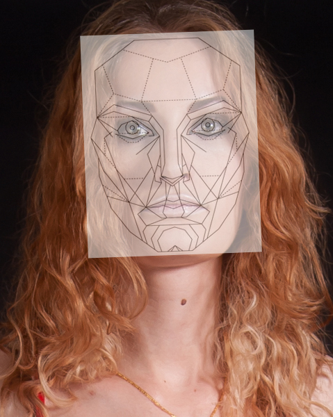
Well according to many experts, this is it:

After many years of research and studies, some facial experts have determined this mask to represent what our brains deem as "beautiful". Everything from the proportion of the lips to the distance between the eyes has been precisely calculated. Makes it seem a little cold and robotic doesn't it? However, our brains really do like order and proportions, so it would make complete sense that a face anatomy which conforms to our ideas of order and good proportions would be deemed as "beautiful".
I won't get into all the nitty gritty here, because I want to keep this article somewhat concise, but if you follow the link I provide here you can read all about how this face anatomy was determined to be the "one". Keep your eye out for the very interesting tidbits about the golden ratio's in face structure, which as some of you may know, also apply to photography in general: http://www.beautyanalysis.com/index2_mba.htm
So What Can We Do With This Mask?
The face anatomy mask provided here can serve as a guideline to help you visualize the changes you need to make with the liquify tool in order to achieve a pleasing result. Many people will simply go ahead and slim the face without any regard for proportion. This can easily lead to unrealistic results that don't make the face any more pleasing then before we started. With this mask we can begin to understand face anatomy and make focused changes that will actually benefit our images.
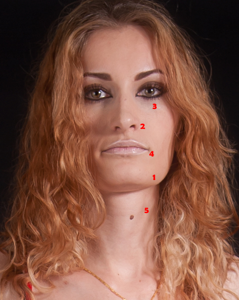
Let's get started! This is the original image we will be working with.

As you can see, our model has striking features, but how do they stack up to the "perfect" face anatomy?

Not too bad actually, but there is clearly room for improvement. Let's break it down, point by point, on the areas of focus.

1. The Chin And Jaw
This is where we see the biggest difference between our model and the face anatomy mask. Our model has a very wide jaw giving her a rectangular face. This face shape is good for portraying a strong and dominant personality but it can also be interpreted as mean and angry. By softening the jaw and bringing it in line with the face anatomy mask we instantly get a more feminine and friendly face. This is something that is extremely important in commercial photography because we want the face to be inviting and warm.
While we are changing the shape of the jaw, we also want to minimize the chin ever so slightly. Not too much, or it will be pointy, but as we soften this models wide jaw, we don't want the chin to become overbearing. The face anatomy mask has a good guideline with rings around the chin area to give you a sense of perspective and how gradual the slope should be. This is something you could further emphasize with dodging and burning to create the right protrusion of the chin and jaw area.
2. The Nose
The nose should be kept as symmetrical as possible. You want to focus on slimming the bridge of the nose and straightening any curvature it may have. In our example here, the right side of the nose is ever so slightly higher then the left. The bridge is a little wide, and it curves slightly towards the right. The length of the nose however is right on point, so we do not need to make any changes there.
3. The Eyes, Brows, And Cheek Bones
Our model happens to have a great pair of eyes. They needed very minor adjustments. They are perfectly spaced and the exact shape and size they need to be. We needed to make small adjustments to the eyelids, because the eye on the left has an eyelid that slightly droops at an angle steeper then the right eye. Again, we want to keep the eyes fairly symmetrical, so any glaring differences should be corrected.
The brows were left untouched because they slope at an angle that is just about perfect and they are also quite well placed. Things to correct here would be brows that slope too much (forwards or backwards), brows that are too small or too large, and brows that are too far apart or too close together.
The cheek bone placement for our example is perfect. You will notice, it is the line that protrudes and stops half way across the cheek, just under the eyes. That denotes where the cheek bone should begin to raise. On a very wide or very narrow face this may need some minor adjustment.
4. The Lips
The lips are such a crucial part of face anatomy. They convey so much emotion. In our example, the lips appear a little wide, but more importantly they are down turned. This makes it appear as if our model is a bit sad. In order to correct this, we adjust the lip length and pulled their placement just a little lower to fit the face anatomy mask. We then straightened the lips and upturned the edges ever so slightly to get away from the sad expression our model was conveying.
5. The Neck
The neck is a big focus area. We want to elongate and slim the neck. While this is not part of the mask anymore a slim and elongated neck is classier and more elegant then a short and wide neck. It also puts more emphasis on the face because the neck doesn't take up as much real estate in the image. In our example we had to slim the neck and we were able to elongate it by eliminating some of the excess under chin that we could see.
The Result
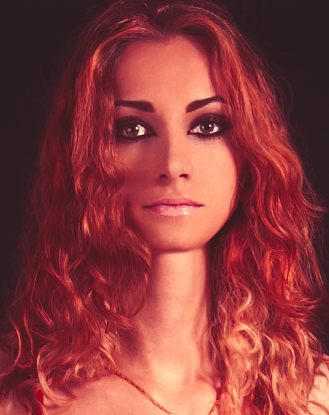
After making all those changes, and a few skin corrections that were bugging me, this is the result we have achieved.

Not bad for a quick example. Sure further improvements could be made if one really had the time, but you can clearly see here that the liquify tool in Photoshop is extremely powerful when used properly and not excessively.
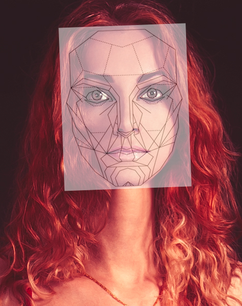
Let's take one last look at how the new image stacks up to the face anatomy mask.

There you have it! I hope this little tutorial gives you all an idea of where to focus your liquifying corrections and the proportions we are supposed to aim for. Now that you've read all this, it is important I tell you that this is NOT the only way to do things. Unique facial features are beautiful and while this face mask has the potential to expose our primal instinct of what is beautiful, it also has the potential to turn things bland. Use your own judgement, because as the photographer, we see the world you choose to show us!
Hope this helps. Feel free to visit me anytime at Peter House - Commercial Photographer to follow our work. Till next time.
If you'd like to take your photo editing to a new level, make sure to check out the variety of Photoshop tutorials and plugins that will speed up your workflow and help you create stunning, professional work. Save 15% by using "ARTICLE" at checkout.


Aw the nearly perfect woman.....
Hey hey, Peka Peka. How you doin? :-p
LOL! I try Zach... I try. :)
I was kind of hoping the commercial "offers" would be rolling in by now... no such luck... maybe I'm not so perfect. wah wah :(
So what you're saying is I'm basically perfect? Good to know... ;P
http://s23.postimg.org/3z0h45dpn/bwahaha.jpg
BWAHAHAHAHAHAHAHAHAHAHAHAHAHAHAHAHA!
That's awesome! LOL! I'm glad I'm not the only one who did that! :)
Jaymes, fantastic! Thanks for posting that up. Always nice to see people trying things out first hand :)
Oh, and just wanted to mention, I think a lot of the naysayers might be a little surprised at how well this mask fits most people actually. I chose the original image I did because I knew it would emphasize the results, but in general the changes we make are not too far off from the original face. It's just nice to have something like this as a guideline.
I agree 100%. As different as we all may be we do have a foundational base template. The mask is an average so anyone could wind up in the proximity. The only real differentiations are in head shape, all the little things like space and width are only minutely different. ;)
This is a great point. ^^
We need to put this mask into photoshop/gimp as an overlay layer, like the rule of thirds layers they have :-)
kenyee, that is something I was thinking of doing, but just didn't have the time. Seems there might be some interest from the community, so I will contact the creators of this mask and get permission to make a scale-able vector mask for everyone to use. I'll make it downloadable via my website, and I will throw an update on here as well when that happens.
Cheers!
Awesome. That would be useful indeed :-)
If you do that, I'll see if I can figure out how to get it into Gimp. They have golden ratios, etc. masks already (more than PS AFAIK) so it should be possible.
This is so messed up and rooted in white people's standards of beauty that I don't know where to begin. And I say this as a white woman. But seriously, could we NOT perpetuate this crap. The sooner people start standing up to this the sooner society will stop placing a women's sole value as human on her beauty.
That's just ridiculous! Way over edited. Advertising just makes me sick! Sick! Sick! Sick! And sure, it's what the client wants. That's what is so sick. I would never edit a portrait that much. And no model would actually want her image changed that much. No way! They would be stupid to want their photo changed that much! Just stupid.
There is no reason what so ever to have to ever distort a photograph that much. I understand this was to show to power of the tool, but there are many people on this discussion that see no problem with distorting a portrait that much. This is why there are so many people who have self image problems. Shame on us all as humans.
This is basically the same type algorithm as Portrait Professional uses inside their warze.
What can we do with this mask? Throw it away 😊
Let humans be humans, more importantly, let women be women. I don’t care if you’re in commercial, you are part of the problem. We already have unrealistic beauty standards, we don’t need you creating fake women and labeling them perfect.
Also, you chose to make her look like an alien with the neck of a Barbie doll so I’m struggling to see how this is ‘aesthetic’ in any way. Glad you got rid of her pesky mole and made her skin without any texture though, it really drives home the whole ‘Alien Barbie’ vibe, which I’m sure is what commercial is pushing for these days 🙄
You warn about the possibility of being bland yet that’s exactly what you’ve done here...