
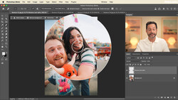
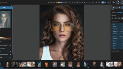
Post-Production and Retouching is just as much an integral part of creating a great image or series of images as pre-production and the actual shoot, especially when you are shooting for a client and not just for yourself. Each genre of imagery, advertising, beauty, fashion, etc. has a slightly different set of rules and parameters when it comes to retouching. In this tutorial we will look at the complete start to finish of a fashion editorial image. Last week I posted the complete gear list for this exact shoot. This week we will look at the first part of retouching, including cleaning up our white seamless and correcting distractions in our image.
Step 1: Cleaning Up the Background
Cleaning up the background will be a three part process. The first step will be to remove the small wrinkles in the paper. The small wrinkles are a texture issue, so I use the healing brush tool. The second step will be to even out some of the tones in the backdrop with dodge and burn. The third and final step will be to blend the gradation of value in the background with frequency separation. It is very important to remember that in order to see most these issues I am applying a Curves adjustment layer to make the image much darker.
Healing brush: The healing brush is in a way an automated frequency separation. It attempts to separate tone from texture and allow us to paint in and adjust texture while maintaining the the tone. When using the healing brush you will basically be replacing texture. Hold down Alt and click to "sample" or choose the area you want to borrow texture from. You can then paint in the texture on the area you want to correct. Also use a new blank layer to paint on and choose the "current and below" option on the right side of the options bar. By painting on a blank layer it makes it much easier to make corrections or undo things that don't work.
Dodge & Burn: With the dark curve adjustment still applied we will now begin dodging and burning to smooth out areas of contrast in the backdrop. To Dodge and Burn I use 2 separate curve adjustment layers. Selecting a point from the middle of the curve I pull one of the curve adjustments layers slightly up to brighten the image and one slightly down the darken the image. On the masks associated with the curves, make them both black to hide the adjustment. You can then use your brush tool to paint in where you would like to dodge or burn you backdrop. Use a weaker brush so you can control the adjustment. I generally start with a 100% opacity and 3% flow brush but in this image I took it down even further to 70% opacity and 1% flow.
Frequency Separation: Now for the finishing touches on the backdrop, I use frequency separation. Remember that your blur radius it was has control over how your image get separated, we are running our separation for the backdrop not for the skin texture as we would normally do. So, the radius is going to be much smaller. In this instance I chose a radius of 3, but also remember this is relative to my file size so you will have to judge for your image. Also, I make a point in the video to remind you to turn off the Curve adjustment that is darkening our image when you sample the tone you want to paint. You want to make sure you are sampling the actual color and not a darker color because the curve adjustment is turned on. I am also not trying to change the appearance of the backdrop in this image, I am just trying to smooth out the transitions in value.
Step 2: Correcting Distractions
The first thing I do before retouching any image is to make notes. I create a blank layer and use a bright color to literally write on top of my image. In this tutorial I circled some of the main distractions and areas to correct. For distractions I am focusing a lot on the fringe of the dress. The fringe here was a bit un-predictable and it would be quite a challenge and disruption for the stylist to run in between each from to correct it. So at the bottom of the dress there are a couple of areas where the fringe has left a gap. On the shoulders of the dress there is an area where the fringe is moving across instead of down and a spot where the fringe is clumping together underneath our models arms. Another major distraction is the tag. For most of the frames we were able to keep it hidden, but figures, the one we want to go with has the tag showing, not a difficult fix and should definitely not be a reason to not choose this image. Finally I am going to address sections that may benefit from liquefy. I mention in the video, that my use of liquefy is NOT to make the model look thinner, she didn't need it. Usually liquefying a model or the image is about making the clothing fit better and enhancing the fashion not the model.
1. In order to fix the fringe I am using the Stamp Tool. I am also using a blank layer with the "Current and Below" option selected. Select areas of the fringe you want to copy and paint them into the areas that needed to be filled in. If you paint in too much you can either erase or add a mask to that layer to remove what you want to hide. The mask option is a great non-destructive way or working. Also for the section of the image underneath the models arm, I am going to create a selection with the Magnetic Lasso Tool, prior to painting with the Stamp Tool. This always helps me to remove the unwanted fringe with more precision.
2. The tag is a relatively easy fix as well. The method for removing it isn't much different from correcting the fringe. Here I make a selection to remove the bulk of the tag, once again using the Magnetic Lasso, I then remove with the stamp by sampling the backdrop. For the remaining section of tag, I also use the Stamp Tool (painting on a blank layer with Current and Below selected) but I sample fringe to cover the tag instead of sampling the background this time.
3. Finally, I move into liquefying. Not real tricks here, the only tip is to work piece by piece and use multiple layers. I think its really helpful to watch the video for this one so you can see how I use multiple layers and layer copies. In the tutorial I also make a mistake, pushing the liquefy too far, which is great because it gives us the benefit of seeing how to mask out our mistake and then create another stamp layer, in order to continue working.
In Part 2 of this tutorial, I will cover many of the more fundamental steps, that I also covered in my 5 Final Steps to Any Retouch post. These steps will include things like, color matching, color toning, skin retouching, and sharpening.
Feel free to reach out with any questions!
Join the Fstoppers community for free
-
Post comments and join in the discussions
-
Browse the site ad-free
-
Share your work and get featured in the community
-
Compete in the photo contests for fun and prizes
9 Comments
Thank you!
Thank you for reading and watching!
Yep! Great! Another one to my favs!! :D
Thanks Paulo!
Nicee... Quick note guys: to avoid switching off the curves layer (10:30 onwards) everytime just to sample the right hue, switch to the eye dropper tool and change the mode from sample all layers to current and below then switch back to the brush tool and sample as you pls with the curves layer on or off.
Boom! Great tip Kolade. Thanks.
Glad that was helpful to you. #kudos
Awesome, thank you for that, now when do we get to see part 2 ? ;-)
Recorded today, should be up next week.