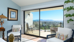
Getting white balance right in real estate interiors is harder than it looks. Competing light sources, colored walls, and reflective surfaces all pull your colors in different directions, and fixing it all globally in post rarely works.
Coming to you from Nathan Cool Photo, this practical video walks through a three-step system for getting accurate, consistent colors in interior real estate photos, whether you're shooting HDR, flambient, or single exposures. Cool starts in camera, making the case for setting a manual Kelvin value instead of relying on auto white balance. Auto can look reasonable at a glance, but interiors with mixed light sources, colored walls, and reflected daylight will fool it every time. Setting Kelvin manually and watching the result on your camera's rear screen gets you close enough that your post-processing corrections become much smaller adjustments rather than full rescues. This applies whether you're editing the files yourself or sending them to an outsource editor.
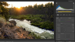
Step two moves into Lightroom Classic, where Cool makes manual temperature and tint adjustments to his raw files before any blending begins. One technique worth paying close attention to: instead of using the white balance eyedropper, he moves his cursor across different areas of the frame and watches the RGB values displayed beneath the histogram. This tells him exactly how the colors are distributed in any given area, which is a far more reliable read than letting Lightroom guess from a single sample point. The key rule here is consistency: whatever temperature and tint adjustments you make, apply them to every frame that will be blended together, ambient shots and flash shots alike.
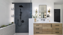
Where it gets more nuanced is step three, the blending stage in Photoshop. Cool's approach here is precise: color corrections go on the specific layers that need them, not applied globally across the whole composite. In the video, he uses a clipping mask to limit a warmth and magenta adjustment to just the shower pop layer, then adds a separate hue/saturation adjustment to pull back excess green in the rest of the image while masking out the cabinets so they aren't affected. He also makes a point of layer order: any color corrections for the interior need to sit below the window pull layers in the stack. If they're above, they'll shift the colors of your exterior view, which you've already worked to get right. The final step is a stamped layer run through the Camera Raw filter for global finishing adjustments, and because the color work was done correctly at each stage, he doesn't need to touch the color sliders there at all.
Check out the video above for the full breakdown from Cool, including the exact layer order he uses and how he handles the hue/saturation masking in real time.


Join the Fstoppers community for free
-
Post comments and join in the discussions
-
Browse the site ad-free
-
Share your work and get featured in the community
-
Compete in the photo contests for fun and prizes
No comments yet