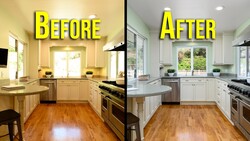
The new Photoshop update adds adjustment layers that feel tailor-made for real estate edits, especially when a scene is flat and hazy. If you shoot homes, rentals, or interiors, the difference between “fine” and “booked” often comes down to controlled, believable separation in the sky, water, and key surfaces.
Coming to you from Nathan Cool Photo, this practical video walks through a full edit in Photoshop using the new Clarity and Dehaze adjustment layer and the newer Color and Vibrance adjustment layer. Cool starts with a coastal scene that looks washed out, then builds the edit by stacking a few targeted adjustments instead of leaning on one heavy global move. The main idea is simple: you can push dehaze hard enough to clean up the sky, but only if you keep it from choking the rest of the frame. The video stays in Photoshop the whole time, which is useful if you’re trying to simplify your workflow or avoid bouncing between apps. Cool’s approach is less about chasing “wow” and more about getting to a clean, marketable look without the usual haloing and weird color shifts.
The part to watch closely is the masking strategy with gradients, because it’s where people usually overcook the file. Cool shows a top-down gradient to limit dehaze to the sky, then flips the concept for color work so the ground gets vibrance and saturation without contaminating the sky. That separation matters when the atmosphere is doing half the desaturation for you, since dehaze is already messing with color and contrast at the same time. You also get a clear warning in practice: vibrance and saturation can fight dehaze fast, so splitting them onto different layers gives you control you don’t get from one “all-in-one” adjustment. If you’ve ever tried to “fix dull” and ended up with radioactive blues and crunchy clouds, this section lands hard.
From there, Cool moves into brightness control in a way that’s easy to underestimate until you see it done well. Instead of lifting exposure everywhere, he adds a Brightness/Contrast layer, then masks it so the harbor area gets attention while the houses don’t blow out. The trick is swapping the gradient from white-to-black to black-to-white and placing it with intent, not just dragging it roughly and hoping. He even rotates the gradient to follow the scene’s lines, which sounds minor but changes how natural the lift feels when you’re guiding the eye through a property photo. After that, he reaches for Levels to set a firmer black and white point and nudges the midtone slider, which is a clean way to add snap without turning the image into a high-contrast caricature. You’re also shown how to circle back and rebalance vibrance versus saturation after contrast changes, since those moves don’t live in isolation.
One detail that’s easy to miss is the workflow angle: saving the whole thing as a layered Photoshop file so you can reopen it later and tweak masks and sliders without relying on Lightroom Classic or a catalog. That can be a big deal if you deliver revisions, revisit a listing weeks later, or want a repeatable starting point for a consistent look. Cool also points out that the same masking logic applies to interiors, and he briefly demonstrates it with a countertop that looks “fine” until you see how selective adjustments give it presence without making the room feel fake. You’ll pick up a few small operational habits too, like checking you’re using the modern gradient tool rather than classic gradient and choosing the right foreground/background setup before dragging. The video leaves some room for judgment calls, like how far to push dehaze before the sky starts to look heavy and unnatural, and where that line sits on different scenes. Check out the video above for the full rundown from Cool.


Join the Fstoppers community for free
-
Post comments and join in the discussions
-
Browse the site ad-free
-
Share your work and get featured in the community
-
Compete in the photo contests for fun and prizes
No comments yet