
As someone who has spent a life in mathematics, I see a lot of attempts to ascribe mathematical concepts to real-world ideas in an overly simplistic way. The media misinterpreting a single medical study and reporting that a glass of red wine is equivalent to an hour at the gym does not mean you should forget the treadmill and buy more Malbec. Weathermen in Kansas do not expect the flapping of butterfly wings to cause tornadoes. But in photography, there's one incessantly perpetuated myth that drives me crazy.
In math, we give names to the really special numbers: π, e, etc. There's another number that has its own name: 
 came up. It's a neat number; it has some cool properties and interesting facets, but it's not the ubiquitous titan that the aforementioned numbers are.
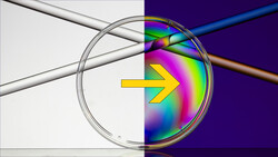
And so, it surprises me that it has gained such a foothold in aesthetics. We hear about it constantly in photography; it's even included as a composition option when using the crop tool in Lightroom. But why? What's so special about it? Are we as humans really naturally drawn to this irrational number (meaning it has no representation as a fraction)? Or is something else at play? I propose it's the latter.
To me, the golden ratio in photography is an example of confirmation bias and the desire to ascribe something mystical. Confirmation bias is the tendency to accept information that supports a belief and reject or diminish the importance of information that undermines it. Horoscopes, luck, and politics all contain great examples of this. We hear it's good luck to perform some ritual, perhaps knocking on wood, and we remember that one time that something bad happened when we didn't, forgetting the hundreds of other times when life went on rather innocuously.
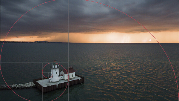
Take a look at the image below:
I'm pretty proud of my composition here. For reference, I've placed red dots at golden spiral points, green dots at rule of thirds points, and blue dots at golden ratio points. Can any one of the twelve points singularly explain why this composition works? Let's take a look. Beginning in the bottom right quadrant, I don't think anyone will argue that these three dots hold much significance, unless you're really into breakwalls.
Moving up to the upper right quadrant, things get a bit more interesting. At the golden ratio point, there's the corner of a fairly tall building, but it pales in comparison to the immediately adjacent Key Tower and Terminal Tower. The rule of thirds point is on a midtone section of the clouds and isn't especially interesting. The golden spiral point is relatively near the leading edge of the brightest portion of the image, but still an appreciable distance from it. Moving to the upper left quadrant, the analysis is about the same. The golden ratio point sits on an unspectacular building, while the rule of thirds point and golden spiral point sit on the trailing edge of the storm.
In the lower left quadrant, things get a bit more interesting. Both the golden ratio and rule of thirds points are over the open water, but the golden spiral point does hit the lighthouse, which is obviously the main and only foreground element. Is it in the most interesting spot, though? I would argue the most beautiful spot of the lighthouse is where the two buildings meet or the peak, not the rather plain side of one of them. And even so, does that lighthouse make the image? No. It certainly contributes, but the composition here is built upon the inclusion of foreground, middle ground, and background elements, coupled with a centered composition of the main subject, the skyline. The lighthouse serves to offset the bright sky on the opposite diagonal, and while interesting, it's not the main subject. To attribute it all to the golden spiral point being sort of near the lighthouse is a vast oversimplification, and it highlights another point: finding the golden ratio is often an endeavor in approximation, which undermines its validity.
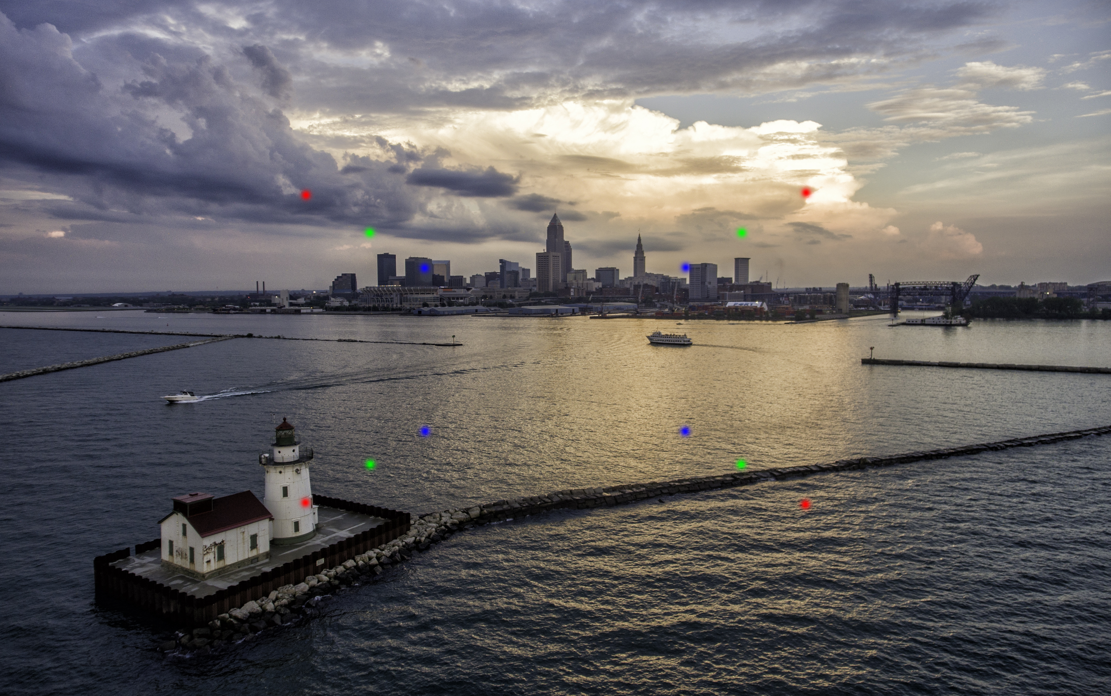
Here's another example:
Here's the issue: finding the golden ratio is often a huge example of confirmation bias. One of its main proponents, Adolf Zeising, thought that measuring the distance of a person's navel to their toes and dividing by their height was an example of its use in the human body, because that ratio is about 1.6. But why the navel? There's nothing special about that. In fact, give me any ratio and something as complex as the human body, and I promise you I'll find something close to that ratio in there. The truth is that we want something special, something "golden" to mean more, so we overemphasize the (statistically expected) times when it appears and ignore the vast majority of times it doesn't.
It's an attempt to find meaning between math and the arts, because wouldn't that be beautiful? But one must be careful, because math can be manipulated too. Did you know there's a nearly perfect correlation (R=.993) between divorce rates in Maine and per capita consumption of margarine in the U.S.? Is it meaningful? Of course not. There indeed are special relationships between math and the arts, but the golden ratio is not some transcendent thing, nor is it one of the most special relationships (not even close, I would argue). I get it, though: it's enticing. It's a spiral. It's a seeming yellow brick road to photographic brilliance. But it isn't a transcendent thing in mathematics, and its statistical consistency in art is dubious at best. Rather, I think it's a good representation of a simple fact: off-center composition is frequently pleasing. It gives a good approximation of a balance between being interesting and extreme. Studies that have tried to show
So, what am I saying? Can you use it for a guide? Sure. Should you use it as the absolute rule at the exclusion of your own aesthetic preferences, compositional instincts, and basal feelings? Absolutely not, just like the rule of thirds (which, incidentally, likely came about as an approximation of the golden ratio). There is not some mythic power contained in


Join the Fstoppers community for free
-
Post comments and join in the discussions
-
Browse the site ad-free
-
Share your work and get featured in the community
-
Compete in the photo contests for fun and prizes
25 Comments
While I don't completely agree with everything here, you make a great point at the end. Far too often I see professional photographers muck up a great shot by shifting it to fit the rule of thirds! Blows my mind, and deeply frustrates me haha
That's really the main point I'm trying to make; these things should be thought of as good starting points and guidelines, not absolute rules of aesthetics. I see people crop on autopilot, and I think they're missing quite a bit of expressive potential by doing so.
Definitely. I WISH people were on autopilot when I've seen them do these things. I've seen numerous conscious decisions to stick to the rules ending in "well it doesn't quite work, but it is what it is..." and they save it that way or say the shots no good. It really burns me up. Thanks for the write up. I hope A LOT of people read it and take it to heart
I completely agree. It is important to learn these rules for the sake of learning to compose a photo, but it's even more important to understand these rules for the sake of knowing when and how to break them in order to get the better shot
n/t
Very good article! I've been thinking a lot about the over use of mathematics and symbols in aesthetics. My conclusion is similar that it's only appealing to mysticism.
Thanks, Felix! I appreciate it.
Composition "rules" are a communication device to help educate on WHY an image works. not a tool on HOW to create an image. Part of the problem is that there are so many compositional techniques, beginners are not sure which ones to apply in a given situation, and then how closely they should adhere to said rules (hint: not much)
If not much, then they're poor rules. And frankly, it's a poor way of teaching, especially if, as you describe, it does not help much. A better way to teach would be to talk about the concepts behind those "rules", which in fact could perhaps be called rules themselves. Things like eliminating negative space. Why does the rule of thirds work a lot of times? Because it places the primary subject away from the center, which gives you more room to place in a secondary subject of interest. If you place it at the center, you don't give as much room for that secondary subject. Things like that should be emphasized more so than simply the rule of thirds, or whatever rule you may have.
I totally agree.
Yessssssssss!!! Thank you for writing what I've been thinking for years, albeit much more articulately.
I've seen too many articles on Fstoppers here, on the internet in general, and in physical books, about composition, where the authors will draw lines and diagonals and symbols showing why the composition works. A lot of times they are fairly complex rather than one or two lines. And it's at that point that I laugh, and say, "really, this is what you were concentrating on when taking the picture?" Yes, indeed, most of it does all seem like confirmation bias.
Thanks, Franklin! There's always a desire to simplify, I think, but sometimes, simplification is not the answer. Composition can be a very complex thing.
I think Alan K. brings up a great point. These are techniques that help explain WHY things work, not HOW to make something work. All compositional Rules (Golden Rule, Rule of Thirds) are simply meant to be guides, and help facilitate balance in an image. The Golden Spiral is a particularly precarious minefield to try to explain, because so few people on the internet are really able to articulate when it's most appropriate to use - specifically this idiot: https://fstoppers.com/architecture/ultimate-guide-composition-part-one-…
That said, any compositional guide is not meant to be arbitrarily thrown on any image. Compositional points of interest need to be placed along lines and/or intersections (called eyes). These can be: faces, the brightest part of the image, areas of high contrast, areas of high saturation, large objects, patterns, shapes, objects that add context to the narrative, any combination of these. If the object isn't relevant to the purpose of the image, then it isn't relevant to the composition and shouldn't be considered when using the guides (or perhaps even included in the shot at all). But also remember that guides, in general, are meant to be a consideration in the thought process of how we see, not absolutions about how we SHOULD frame something.
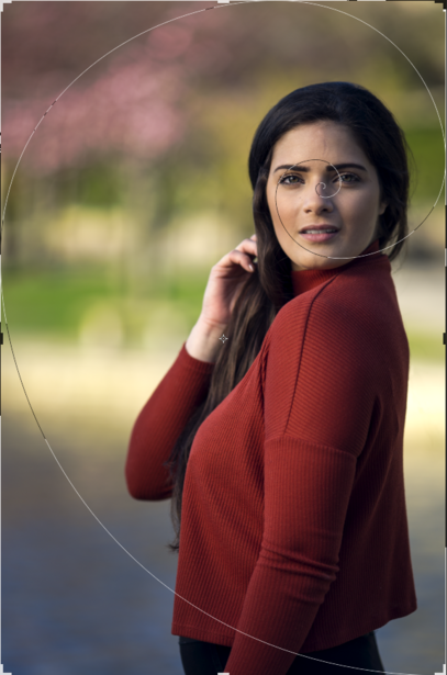
The Spiral, in particular, is maybe the most misunderstood. It's often used in a flat, two dimensional composition when the rule of thirds would be plenty fine (like the first two images I've attached). It's not great (although CAN be utilized well) for landscapes. The Spiral is meant to draw the eye around the image, filling the frame (see the 3rd attached image). The Spiral is also great at stacking foreground mid-ground and background elements in a photo, creating a dynamic sense of depth (see 4th attached photo).
In the image of the girl with the red shirt above, as it was mentioned, the Golden Spiral wasn't thought of at the time. Probably because a more accurate way to explain the composition would, as mentioned, be the Rule of Thirds (body along the right line, head at the intersection). Had the the Golden Spiral composition been applied, perhaps it would have made more sense had her arm been relaxed forward away from the body and her hand relaxed and curled back toward the body, falling along the dominant spiral line. We could even take this one step farther, zooming out and using the hand (a light object on dark pants, showing contrast) as the starting point of the curve in the bottom right corner. One could argue if it would make the shot better, and perhaps it would't change the response to the image, but it would fill the unused space a little more successfully. It would also be a Golden Spiral.
Remember, good composition doesn't make a shot less boring. It does, however show that you're a more capable visual communicator, and is something I think we can all agree is a pretty good thing.
.
Thanks for sharing!
Feynman: Mathematicians vs. Physicists
https://www.youtube.com/watch?v=obCjODeoLVw
He's describing how mathematicians are interested in the general case while physicists are interested in the specific case. The debate manifests itself in photography between the people that try to apply the golden rule as a general formula for all pictures vs those that understand it can only be one element in the dynamic system of forces represented within a particular picture.
Bottom line: Bad composition is mathematics. Good composition is physics.
I've seen a lot of videos and read a lot of books on photography. 95% say that these "rules" are not rules but guidelines. They give you a starting point, but your vision is the most important rule to follow. Also, know when you can "break" these rules and why you are doing it.
Great article. Even outside of art, the golden mean is rarely found or used. A recent Ted talk discussed the issue with architects. All who are aware of the Golden mean, all who could not find a single instance where it was being applied in their own work.
Math was always my worst subject in school so using math to take pictures is exactly why I didn't get into photography. It's more so about how you want to convey a feeling or mood or story rather than a perfectly mathematical equation. And even if it is perfect mathematically it can still suck.
I'm sorry, I hope this doesn't come off as rude or arrogant, but this article is working under a flawed assumption that the way you have shown is how you use the golden ratio. It's not. It is however, probably how many people use it, and how many people use the rule of thirds thinking it some how makes their images so much better. You are totally correct in your points that placing something at a point doesn't automatically make the image more interesting.
Like one of the other posters commented it's just a good easy-to-understand tool to teach people how to get their subject out of the middle of the picture.
For my own work I enjoy using the different Photoshop crop overlays because they will often suggest a composition that I wouldn't have thought of otherwise. It can be easy to overlook subtle diagonals or objects forming natural grids in a photograph but the different crop overlays help highlight them.
I read so many articles like this that have poisoned the Internet with the lack of credible knowledge on the art of composition. The Rule of Thirds doesn't have anything to do with real design, and this oversimplified use of the golden section ratio doesn't give an artist accurate guidance on classical skill-based techniques.
This is simply a matter of, yet, another photographer trying to debunk the golden section system of design. And yes, the golden section is actually a system, not one specific ratio, which is only mentioned here. Any master artist that is trained properly is using an entire system of design, meaning the armature of the rectangle and root rectangles as discussed in many books written on Dynamic Symmetry.
Real design is not a "starting" point; it's the beginning, the middle, and the end of a well-constructed work of art. Nor is design, or "composition" intuitive. It needs to be studied, mastered, and applied to all art, regardless of the medium used. This is just one more copied and pasted article that somehow ends up being proposed as a revelation in the art of composition. It is nothing of the sort. It's simply one more failed attempt of trying to maintain the illusion that great art is created spontaneously. Which it is not.
My point was never to debunk a system of design, and I highly encourage you to reread the article to see that. As a system of design, it's perfectly valid, as is any such system designed in a subjective space. My point was that the mythic status appointed to it by justifying it through its place in mathematics is not appropriate — no more, no less.
Hi Alex. I understand your point. However, the problem lies in the fact that most photographers aren't trained in design. So readers that come to this website will interpret what you're saying as "toss out all rules" in art, and the golden section has no validity, etc. Let's face it; most artists aren't mathematicians, and they skim articles quickly. So my point is, while I get where you're coming from, the message is misleading and somewhat self-defeating. It also encourages artists and photographers to throw knowledge to the wind and shoot intuitively. This rarely, if ever, works successfully, and the proof lies in the consistency of an artist's portfolio. For example, I see a lot of images on this website where the photographer doesn't understand figure-ground relationship, greatest area of contrast, gamut, edge distractions, or how to apply the basic armature of the rectangle to their images. As far as the Rule of Thirds is concerned, it's validity only applies to specific rectangles. Not in the form it's used by most photographers. Not only that, it's restrictions outweigh its usefulness. As Myron Barnstone once said, "To only know the system of the Rule of Thirds and none of the other rich design procedures that artists have used is to be poverty-stricken."
Alex: I just reread your article as you suggested. A few things. In the above photograph, you mention the red dots and the green dots that indicate the golden section and the Rule of Thirds divisions. However, because of the greatest area of contrast in the photograph, the viewer's eyes are immediately drawn to the sky and exit out of the frame. In other words, the viewer doesn't initially see the other areas of the image. I can't imagine this was your intent. Also, because every element is relatively the same size and lost in detail, there isn't a visual hierarchy to your composition. A well-designed work of art can be brought down to the size of a postage stamp and still retain its beauty and its intended design.
Moreover, the eye should move fluidly across an image and exit at an appropriate time. This is achieved through the use of effective arabesques, figure-ground relationship, any many other techniques used in classical skill-based design. In the photograph of the woman, you're disregarding the angles inherent to the geometry of the rectangle that you are designing within. So when you speak of the Rule of Thirds, which doesn't incorporate any diagonal lines at all, you're missing most of the important elements of design as well as the ability to place your subject within the chosen rectangle effectively.
You also mention at the beginning of your article that it drives you nuts when a principle is oversimplified and applied to art. In fact, your article has done just that. You have taken one ratio, applied it incorrectly and oversimplified it to a few photographs. For example, most photographers shoot in a 1.5 rectangle. In real design, to compose in 1.5, artists overlap two root 4 Dynamic Symmetry rectangles along with the basic armature of the rectangle.
To stress my point further. The Rule of Thirds is oversimplifying design to the extreme. So while you stress its use and its validity, it contradicts your initial message at the beginning of the article. Furthermore, I've read some of the comments that others have said regarding artists that write articles on design, complaining about "lines all over the place." Those lines are the structure of a work of art and any artist or photographer that can't read those "lines" can't effectively communicate through art.